Schuster teaches at the renowned HDM in Stuttgart and is a member of the strategy team at Eberle.
How should effective branding be designed?
The integration of branding is crucial. The brand name, the brand logo and the product and packaging design are conceived in such a way that they form a unit that is as consistent with the positioning as possible. First of all, it is an advantage if the brand name already has a clear reference to the product performance or at least has a high level of meaning. In addition to the brand name, the logo and the design of the product must also convey the same position-related associations in order to quickly and effectively convey a uniform image. The French brand “Bonne Maman” uses integrated branding to clearly communicate its brand positioning directly on the jam shelf. The name conveys a direct association with mother’s or grandmother’s kitchen. This effect is supported by a logo that visualizes the brand name in a traditional, handwritten style. The jam’s faceted jar in combination with a white script label and a lovely red and white checkered lid round off the branding perfectly.
What needs to be considered when rebranding?
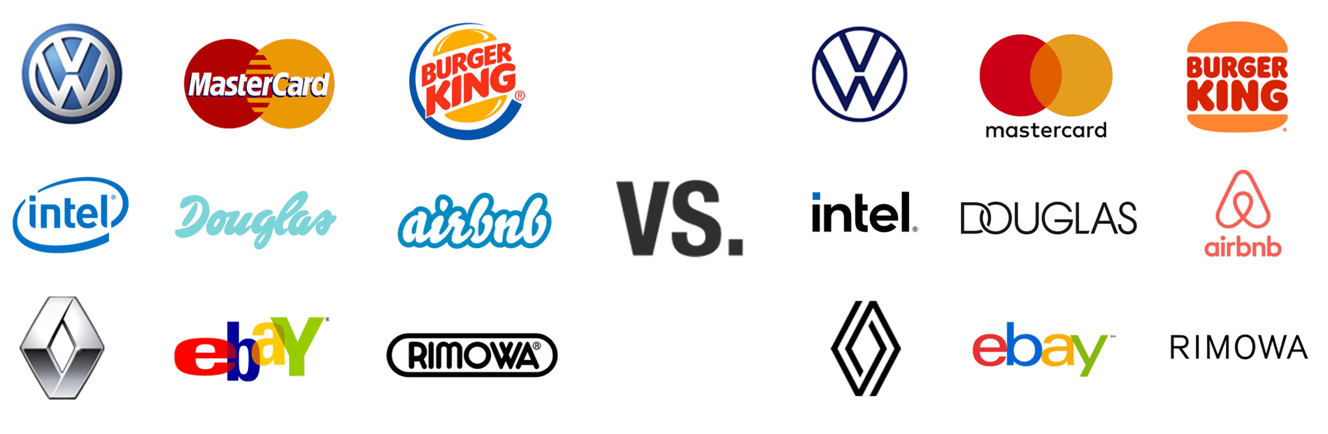
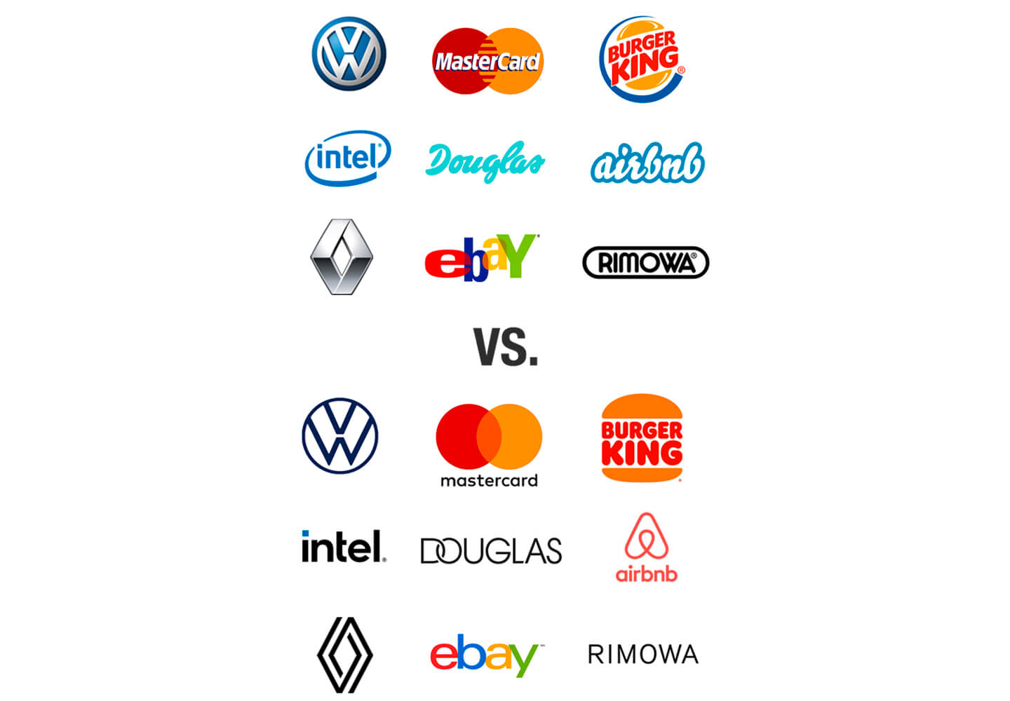
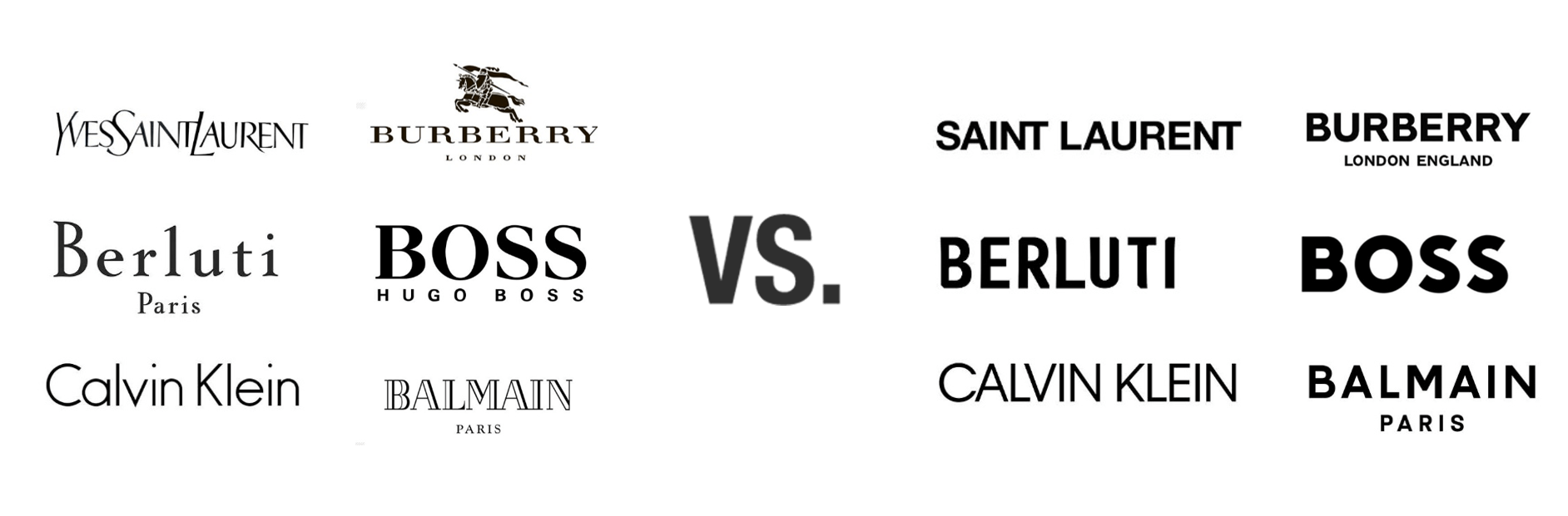
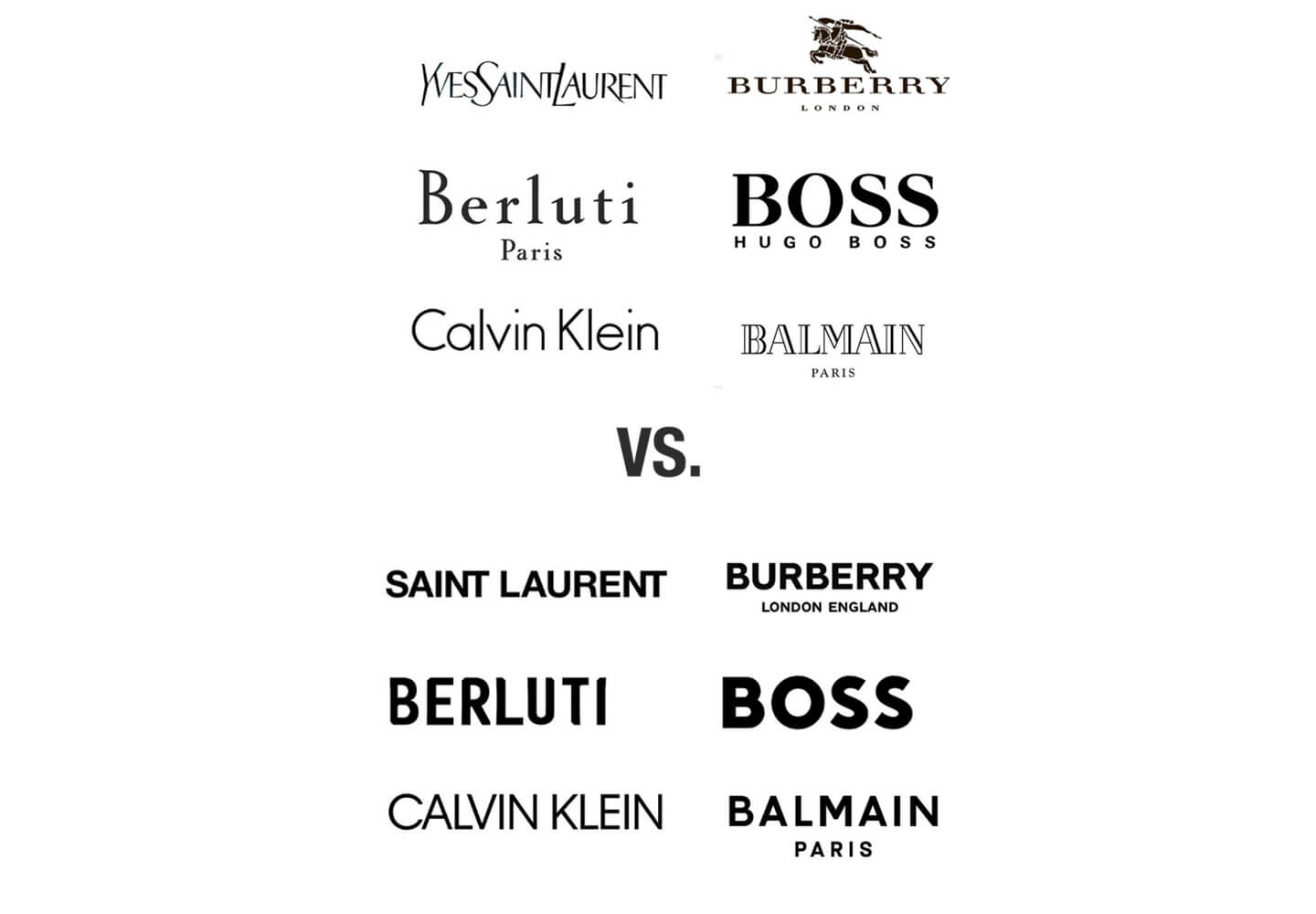
It is very important to revise the brand design at regular intervals. However, the self-similarity of the brand must always be ensured, so that one can speak of an evolutionary development process. The recognizability of a brand must be ensured at all times, even with revised branding, so that stored schemas can still be recalled. Nevertheless, the branding must be carefully revised over time so that the brand does not lose its topicality and relevance. The brand logo is always in the context of the current aesthetic zeitgeist. In recent years, the trend towards minimalism has dominated, giving brands a certain elegance. Minimalist signets not only strengthen the clarity and memorability of brands, but also increase the performance of branding in digital environments. Many major brands have followed this trend in recent years and simplified their branding.
Isn’t there also a risk of brand dilution if all brands follow the trend towards minimalism?
Yes, as correct and consistent as this trend may seem at first glance, it also represents a major challenge. A current look at the fashion industry shows that the template-like reworking of brand logos can also be viewed critically. An important task of branding is to ensure the distinctiveness of the brand. Many fashion brands have simplified their logos in recent years, making them easier to read and perhaps also a little more elegant. However, despite the advantages listed, a lack of distinctiveness and conciseness cannot be denied. So there is only a fine line between the aesthetic zeitgeist and undifferentiated uniformity. The further development of branding must therefore not only be based on the brand identity, but is always in the context of the competition.
What challenges does branding face?
Branding must become more flexible and adaptable. The logo has long since freed itself from the shackles of overly strict, formal and sprawling corporate design manuals. Coca-Cola kicked things off in 2013 by replacing its world-famous lettering on the label with first names for the first time. Many brands such as Nutella, Nivea and Toblerone have followed this example and have since catered to the trend of personalizing products. Branding can therefore also help to strengthen consumers’ personal commitment to the brand. Furthermore, design systems today adapt seamlessly to user interfaces, which also requires a high degree of flexibility. The first reflex when designing app icons or favicons, for example, is to use the brand logo in accordance with the CD guideline. In reality, this often leads to a weakening of the brand effect. Some brands have therefore realized that their branding needs to be more agile. Netflix, for example, only uses the concise N on the app icon, Amazon works with the “smiling” arrow and Coca-Cola dispenses with the logo altogether and only depicts the iconographic bottle.
What opportunities are arising from increasing digitalization?
To take full advantage of the opportunities offered by digital environments, you have to move away from a static view of branding. By using animations, for example, the logo can be given an independent character. At the same time, an important contribution can be made to communicating the brand positioning. Animation is an integral part of branding, especially for digital brands. Netflix, for example, uses a logo animation before videos in which the brand logo melts into a spectrum of colors. This is intended to convey the varied diversity of the title selection and create the right mood for a perfect movie experience.


 back
back