Every year, the Pantone Color Institute presents a new color of the year that reflects current trends and moods in society. For over two decades, this trend color has served as inspiration for creatives, brands and consumers and shows how colors can shape design and everyday life. Colors have a strong effect on our feelings and perceptions. They can create harmony, inspire reflection or convey a powerful message. The color of the year thus provides impulses for a wide range of industries that go beyond design.
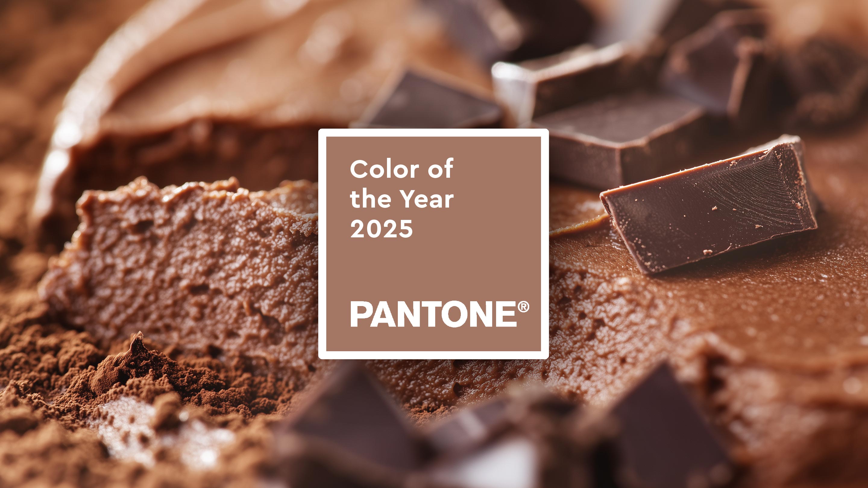
Sounds good enough to eat: “Mocha Mousse” is the Pantone color of the year 2025. This warm, rich brown shade immediately makes us think of delicious chocolate, cocoa and coffee. It appeals to our need for comfort, pleasure and security and is “driven by our desire for the pleasures of everyday life”, says Leatrice Eiseman, Executive Director of the Pantone Colour Institute. The renowned color expert, known for her profound knowledge of color psychology, emphasizes that Mocha Mousse embodies sophistication and luxury as well as down-to-earthness, making it a true classic with subtle glamour.
The choice of this deep brown reflects the trend towards naturalness, conscious consumption and slower trend cycles. Associated with natural pigments, Mocha Mousse conveys stability, honesty and timelessness.
With “Mocha Mousse”, Pantone is continuing the trend towards soft and natural shades. In recent years, earthy, calming colors have become increasingly important as they convey a feeling of comfort, consistency and closeness to nature. “Mocha Mousse” is part of this trend and reflects the ongoing desire for harmony and balance in a fast-paced world.
2024: Peach Fuzz – A color for compassion and elegance
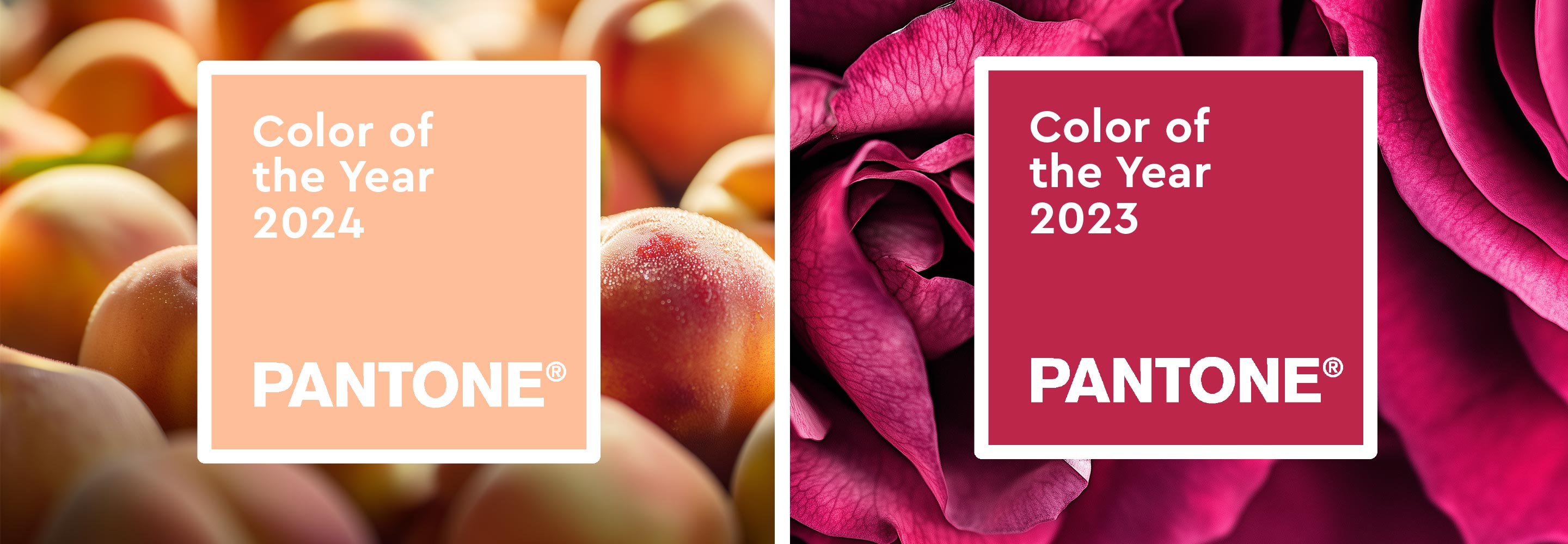
It sounded like a trendy drink, but it was the Pantone color of 2024: “Peach Fuzz”. A shade between pink and orange, the name literally means “peach fuzz”. Soft, fruity and velvety like peach skin, somehow relaxed and friendly, not a radiantly bright shade – and yet full of light. In color psychology, the peach tone stands for warmth, gentleness, calming and optimism.
With Peach Fuzz, “(…) we have chosen a color that radiates warmth and modern elegance. This shade radiates compassion, is like a tangible embrace and effortlessly bridges the gap between youthfulness and timelessness,” said the jury at the time, explaining their choice.
2023: Viva Magenta – Powerful red for courage and joie de vivre
2023 was the year of “Viva Magenta”, a dynamic red inspired by nature. It stood for strength, joy and fearless self-development – like a call to start something new with optimism and creativity.
2022: Very Peri – A color full of innovation
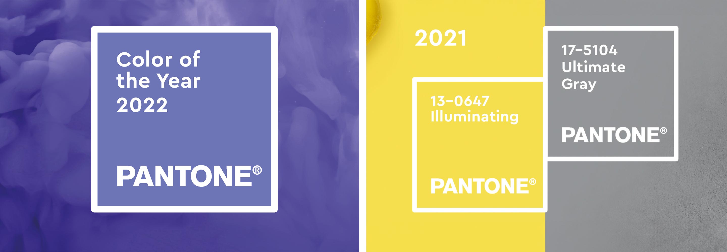
Surprise! “Very Peri” was the Pantone color 2022. A deep violet blue. Luminous and electrifying. Fields of lavender, cornflowers. There had always been violet tones in recent years, and yet “Very Peri” was something special: while the colors had previously all come from the existing Pantone palette, “Very Peri” was a new mixed color for the first time. It was an in-house creation that was intended to stand for innovation and the prospect of something new. No recourse to what already exists. Neither black nor white, more in the middle and therefore fully in tune with the spirit of the times.
In color theory, violet is a secondary color of red and blue that combines the two opposing color effects – flaming, warm red and calming, cool blue. These contrasts create a field of tension in which violet tones move. They often have a mysterious, spiritual, transformative and balancing effect. They therefore have a special significance in many religions. Also interesting: The idea for the name “Very Peri” came from the purple flowers of the plant “Periwinkle”, known as “periwinkle” in Germany. Very periwinkle then!
And there was another surprise in 2022: Veri Peri was supplemented by a special color to represent the importance of biodiversity. You can read more about it here.
2021: Ultimate Gray and Illuminating – hope meets stability
The two colors could not be more different. But as we all know, differences attract. In graphic design, colors only really come into their own when strong contrasts work together. And the Illuminating and Ultimate Gray shades did just that! As a team, the two colors metaphorically gave strength and hope as well as a connection between the solid and the positive. While the color gray was associated with coldness and harshness, yellow was associated with warmth and sunshine. Isaac Newton adopted this principle early on and developed the first color wheel – a basis for color inventions that still inspires designers today. This successful color combination reflected the mood of 2021 and was a positive surprise. It was all in the mix!
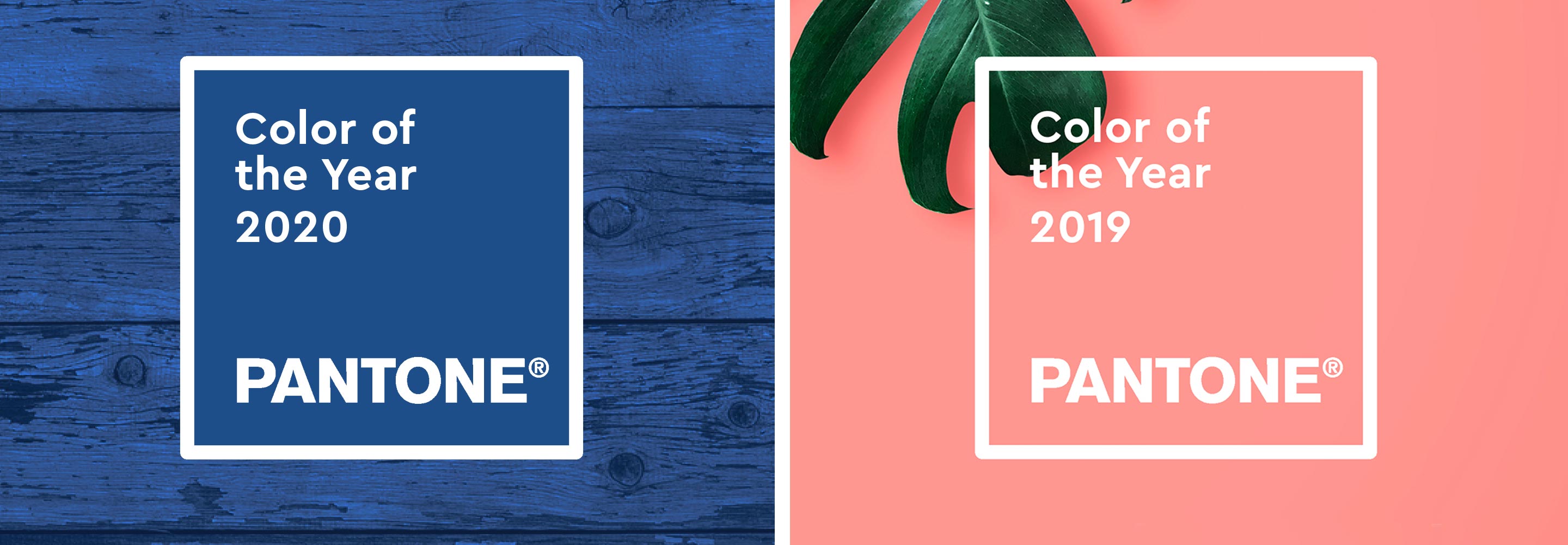
2020: Classic Blue – A return to tranquillity
Pantone surprised 2020 with a simple color choice: a dark blue. Some of the reactions were: Blue? How boring! True, with Living Coral, Ultra Violet or Greenery, Pantone has shown more courage with color in the past. However, the Panton Institute was interested in precisely this timeless simplicity. Classic Blue is: “An expression of our longing for a reliable and secure basis on which we can build on the threshold of a new era.”
A closer look at color reveals interesting aspects: It has enjoyed a special status in painting for centuries. Blue pigments were among the most expensive in the world; in Leonardo da Vinci’s paintings, blue is the color of the divine. The most famous Renaissance artist clothed his Maries in blue robes, giving them holy status. Even the highest nobility preferred to dress in “royal blue” in the Baroque period. The blue bloods lost their god-like status, but the success story of the color blue continued. In modernism: artists such as Pablo Picasso, Franz Marc and Joan Miró spent entire creative periods working on the significance of blue and owe it great success.
2019: Living Coral – The color of connectedness
In 2019, Pantone chose “Living Coral” – a harmonious and strong coral with a golden undertone. According to the Executive Director of the Pantone Color Institute, Leatrice Eiseman, the human and motivating qualities of Living Coral perfectly matched the zeitgeist, in which consumers increasingly crave interaction and social connection. The color was intended to symbolize joie de vivre and the growing importance of sustainability.