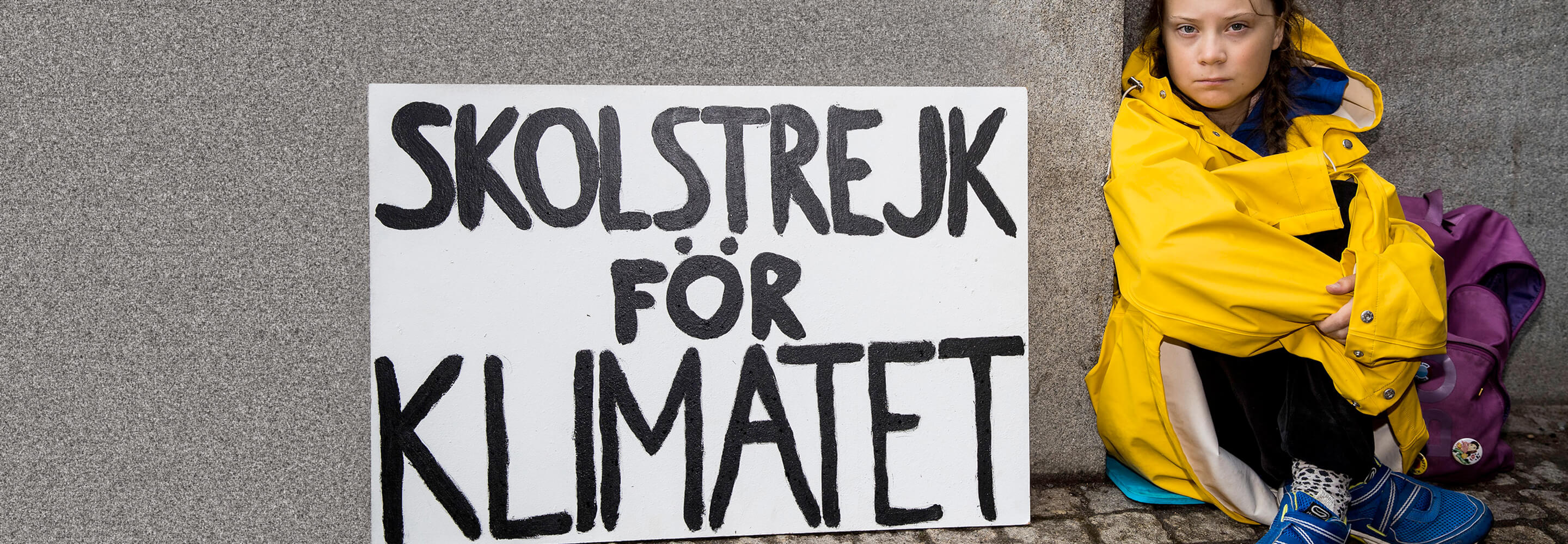
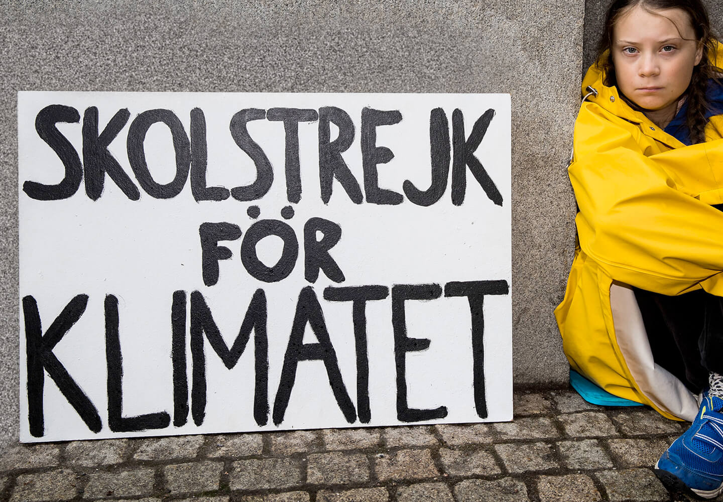
Skolstrejk för Klimatet – this powerful message from Swedish climate activist Greta Thunberg went around the world and became the symbol of an entire movement. As the initiator of Fridays for Future, she launched her protest in 2018 with a hand-painted poster on which her demand for climate protection was clearly written in thick, childish capital letters. This simple but powerful design did not fail to make an impact. Millions of people, especially young activists, joined their movement and demonstrated for climate justice worldwide on Fridays.
The visual power of this poster did not go unnoticed. The New York design agency Uno has now developed a very special font based on Greta Thunberg’s striking poster font. The idea behind it is as simple as it is effective: a font that reflects the authenticity and urgency of the protest. This is why the font consists exclusively of capital letters – because quiet demands are often drowned out in today’s world. If you want to convey a clear message, you have to be loud and clear, even in the design of your texts.
The formal language of the Greta Grotesk font is deliberately simple and direct. You will look in vain for flourishes or embellishments. The lines are strong but not perfectly straight, the letters appear slightly irregular – just like on Greta Thunberg’s original poster. But it is precisely this imperfect look that makes the font so unique. It conveys spontaneity, determination and a certain urgency that perfectly matches the character of a protest movement. The slightly unpolished aesthetic is reminiscent of the handwriting of a child carrying a big message to the world with simple means – a symbol of the young generation actively campaigning for a future worth living.
With this newly developed font, Fridays for Future now has a way to identify even more visually with its founder. Activists around the world can now spread their messages in the exact handwriting with which the movement began. This gives the demands even greater recognizability and symbolic power.
This special font Greta Grotesk is not only a tribute to Greta Thunberg’s commitment, but also a sign of how design and activism can complement each other. Type is a powerful means of communication – and when combined with such a strong message, it can change the world.
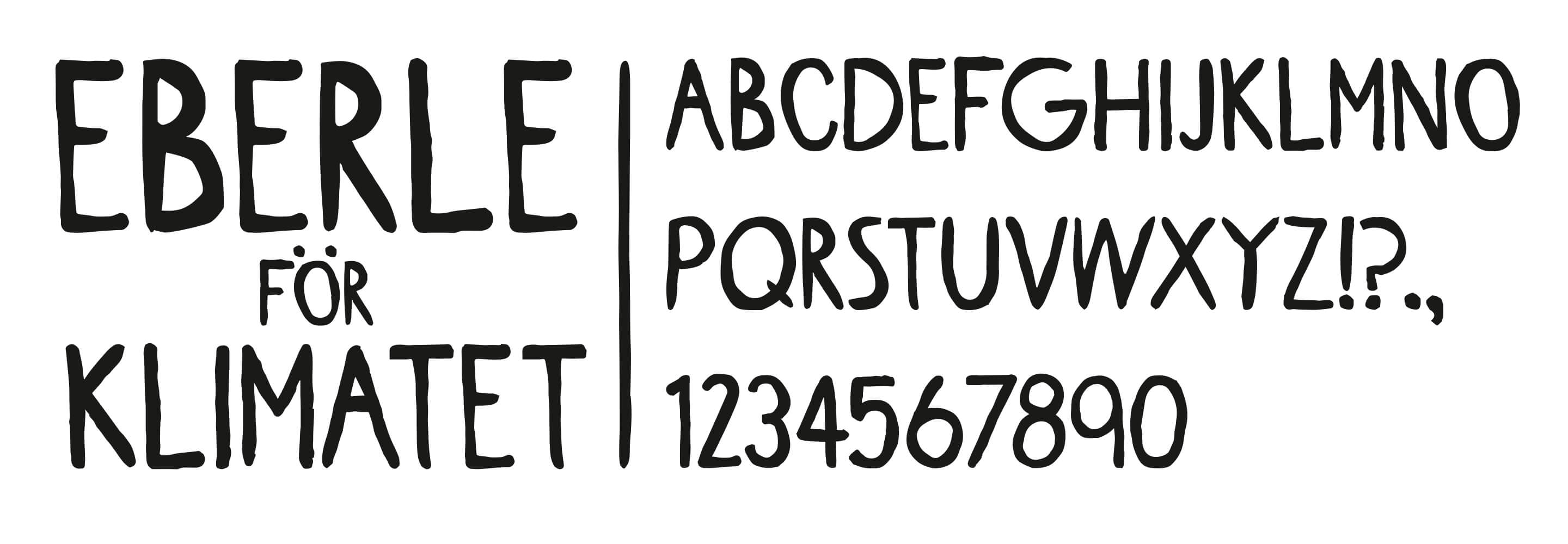
Photo:
Michael Campanella/Getty Images