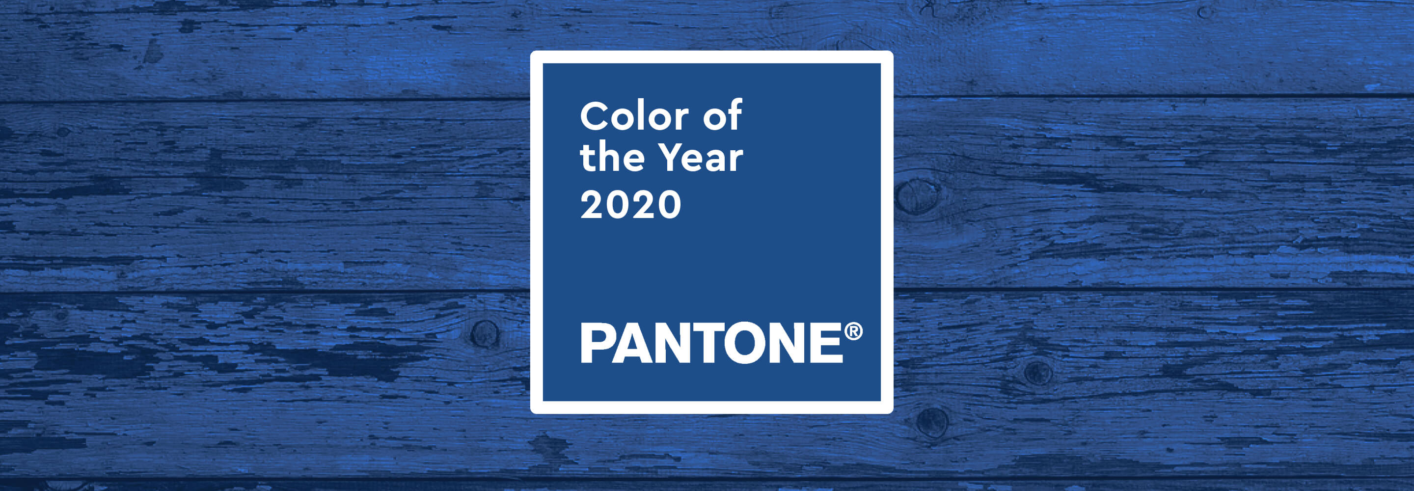

Pantone surprises this year with a simple color choice: a dark blue. Some of our reactions: Blue? How boring! True, with Living Coral, Ultra Violet or Greenery, Pantone has shown more courage with color in the past.
This timeless simplicity is precisely Pantone’s message for the coming year. Classic Blue is: “an expression of our longing for a reliable and secure foundation on which we can build on the threshold of a new era,” says Pantone.1
Perhaps we need to take a closer look at the color blue in order for it to unfold its full effect: It has enjoyed a special status in painting for centuries. Blue pigments were among the most expensive in the world; in Leonardo da Vinci’s paintings, blue is the color of the divine. The most famous Renaissance artist clothed his Maries in blue robes, thus giving them sacred status. Even the highest nobility preferred to dress in “royal blue” in the Baroque period. The blue bloods lost their god-like status, but the success story of the color blue continued. In modernism: artists such as Pablo Picasso, Franz Marc and Joan Miró spent entire creative periods working on the significance of blue and owe it great success. So let’s let the color work its magic on us.
> Click here for the Pantone color of the year 2021