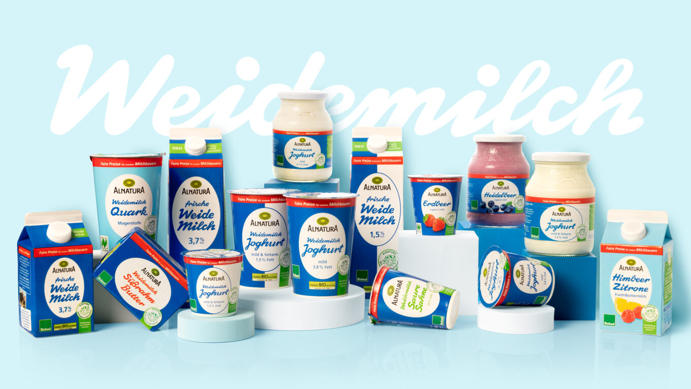
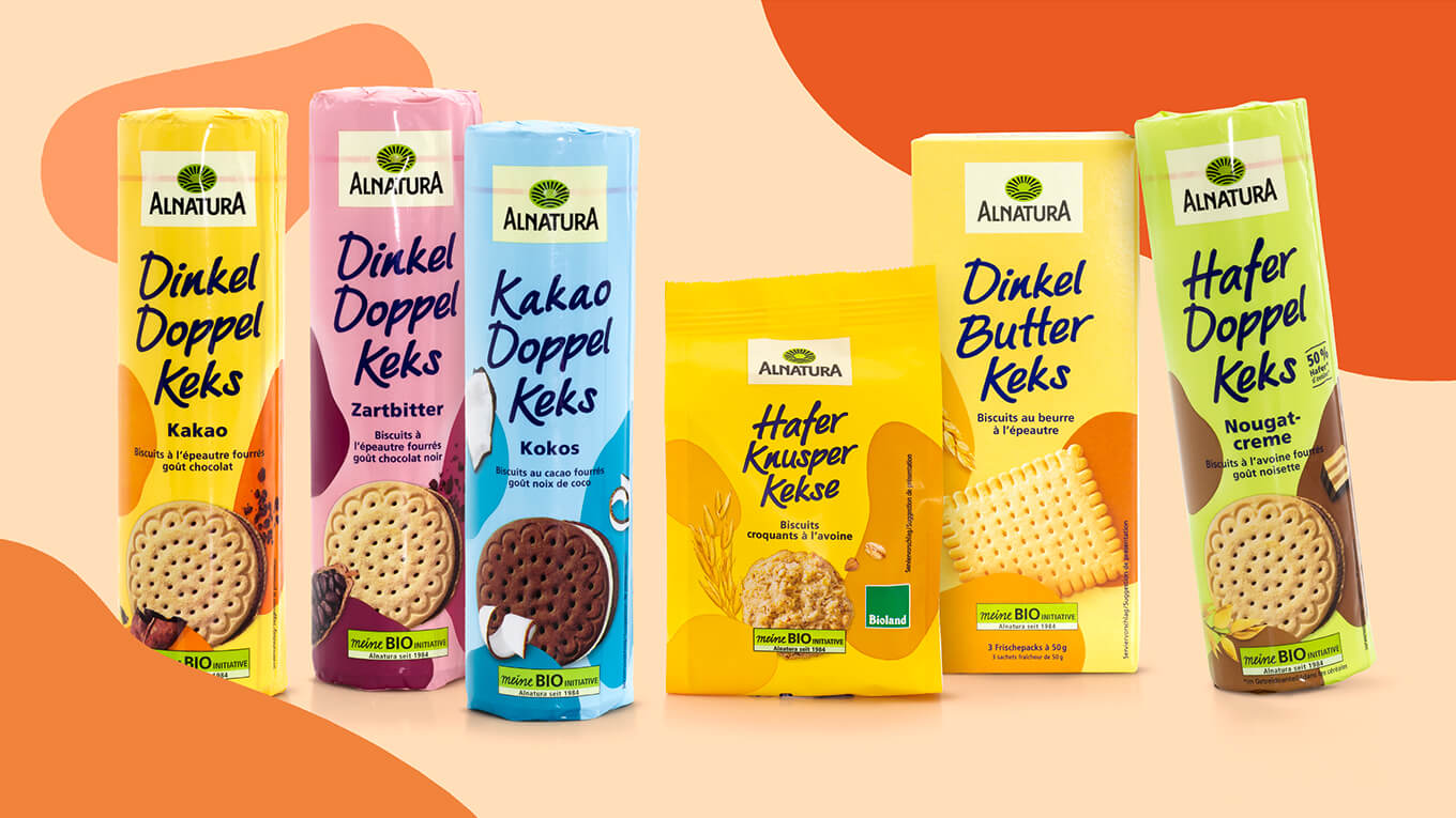
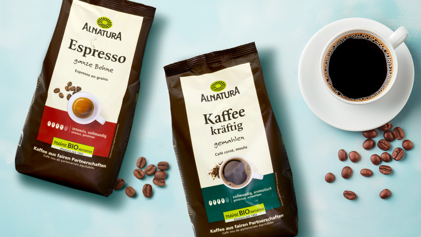
Modern, authentic, natural and high-quality – this is how our packaging relaunch of the Alnatura bread range presents itself. Clear color schemes attract attention at the point of sale and support intuitive variety differentiation. The large beige brand field promotes recognizability and at the same time gets to the heart of the calmness and reduction of our new packaging design.
The new product images come from our in-house photo studio VISCOM and reflect exactly what Alntaura breads are all about – quality and natural ingredients. We have deliberately dispensed with artificial serving suggestions in order to focus fully on the product. The breads are shown pure and are only complemented by loosely arranged, characteristic ingredients of the respective variety.
More information:
Our client: Alnatura
All projects for our client Alnatura


