For the Alnatura sweet cookies relaunch, we developed a well thought-out concept that strengthens the brand identity and ensures a uniform, recognizable design. The aim was to establish a clear visual language that runs consistently through the entire range and increases the recognizability of the Alnatura brand on the shelf. The new packaging design combines emotional brand impact with clear orientation within the product group.
A central element of this concept is the striking typography that Eberle developed specifically for the double cookies many years ago. Over time, this unique handwriting has established itself as a striking design feature and is now perceived as defining the style of the entire brand. To further strengthen this recognizability and create a harmonious product presentation, we consistently used the characteristic typography for the entire Alnatura sweet cookie range.
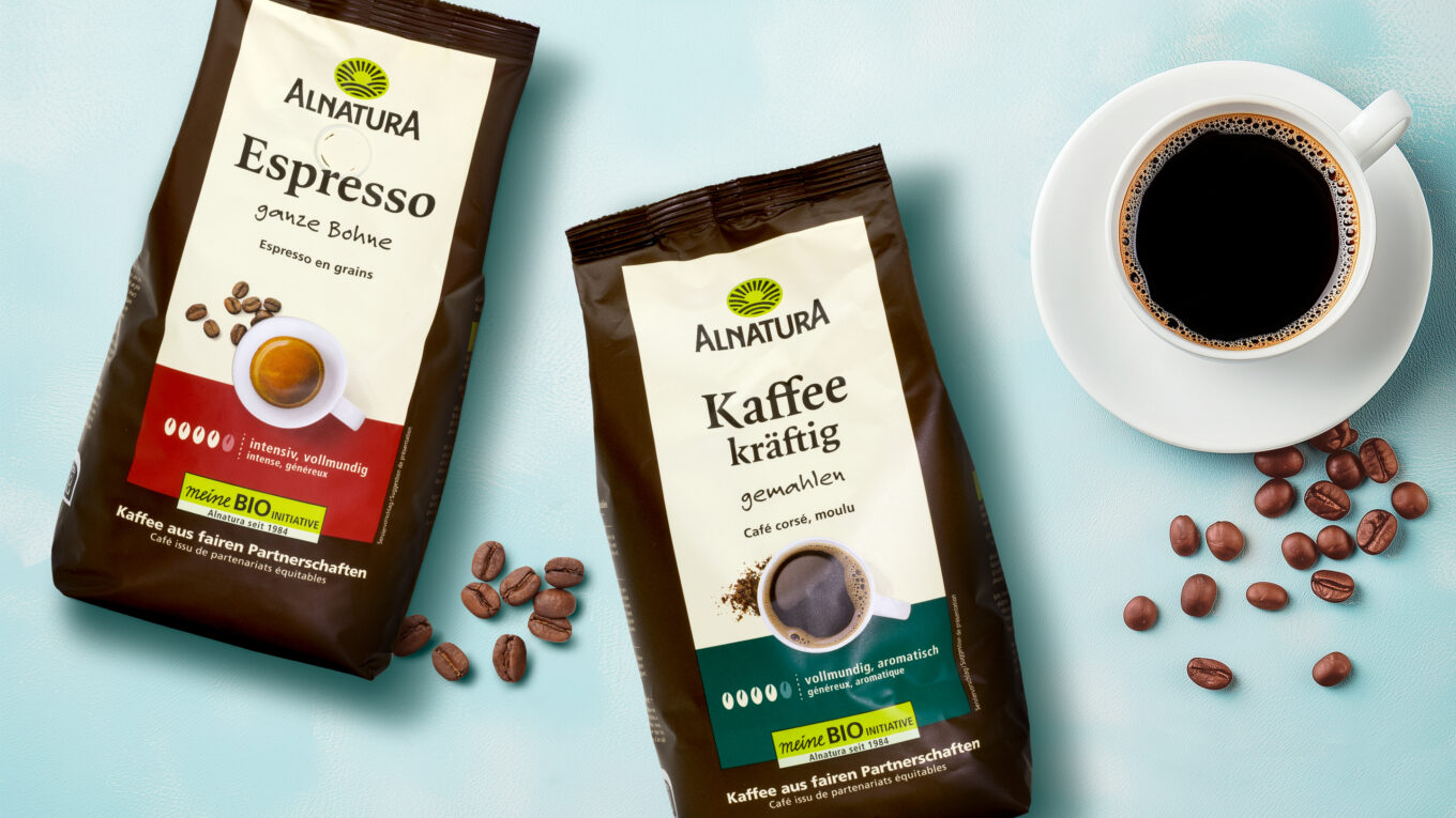
We deliberately opted for a uniform color scheme: the striking blue, which already played a role in the previous design, was integrated as a unifying element across all packaging. This not only creates a strong visual link within the range, but also emphasizes Alnatura’s brand values – naturalness, quality and authenticity.
This targeted design development not only makes the Alnatura sweet cookies range more visually appealing, but also positions it better strategically. The new design gives the products a stronger presence, helps consumers find their way around the shelves and supports long-term brand loyalty.
Do you have any questions, a specific project or would you simply like to get to know us?
Then contact us for a non-binding initial consultation.

Further information:
Our customer: Alnatura


 back
back