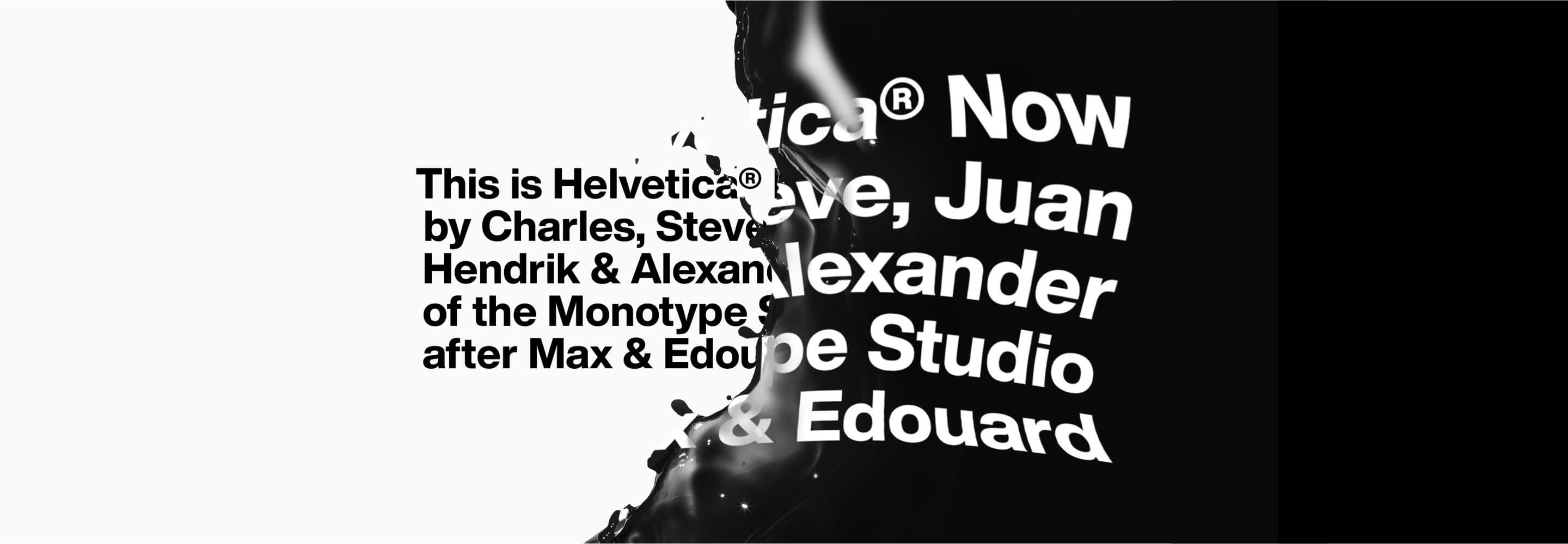
In spring 2019, the renowned font provider Monotype presented a comprehensive revision of the legendary Helvetica font family, adapting this typography classic to the requirements of the digital age. The iconic font, which has been one of the most widely used and influential typefaces in the world since its creation in 1957 by Swiss designers Max Miedinger and Eduard Hoffmann, has been modernized with the new version, which brings both technical and design improvements.
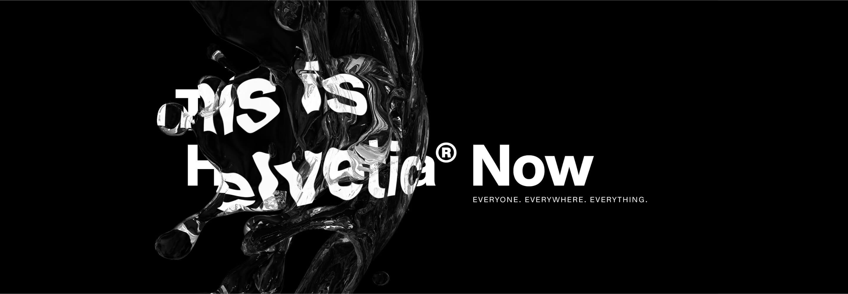
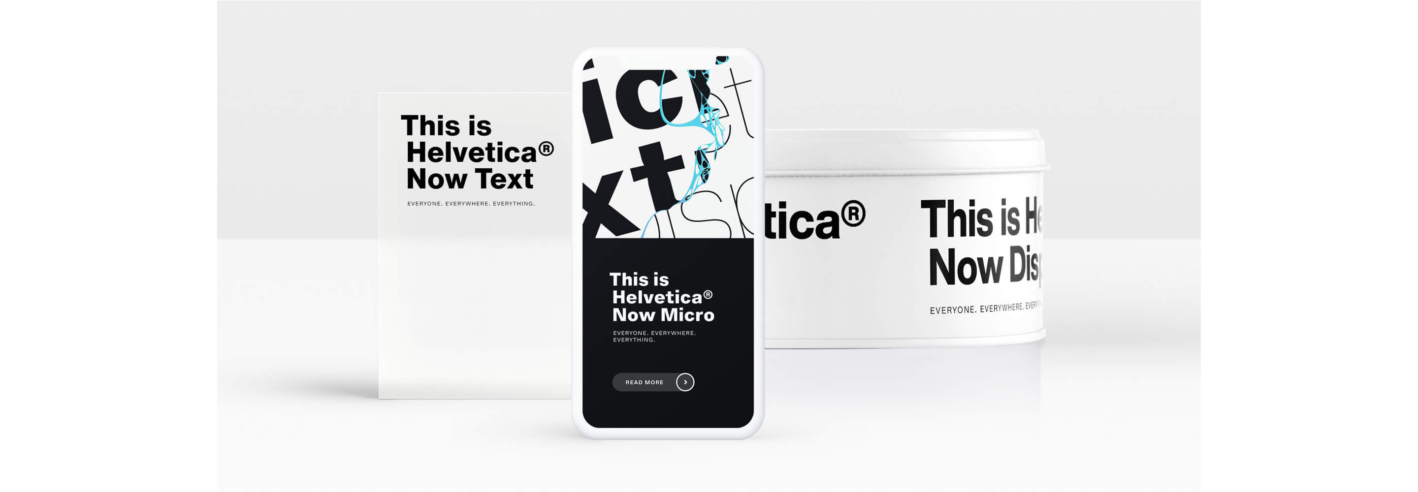
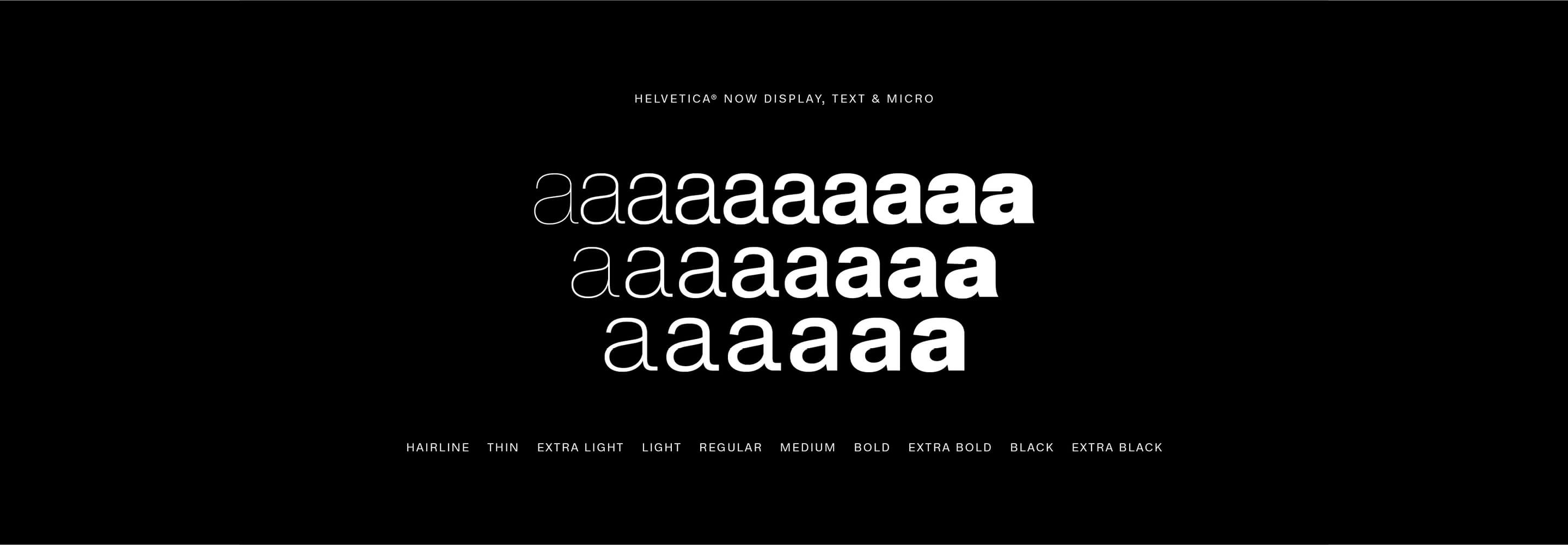
The new font is called Helvetica Now and comprises an impressive 40,000 newly drawn glyphs. A total of 48 different font styles have been developed, allowing the font to be used even more flexibly in different contexts. One particularly striking innovation is the introduction of three optical sizes: Micro, Text and Display. These subdivisions ensure that the font remains optimally legible depending on the area of application. While the micro version has been specially optimized for very small font sizes – for example for footnotes or tiny text on mobile devices – the text version is ideal for continuous text and longer reading passages. The display version, on the other hand, was developed for large font sizes and is particularly suitable for headlines, posters or digital advertising material where a concise presentation is required.
In addition to these structural improvements, Helvetica Now also offers a range of design innovations that create more creative freedom for designers and typographers. Particularly noteworthy are the alternative character variants, which allow more individualization options. For example, there are round dots, which create a softer typeface, and an alternative straight “leg” for the letter R, which creates a more modern, clearer aesthetic. Such details make it possible to adapt Helvetica Now flexibly to different design requirements without losing the font’s characteristic style and timeless elegance.
With this revision, Helvetica remains one of the most important and versatile typefaces in the digital era. Thanks to its improved legibility, greater flexibility and modern adaptations, it will continue to be used in a wide range of applications – from brand identities and user interfaces to editorial design and advertising graphics. With Helvetica Now, Monotype proves that even one of the world’s best-known typefaces can be further developed and optimized for the future through targeted innovation.
The original font was developed by Max Miedinger and Eduard Hoffmann in 1957 and is still used today due to its classic and minimalist design. 1983 saw the first and for 36 years the last revision of the sans serif classic. With the arrival of new digital technologies, writing often reached its limits. With Helvetica Now, Monotype wants to dissolve these boundaries: “Helvetica Now solves all the legibility and style problems that brands have faced when using Helvetica,” says Type Director at Monotype Charles Nix.


 back
back