Many logos have been simplified in recent years. Flat, geometric, sans serif. This has helped in apps, interfaces and favicons, but uniqueness has often been lost. At the same time, some brands are once again making more visible use of identity-creating codes from their history. This return is not an end in itself. It creates familiarity, provides orientation and sharpens the profile. This is precisely where retro branding comes in.
Nostalgia marketing describes the psychological effect that promotes self-continuity and affiliation through memory stimuli and makes decisions easier. This increases openness to messages.
Retro branding is the creative implementation. Earlier logos, typography, color tones, shapes or claims are reactivated and translated into a contemporary system. In short: nostalgia is the effect, retro is the tool.
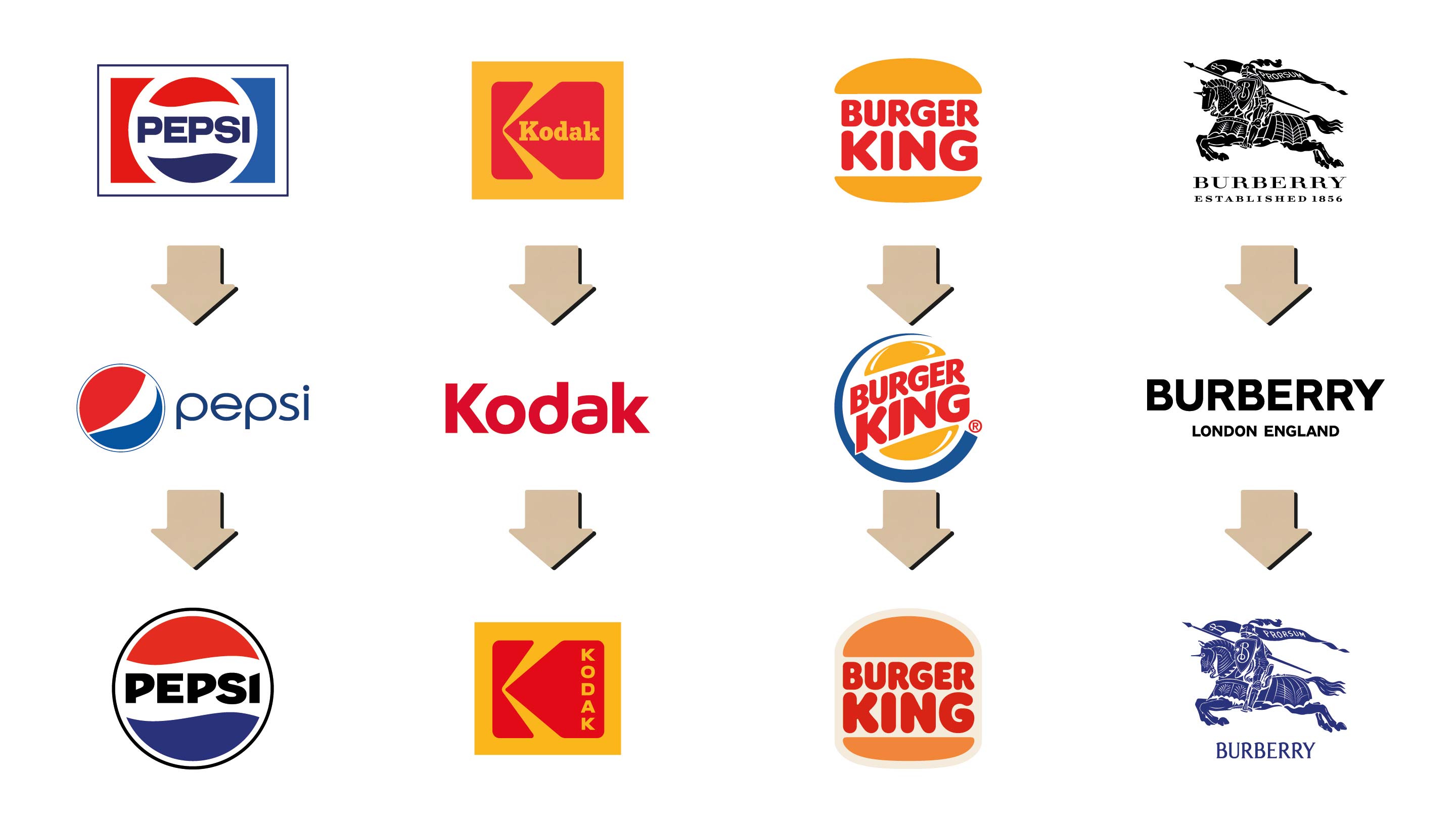
Burger King has introduced a comprehensive redesign. The logo, font, colors and packaging are reminiscent of earlier decades, but have a clear and digital feel. The roll-out across the restaurant, uniforms and app achieved measurable effects. According to Burger King, the rebrand has led to a significant increase in visit intentions
Pepsi 2023 visibly harks back to earlier decades, but with a modern reinterpretation featuring new typography, adapted proportions and an extended color palette of electric blue and black, reminiscent of the neo colors of the 1980s.
Burberry has brought back an archive motif. The wordmark uses serifs again. The Equestrian Knight emblem returned in a modern form and supports a visible emphasis on Britishness.
Peugeot has had a coat of arms with a lion’s head since 2021. The look is based on earlier logo developments and at the same time signals technological orientation, for example in electrification.
These cases are united by one basic idea. Brand codes from the past are condensed into a contemporary design language that works in digital
environments as well as on the product.
Retro branding does not mean simply reactivating an old logo. It is about a convincing translation into the present. If this connection is missing, the recourse looks like a backdrop. If it succeeds, the result is recognizability with relevance.
The following process leads to a structured and resilient decision. It helps to put meaning before design and to steer retro as a means to an end.
The trend towards minimalism remains correct, where legibility, elegance and digital scalability count. Retro branding does not contradict this. The best examples combine familiar brand DNA with clear, modular systems. Pepsi, Burberry and Peugeot show that a return to codes with a strong character and clean digital usability are possible at the same time. This is not a step backwards, but a focus on the unmistakable.
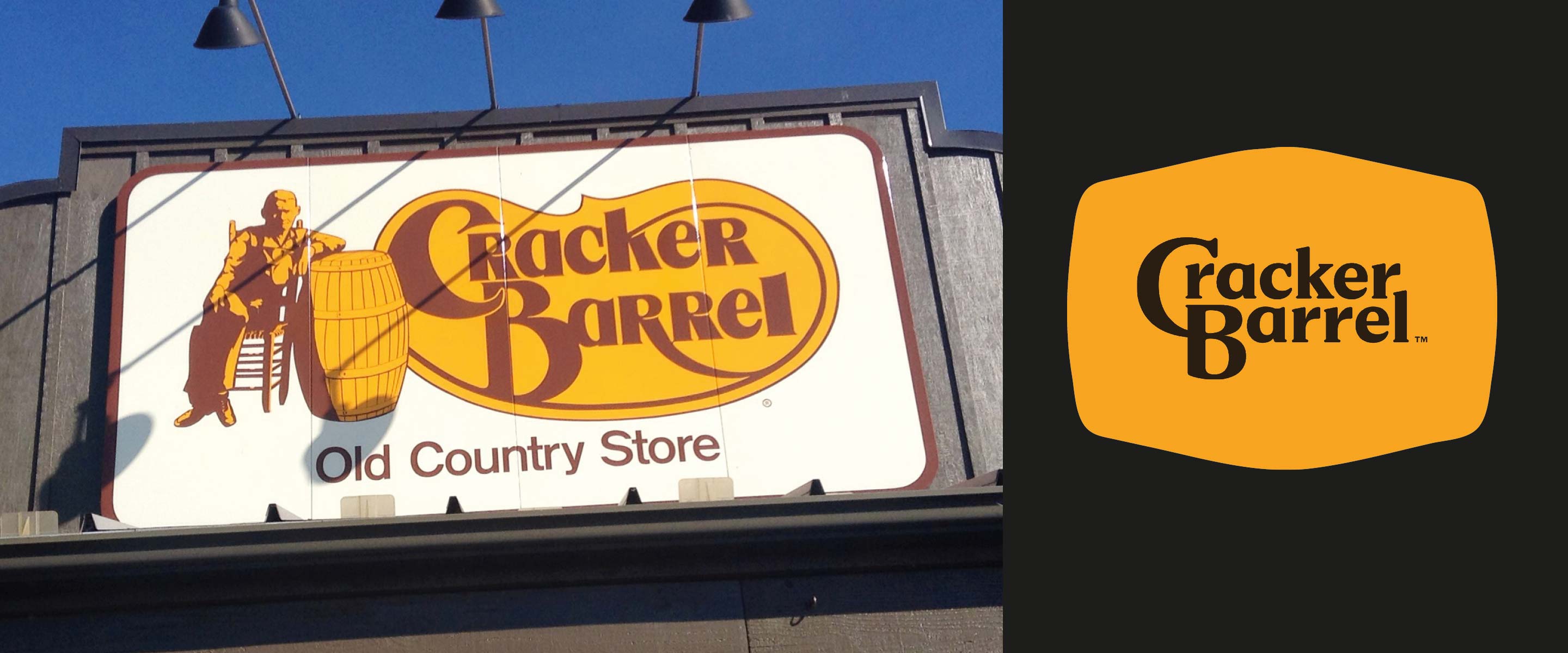
In August 2025, the case of Cracker Barrel – a US restaurant and country store chain known for its nostalgic brand image – showed just how sensitive the handling of brand history can be. The company replaced its iconic logo with the “Old Timer”, which had been leaning against a barrel for decades, with a minimalist version. What was intended as modernization became a cultural issue: protests ranged from outraged customers to Donald Trump, who interpreted the move as a symbol of a decline in values. The pressure was so great that Cracker Barrel withdrew the new logo and returned to its traditional look. An example of how closely brand symbols are interwoven with cultural identity – and how risky it is to abandon familiar codes without an emotional translation into the present.
What does retro branding mean?
Retro branding describes the return to historical brand elements that are interpreted in a modern way to strengthen identity and trust.
How does retro branding differ from nostalgia marketing?
Nostalgia marketing generates emotions, retro branding shapes them. It is the creative, visual part of memory management.
Why is retro branding currently so popular?
In times of visual uniformity, familiar brand codes provide orientation and emotional support.
Which brands use retro branding successfully?
Examples include Pepsi, Burger King, Burberry and Peugeot – all of which combine history and modernity in digital form.
When should you do without retro branding?
If a brand does not have a clear visual history or the values of the chosen era are no longer compatible with the present
Was this article helpful for you? Do you have any questions or would you like to make an appointment? Simply contact us and let’s find out together how we can help you quickly.
Image sources:
PepsiCo, Eastman Kodak, Burger King, Burberry Group, all public domain, via Wikimedia Commons


 +49 7171 925290
 kontakt@eberle-werbeagentur.de


