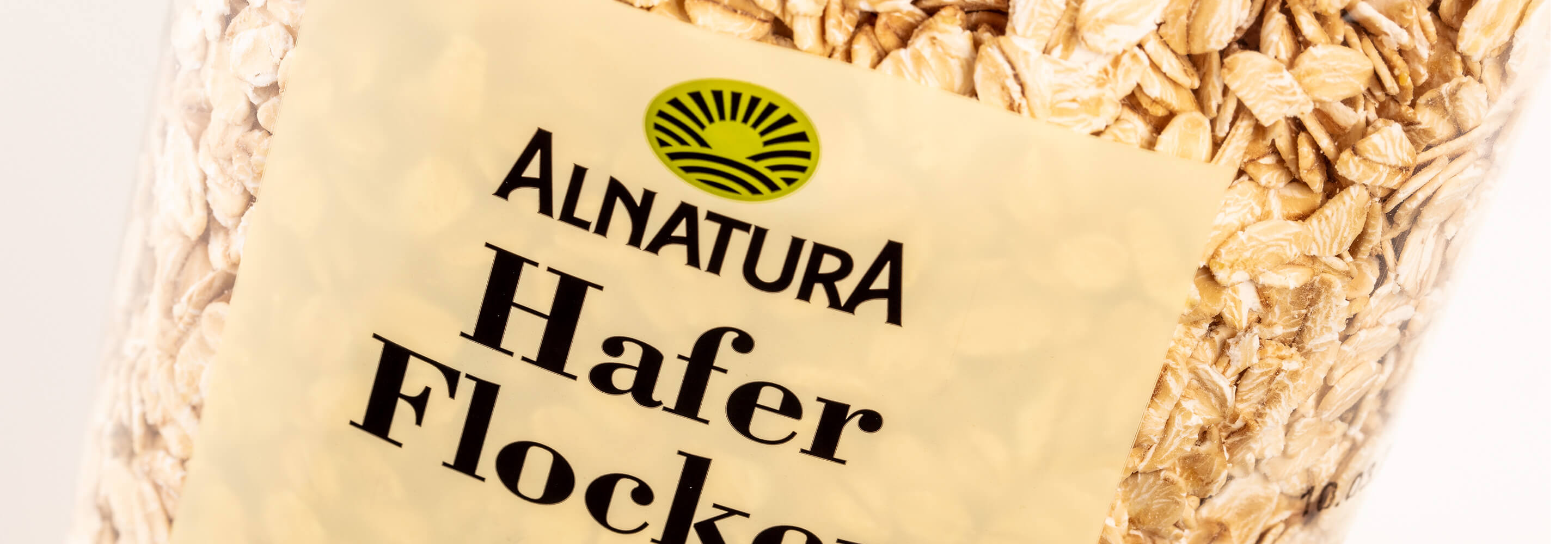
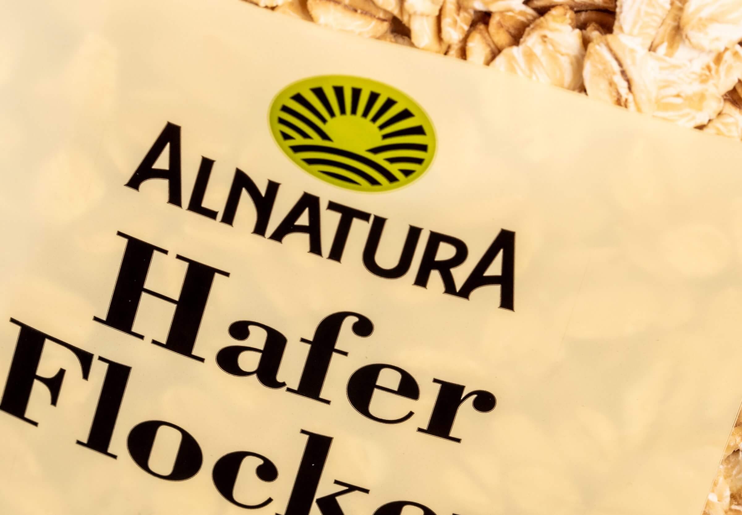
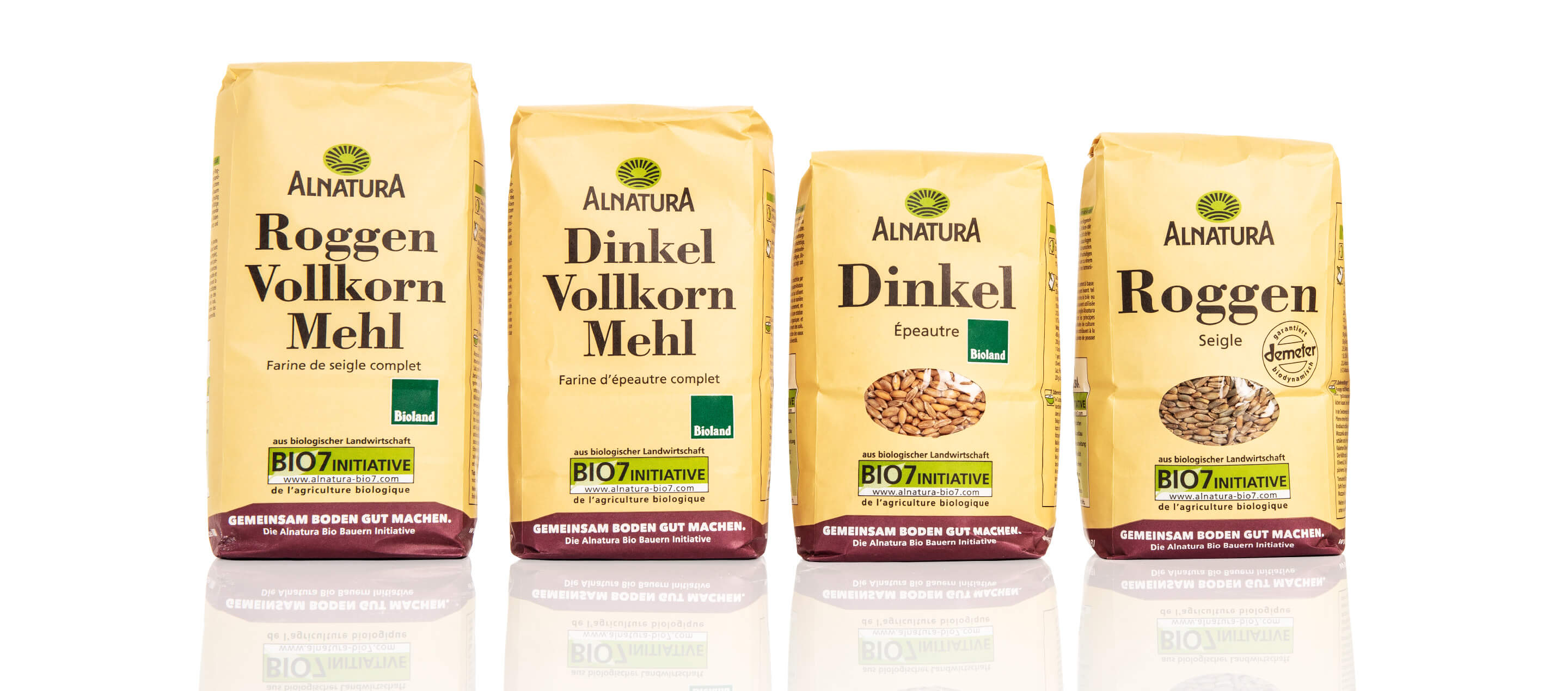
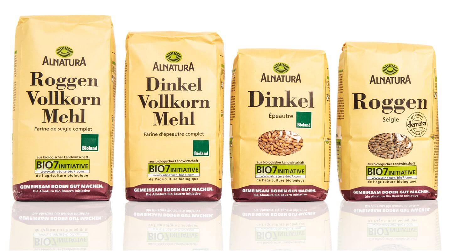
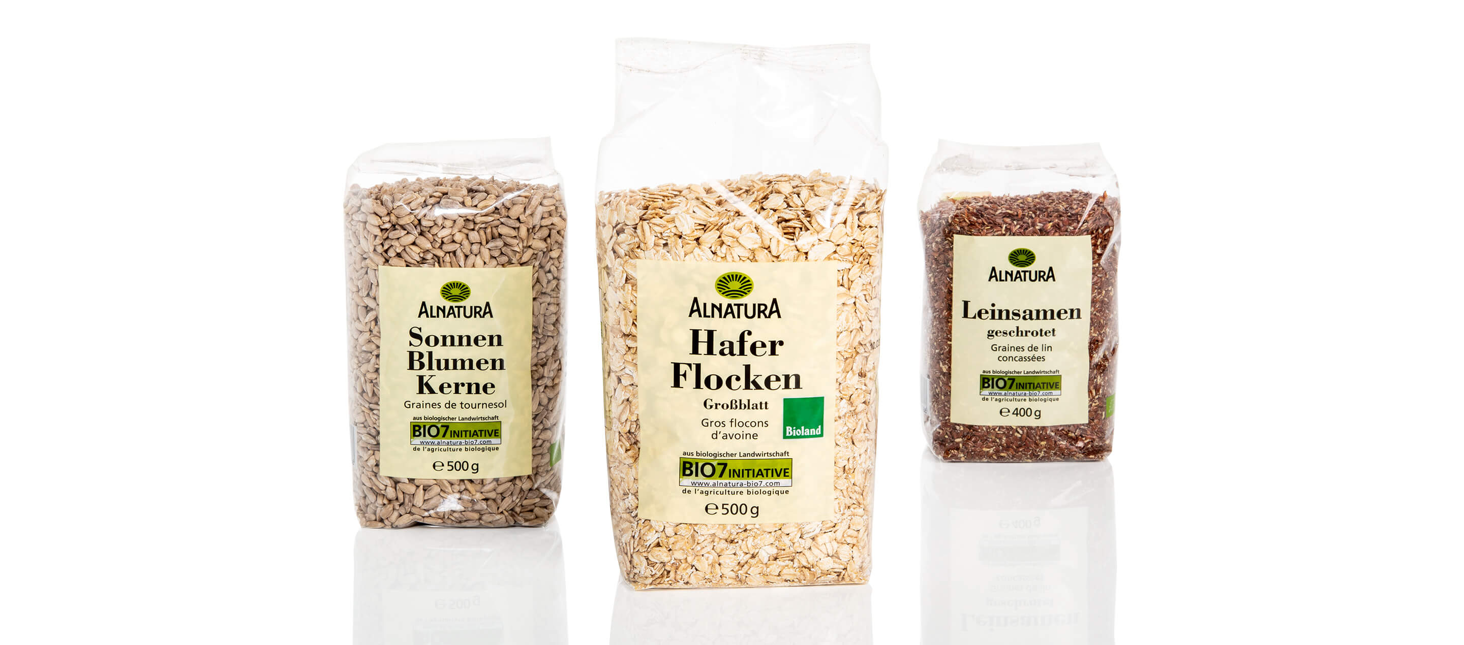
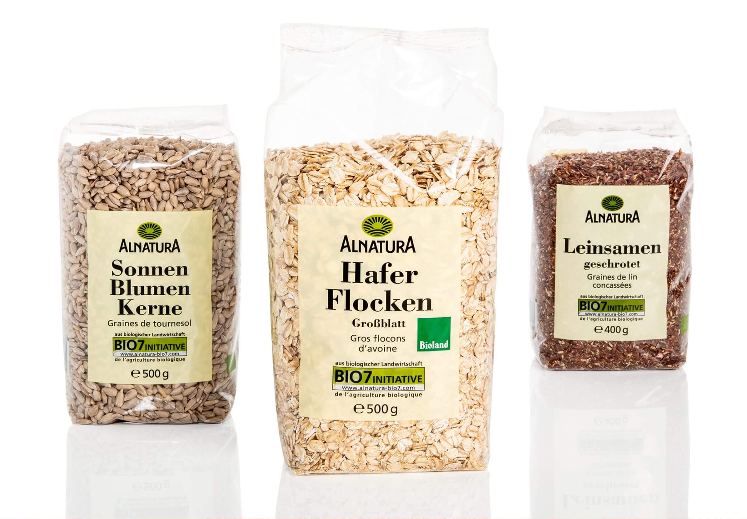
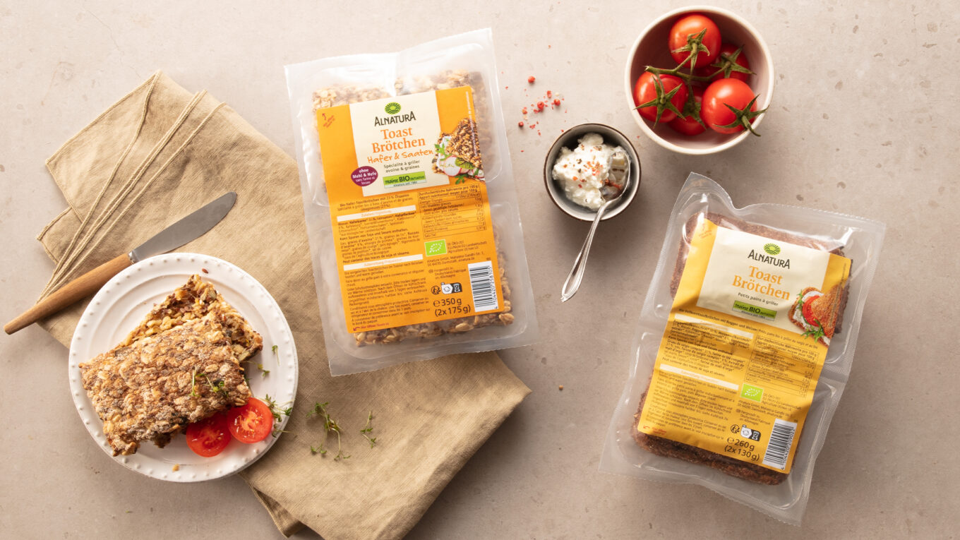
The Alnatura basic range has not only significantly shaped the perception of organic products, but has also had a lasting influence on the design codes of the entire industry. The clear color scheme, the reduced typography and the discreet packaging design have now become a kind of standard for organic products and stand for trust, transparency and quality.
This minimalist yet striking design means that Alnatura’s basic range remains timeless and recognizable. It conveys a set of values that stands for conscious nutrition, sustainability and naturalness – and has done so with great success for many years.
For 25 years, the design of the Alnatura basic range has been carefully developed and only ever tweaked in subtle nuances in order to preserve the original character and recognizability of the brand. This continuous but gentle modernization ensures that the design remains timeless and yet meets current aesthetic and functional requirements.
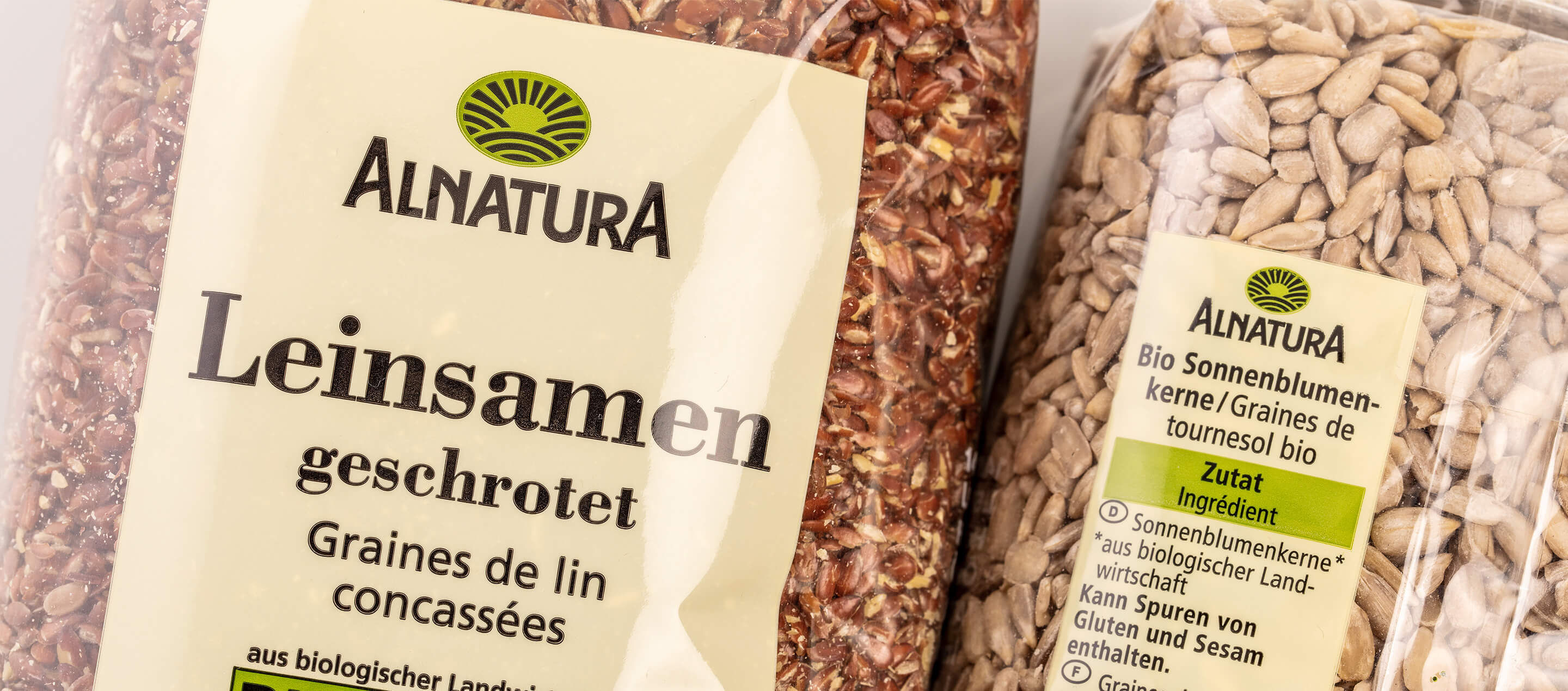
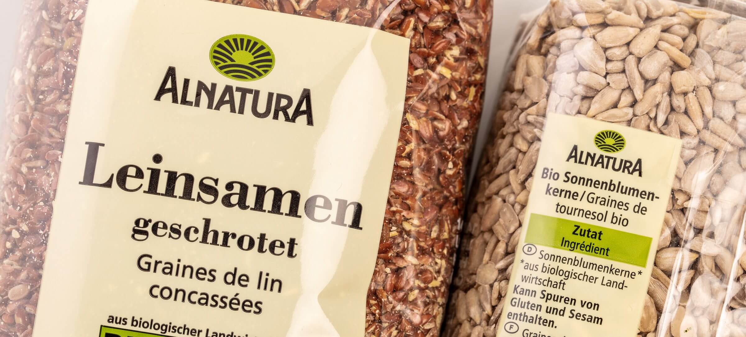
Through this careful evolution, the design has become an essential part of Alnatura’s brand identity over the years. It reflects the brand’s values – sustainability, naturalness and transparency – and communicates these directly to consumers. The consistent color scheme, the reduced typography and the clear design underline the high quality of the products without distracting from their naturalness.
As a result, the design has not only established itself as a defining element for Alnatura, but also as a style-defining element for the entire organic sector. It has become a visual symbol for conscious, sustainable nutrition and enjoys a high level of trust and recognition among consumers.
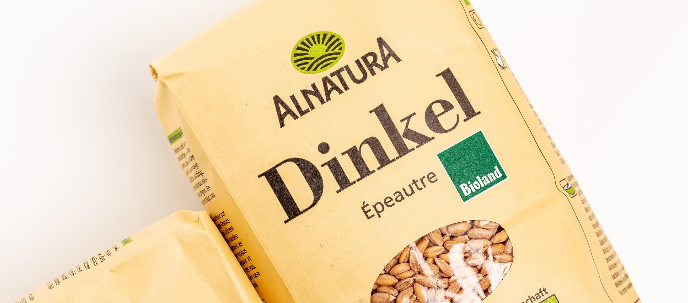
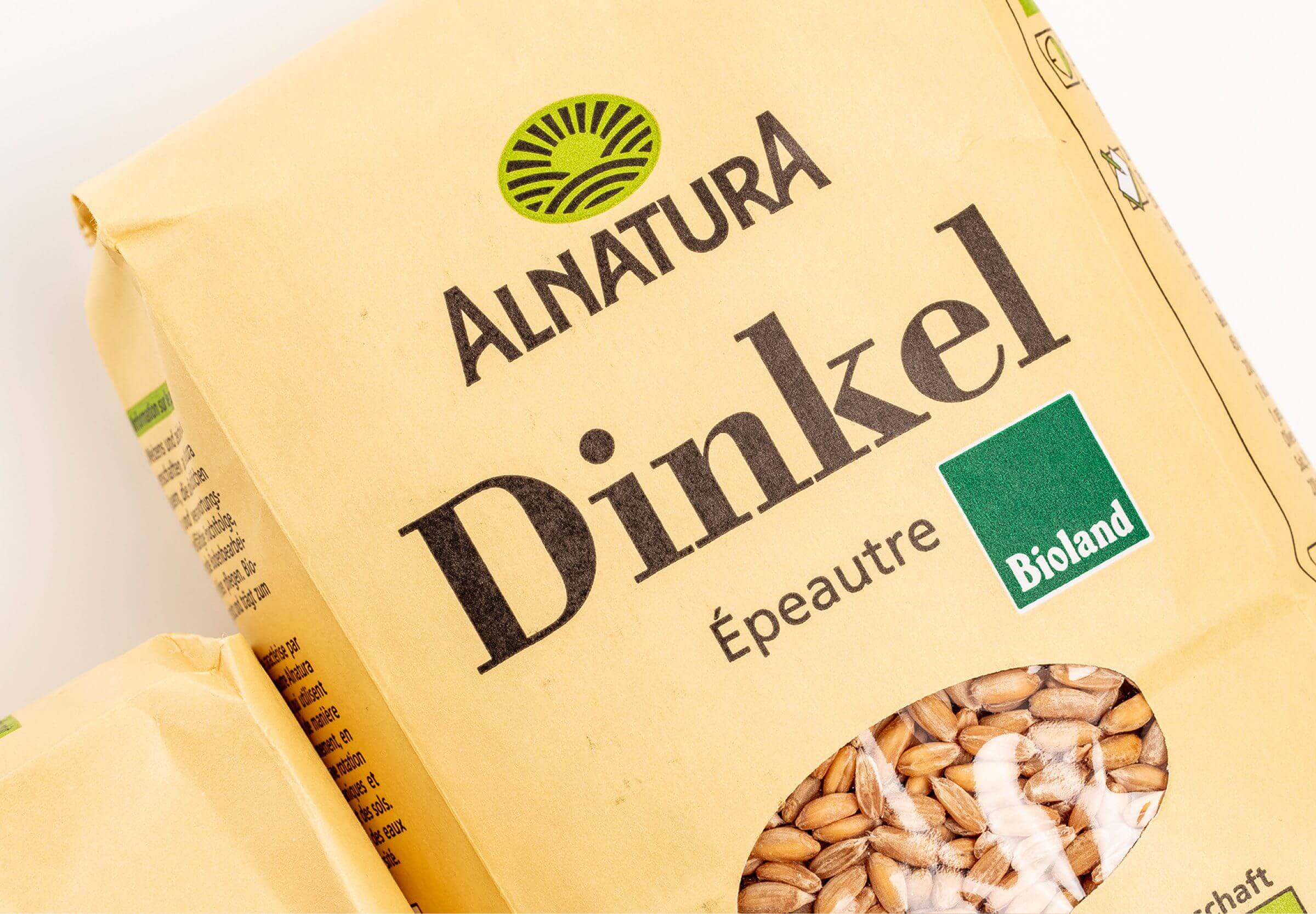
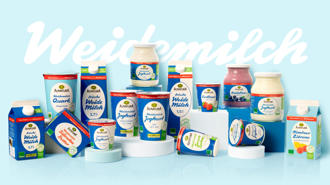
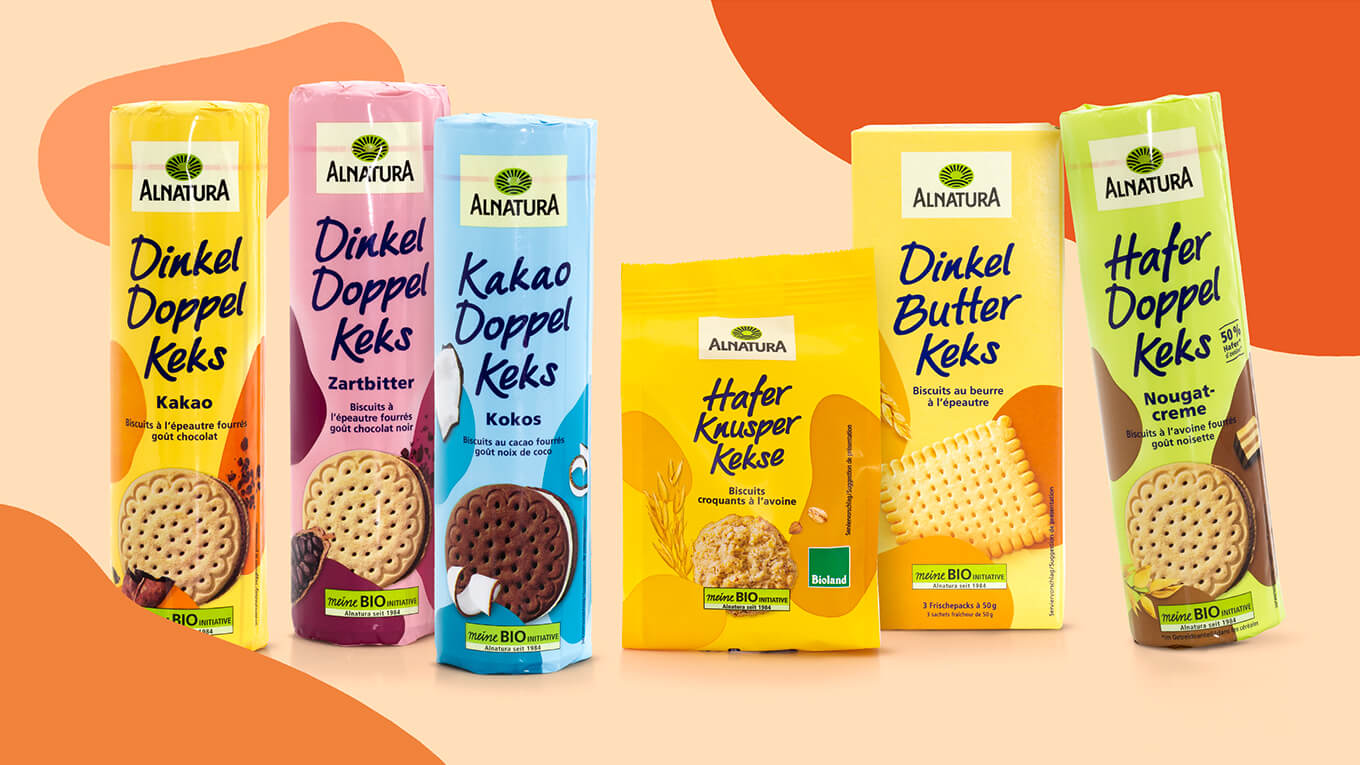
The basic range comprises around 100 products, such as flours, cereals, seeds and kernels.
We have been looking after Alnatura since 1995 – this includes the packaging design of 1,400 Alnatura brand products, communication for the company and the expansion of the Alnatura Super Natur stores from two to 140 today.
Further information:
Our customer: Alnatura


 back
back