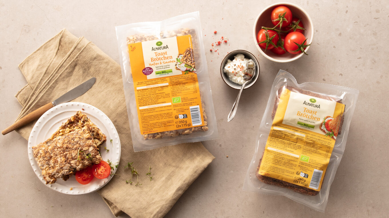
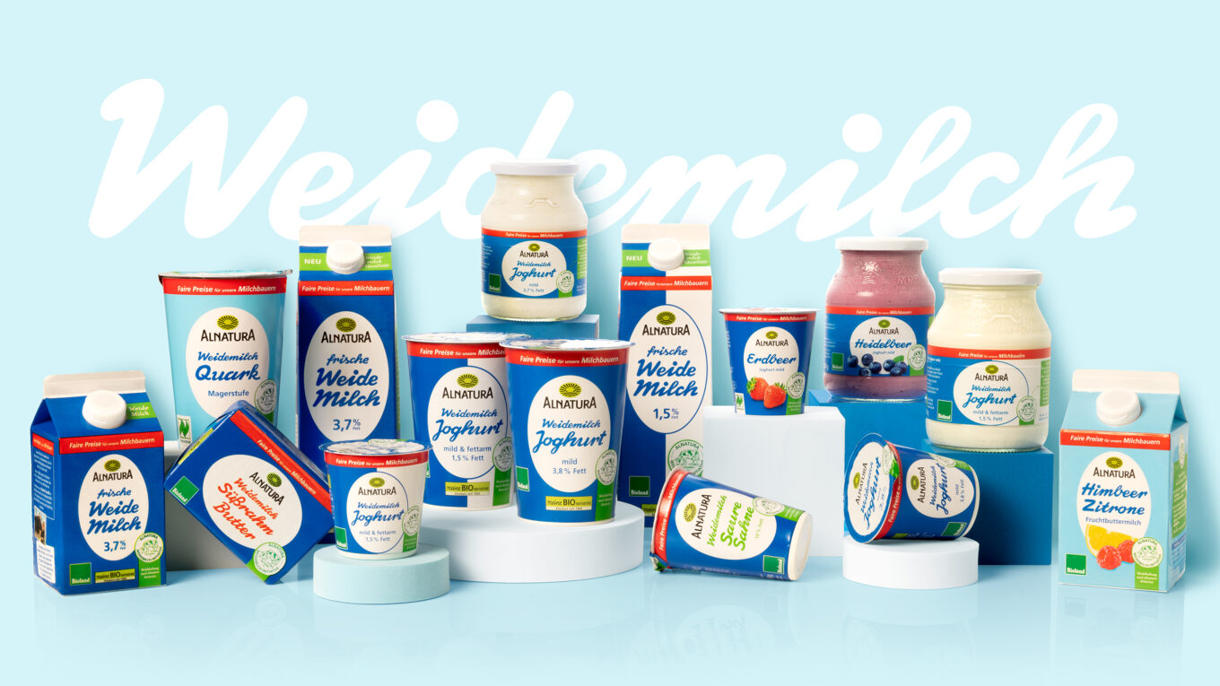
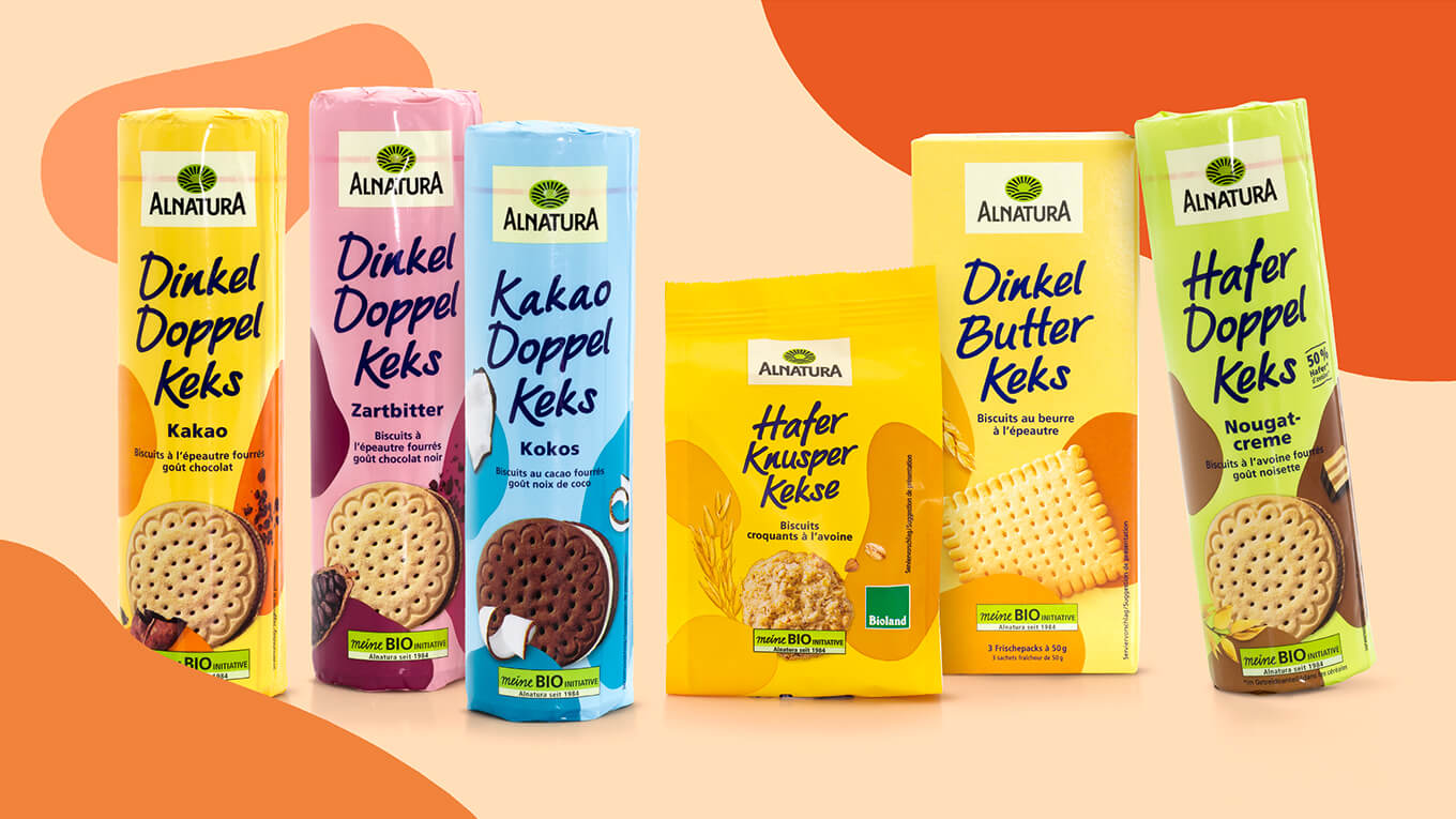
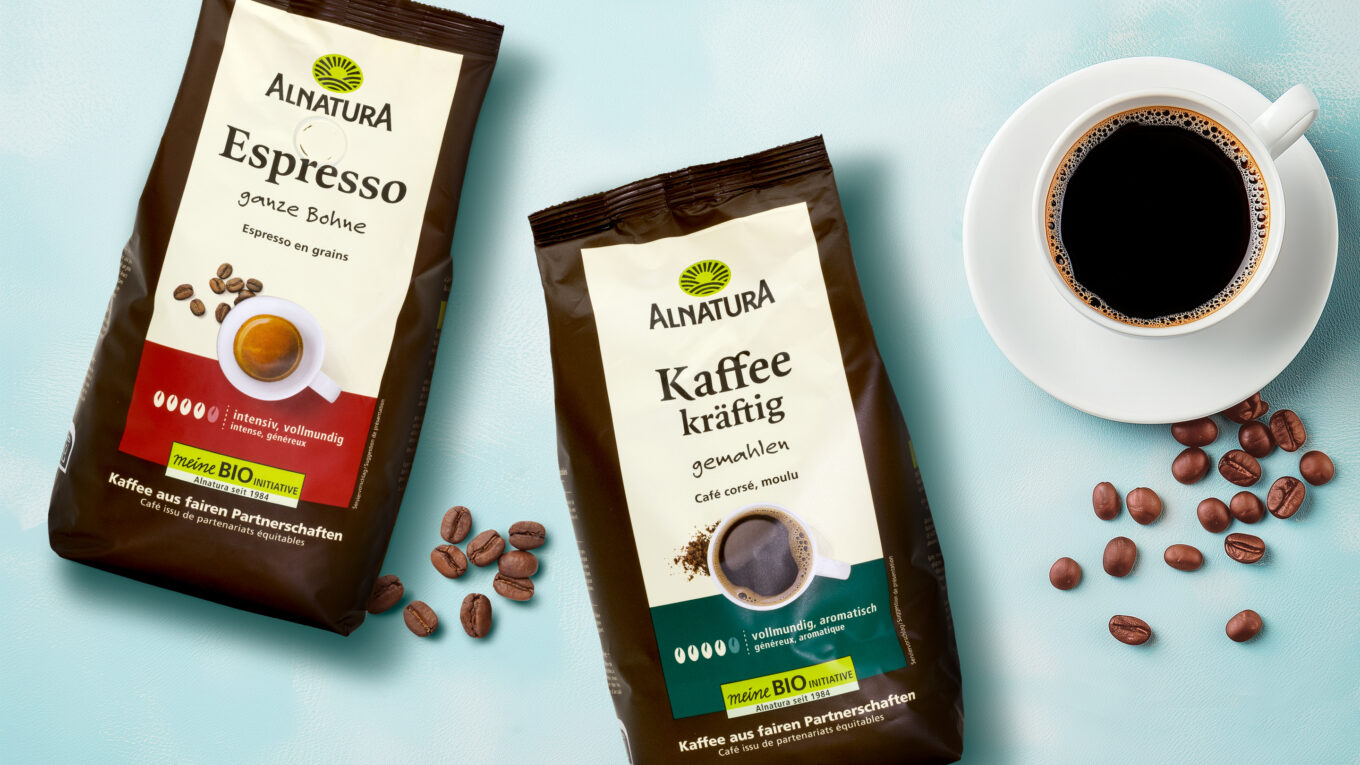
We developed a comprehensive concept for the Alnatura soft relaunch of various product categories with the aim of updating the Alnatura brand image and making the overall appearance more concise, stringent and contemporary. The focus was on creating a clear visual identity that both strengthens the brand’s recognizability and authentically conveys Alnatura’s values – naturalness, quality and sustainability.
The revision covered several product areas, including pasta, oils, honey & sweeteners, juices and preserves. These products are part of many consumers’ daily needs and play a central role in a balanced, conscious diet. As they are only minimally processed, their taste stands for pure enjoyment and natural ingredients – an aspect that is also reflected in the new design.
The revised design not only ensures a stronger presence at the point of sale, but also makes it easier for consumers to find their way around the range. A clear color and visual language as well as an intuitive structure of the packaging elements improve orientation within the product categories.
With this relaunch, Alnatura is strengthening its market position and remaining true to its philosophy: high-quality organic products, transparently communicated and attractively presented – for conscious, enjoyable nutrition.
Our design concept emphasizes the naturalness and authenticity of the products and creates trust through a clear, simple structure. Instead of artificial staging, it relies on an honest, minimalist design that emphasizes the quality and value of the ingredients. Without cluttered design elements, the layout enables intuitive orientation on the shelf and highlights the products visually. The simple but appealing aesthetic strengthens the brand identity and appeals to both regular customers and new target groups. This approach creates an emotional connection based on transparency, naturalness and trust – values that conscious consumers appreciate.
The color beige is a central design element of Alnatura and significantly shapes the brand image. In the new design concept, it is used across the entire surface of the packaging to emphasize the brand’s recognizability and naturalness. Varieties are differentiated by means of clear, simple color coding, which enables consumers to find their way around the range intuitively.
More information:
Our client: Alnatura
All projects for our client Alnatura

