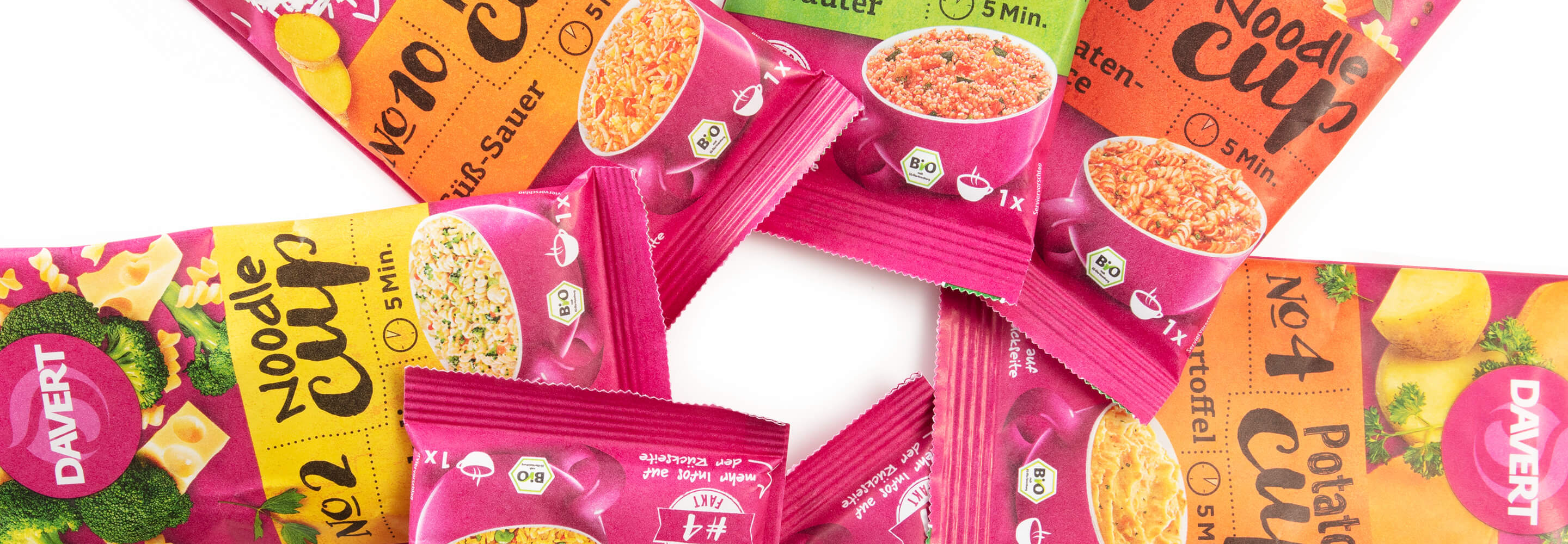
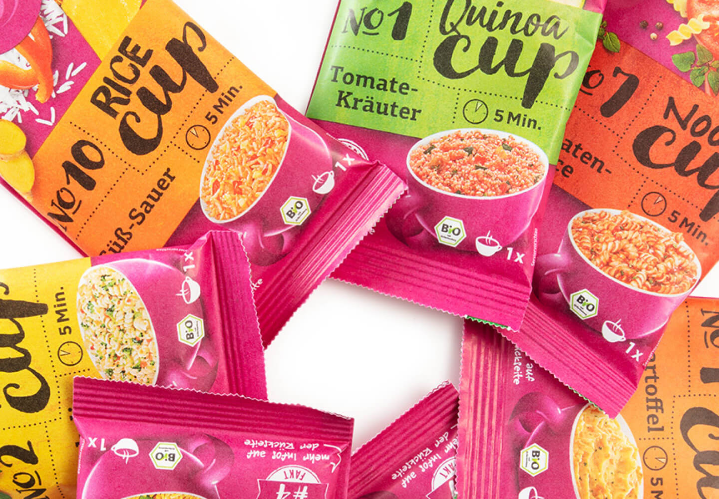
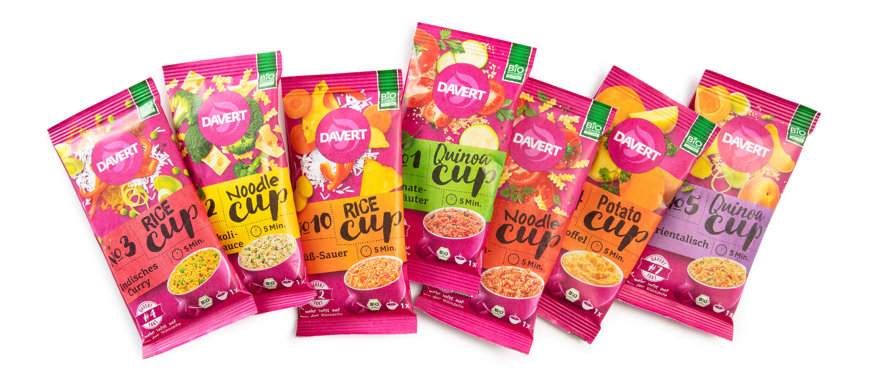
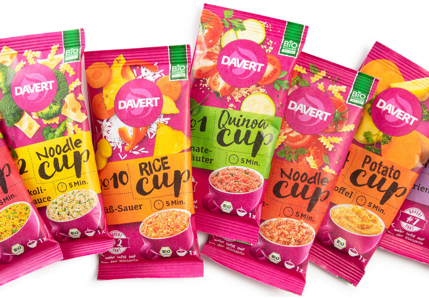
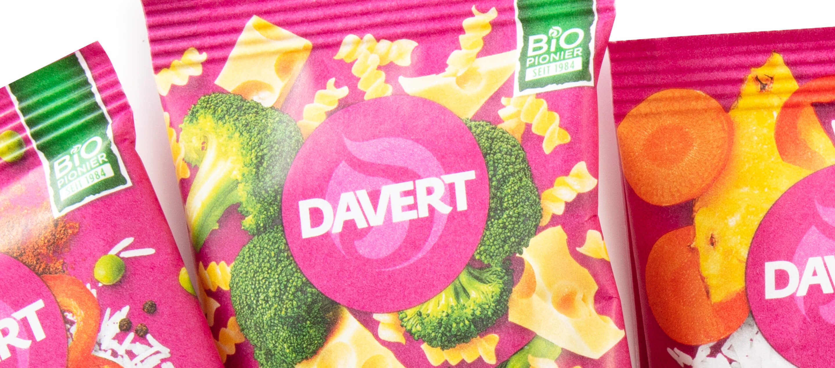
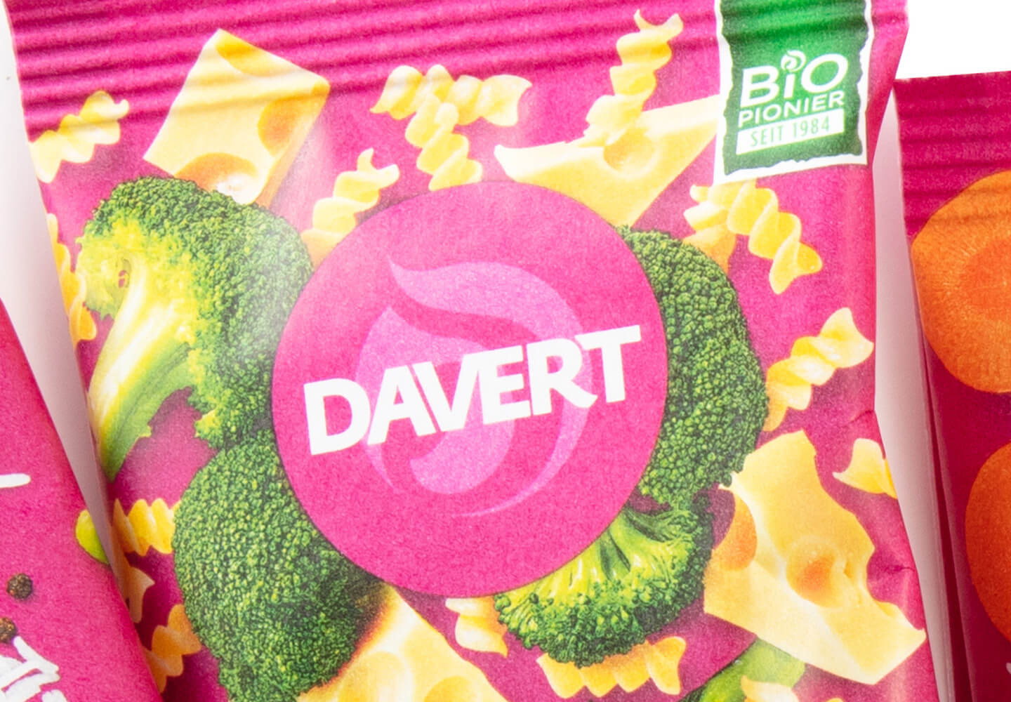
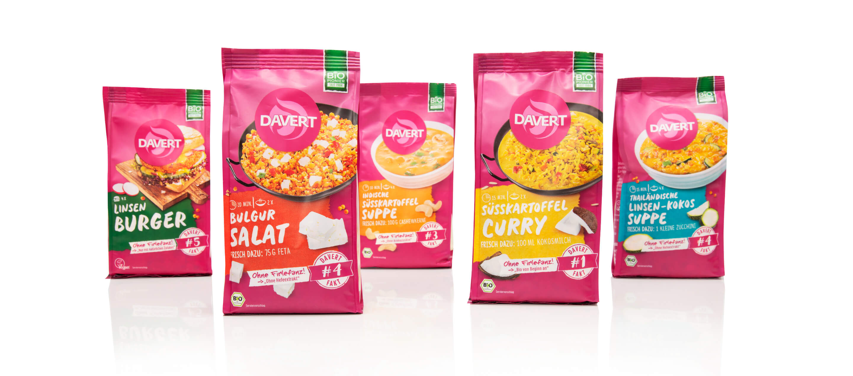
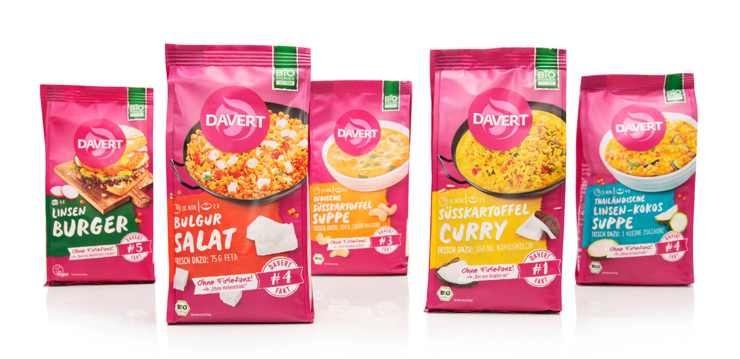
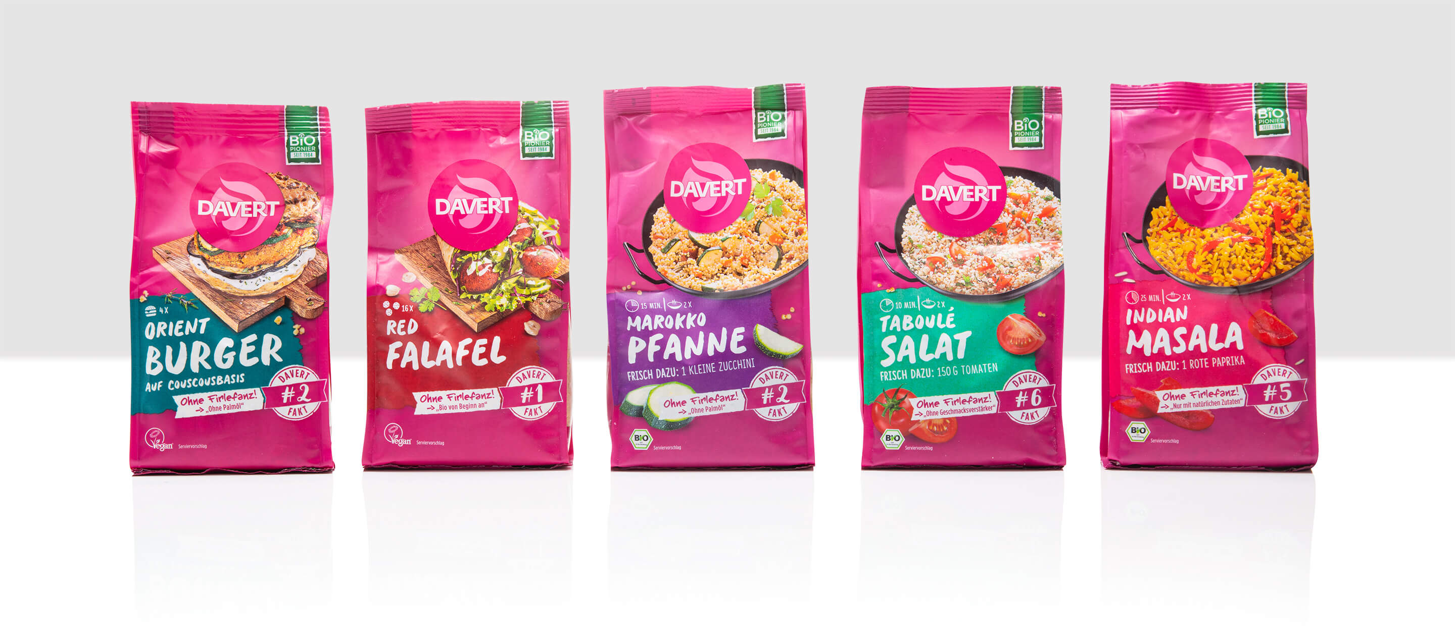
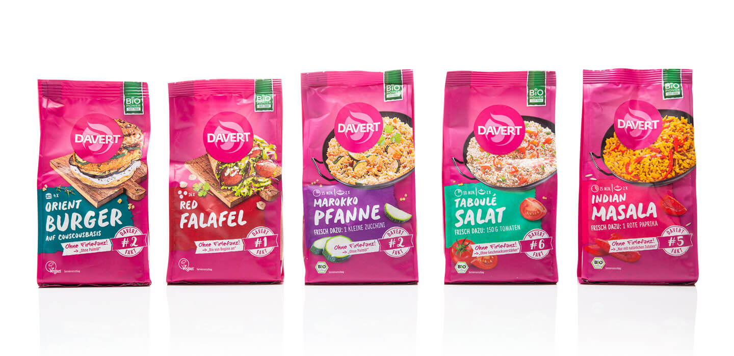
With bright colors and a concise visual language, we have given the Davert convenience range a fresh, modern look that clearly structures the variety of products and presents them in a visually appealing way. The aim was to give the constantly growing convenience range a visual order and to make it easier for customers to find their way around the various categories. The focus was on two central aspects: clear differentiation between the different varieties within the range and a clear visual distinction between the pan-fried, soup and burger dishes and the quick-prepared cups.
To make this differentiation clear, we developed a sophisticated color concept that gives the individual categories an unmistakable visual identity. Each product group was given its own color scheme, which blends harmoniously into the overall image of the Davert brand, but still ensures immediate recognition. This allows customers to distinguish between hearty stir-fries, warming soups, creative burger variations and the quick cups at first glance.
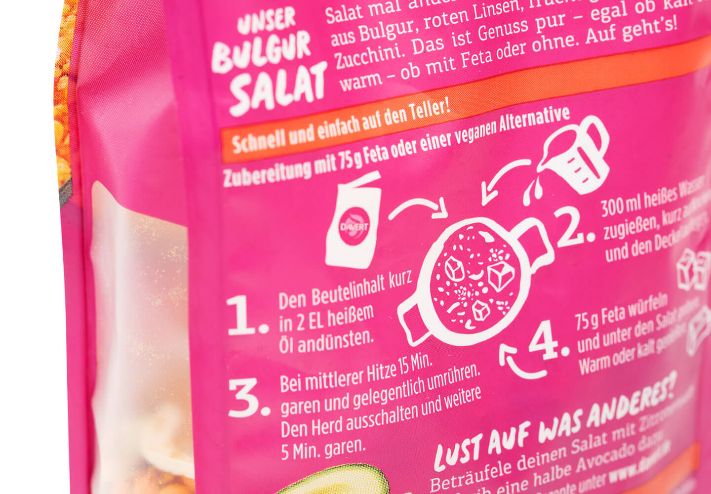
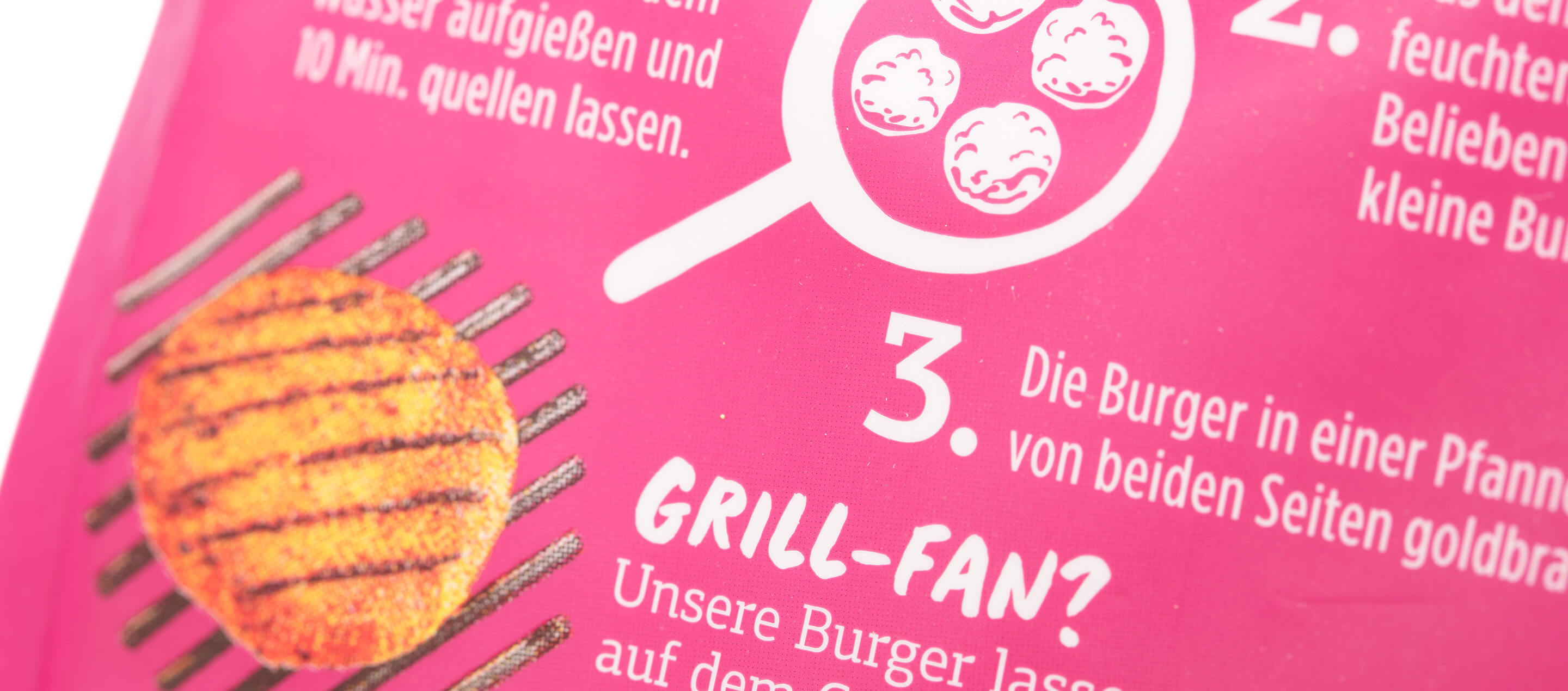
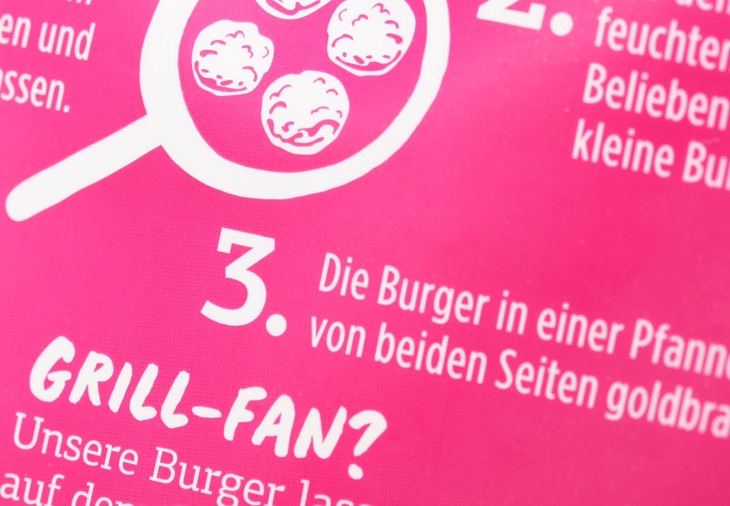
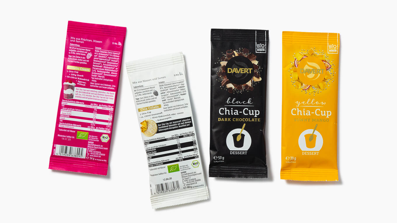
In addition to the color scheme, the visual language also played a decisive role. We opted for high-quality, appetizing food photography that emphasizes the freshness and quality of the ingredients and at the same time underlines the preparation character of the products. While the pan-fried dishes, soups and burgers are presented in generous, handcrafted images, the cups feature a compact, practical presentation that visually emphasizes their quick preparation and to-go character.
This new packaging design gives the Davert convenience range a modern, fresh and clear design that not only strengthens brand perception, but also enables intuitive navigation at the point of sale. Customers can choose their desired products more quickly, while the packaging conveys Davert’s core values – organic quality, sustainability and enjoyment – in every respect.


 back
back