The Riedenburger brewery has been producing traditional beers with great passion and craftsmanship since 1756. Over the centuries, the family business has continuously developed its art of brewing without losing its roots. In 1994, the brewery made a conscious decision to take a pioneering step: it converted its entire range to 100% organic quality and has since brewed exclusively certified organic beers and soft drinks – a commitment to sustainable agriculture, unadulterated ingredients and a responsible brewing culture.
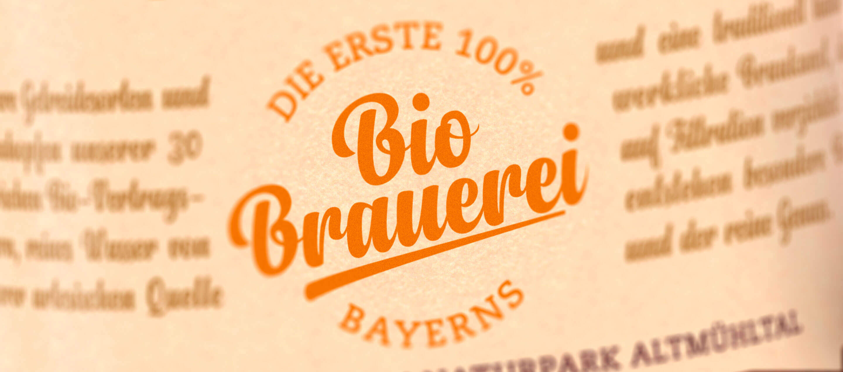
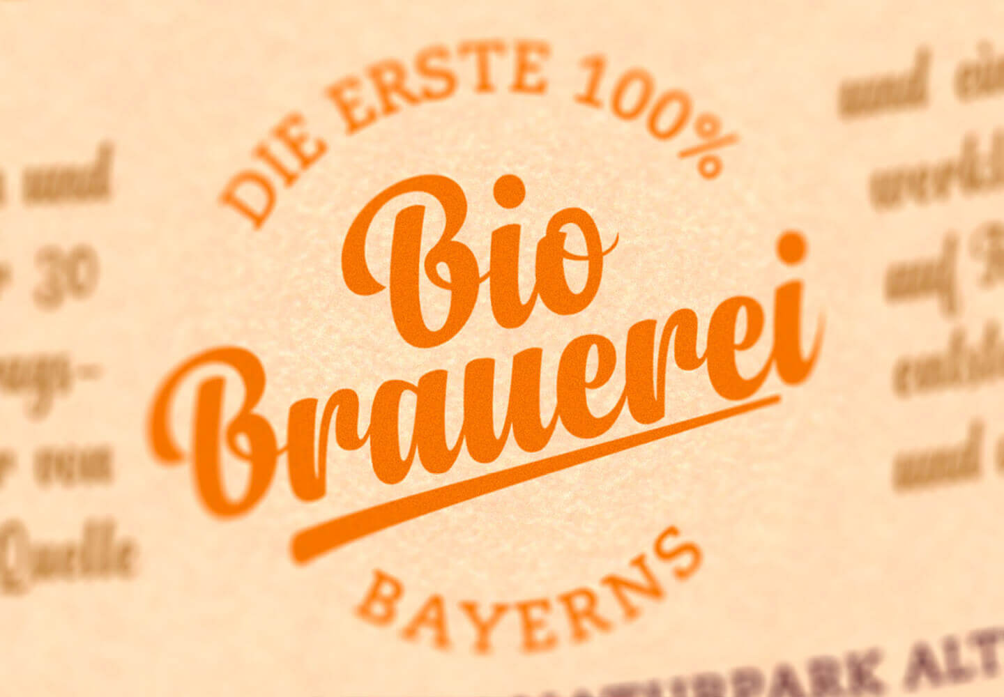
In order to communicate the brewery’s values and philosophy even more clearly, we worked intensively on the brand strategy in a joint workshop and positioned the Riedenburger brewery as “Bavaria’s first 100% organic brewery”. This positioning as an organic pioneer not only underlines the company’s decades-long commitment to environmentally friendly and sustainable brewing methods, but also clearly sets Riedenburger apart from other breweries.
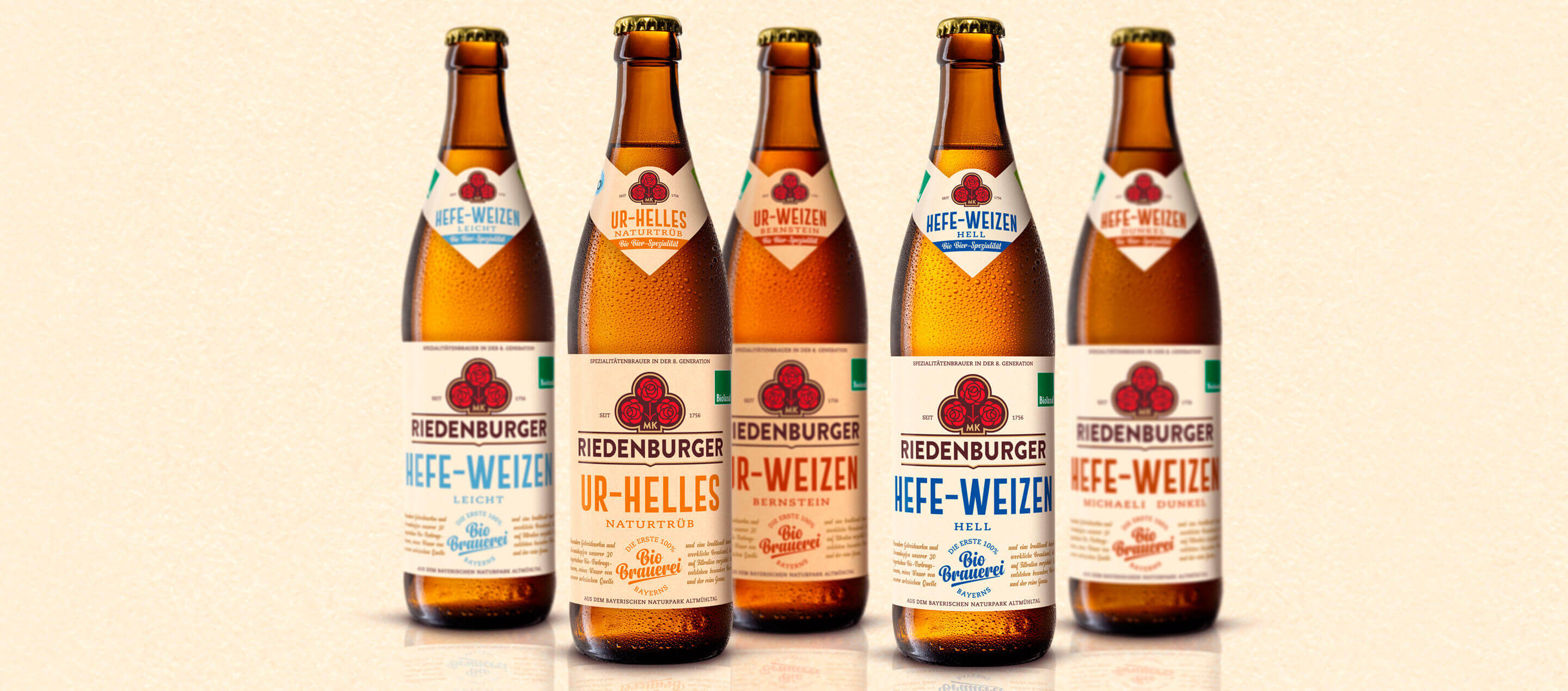
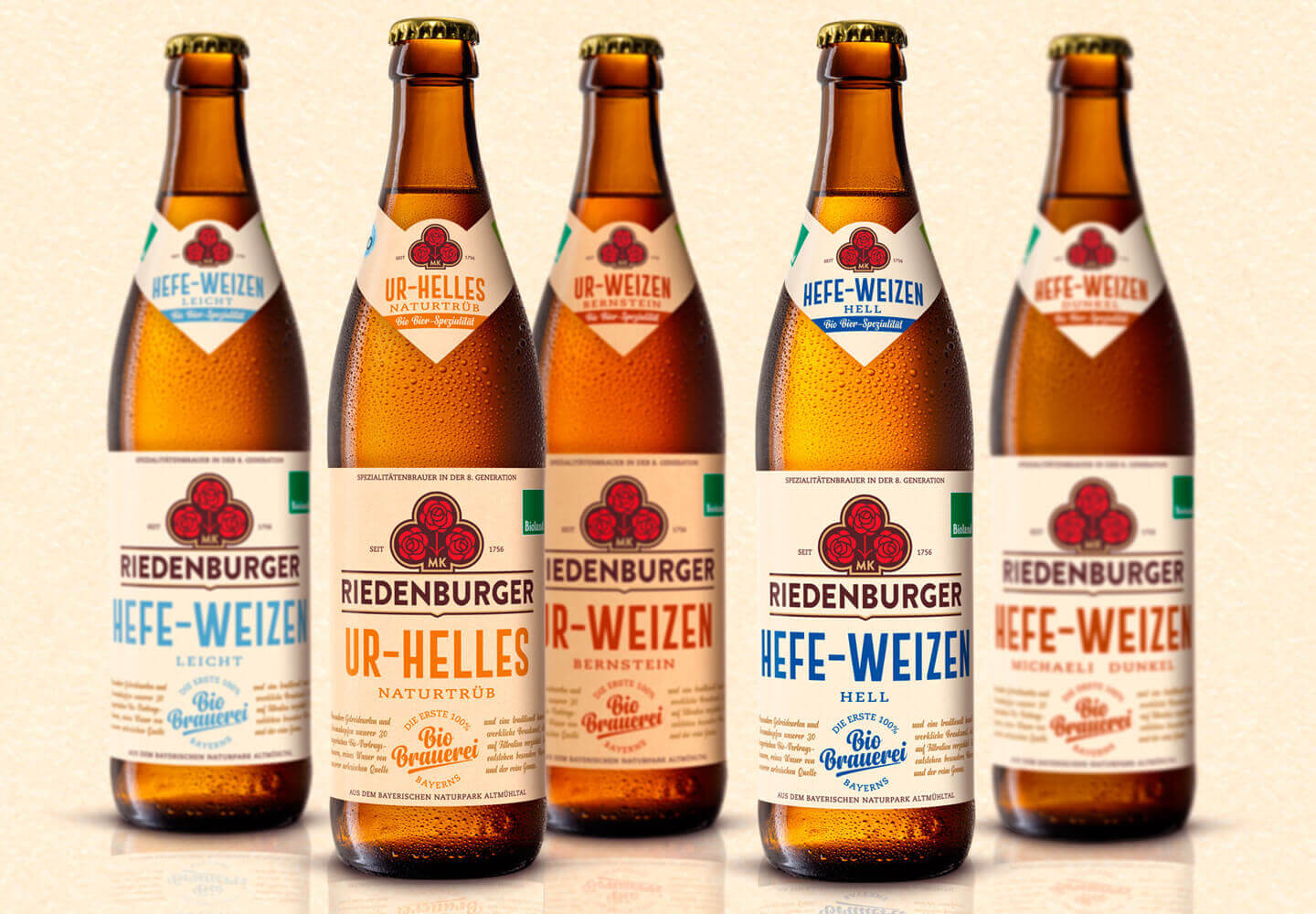
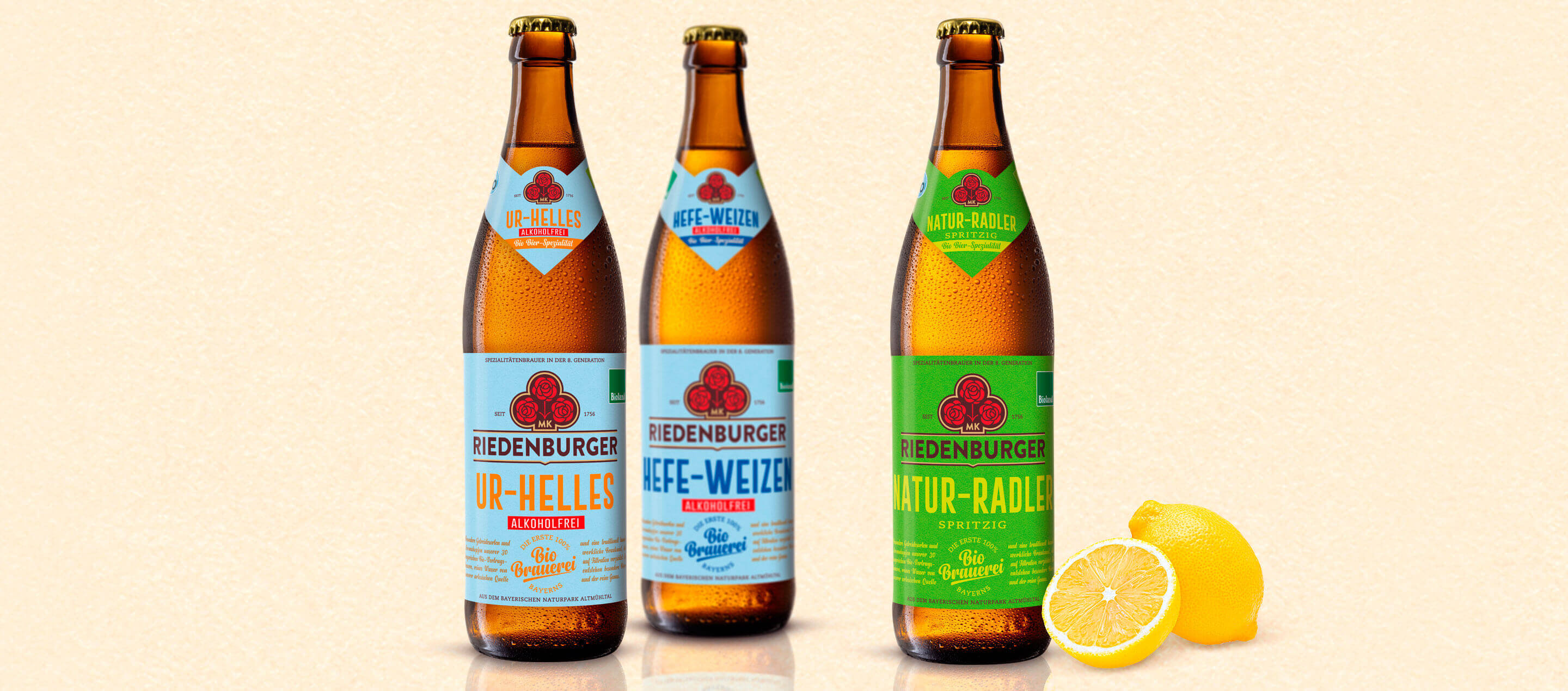
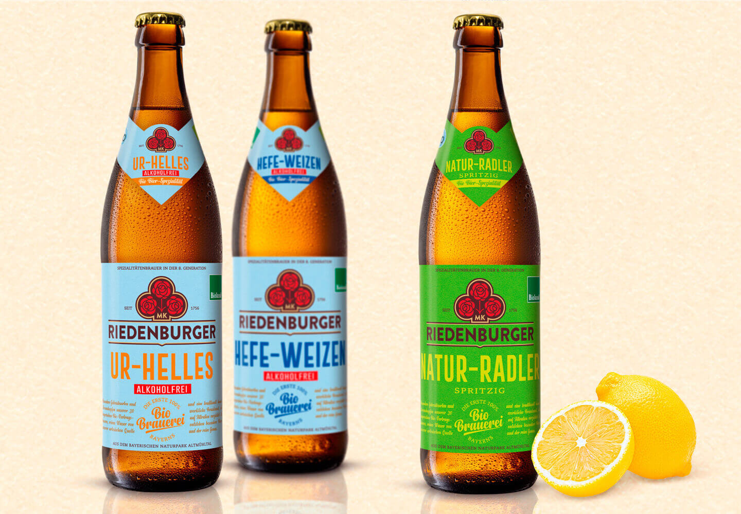
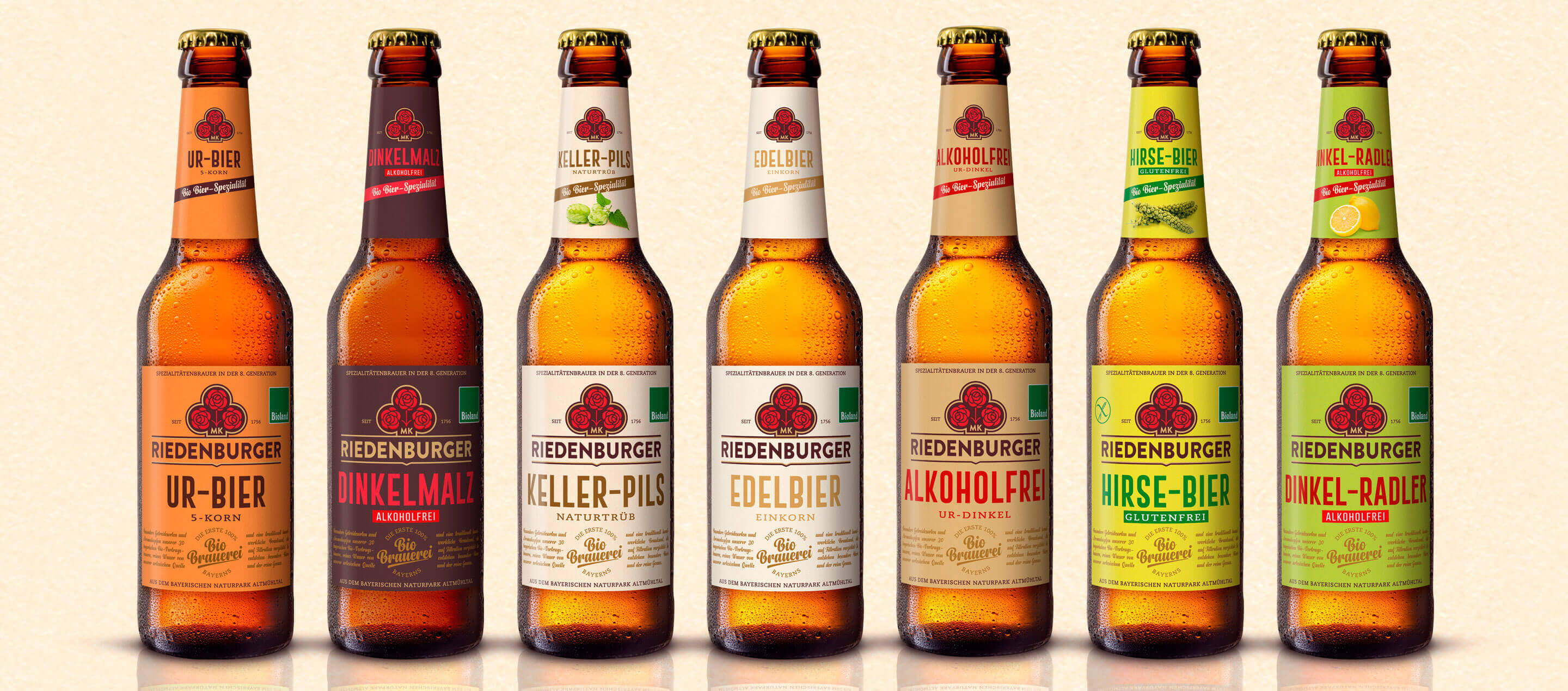
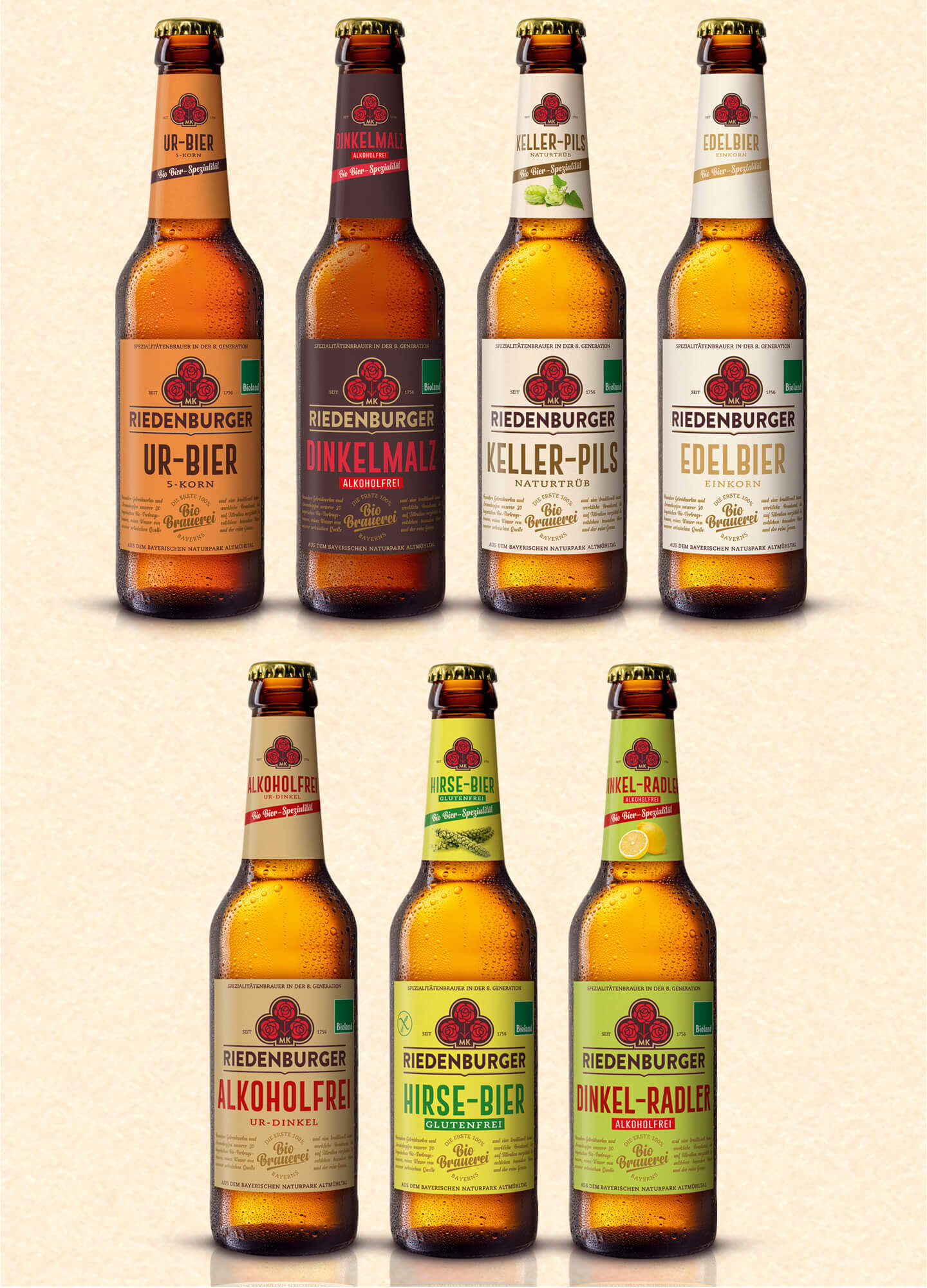
In line with this clear positioning, we have developed a new packaging design for the Riedenburger organic beer specialties. The design combines tradition and modernity and conveys the brand’s values in a visually convincing way on every single bottle. The authentic design, natural colors and craft-inspired typography emphasize the high quality of the beers and combine the long brewing tradition with a contemporary look. In addition, a clear differentiation of varieties within the product line ensures better orientation and greater recognizability on the shelf.
The new packaging design reflects the authenticity, closeness to nature and innovative strength of the Riedenburger brewery and not only makes it visually tangible as a 100% organic brewery, but also creates an emotional connection to consumers who consciously want to enjoy sustainable and high-quality beers.
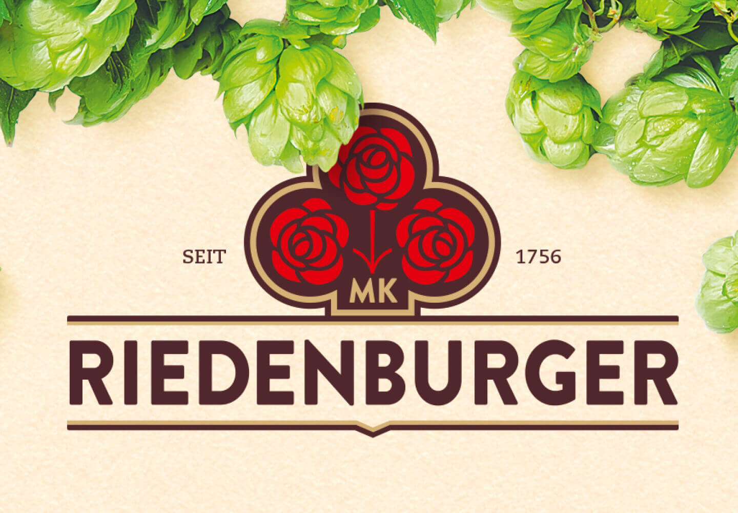
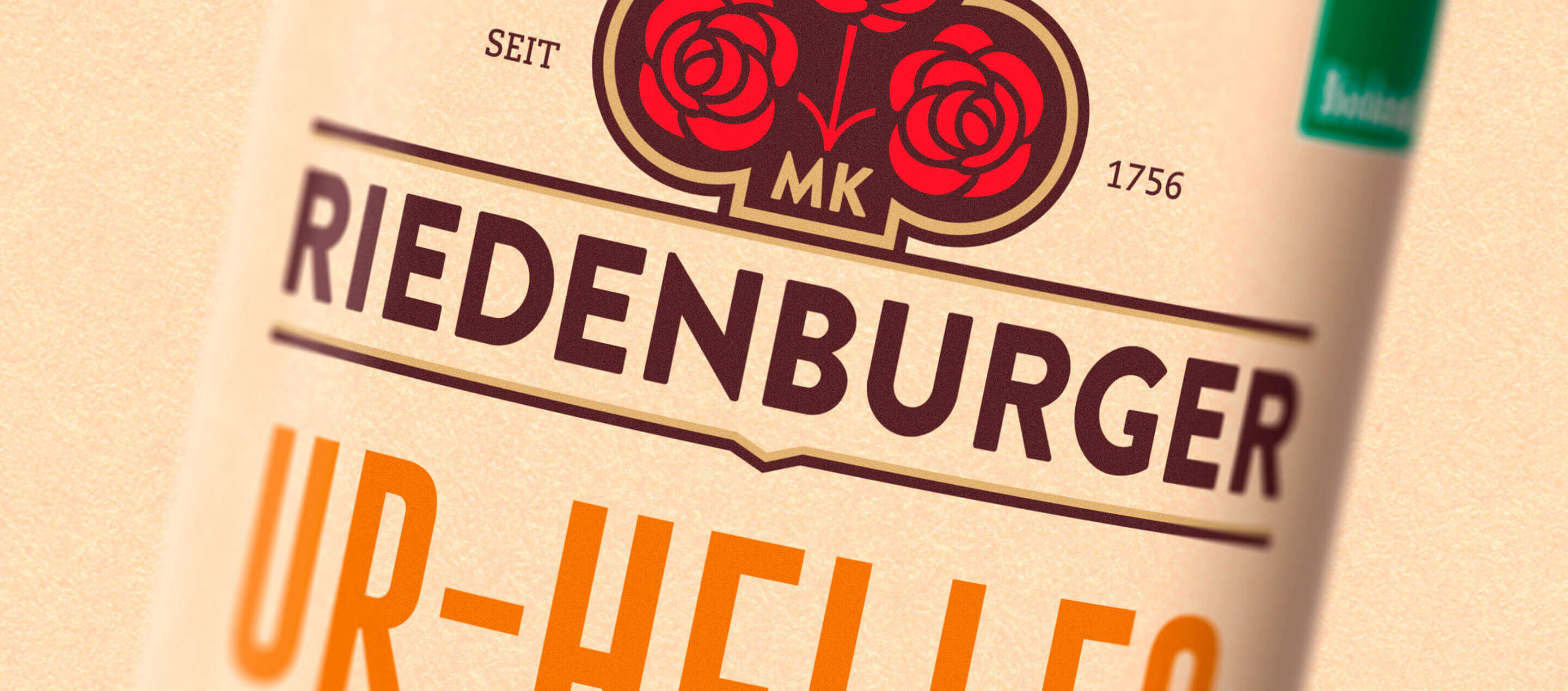
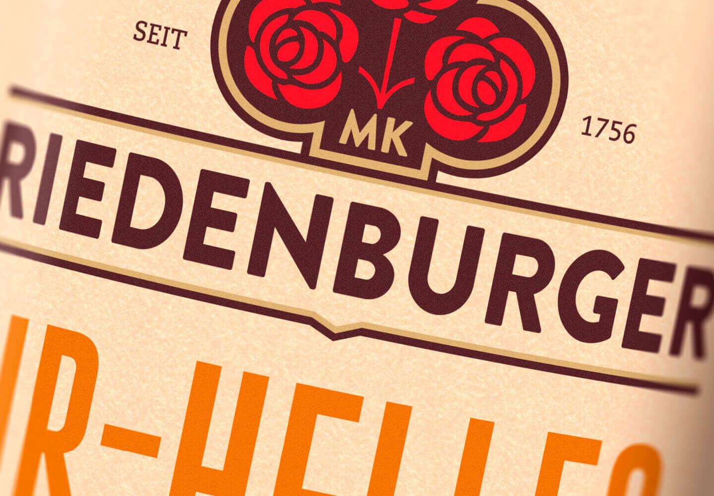
The new design combines tradition, the art of craft brewing and an organic feel. We adapted the logo, but kept the three roses that have been used throughout the brewery’s long history and are well-known throughout the region. The new labels for the Longneck and NRW bottles are clearly structured and are based on typical codes – for example blue for non-alcoholic beers.
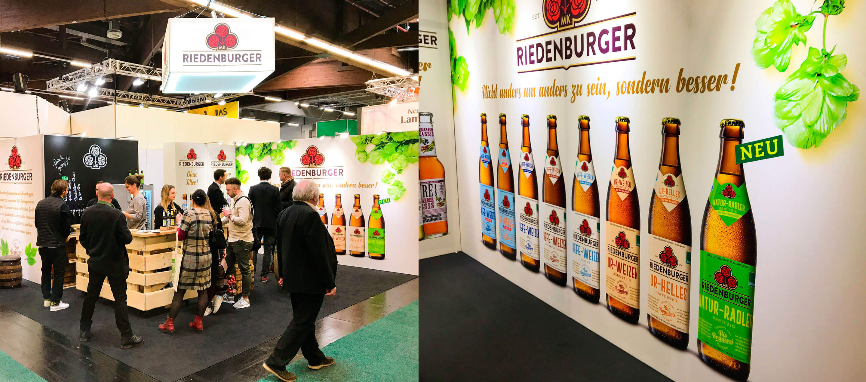
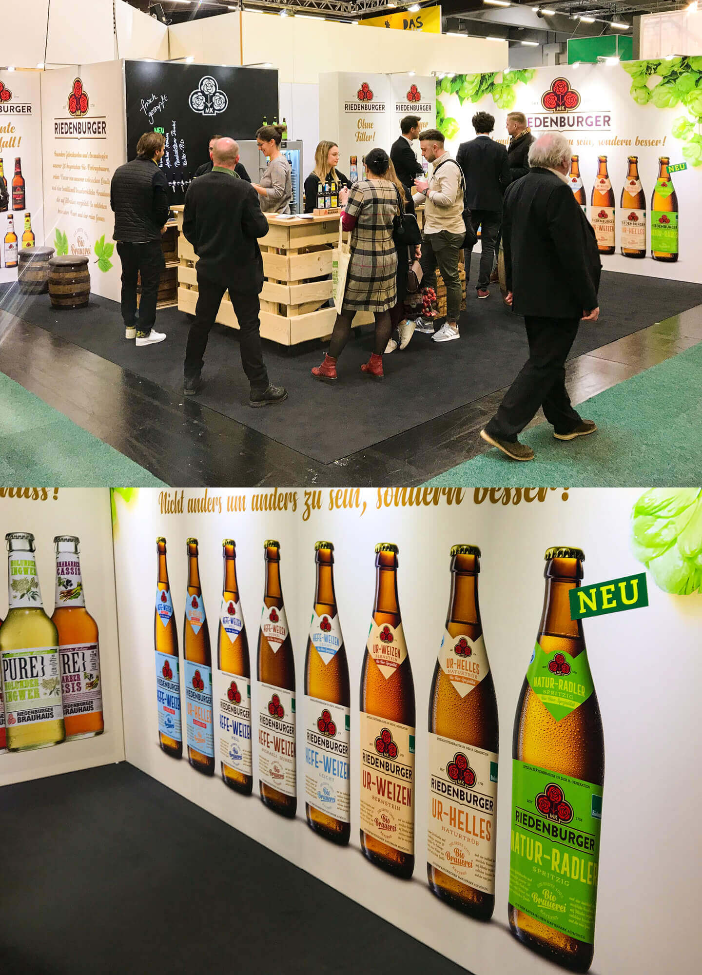
To accompany the relaunch, we designed a trade fair stand, product flyers and advertisements for Biofach 2020. The new packaging design was presented to the public there.
Further information:
Our client: Riedenburger
All projects for our client Riedenburger
Further projects of our branding agency


 back
back