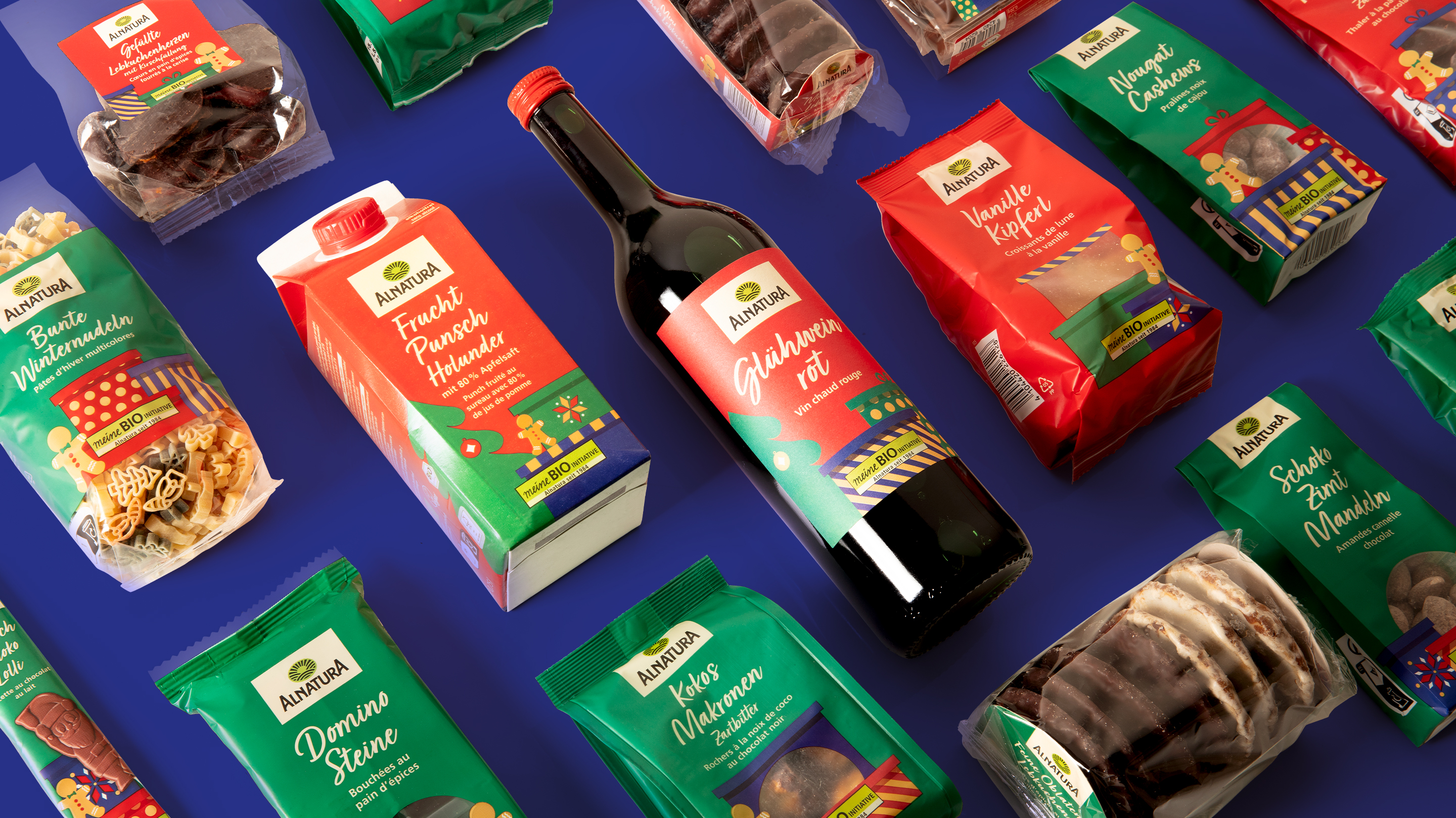
The emotionally charged and highly competitive Christmas segment makes clear brand profiling essential. For our client Alnatura, one of the few organic producers with its own seasonal products, this meant visualizing both the special market position and the gift character of the products. An emotional design was to further sharpen this position and strengthen the brand in the long term.
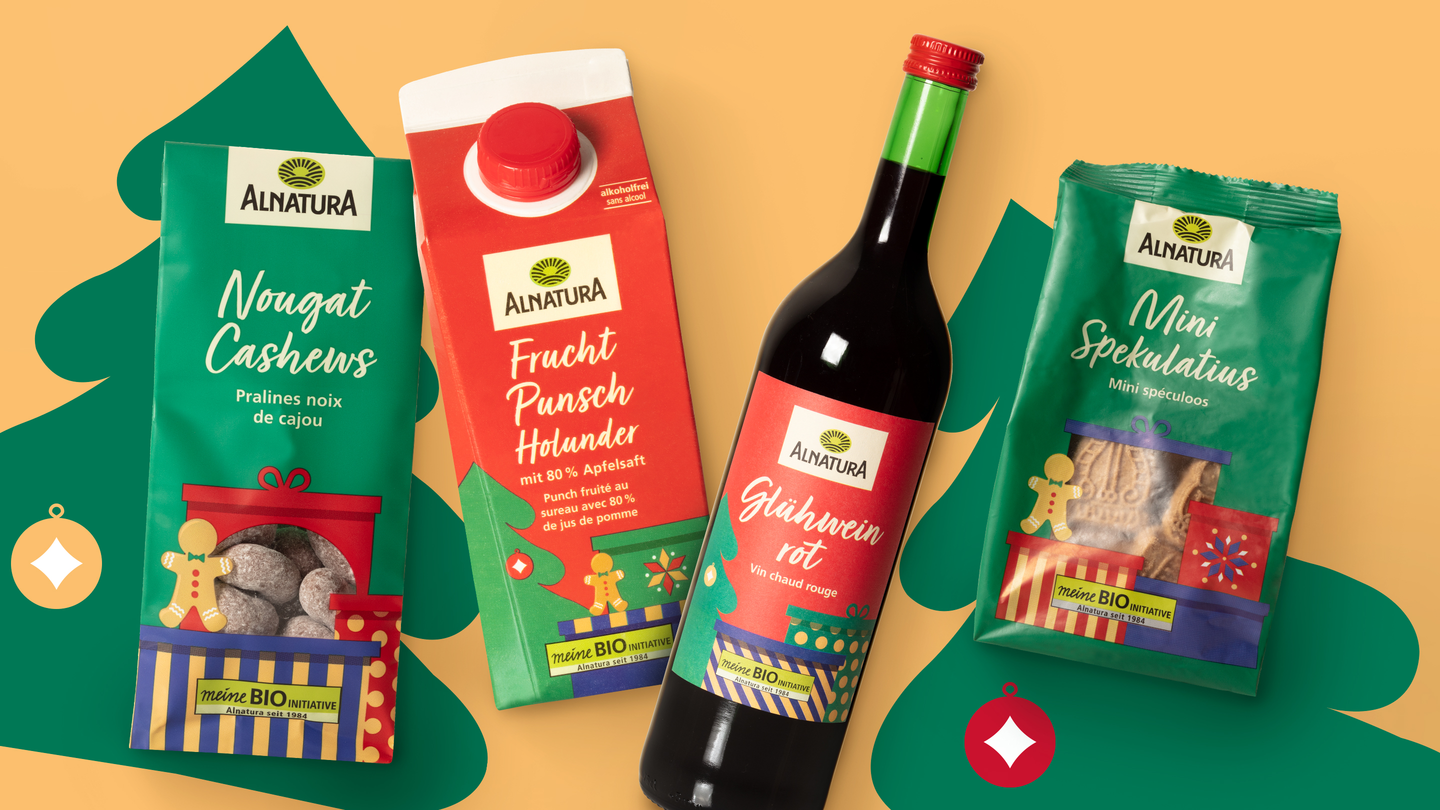
We rely on imagery that conveys warmth and personal closeness. Classic symbols create a sympathetic appeal and emphasize the gift character of the products.
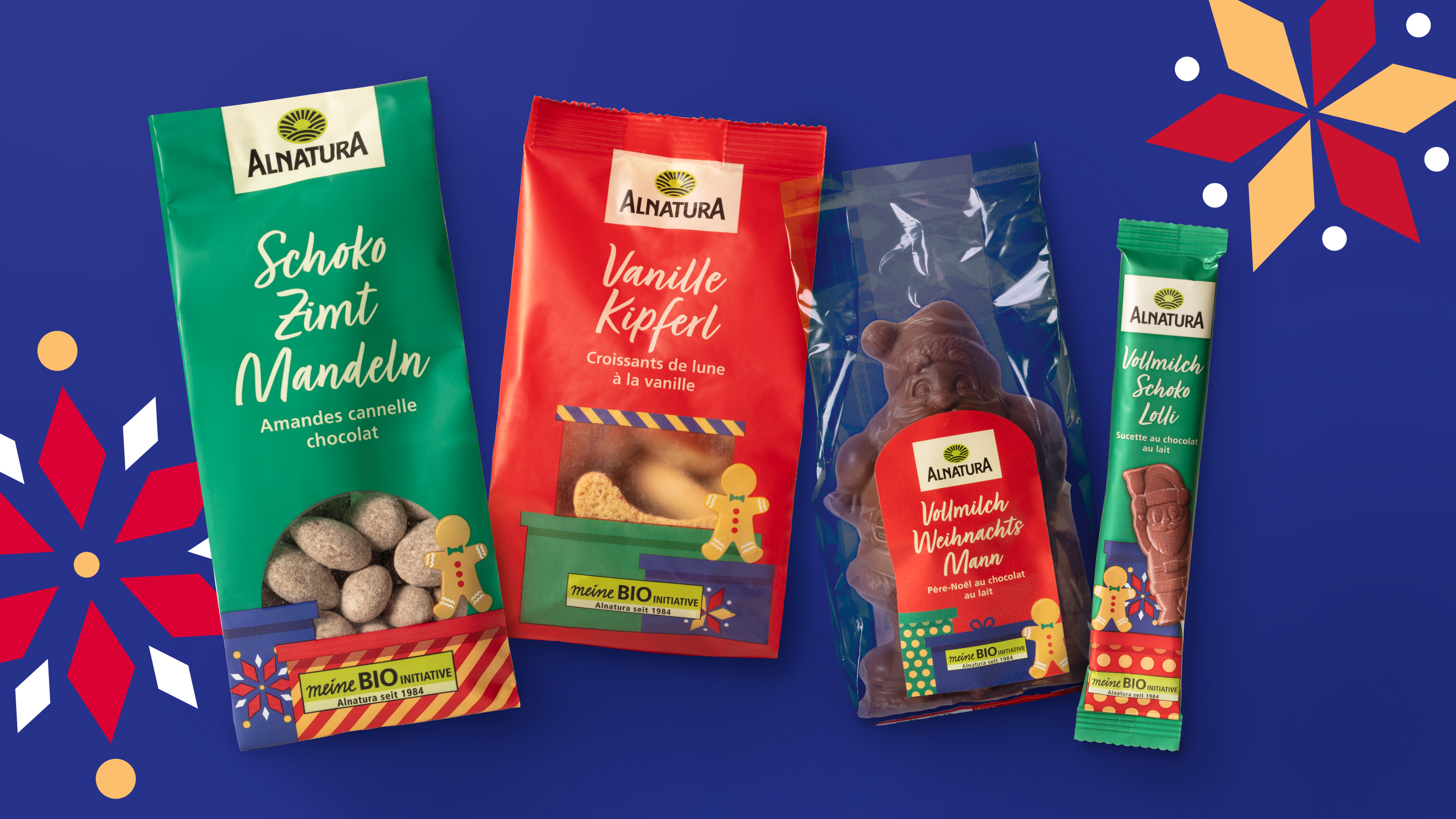
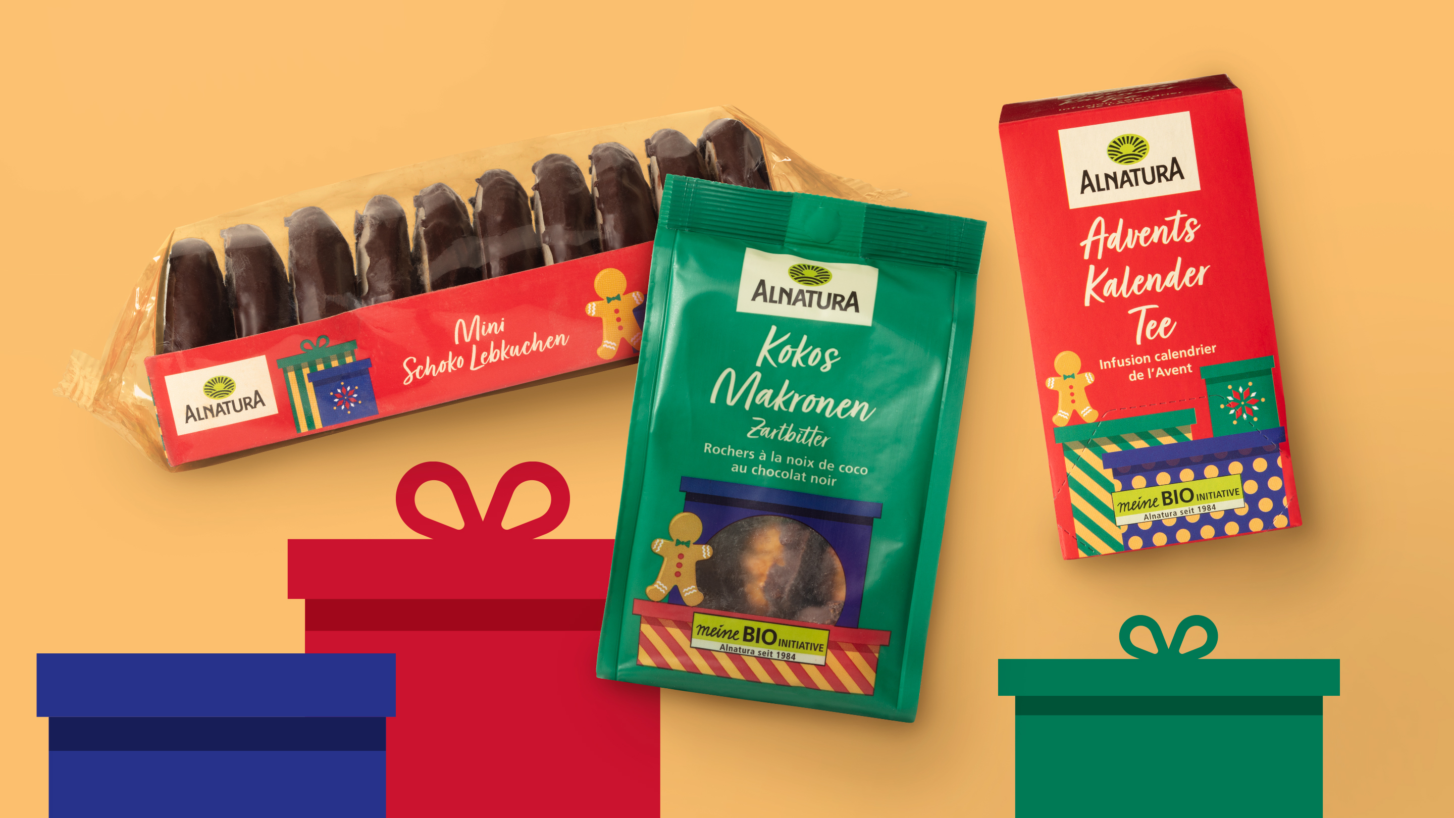
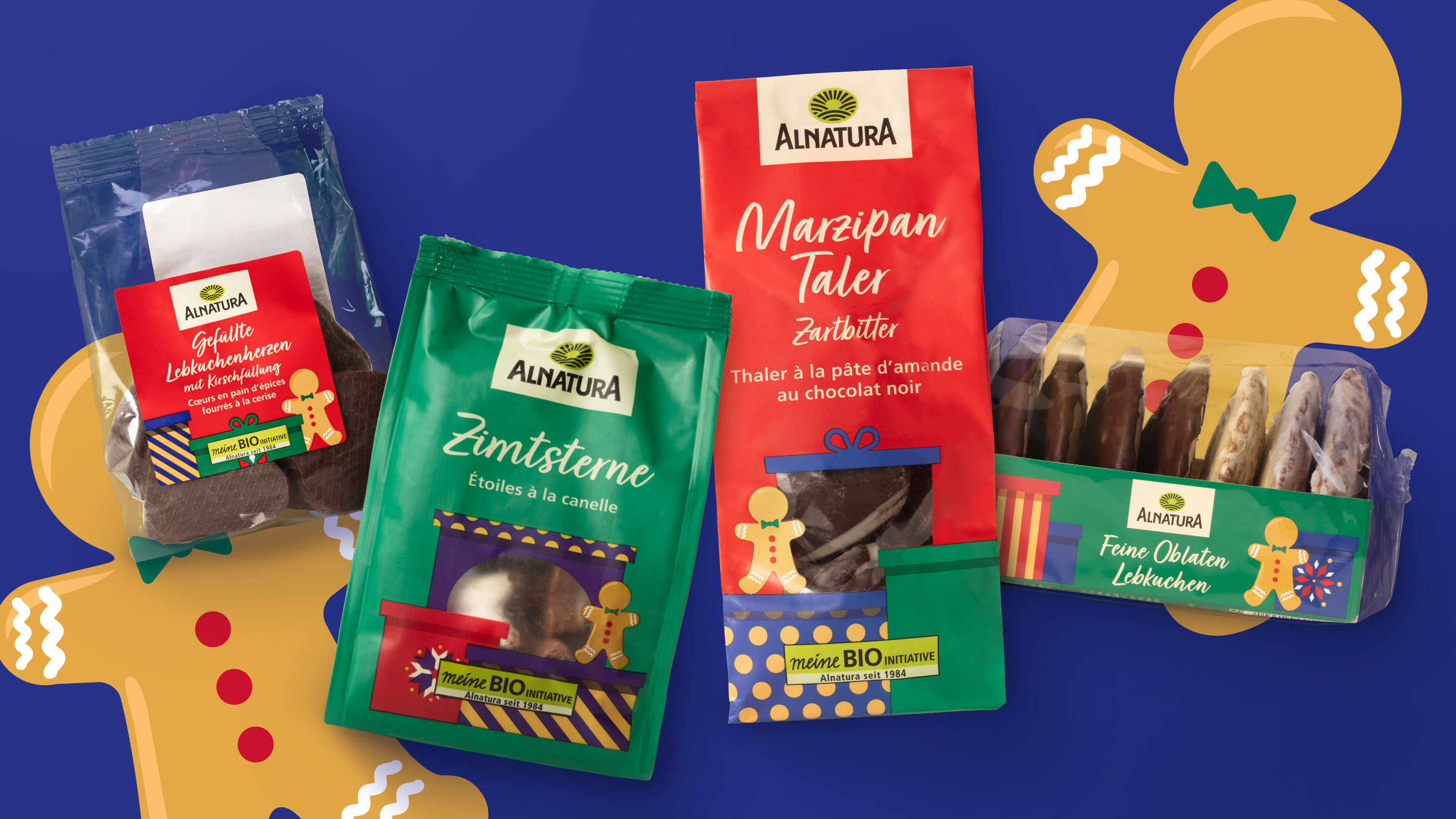
The design series is based on a classic Christmas color palette in red, green and blue in a clear, generous surface design. Supplemented by our flexibly structured design system, a consistent design logic is created that is recognizable and enables differentiated variety communication. The interplay of a striking color scheme, stringent design language and targeted variation results in a clearly structured product range architecture. Each pack has an individual character, while the overall image at the PoS merges into a coherent, eye-catching brand block – a decisive advantage in the visually dense Christmas segment.
More information:
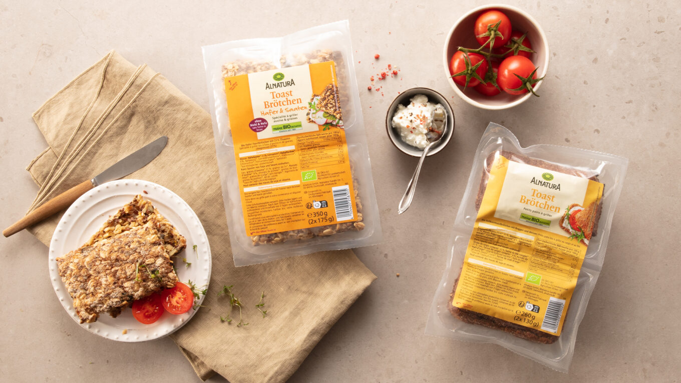
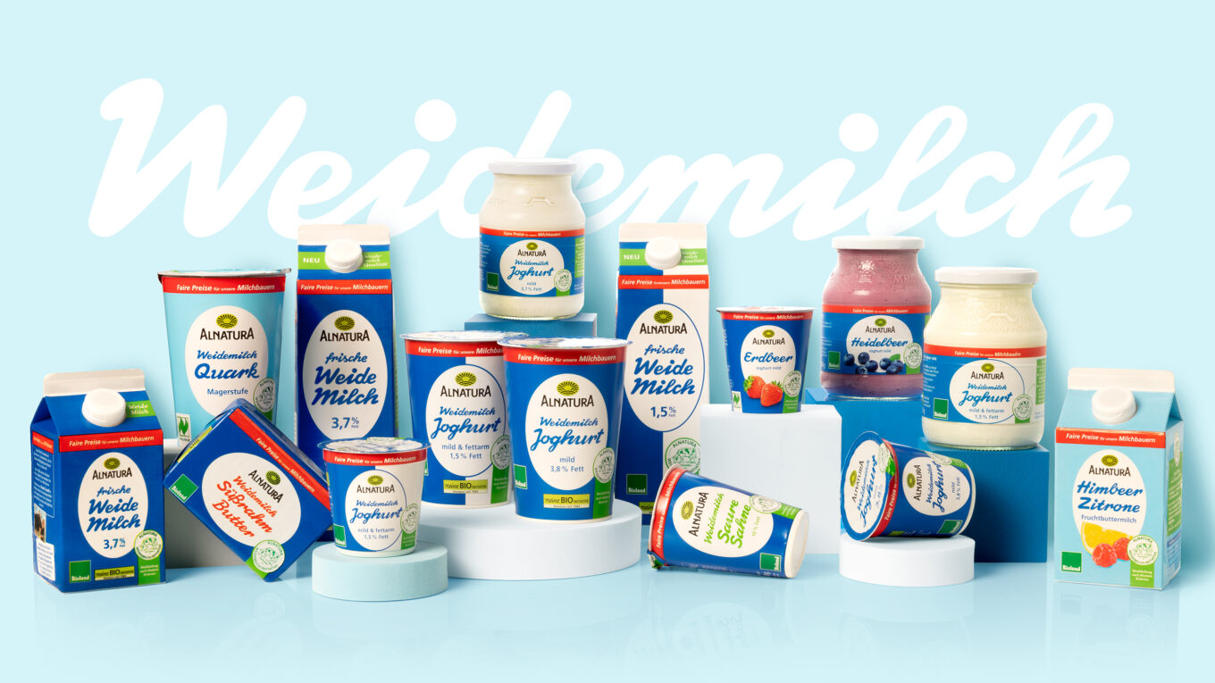
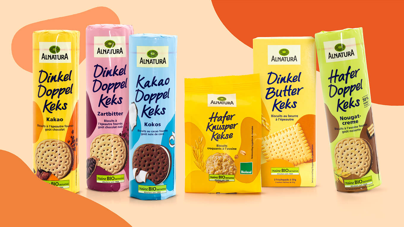
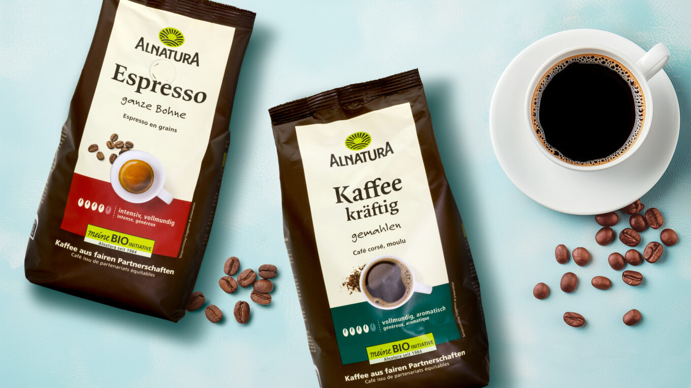
Our client: Alnatura
All projects for our client Alnatura
More projects from our packaging design agency