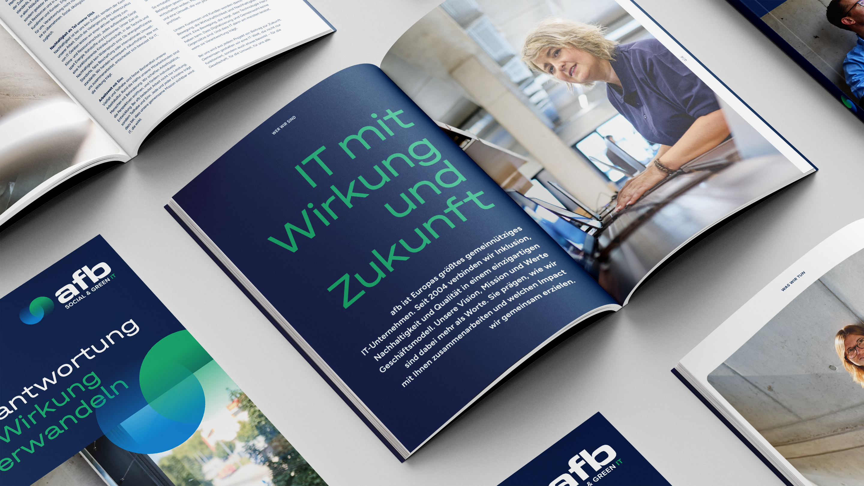
Double sustainability—that’s the Green IT concept of our client, afb social & green IT. The IT refurbisher purchases used laptops, smartphones, and other IT hardware, securely wipes all data, professionally refurbishes the devices, and returns them to the market as high-quality second-life products. And it does so as an inclusive, nonprofit company where people with and without disabilities work together. Over the past two decades, the company has grown to 20 locations and 700 employees across Europe. It was time to modernize and professionalize its brand identity.
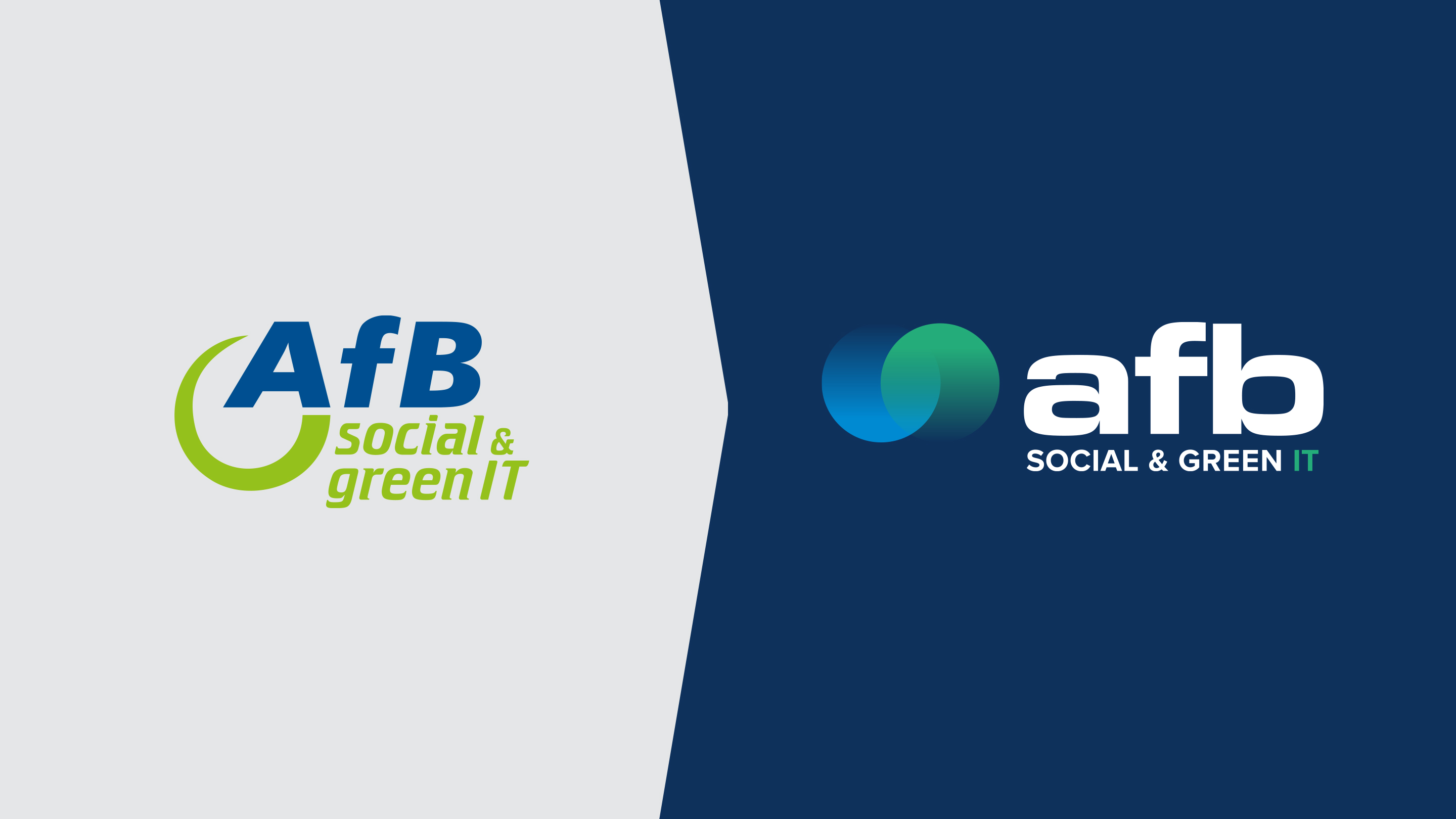

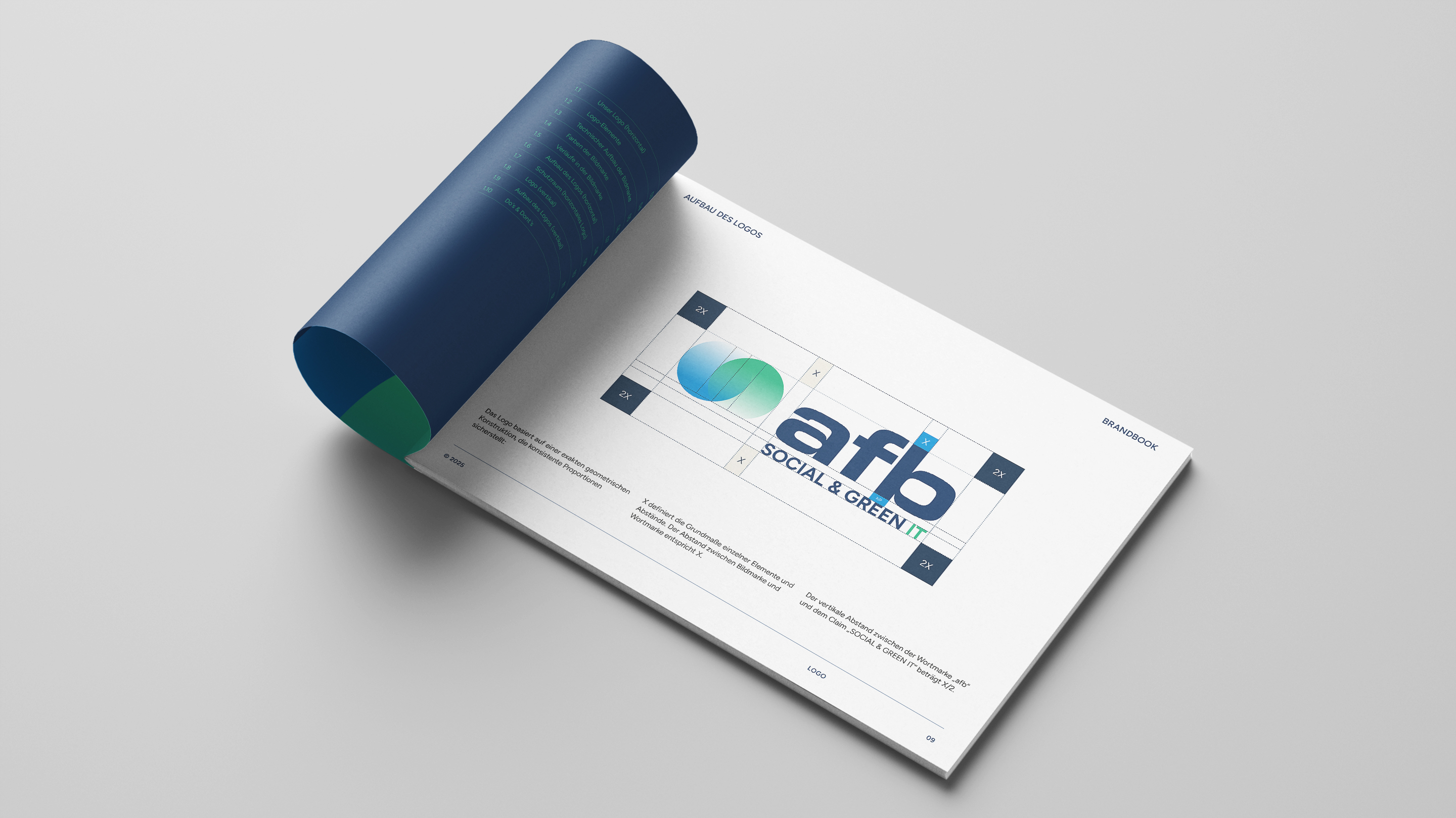
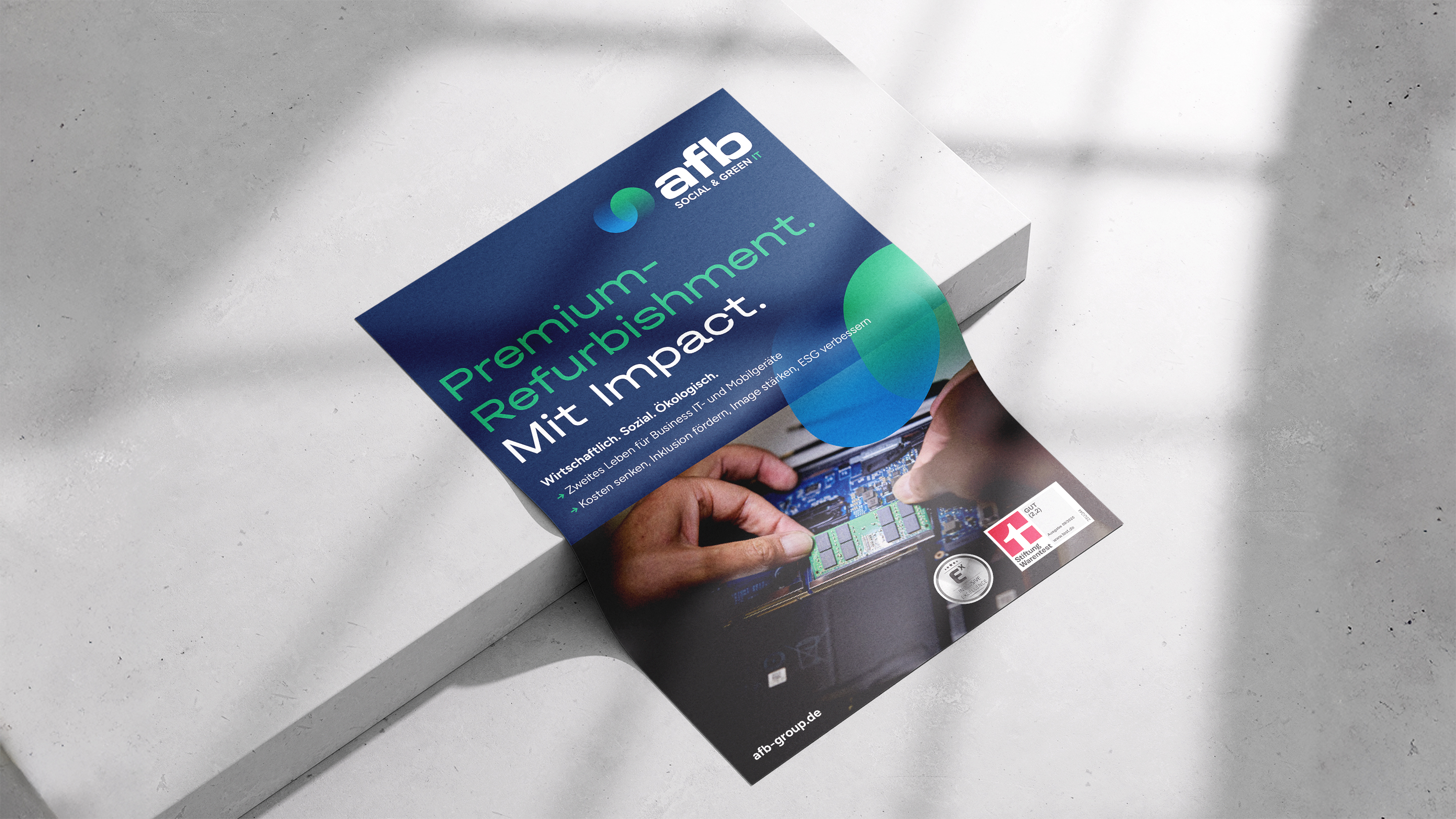
Together with afb, we strategically rethought the brand identity and fundamentally revised the logo. The new word and figurative mark integrates the lemniscate as a memorable symbol for the second life concept. It stands for duality, balance and connection, for cycle and infinity. The modernized shades of blue and green symbolize technology, quality and reliability on the one hand, and nature, life and sustainability on the other. In this way, the sustainable core of the brand is retained, while afb social & green IT positions itself confidently and independently at the same time.
As part of the relaunch, not only was the logo renewed, but the entire brand architecture was sharpened. The new word-image brand with subline serves as a universal signature across all communication channels, representing the company, its employees and its values in a direct way. With the striking circles, the blue-green colour scheme and the new lettering, the trademark visualizes afb’s central mission: to offer high-quality IT products and IT services with unique added value as an inclusive company.
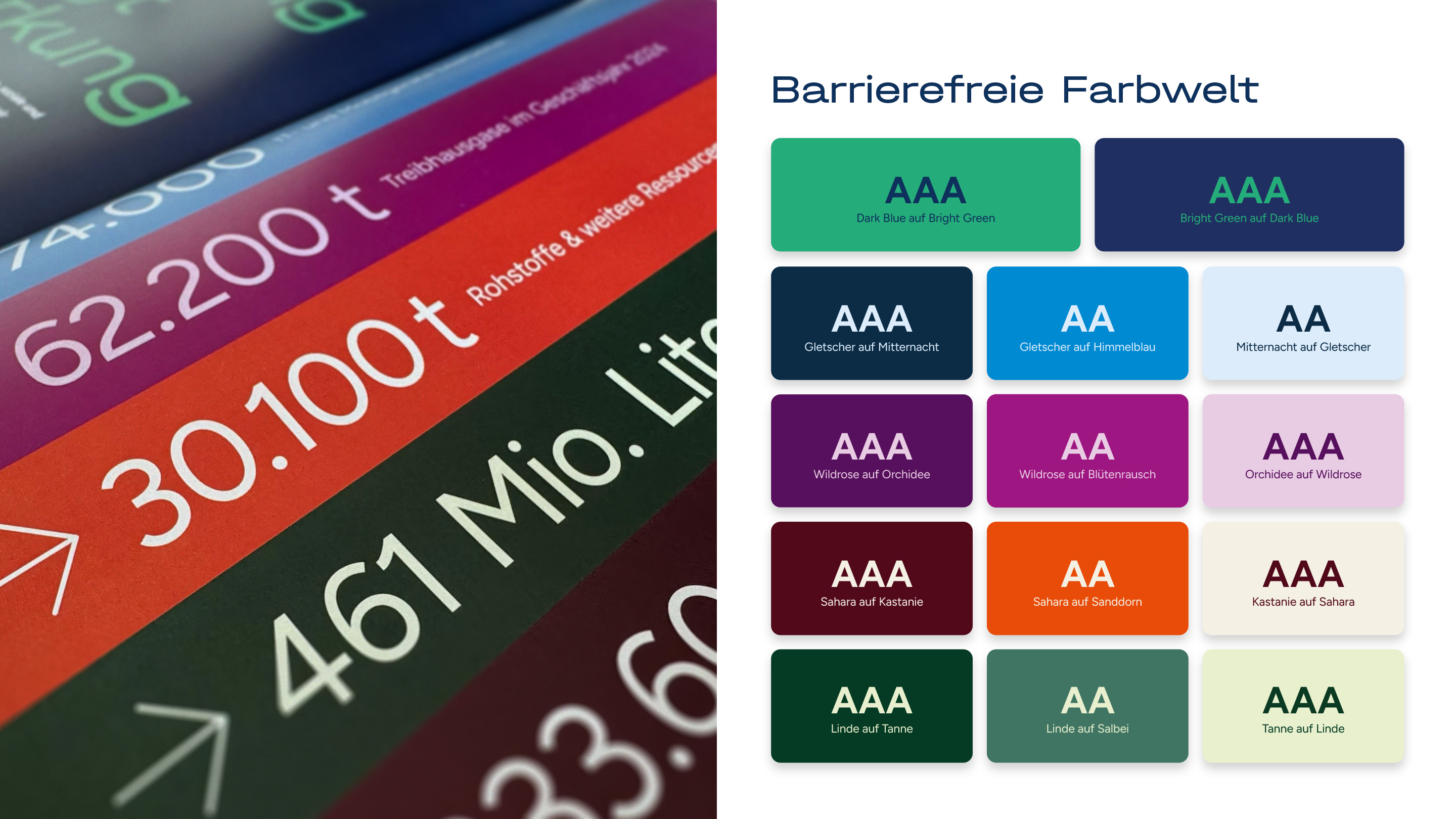
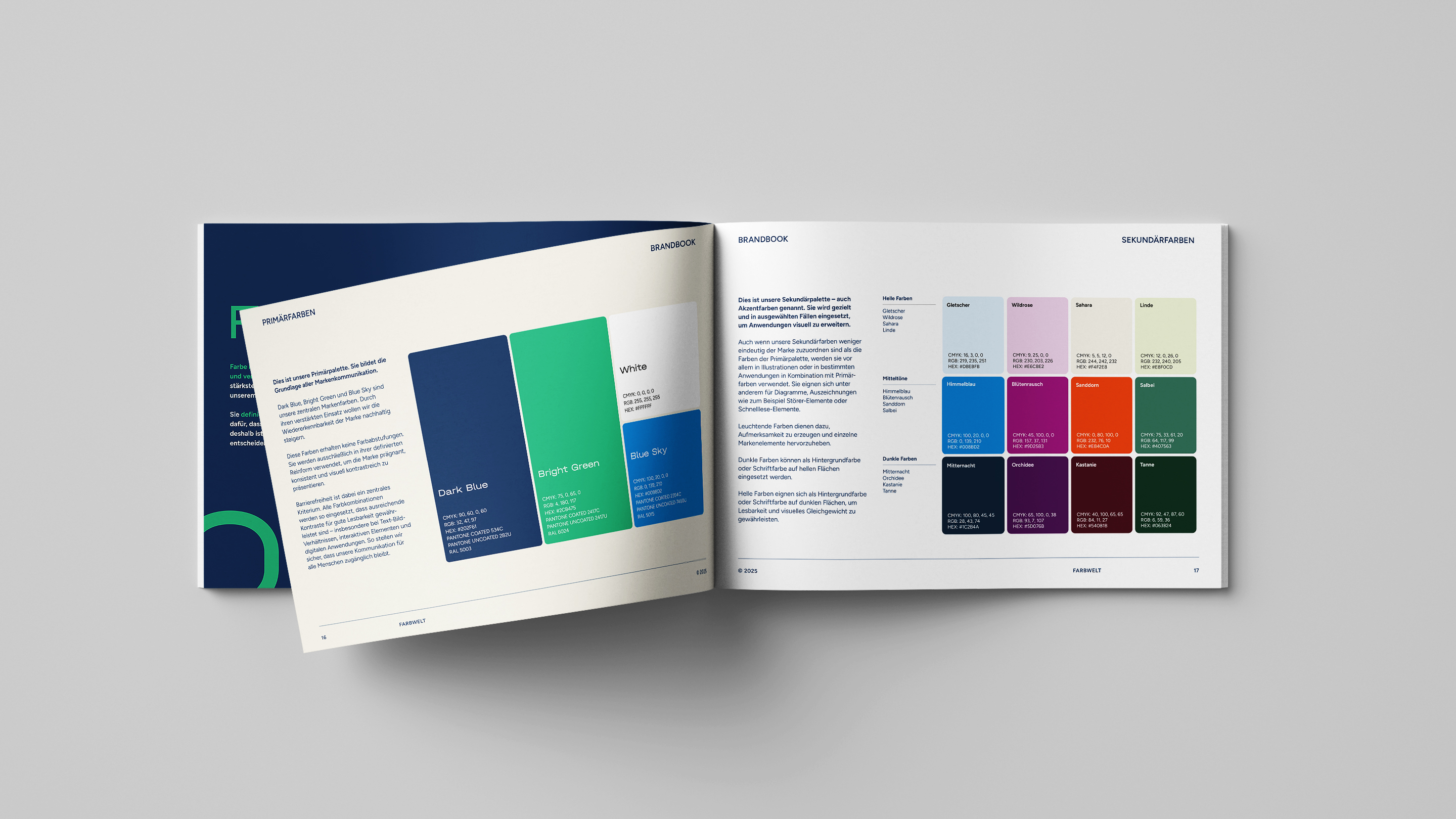
We developed a modern, barrier-free typography, clear color schemes and a consistent design language to match the new look. A comprehensive style guide defines all visual elements – from the logo and icons to the authentic, approachable visual language. The relaunch strengthens afb social & green IT’s visibility in the market and clearly positions it as a premium refurbisher and Europe’s largest non-profit IT company. We also continue to provide strategic support for afb social & green IT in terms of content: with PR work, C-level communication and reputation building. The result is a coherent brand image – visually, communicatively and in terms of public perception.
More information:
Our client: afb social & green IT
All projects for our client afb










 back
back