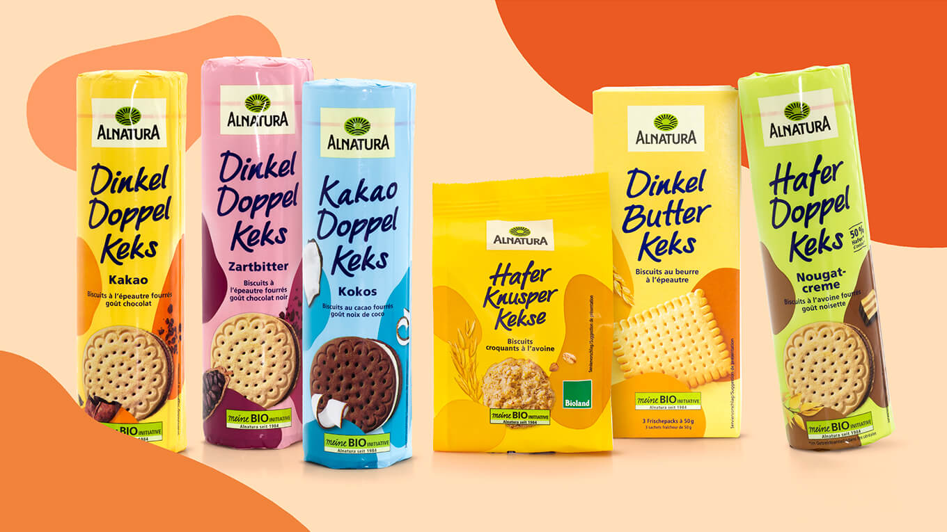
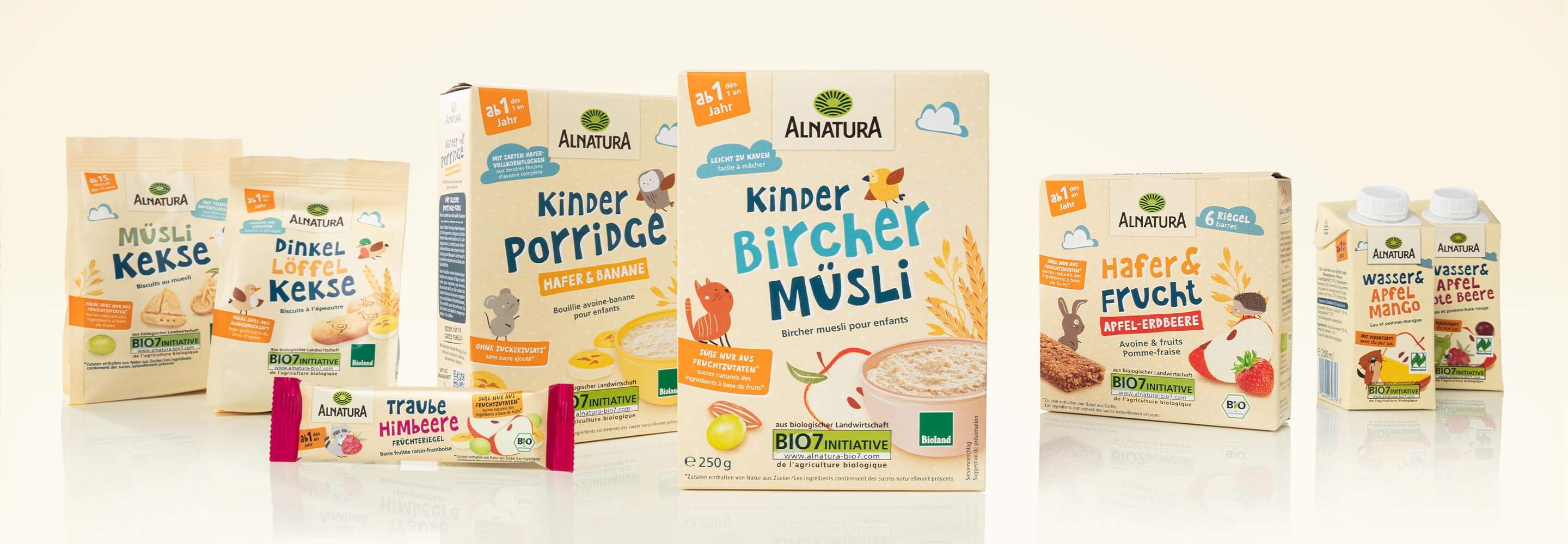
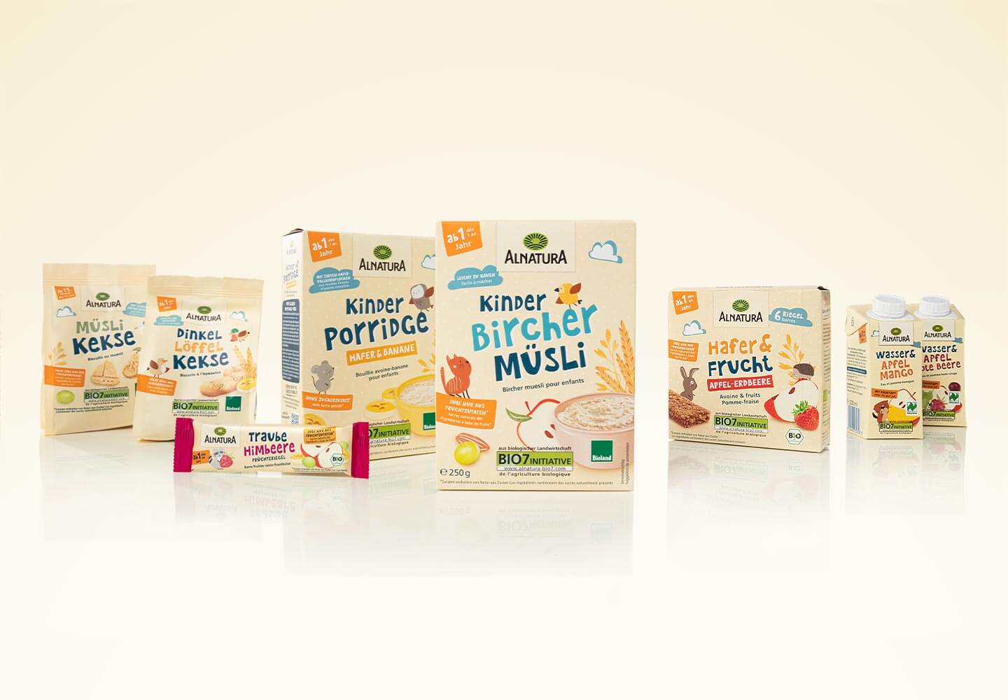
The aim of the redesign of the Alnatura children’s products was to inspire both children and parents with a loving redesign. The packaging should not only look appealing and modern, but also playfully convey the values of Alnatura. Particular attention was paid to emphasizing the uniqueness of the brand: Authenticity, naturalness and premium organic quality remain the focus.
In addition to a fresh, contemporary design, the comprehensibility of the product communication was also optimized. Clear, friendly design elements ensure an appealing look that creates trust and arouses children’s curiosity. The new packaging gives the products more vibrancy and highlights their special features. At the same time, the design should not only appeal to existing Alnatura customers, but also reach new target groups.
This careful but effective revision has created a harmonious balance between child-friendly design and proven Alnatura quality. The result is a visual language that convinces parents and inspires children – and positions Alnatura children’s products even more strongly in the market.
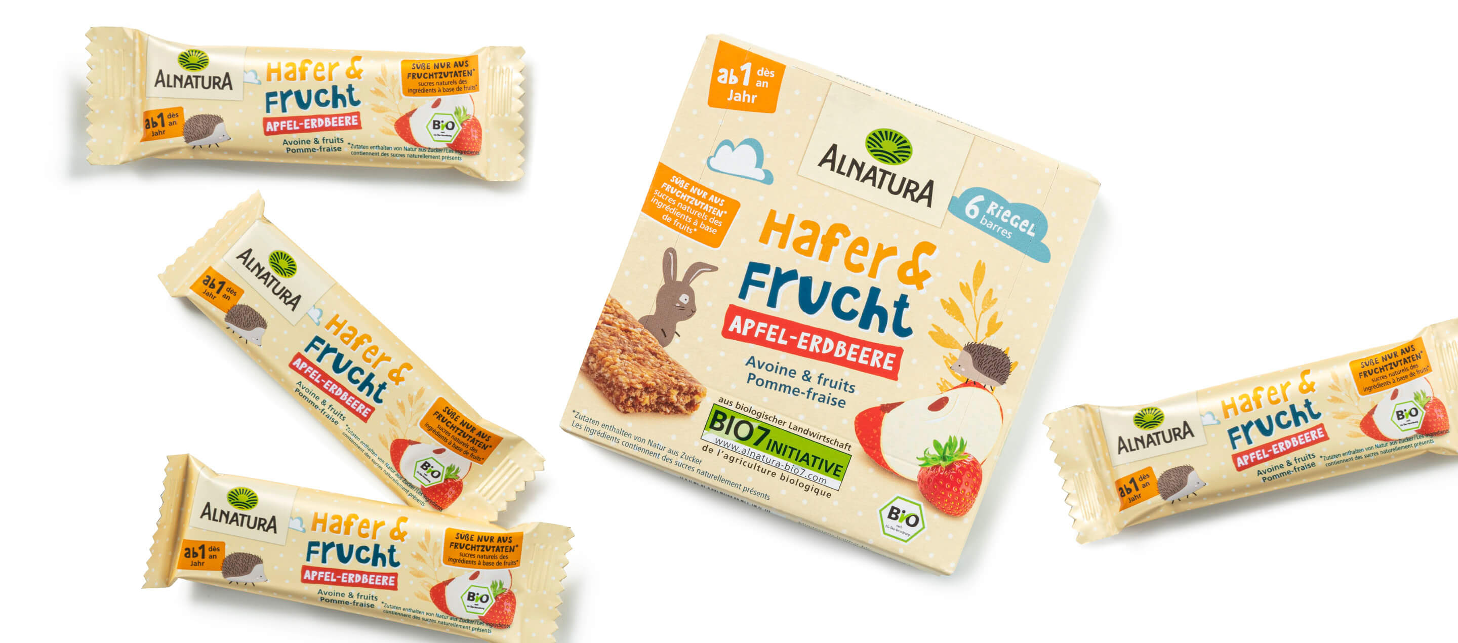
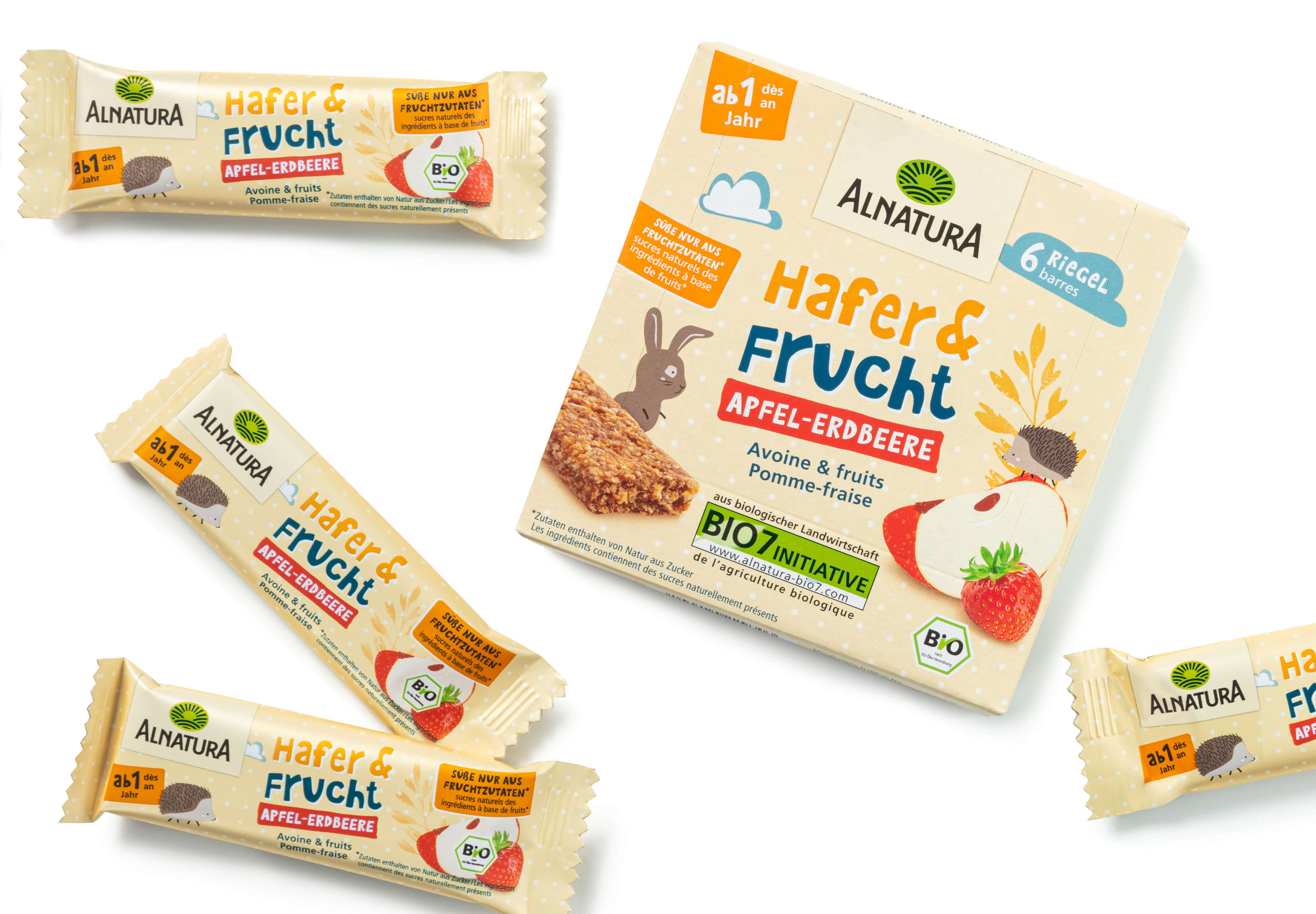
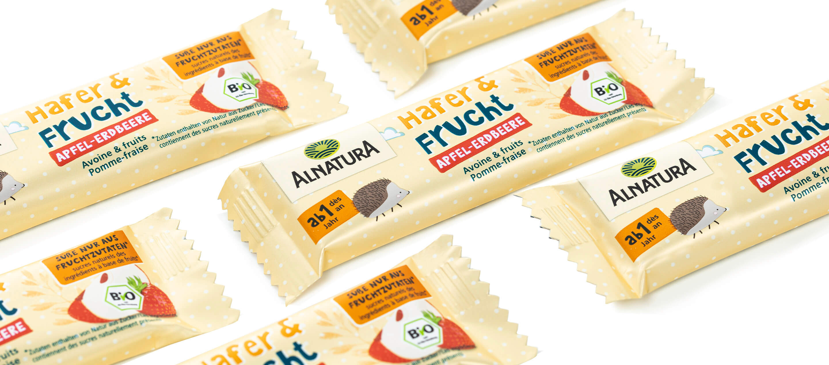
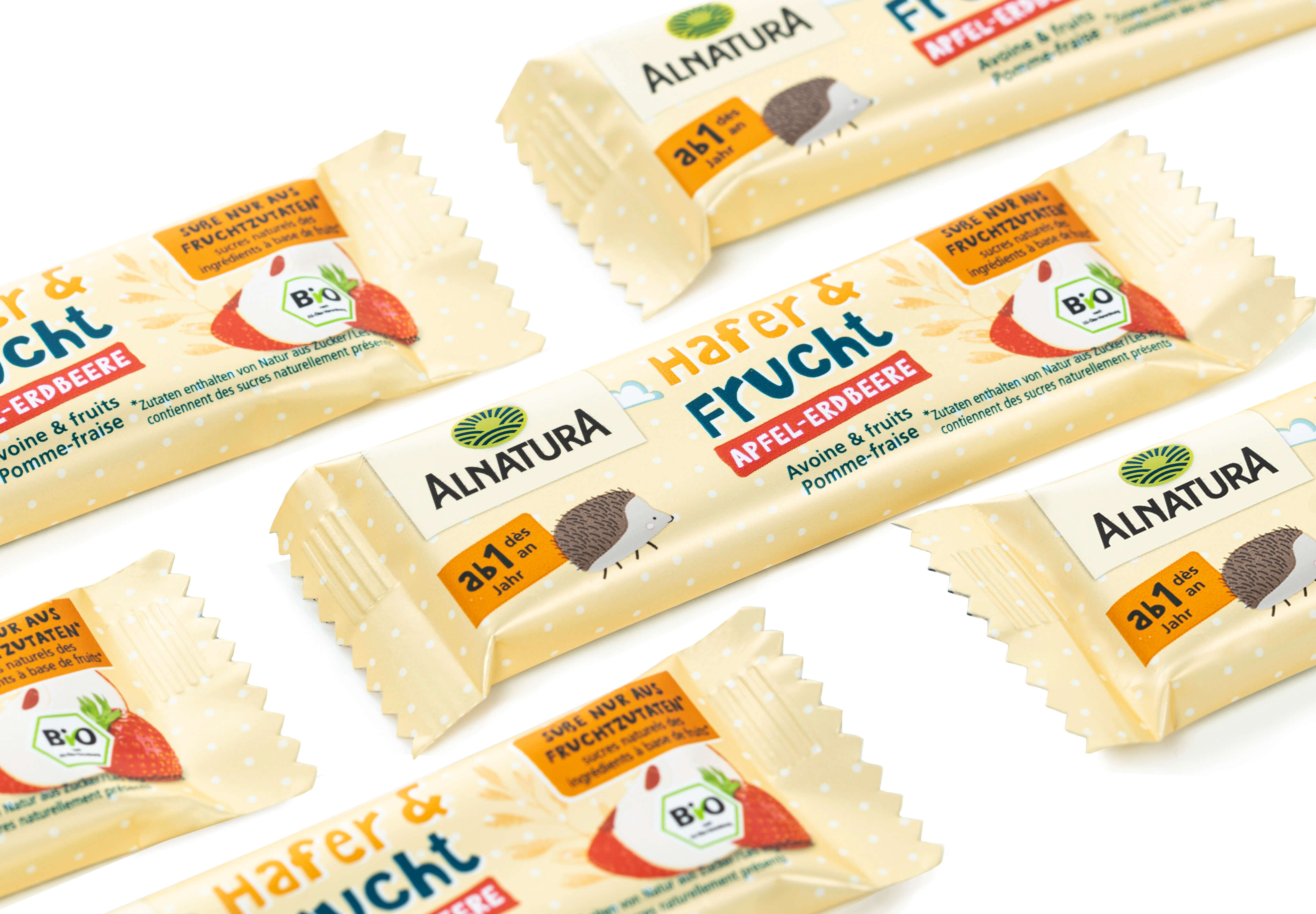
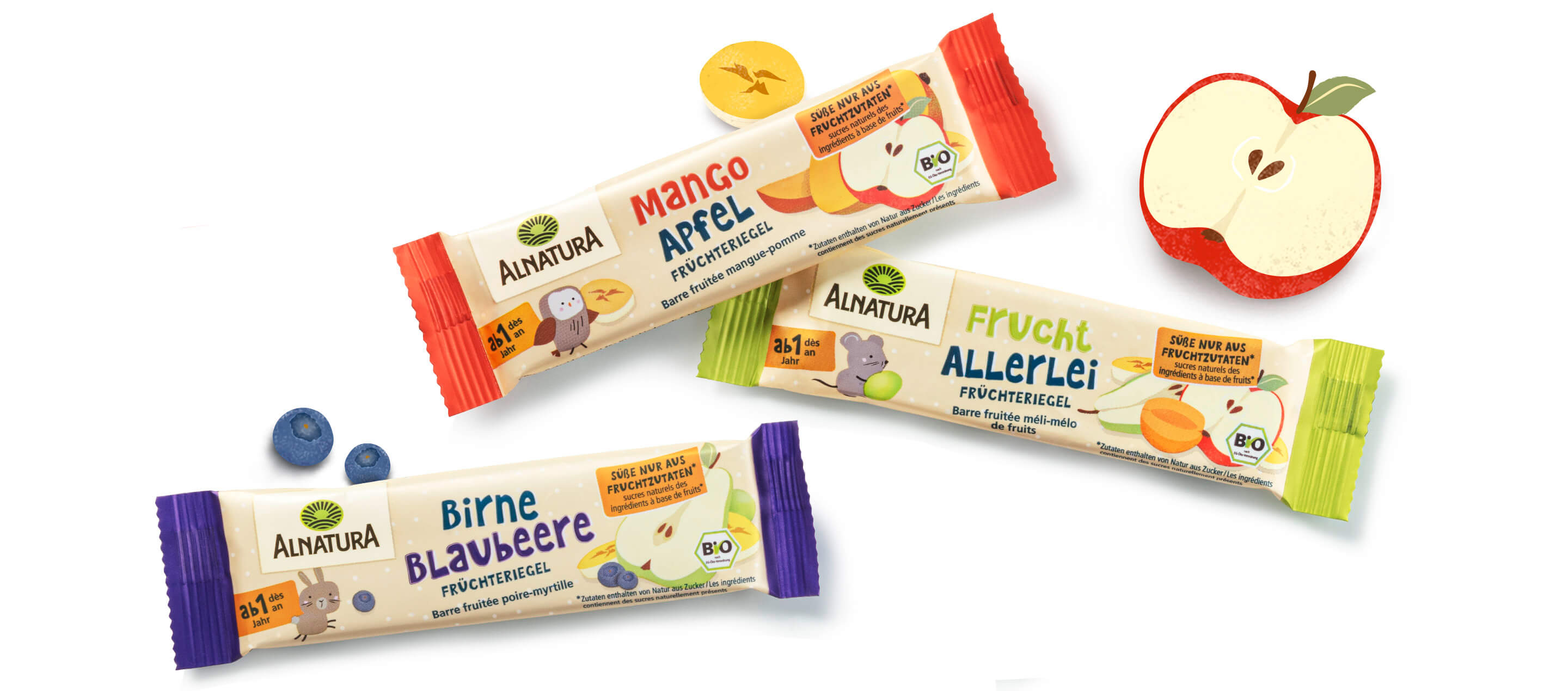
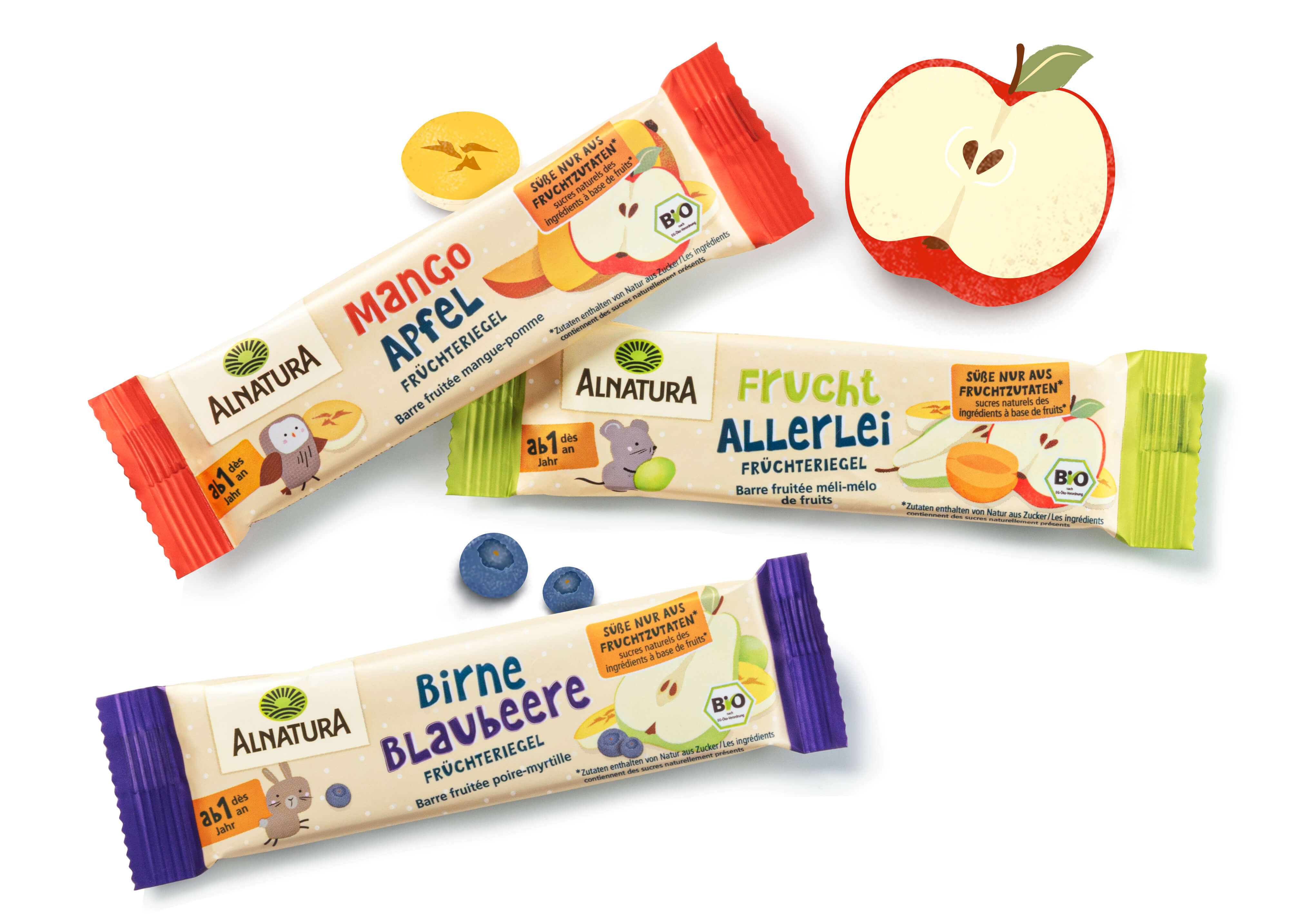
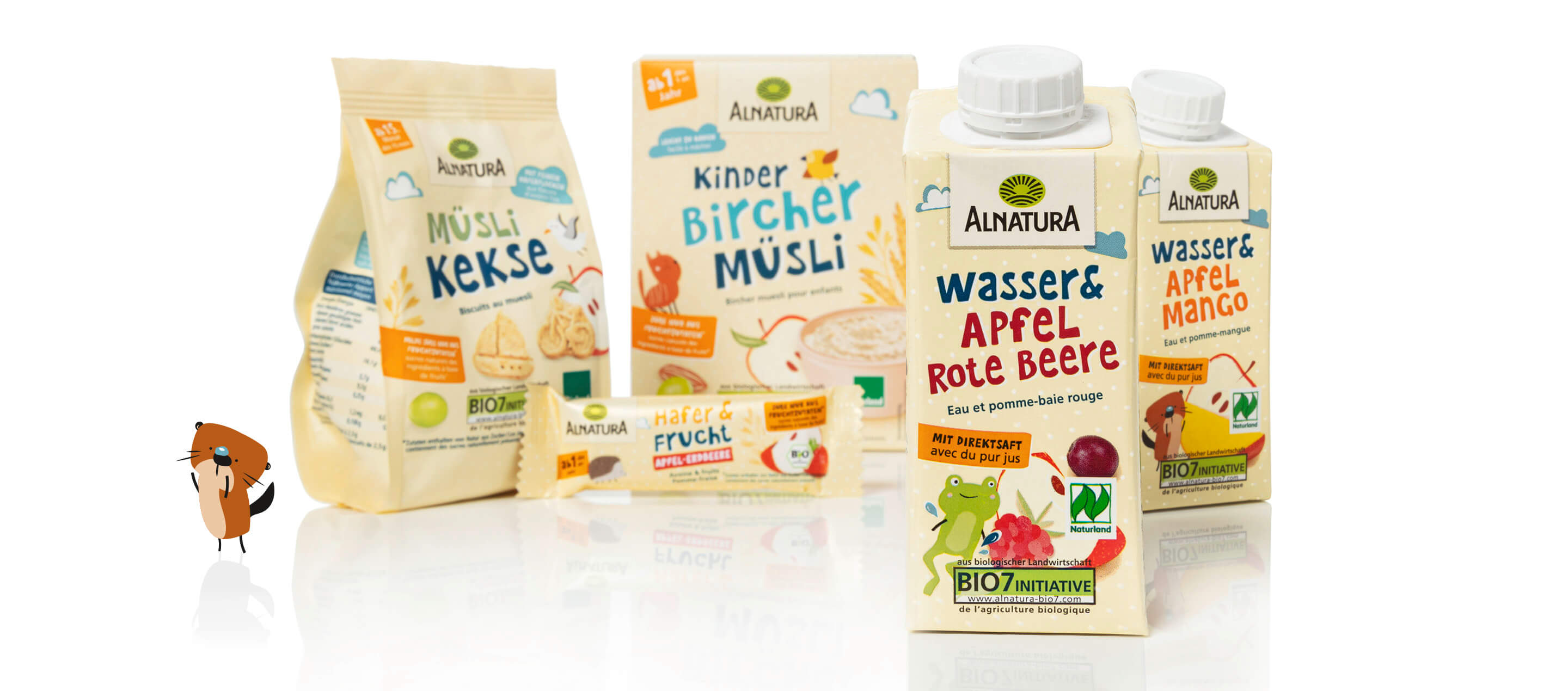
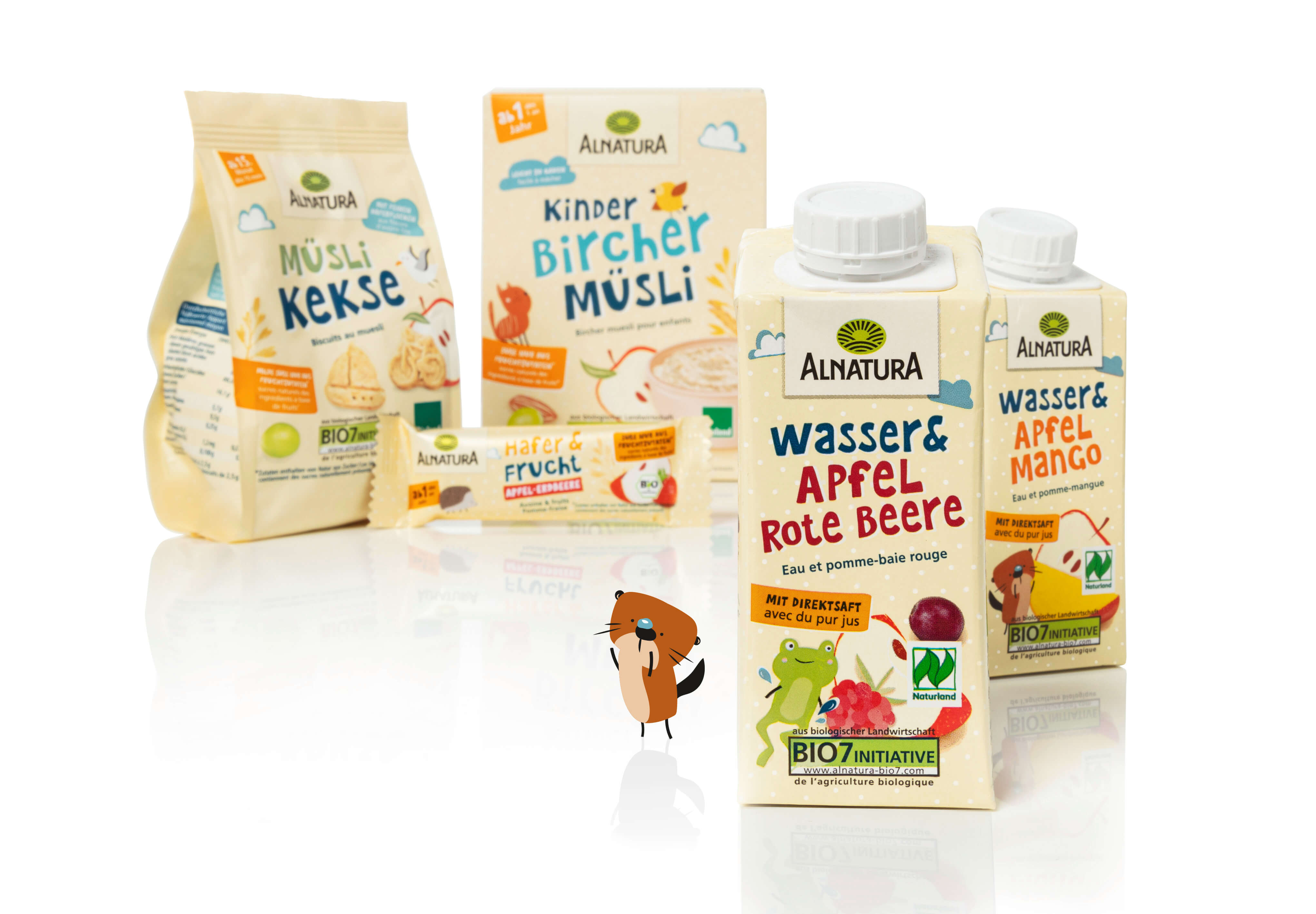
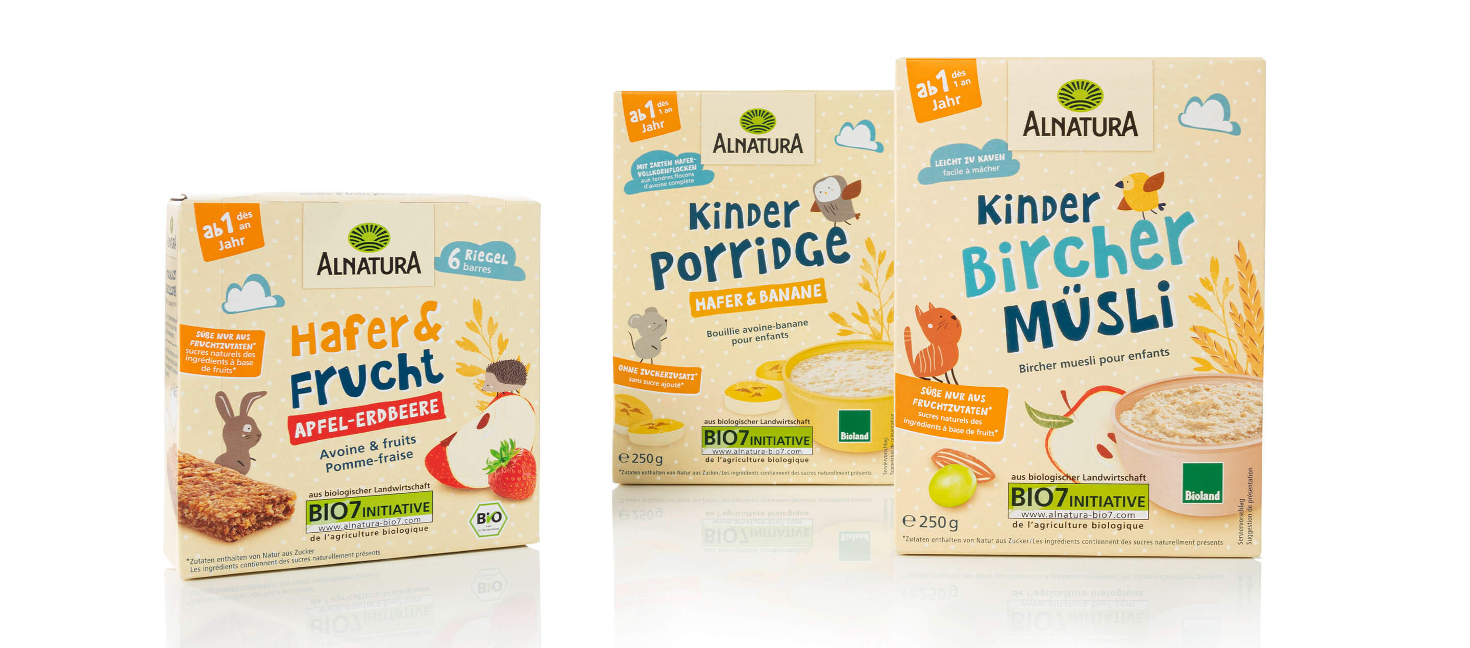
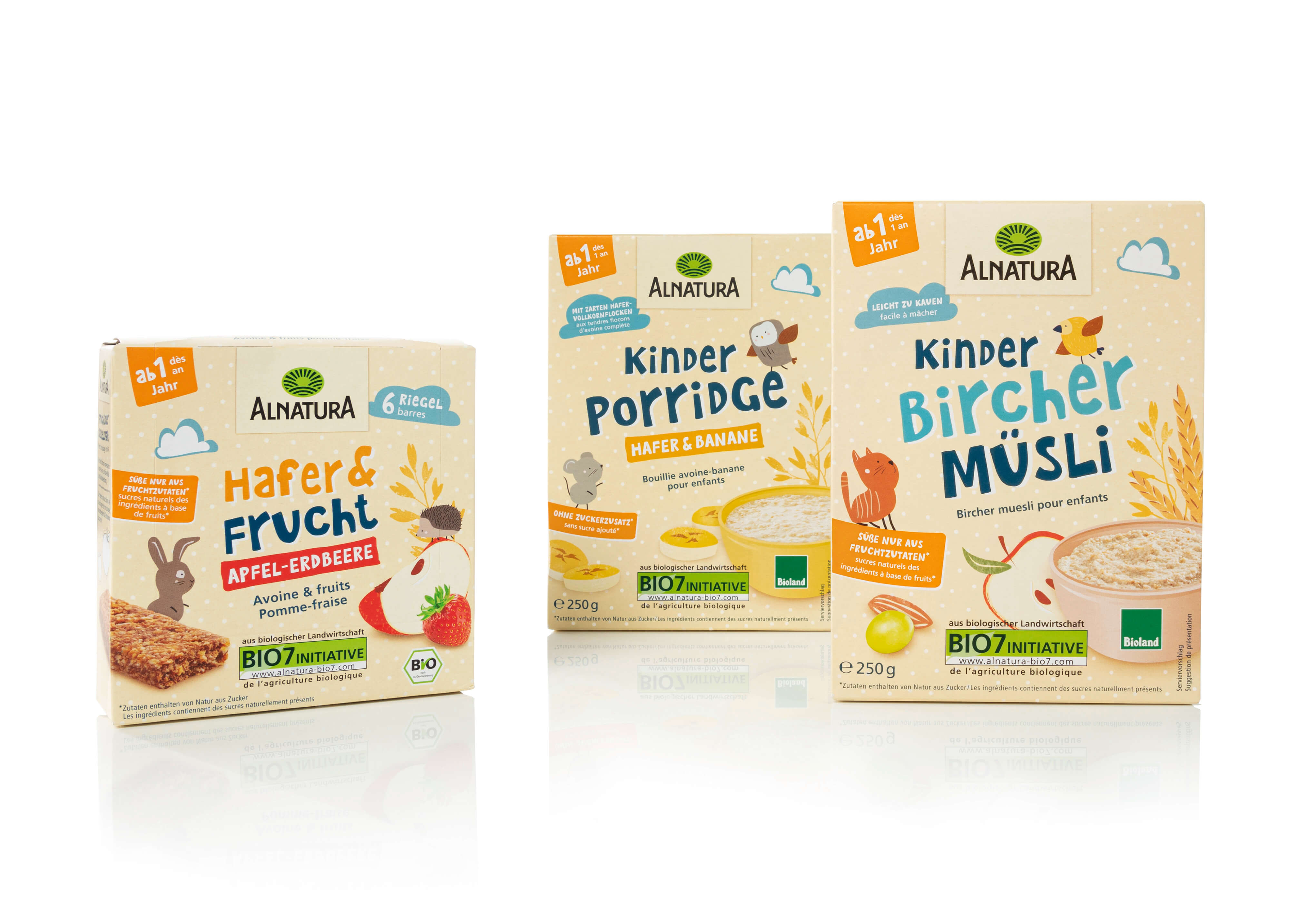
Targeted accents with warm colors have created harmonious and at the same time “tangible” packaging that invites the eye to discover. This applies in particular to the lovely animal and nature illustrations on the children’s Bircher Muesli, which make for a playful and appealing design. They create a positive emotionality that underlines the naturalness and high quality of Alnatura products. This creative approach intensifies the product experience and appeals to both children and parents. In addition to muesli, the newly designed products also include bars, snacks and mini rice cakes. The packaging conveys value and encourages a conscious approach to high-quality organic ingredients. In addition, clear design elements and uncluttered typography facilitate orientation and make the product information easy to grasp at a glance. This not only improves aesthetic perception, but also strengthens trust in the brand. Alnatura relies on a design that focuses on sustainability and naturalness without sacrificing playful details. The packaging invites consumers to consciously engage with the valuable ingredients.
More information:
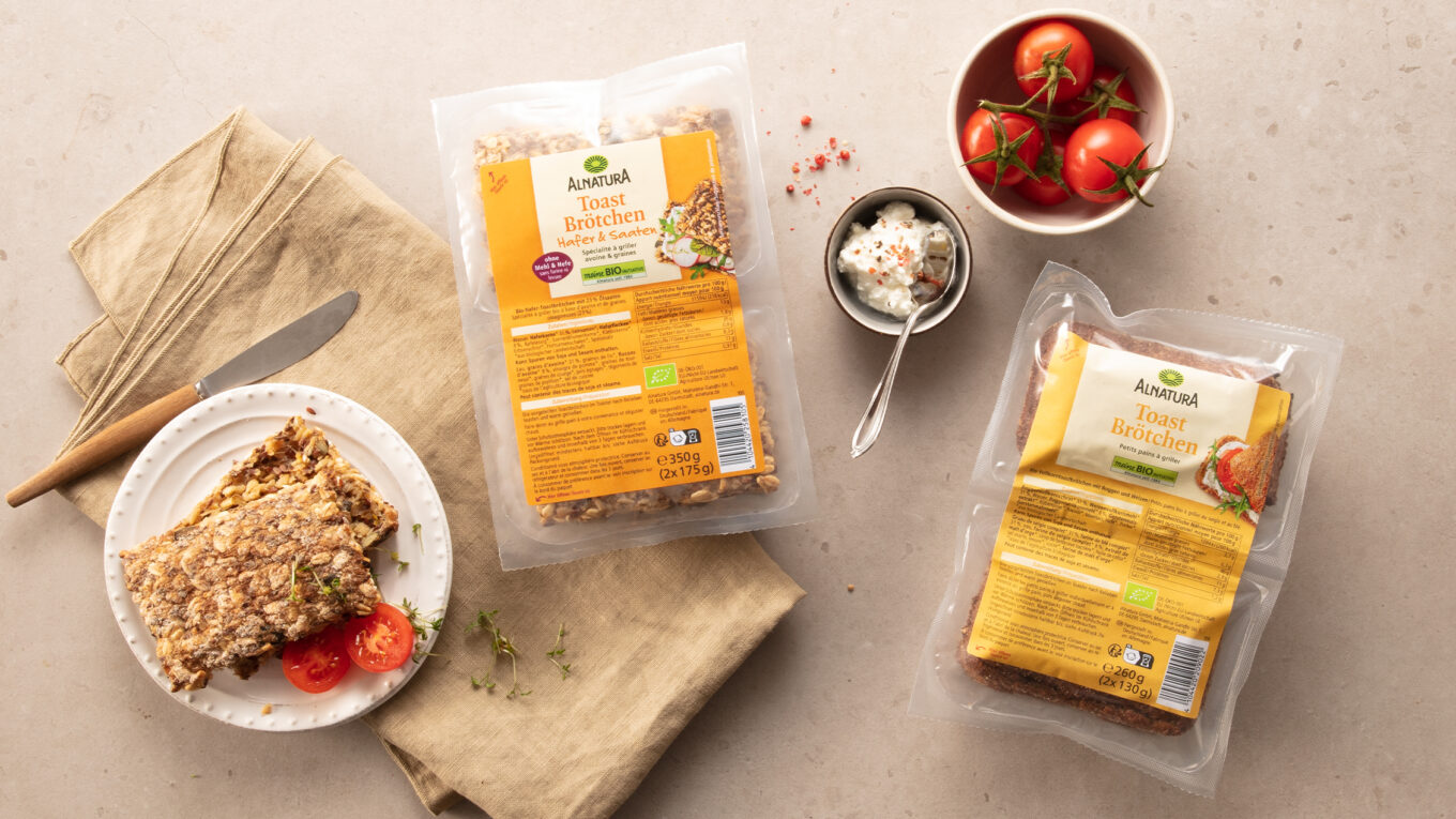
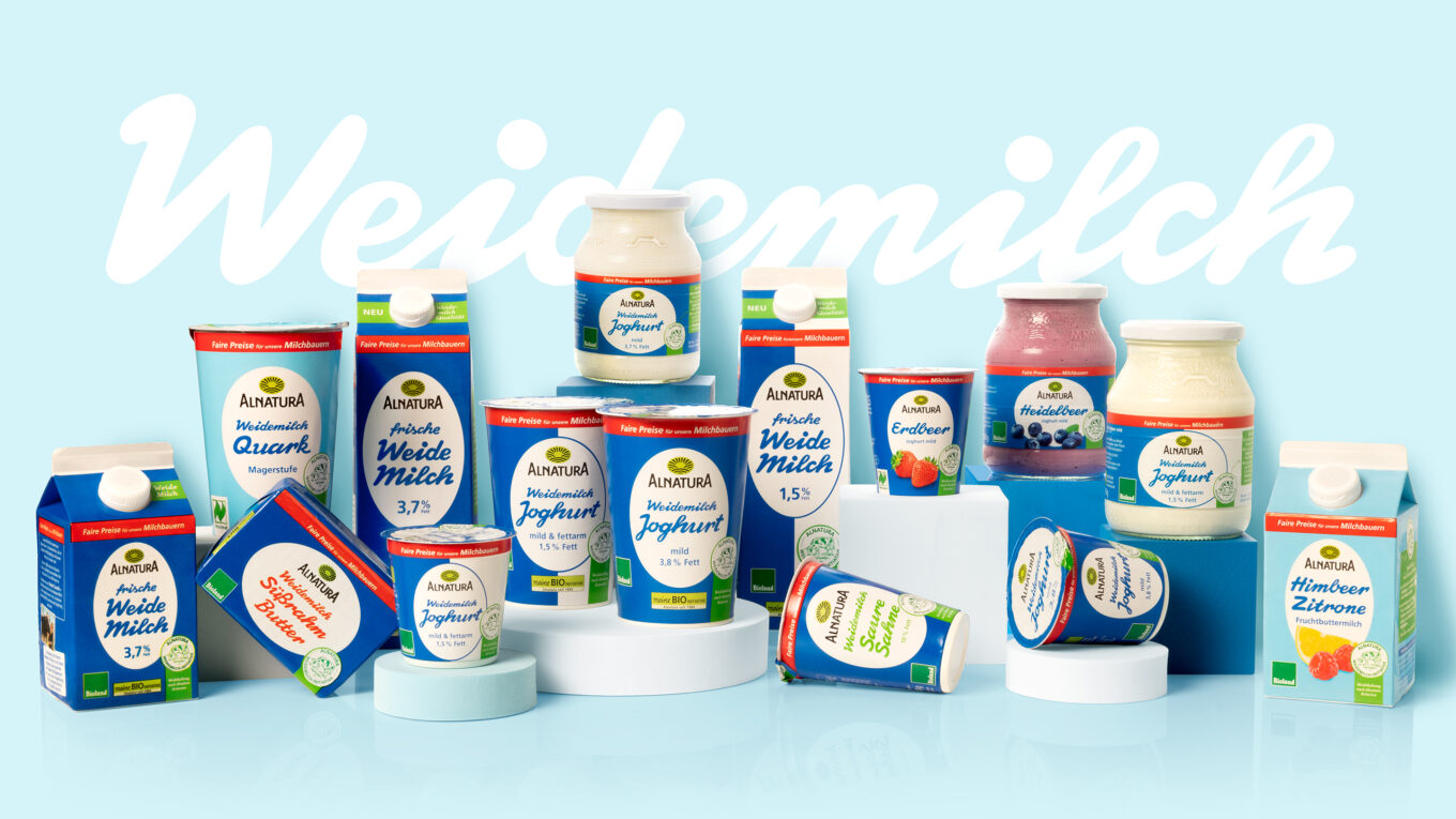
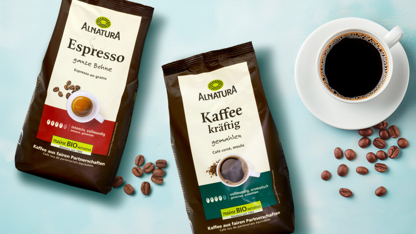
Our client: Alnatura
All projects for our client Alnatura