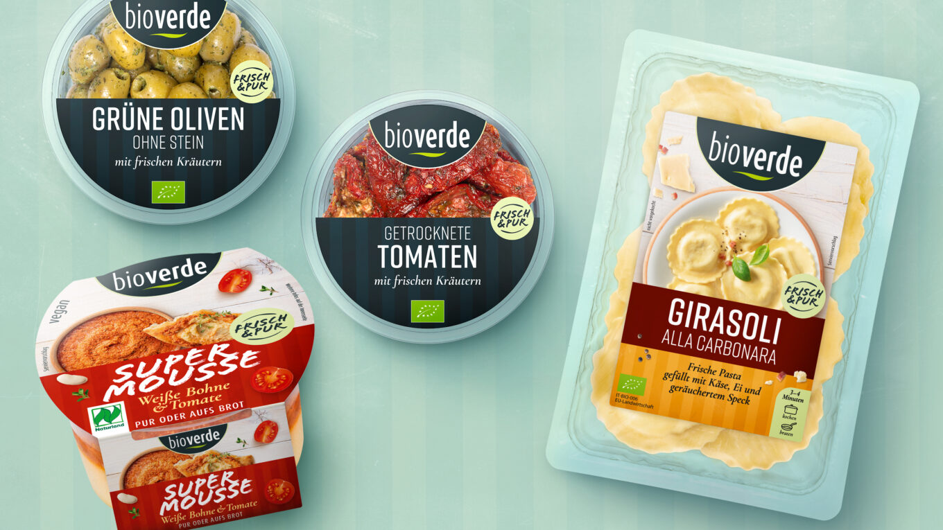
bio-verde has been producing delicatessen products from carefully selected organic ingredients in Eresing, Bavaria, for over 30 years. When developing the new communication presence, we were inspired by the packaging design market mark. The result: a harmonious appearance that whets the appetite for great enjoyment from the world’s markets.
The key visual was created from the semicircle of the bio-verde logo, which we completed – and which now unites the world of enjoyment of bio-verde on a plate. This stands in particular for balance, perfect taste, fine delights and high-quality organic ingredients.
The key visual is also played out consistently in the ad motifs. The paper and board textures ground the design and also underline the premium organic quality. Together with the color palette in different shades of green, we created a light and natural overall look.
The website www.bio-verde.de uses simple, customer-friendly navigation and informative content with a focus on origin, enjoyment and the (delicatessen) range to attract users and introduce them to bio-verde’s high quality standards.
Changing topics such as new product presentations, fine cuisine and competitions generate traffic on the social media channels.
For the food photos, we placed the bio-verde delicatessen products in a new context of enjoyment. The lovingly arranged plates and bowls are the highlight, accompanied by fresh, delicious ingredients. Combined with organic materials and matching props, an emotional visual world has been created – with plenty of organic food appeal.
More information:
Our client: Bio-Verde
All projects for our client Bio-Verde
More projects from our branding agency
