The SUSA brand stands for high-quality, feel-good underwired corsetry that has been manufactured with great care and traditional craftsmanship in Heubach, Baden-Württemberg, for over 150 years. With a clear focus on comfort, quality and fit, SUSA has established itself as a major player in the lingerie industry and combines traditional values with modern designs that appeal to women of all ages.
To further develop the brand in line with current trends and sharpen its strong identity, we carried out a comprehensive relaunch based on a joint branding workshop. As part of this process, the entire brand identity, logo, and packaging design were fundamentally revamped to create a more modern, fresh, and at the same time authentic brand presence.
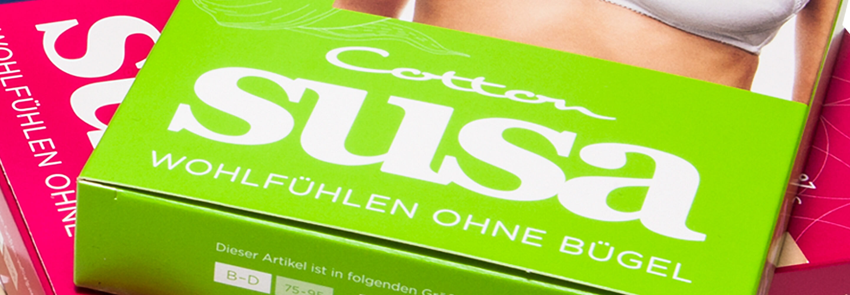
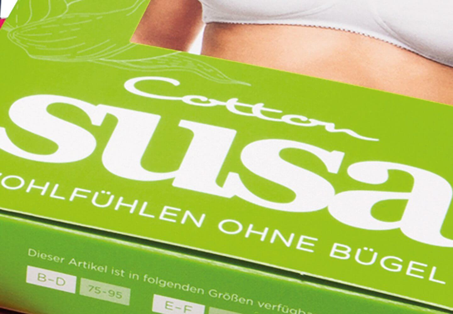
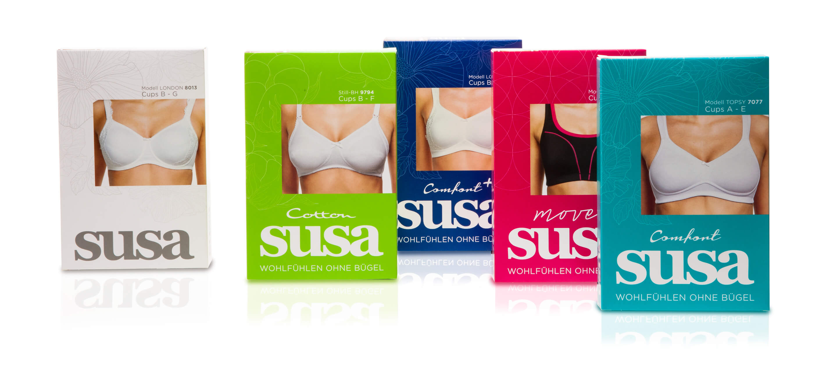
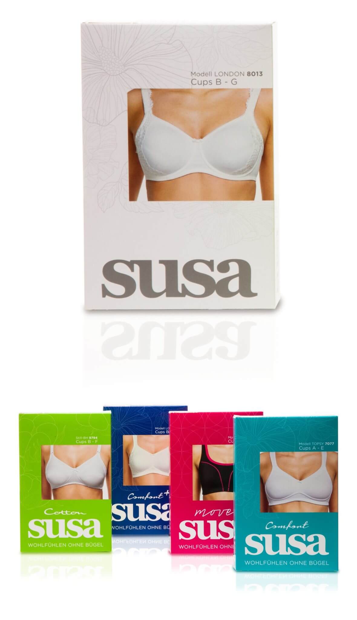
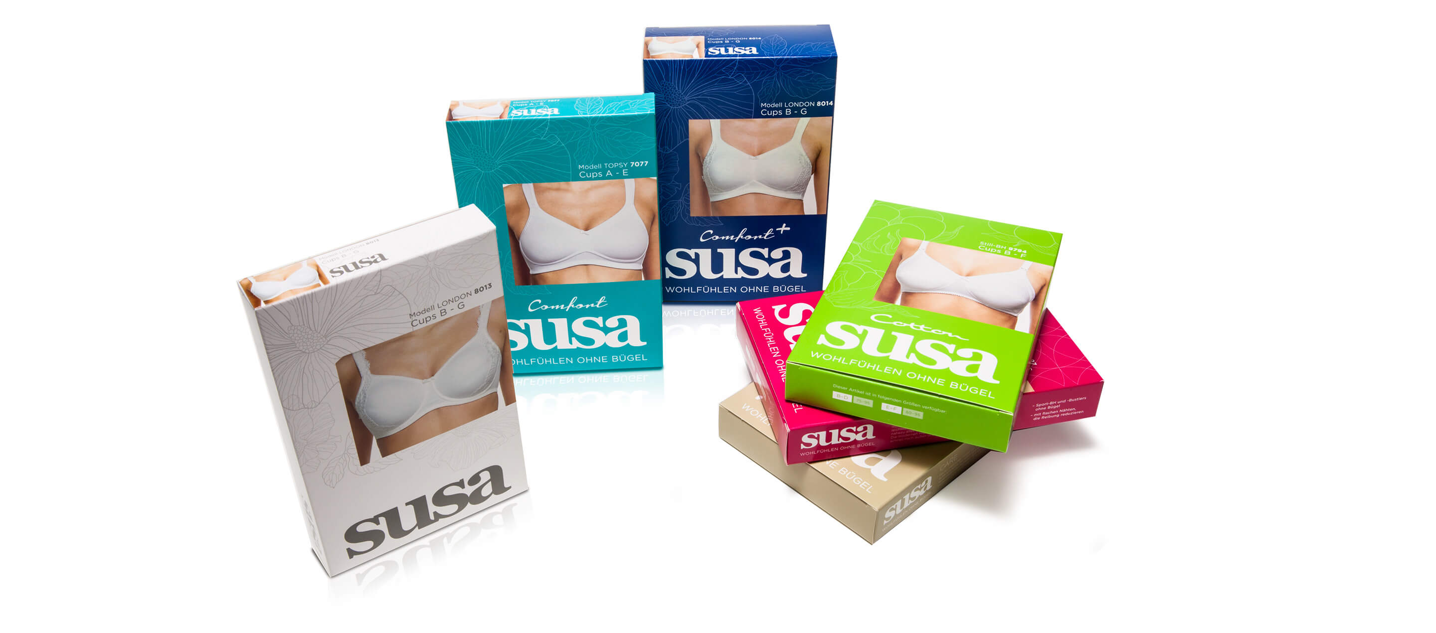
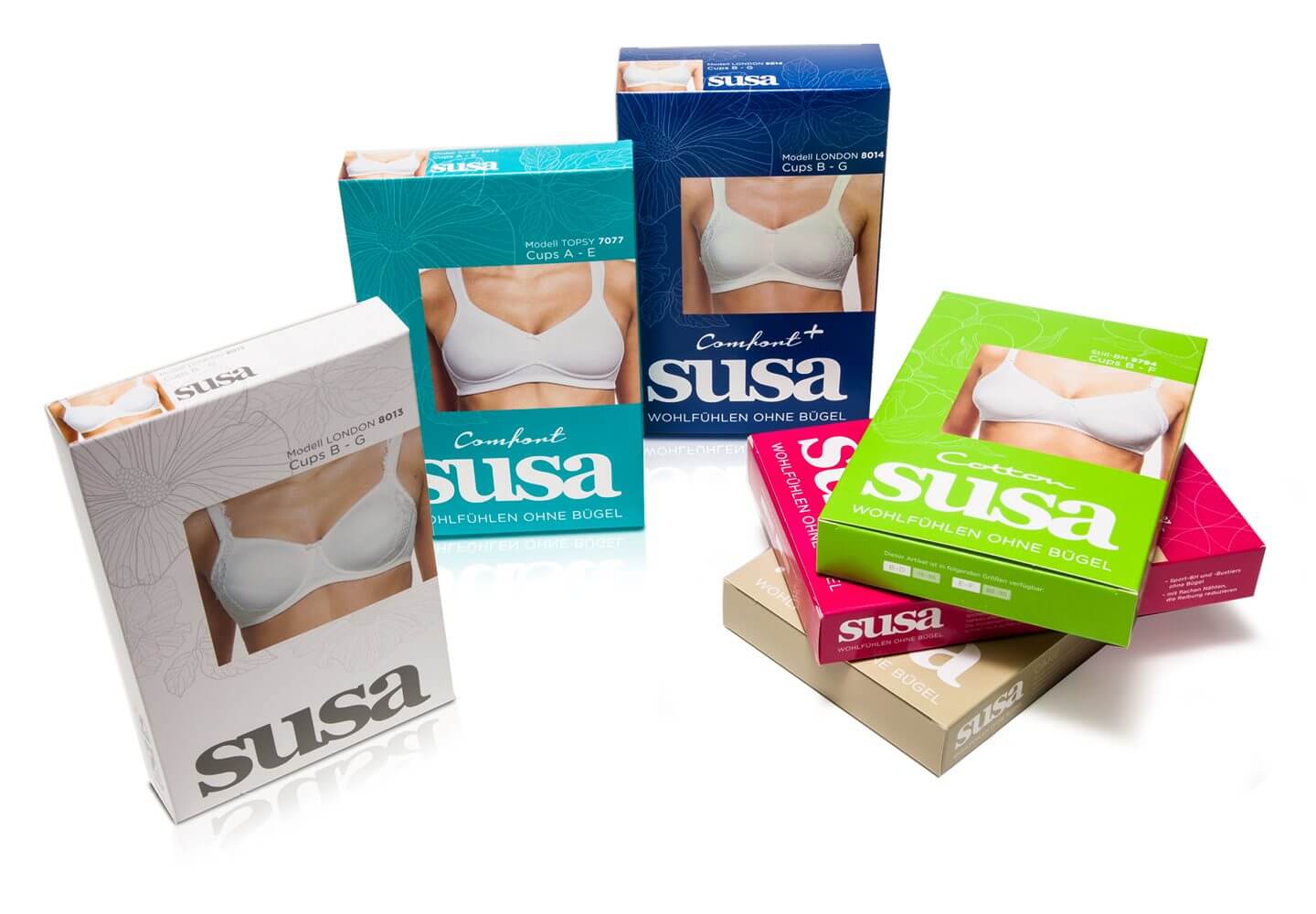
The new logo design conveys clarity and elegance, while the revised packaging emphasizes the high quality of the products through a contemporary design with harmonious colors and clear typography. In addition to the visual redesign, the brand communication was also further developed to position SUSA as a timeless, style-conscious and at the same time comfort-oriented brand.
The relaunch not only strengthened the brand’s recognizability, but also reinterpreted its core values – comfort, quality and tradition – in a modern way. SUSA now presents itself with a clear, uniform image that perfectly reflects the combination of traditional craftsmanship and innovative design.
The pack design has been developed to work in different colors for the different categories.
The result is a very feminine and sometimes playful design that can now also appeal to a younger target group. More about our customer SUSA here.
More information:
Our client: Susa
All projects for our client Susa
More projects from our branding agency and packaging design agency








 back
back