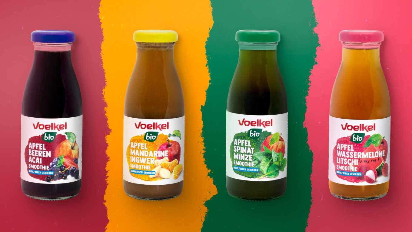
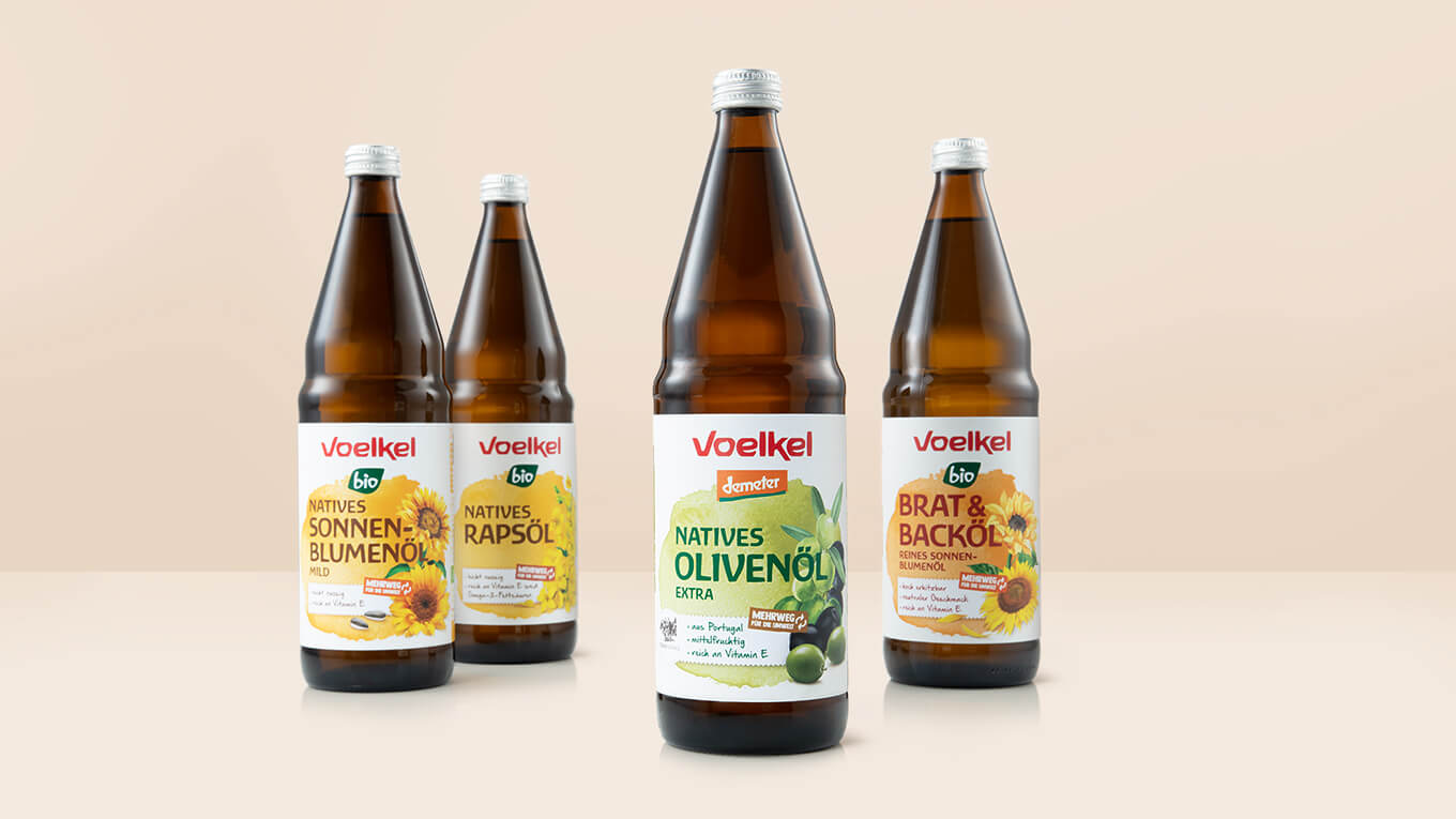
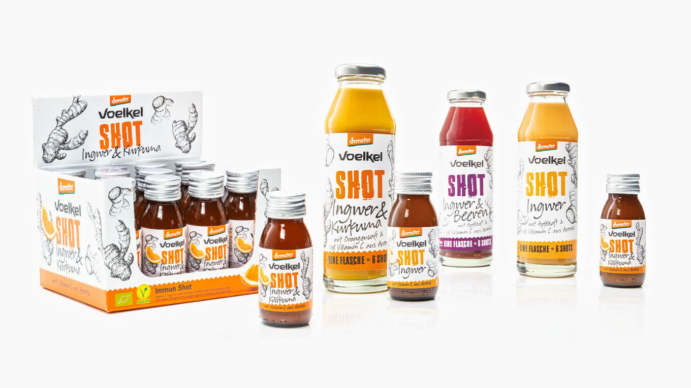
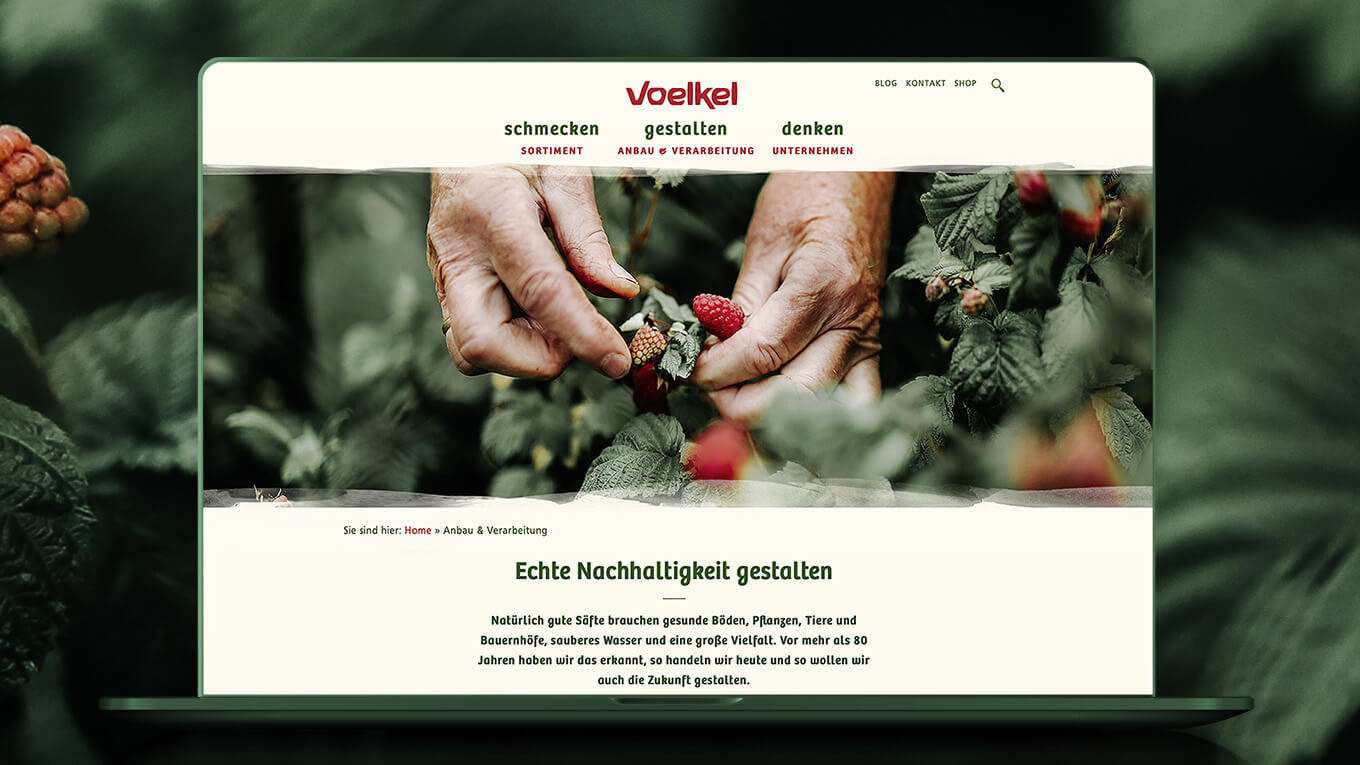
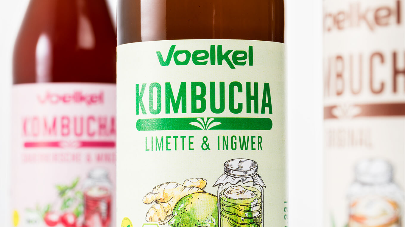
With the redesign of its core range, Demeter pioneer Voelkel is once again positioning itself as a brand with one of the highest quality standards when it comes to juice. The new look is more modern, clearer and more colorful – without completely breaking with the tried and tested.
We have said goodbye to the anthroposophical sun that used to shine in the background. Instead, an organic color surface now forms the defining element on each label. All important information is bundled here. At the same time, the color serves to differentiate the fruit juices: This is based on the main fruit variety of the respective juice.
In addition to the color scheme, the combination of illustrations and photos in the presentation of the ingredients is also new: In the foreground, real pictures demonstrate the freshness of the raw ingredients, while the illustrative elements symbolize craftsmanship and tradition. For juices with a high vitamin content, for example, a disruptive label with the words “Good for your immune system” has also been developed. The logo hierarchy has also been adjusted: The Voelkel brand name is now at the top of the hierarchy, followed by the Demeter logo or an organic flag, depending on the quality.
Consumers can find further information on the side of the label: For example, about the charitable foundation behind the Voelkel brand, but also about Demeter quality, cultivation cooperatives or properties and benefits that distinguish the respective juice. The various additional information is clearly structured and color-coded for quicker comprehension.
Lined up on the shelf, the bottles of the Voelkel core range with their new look provide a striking face and a wonderful play of colors that makes you want to enjoy natural food juice.
More information:
Our client: Voelkel
All projects for our client Voelkel
