The new Alnatura muesli packaging has a modern yet timeless design that appeals to all generations who value a conscious start to the day. The focus was not only on an appealing look, but also on clear, intuitive orientation. The new packaging design conveys enjoyment, naturalness and quality – core values of the Alnatura brand – and ensures a harmonious combination of aesthetics and functionality.
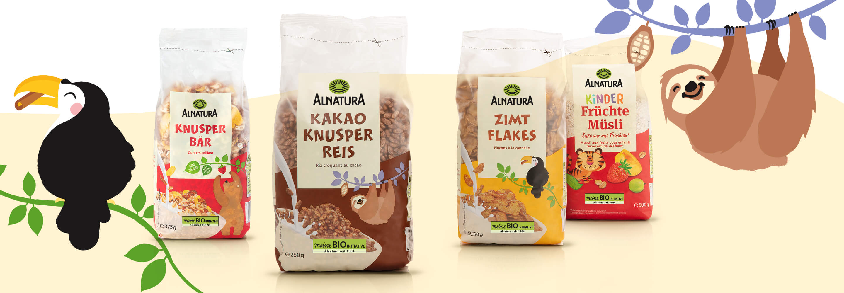
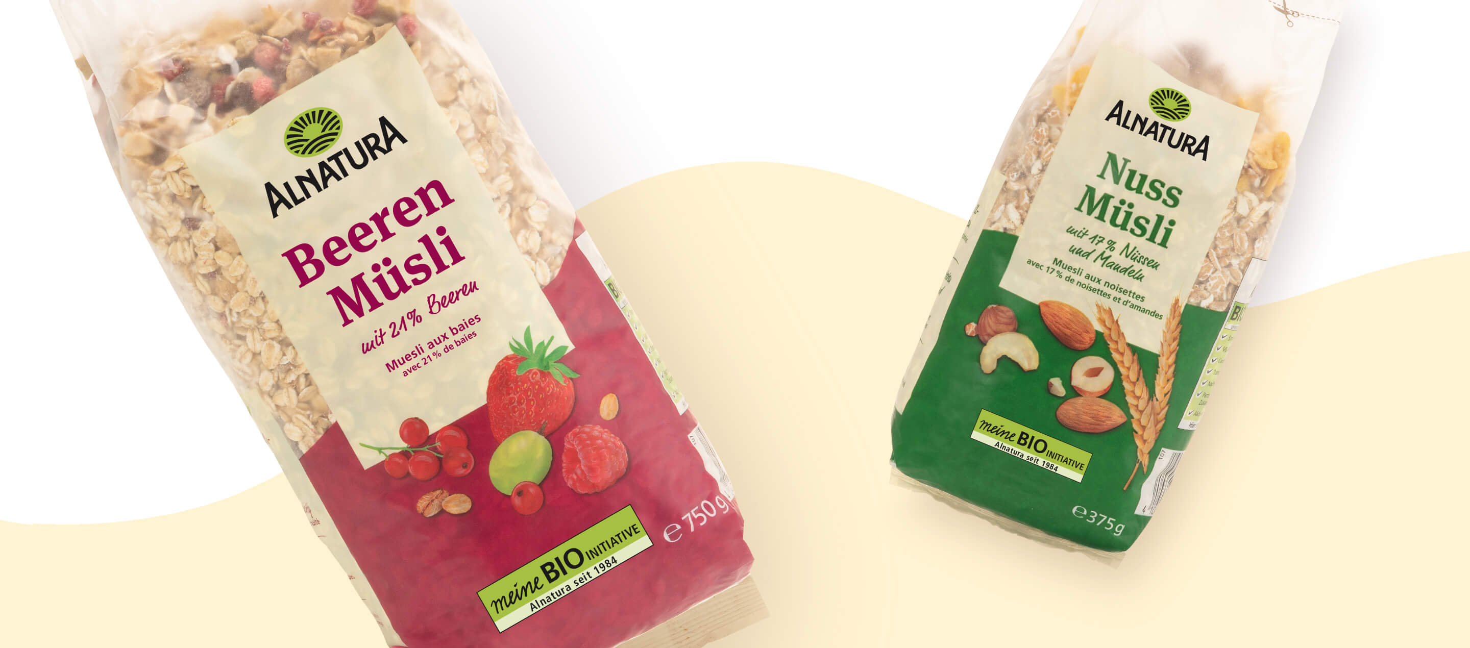
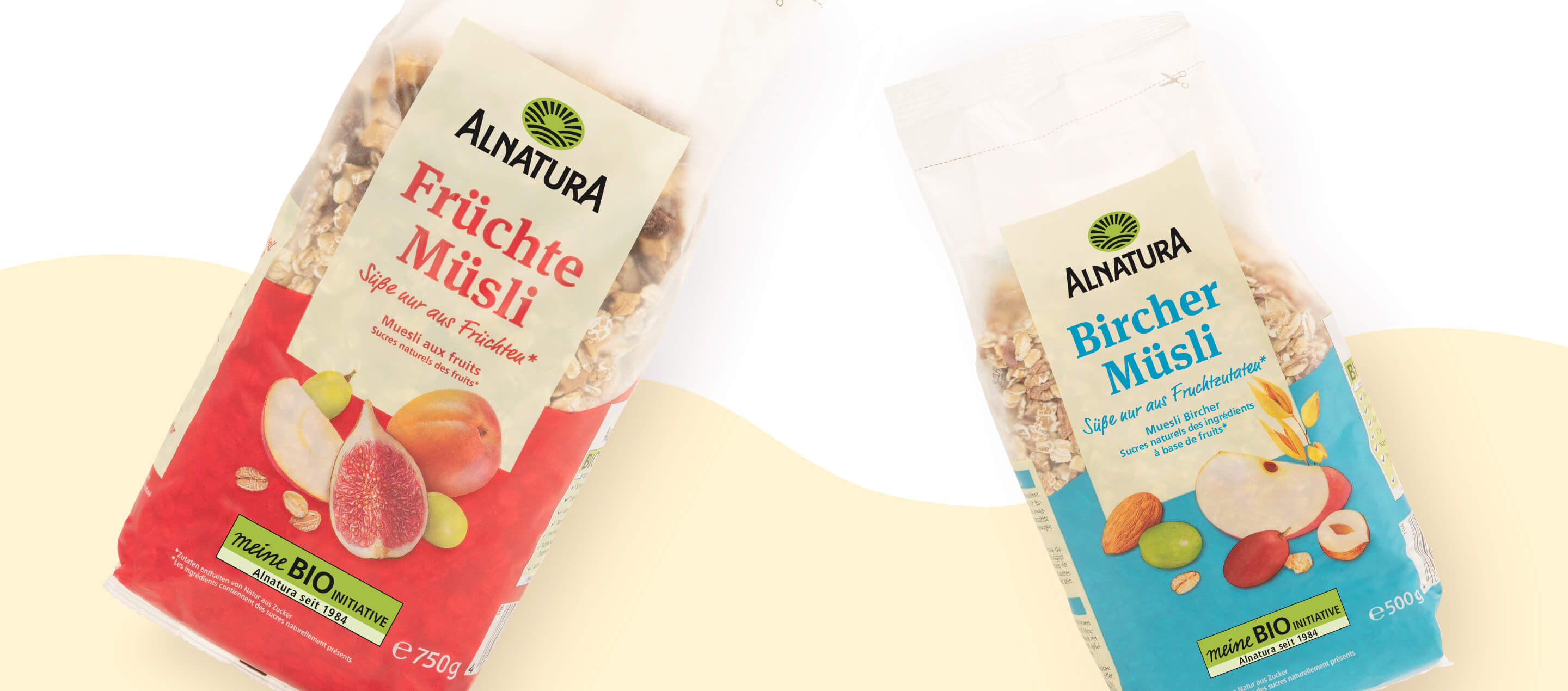
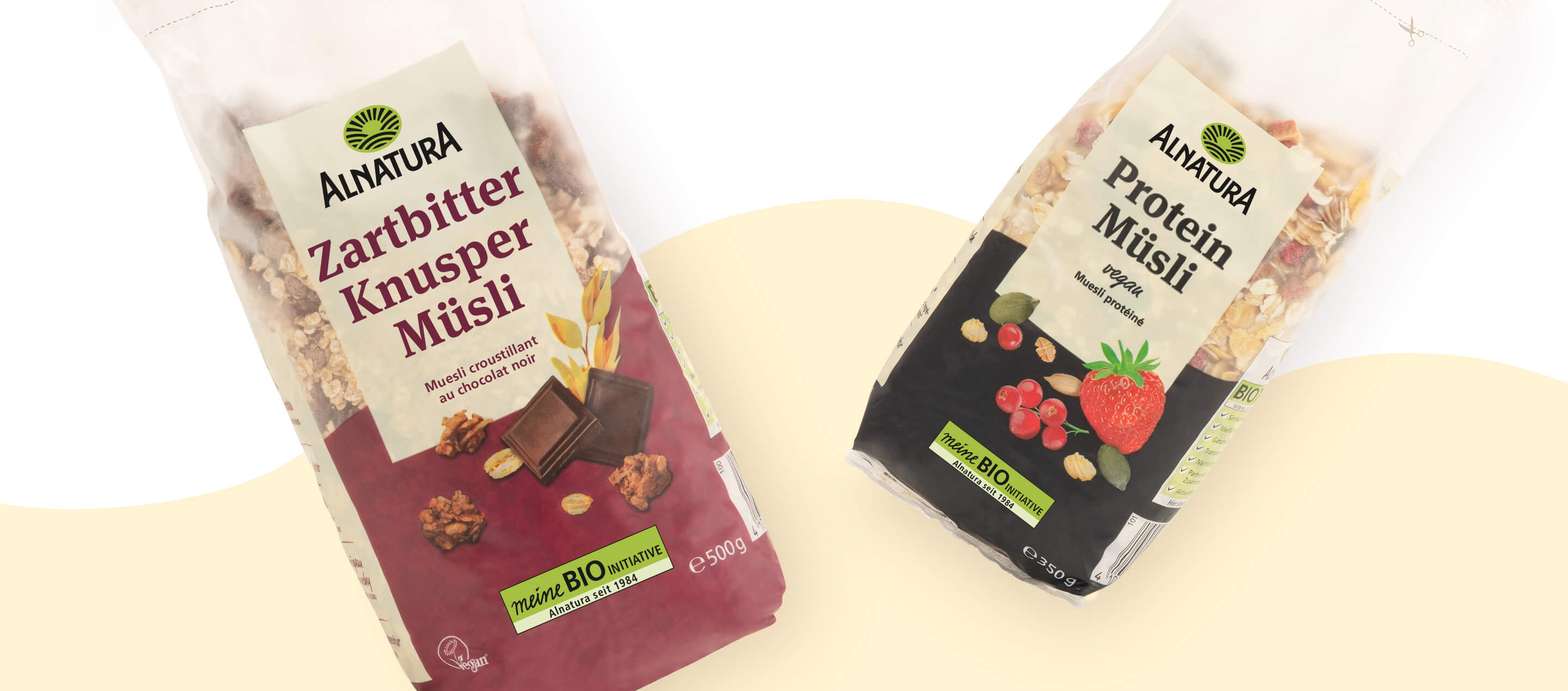
A key design element of the new Alnatura muesli packaging is the targeted use of the color code, which focuses on the flavor-giving ingredient of each variety. A sophisticated color scheme – from warm apricot to intense red and fresh green to various shades of blue – highlights each variety individually. This clear color structure not only enables quick differentiation between the products, but also facilitates orientation on the shelf. The deliberate choice of color also ensures an emotional appeal and reinforces the association with the natural ingredients. The look is complemented by large, detailed illustrations of the ingredients, which convey the genuine taste experience and visually underline the high quality of the products.
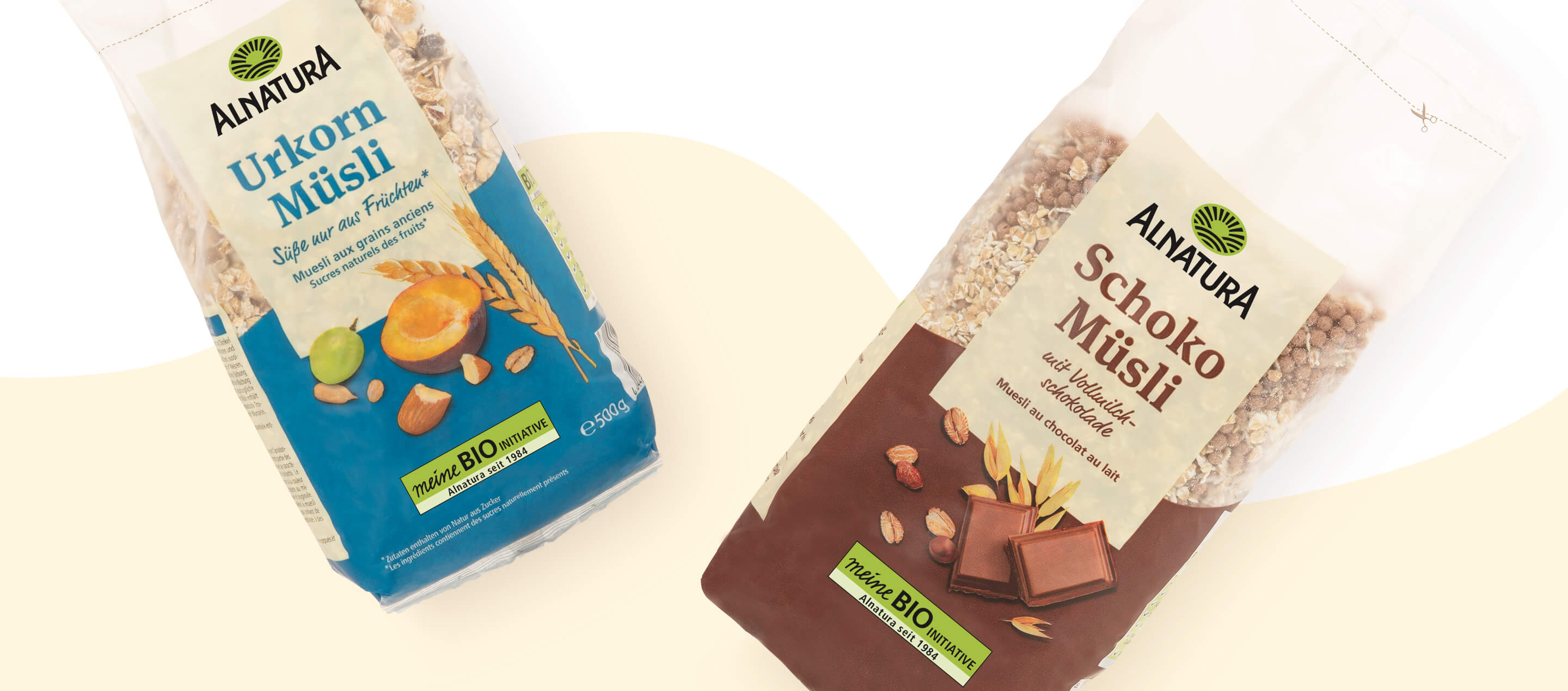
In addition to the color scheme, the typography also plays a decisive role in the new packaging design. The font design was deliberately chosen to create a balance between clarity, vitality and softness. This harmonious combination gives the packaging an inviting appearance and at the same time ensures a modern and high-quality look. The slightly organic design language of the typography emphasizes the naturalness of the Alnatura mueslis and creates a link to the artisanal quality of the products.
Another central design element is the beige color areas, which were used specifically to promote conciseness and recognition. They provide a calm, natural background that complements the color worlds of the individual varieties and creates a consistent design line. The deliberate reduction to natural, earthy tones reinforces the sustainable, authentic character of the Alnatura brand. At the same time, this design element gives the packaging a certain warmth and familiarity, making the design both emotionally appealing and high-quality.
The new packaging concept therefore combines aesthetics with functionality. It not only improves visibility in stores, but also creates a stronger visual brand identity. The redesign gives Alnatura mueslis a clear, contemporary presence that communicates naturalness, quality and taste in equal measure. The result is packaging that is both visually appealing and authentically conveys the values of the Alnatura brand – for a conscious indulgence experience from the very first glance at the shelf.
Further information:
Our customer: Alnatura


 back
back