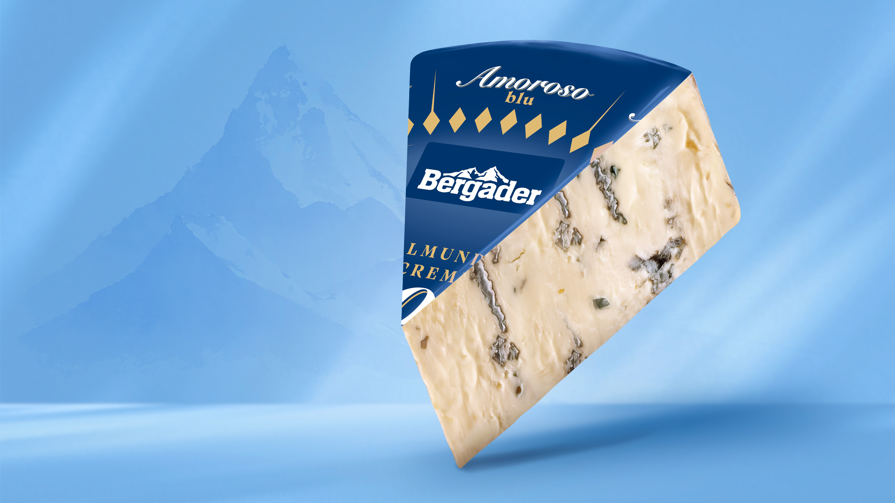
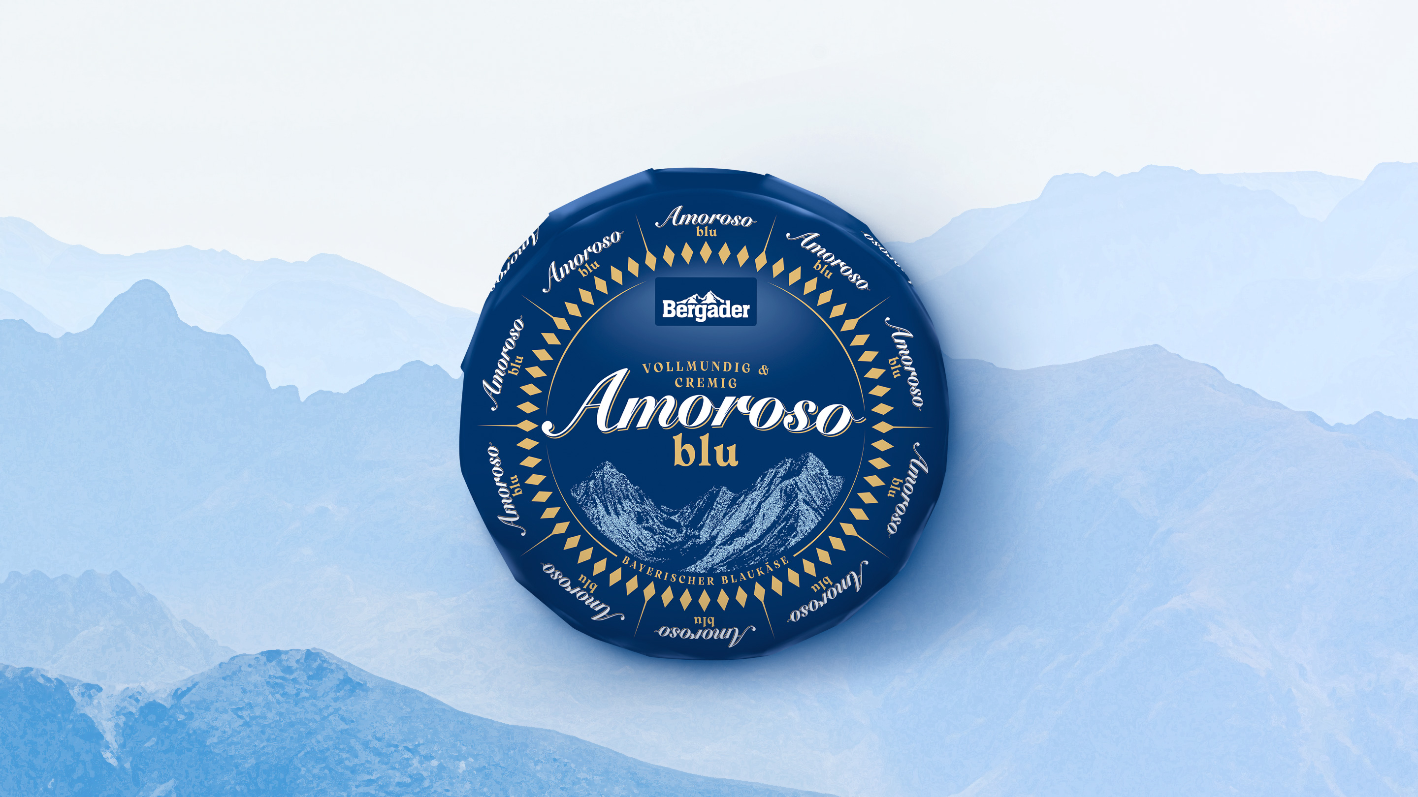
A new name was developed for the cheese known as “Bavaria blu – der Würzige” to better define its flavor profile and strengthen its differentiation within the product line: Amoroso blu. Our task: To translate the new brand positioning into a packaging design and develop a distinctive brand identity that visually conveys the product’s character and clearly sets it apart on the shelf.
Creamy, full-bodied, and robust, yet not spicy: Based on the sensory profile—the centerpiece of the repositioning—we developed a design that combines origin, quality, and enjoyment. The modern interpretation of the diamond shape and the relief depicting the Watzmann mountain range anchor the cheese in its Bavarian heritage. By combining dark blue with subtle gold accents, we lend the packaging a sense of premium quality and ensure that the variety stands out on its own while also blending harmoniously into the existing brand portfolio.








 back
back