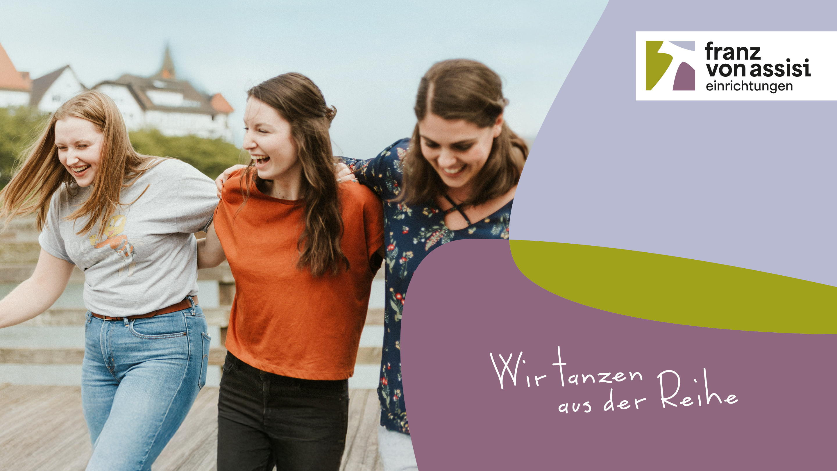
The Franz von Assisi Society—a regional association of youth welfare organizations and special education schools (SBBZ)—has been given a fresh new look. Together, we developed a logo that stands out for its harmonious colors, clear visual language, and symbolic depth. It stands for brand recognition, trust, and a modern brand identity —in harmony with the association’s values and work. The result is a contemporary identity deeply rooted in Franciscan principles.
The new visual identity makes the change and further development visible – approachable, clear, meaningful. The central element is the rope, the peace symbol of St. Francis: a symbol of protection, blessing and belonging. It is framed by three colors – green (love of nature), blue (trust and security) and violet (spirituality) – which represent the Schwäbisch Gmünd, Donzdorf and Unterriffingen locations.
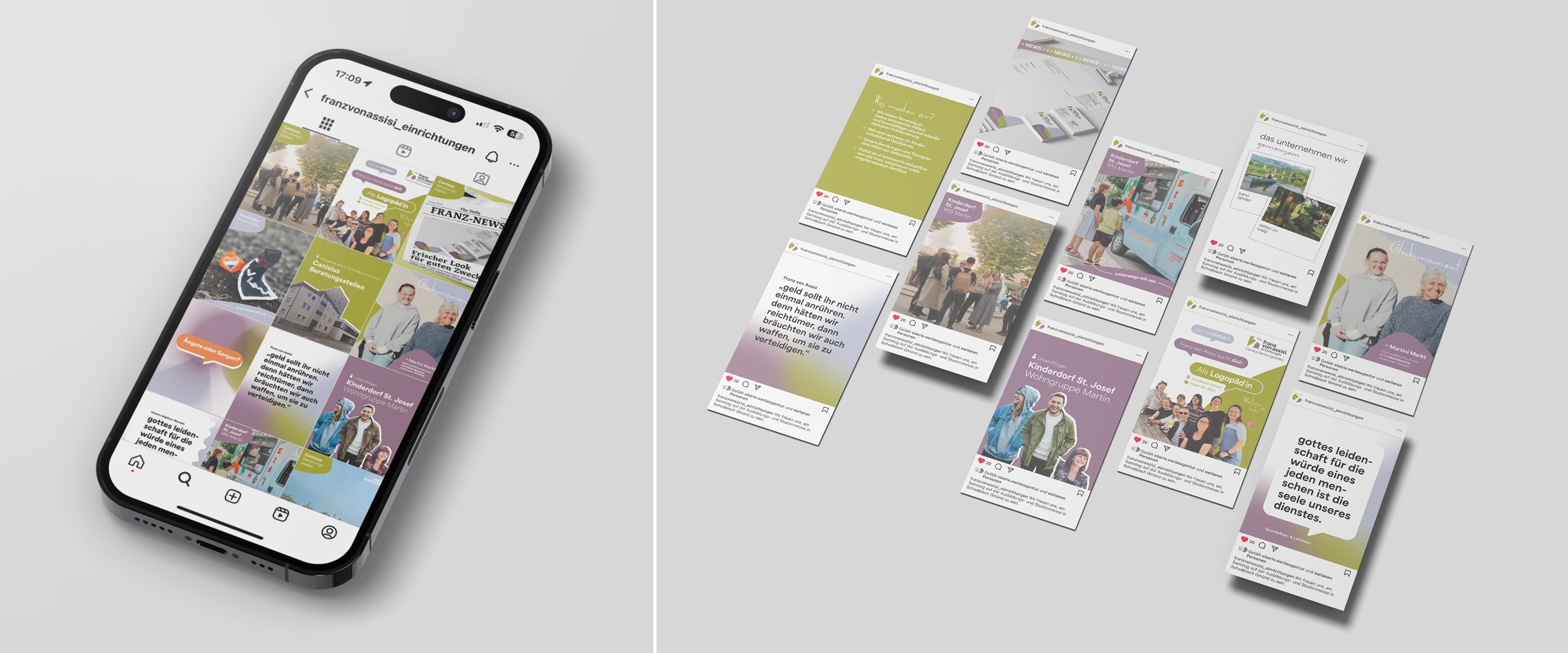
In the next step, we created a consistent corporate design: whether letterhead, business cards or social media – the new look runs consistently through all communication media and appears open, self-confident and human – just like the people behind it.
What makes this project special? It has grown out of the organization itself. The new visual identity of the Franz von Assisi Gesellschaft is an expression of a strong community with a clear attitude.
More information:
Our client: Franz von Assisi Einrichtungen
All projects for our client Franz von Assisi Einrichtungen
More projects from our branding agency










 back
back