EBEP_181101_Relaunch_Web_Projekt_2880_1000_01_NEU EBEP_181101_Relaunch_Web_Projekt_2880_1000_01_NEU

Packaging for Müller: A natural treat with a new look

For consumers who place particular value on natural enjoyment, the Müller dairy has developed Froop Naturgenuss – a new range characterized by an unadulterated taste experience. Gently pureed fruit meets fine yoghurt and creates a harmonious combination of freshness and creaminess. The special feature of this product line is that the recipe is deliberately less sweet in taste and does not contain gelatine. This is Müller’s response to consumers’ growing desire for more conscious indulgence and natural ingredients. To emphasize this naturalness visually, a suitable packaging was developed for Müller that underlines the high quality and fresh character of the range.

The challenge was to create a packaging design that clearly stands out from the established Froop varieties but still maintains a visual link to the existing range. At the same time, the special product features had to be clearly communicated in order to appeal to the target group and position the product optimally at the point of sale. A harmonious interplay of colors, typography and design elements ensures that the naturalness of the product is visually emphasized.

EBEP_181101_Relaunch_Web_Projekt_2880_1270_01 EBEP_181101_Relaunch_Web_Projekt_2880_1270_01

A unique look with recognition value

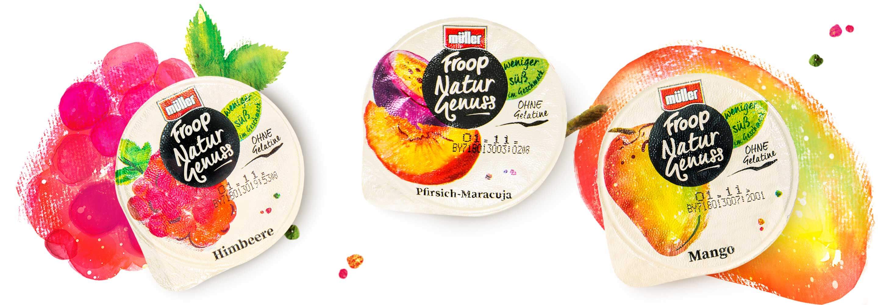
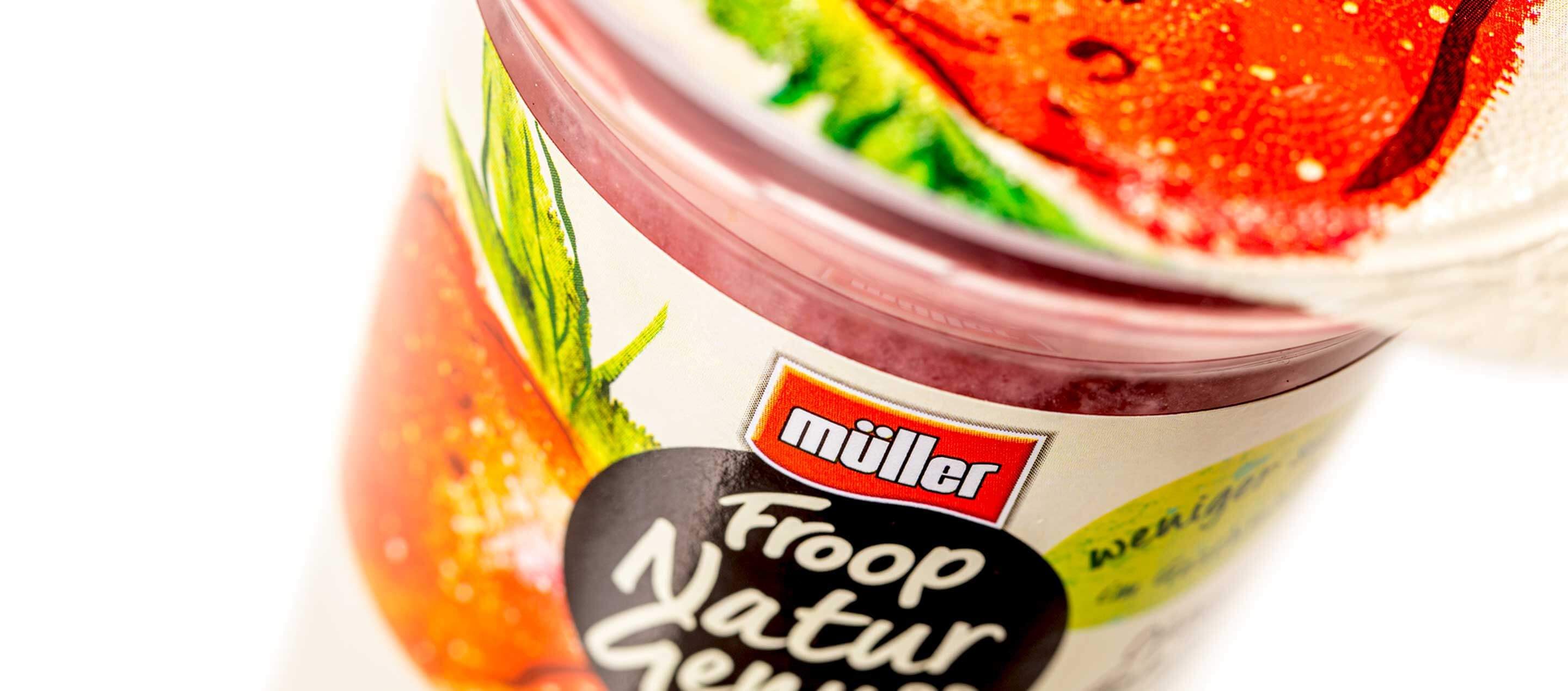
To meet these requirements, we have created a visual identity that is both independent and harmoniously embedded in the Müller product portfolio. The centrally positioned black circle, in which the range name is placed, gives the range a striking recognizability and creates the impression of an independent brand within the Froop family.

This design is complemented by high-quality watercolor illustrations that showcase each individual flavor – strawberry, raspberry, mango and peach-passion fruit – in a natural way. The illustrations are placed on a light background, further emphasizing the freshness and purity of the ingredients. In addition, delicate disruptive elements, which have been gently incorporated into the design, ensure discreet but effective visual communication of the core messages.

Naturalness that convinces

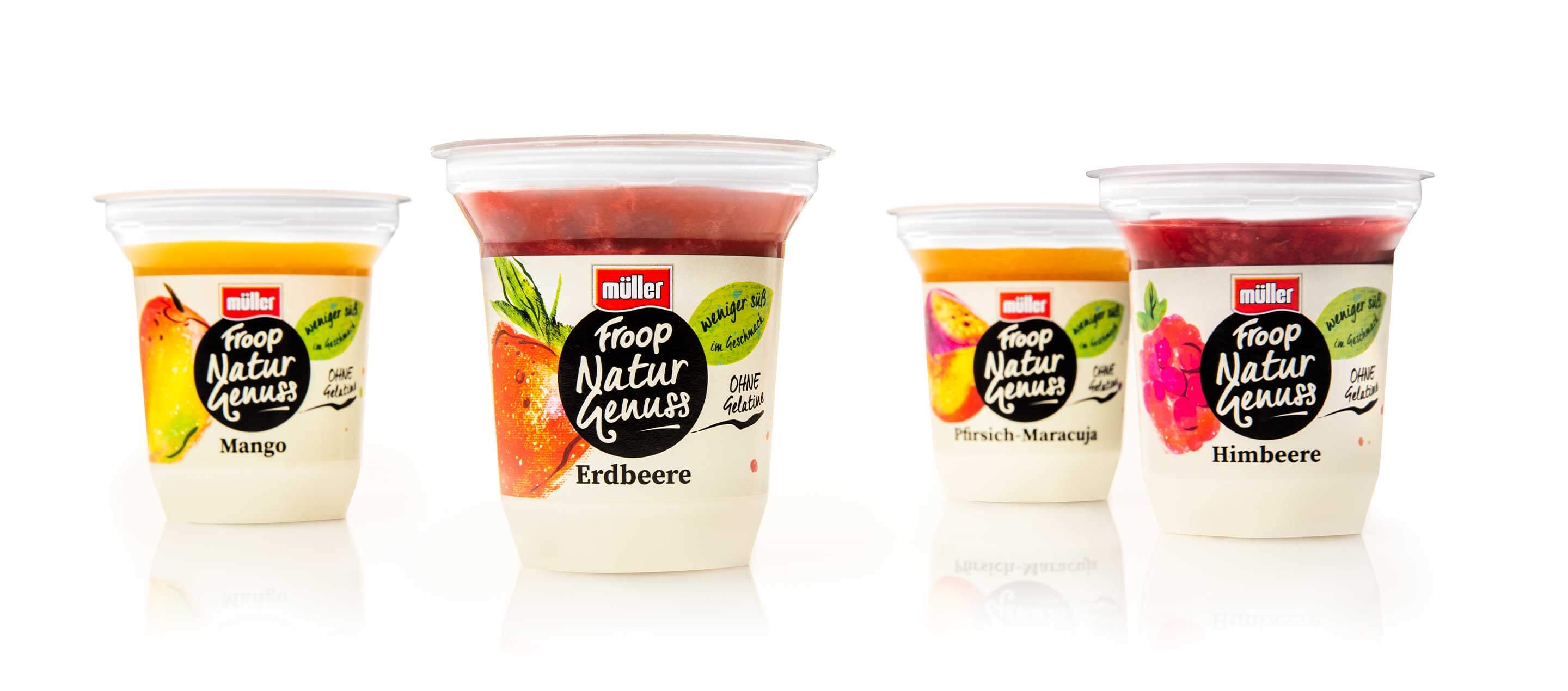
The result is modern and appealing packaging that specifically conveys the naturalness and high quality of the product. Froop Naturgenuss deliberately appeals to a target group that values natural ingredients, less sweetness and conscious indulgence. This makes it possible to stand out from the competition in the chiller cabinet and at the same time retain the trust of existing Froop fans.

With the centrally positioned black circle, including the product range name, we have created the look of a separate brand that still allows the connection to the existing range. The color illustrations in watercolor style on a light background and the matching filigree disruptive elements convey the natural fruit experience that the new Froop Naturgenuss promises its customers.

EBEP_181101_Relaunch_Web_Projekt_2880_1270_02 EBEP_181101_Relaunch_Web_Projekt_2880_1270_02

More information:
Our client: Müller
All projects for our client Müller


Further work
defu - Packaging for organic pet food
Defu
defu packaging
defu - Packaging for organic pet food
Defu
Alnatura - Coffee relaunch
Alnatura
Alnatura Kaffee Relaunch
Alnatura - Coffee relaunch
Alnatura
Weleda - innovative Xmas floor display
Weleda
Weleda Xmas Display
Weleda - innovative Xmas floor display
Weleda
Neudorff - Cross-media image campaign
Neudorff
Neudorff Crossmediale Imagekampagne
Neudorff - Cross-media image campaign
Neudorff
Allos - New website
Allos
Allos Web-Auftritt Vorschau
Allos - New website
Allos
Egle - Food packaging
Egle
Egle Relaunch
Egle - Food packaging
Egle
Eber