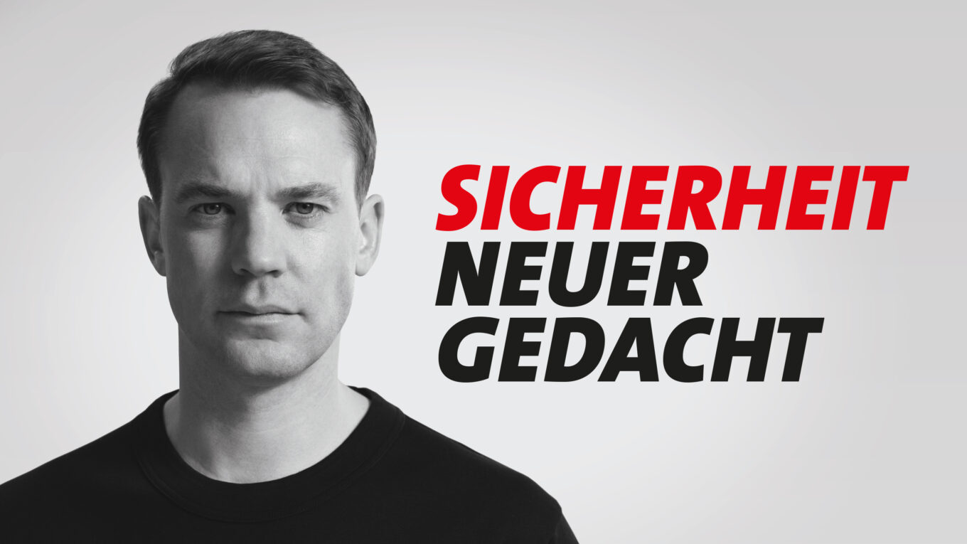
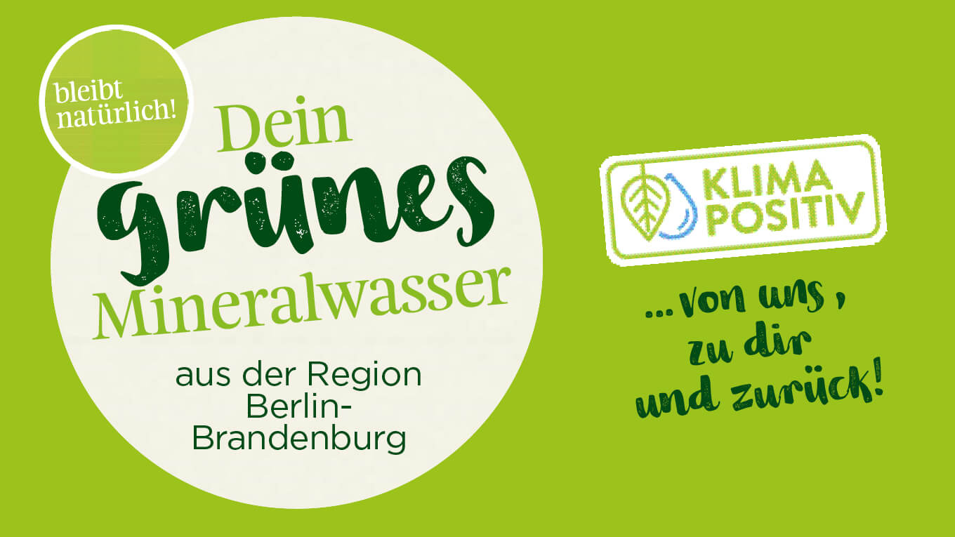
Under the guiding principle of “Strengthening brands sustainably”, we worked with Rheinsberger PreussenQuelle to develop a comprehensive concept for a strong, authentic brand identity. Our focus was on making the company’s values – sustainability, transparency and the highest organic quality – visible in every aspect of the visual communication.
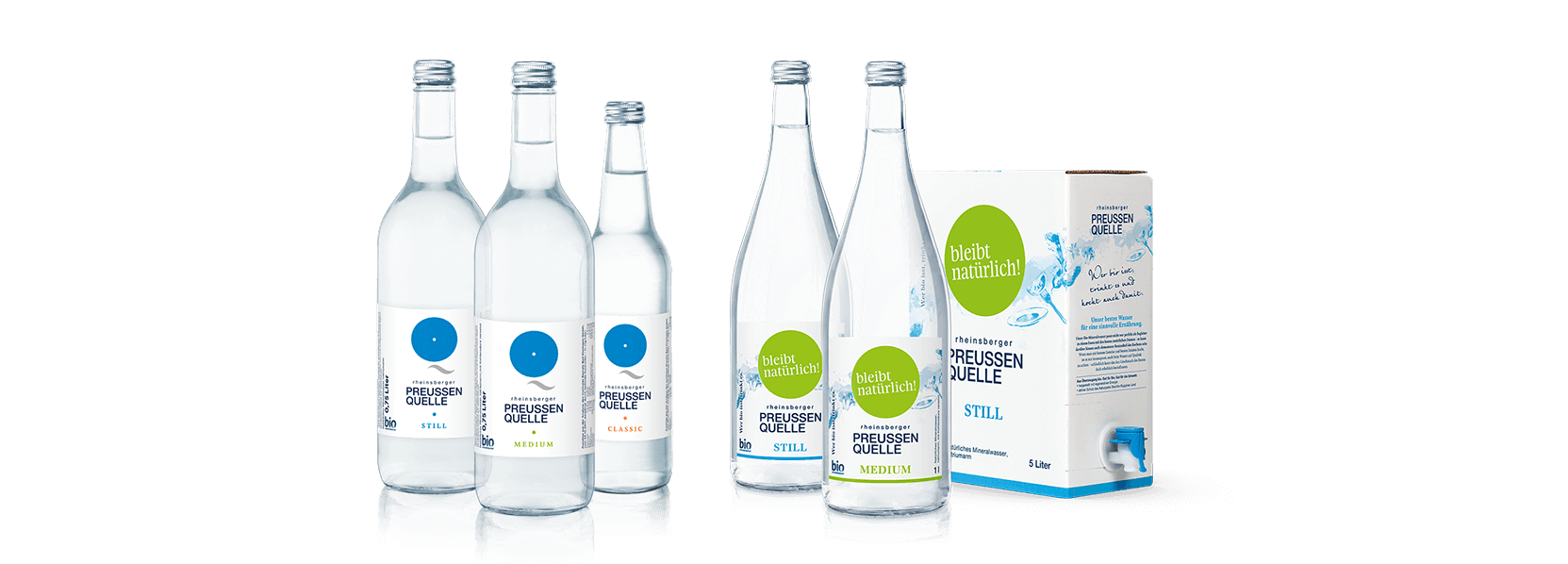
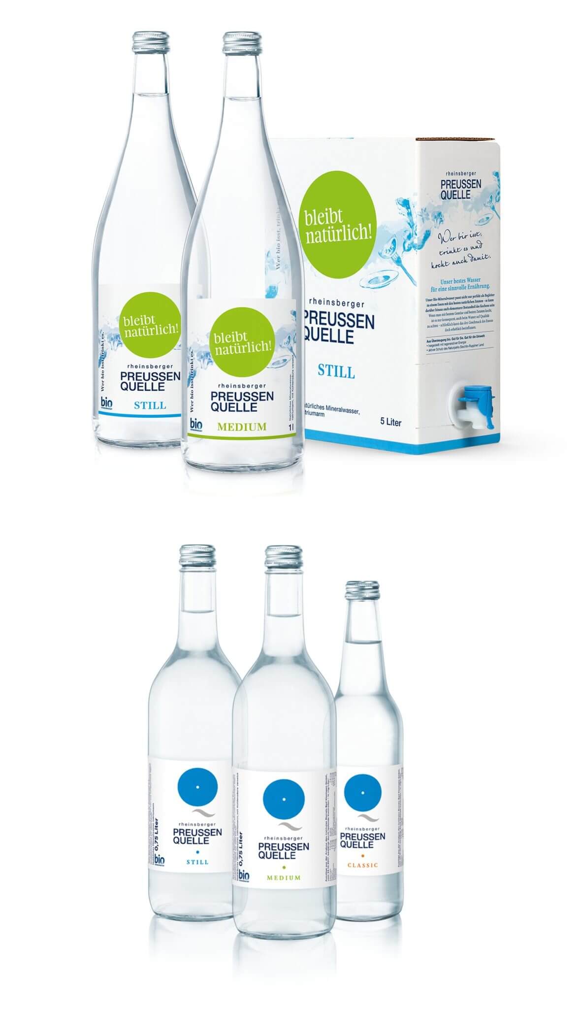
A central component was the development of the packaging design for the entire gastronomy and end consumer range. The aim was not only to create an aesthetic and functional design, but also to make the brand’s sustainable philosophy recognizable at first glance.
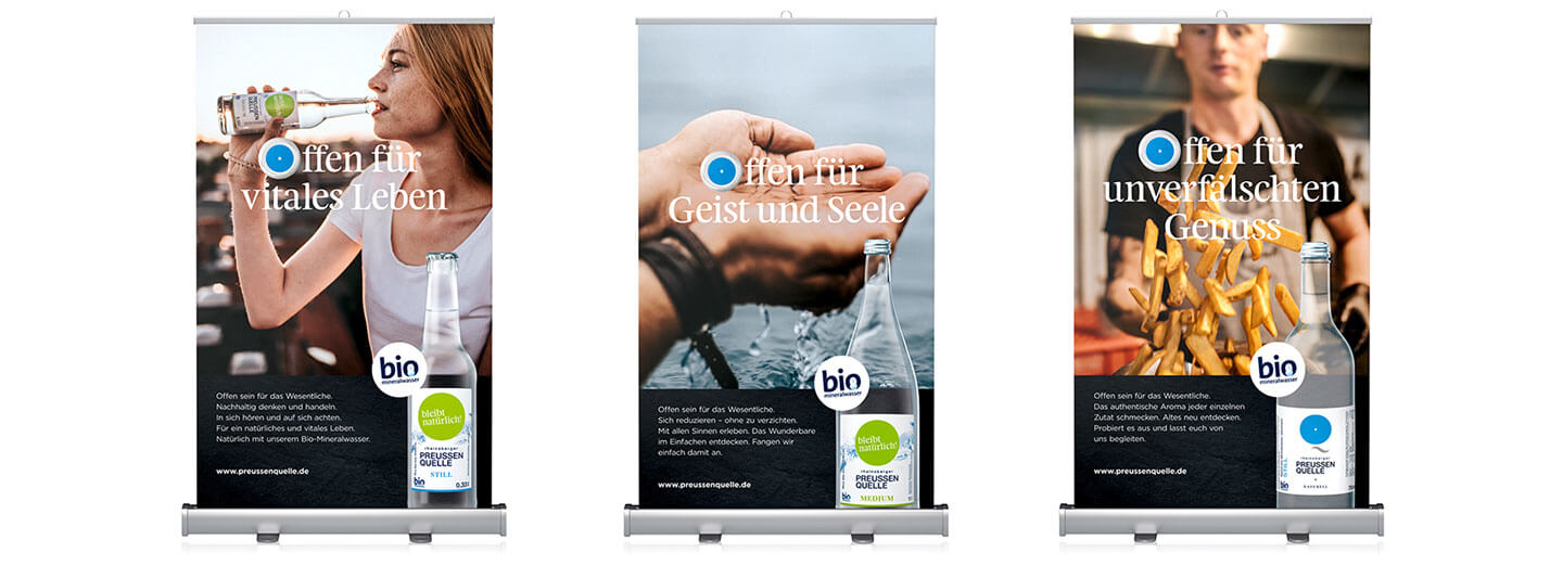
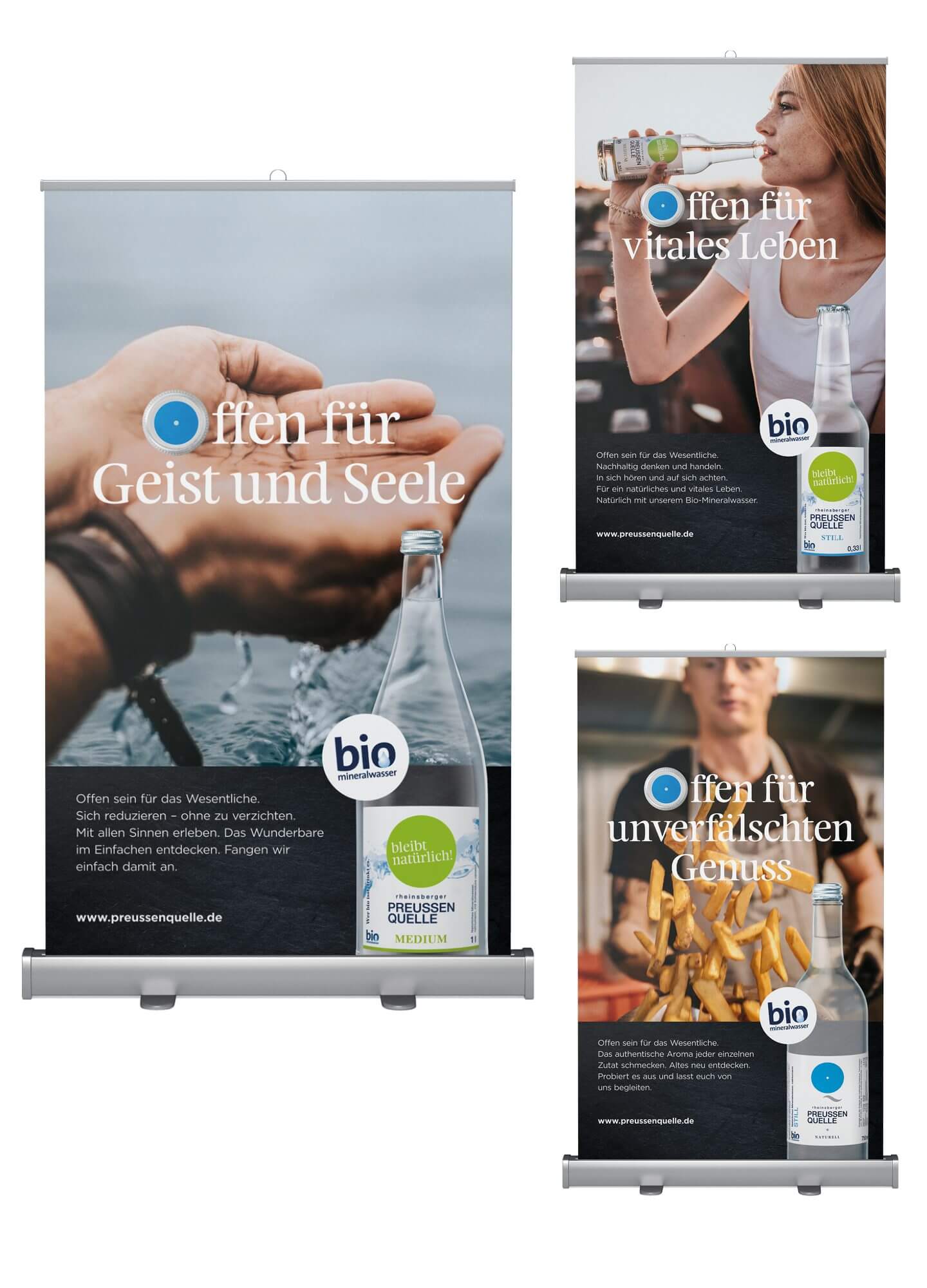
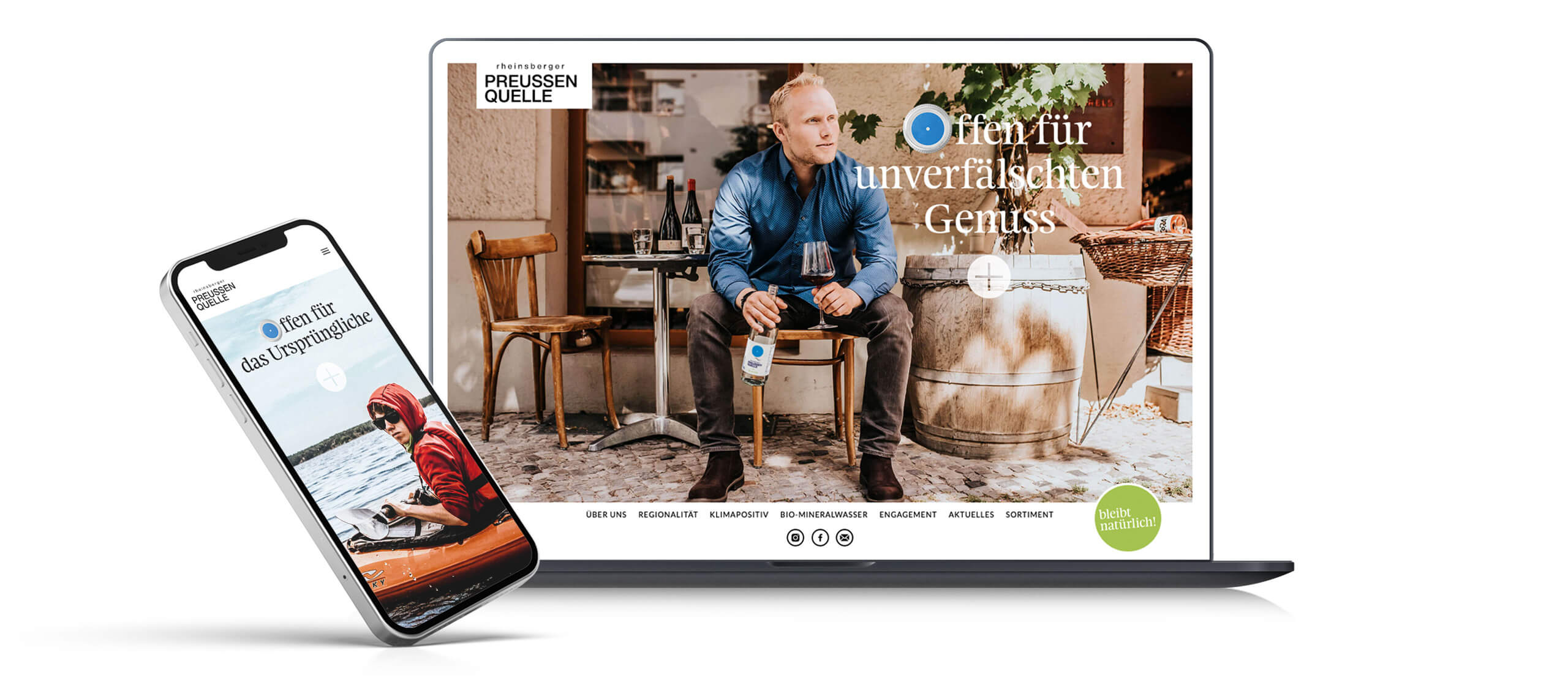
But our involvement went far beyond the packaging design: together with the Rheinsbergers, we developed a new visual language that impressively conveys the purity and naturalness of the organic mineral water. We also developed a modern corporate design that clearly and consistently presents the identity of Rheinsberger PreussenQuelle – from the logo design, typography and color scheme to all communication materials.
Our approach: open to everything a brand needs – from strategic consulting and creative design to long-term brand management. In this way, Rheinsberger PreussenQuelle was not only visually enhanced, but also strengthened in its position as a pioneer for sustainable organic mineral water.
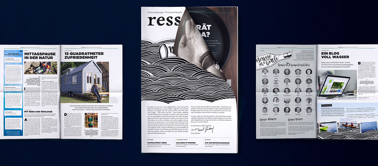
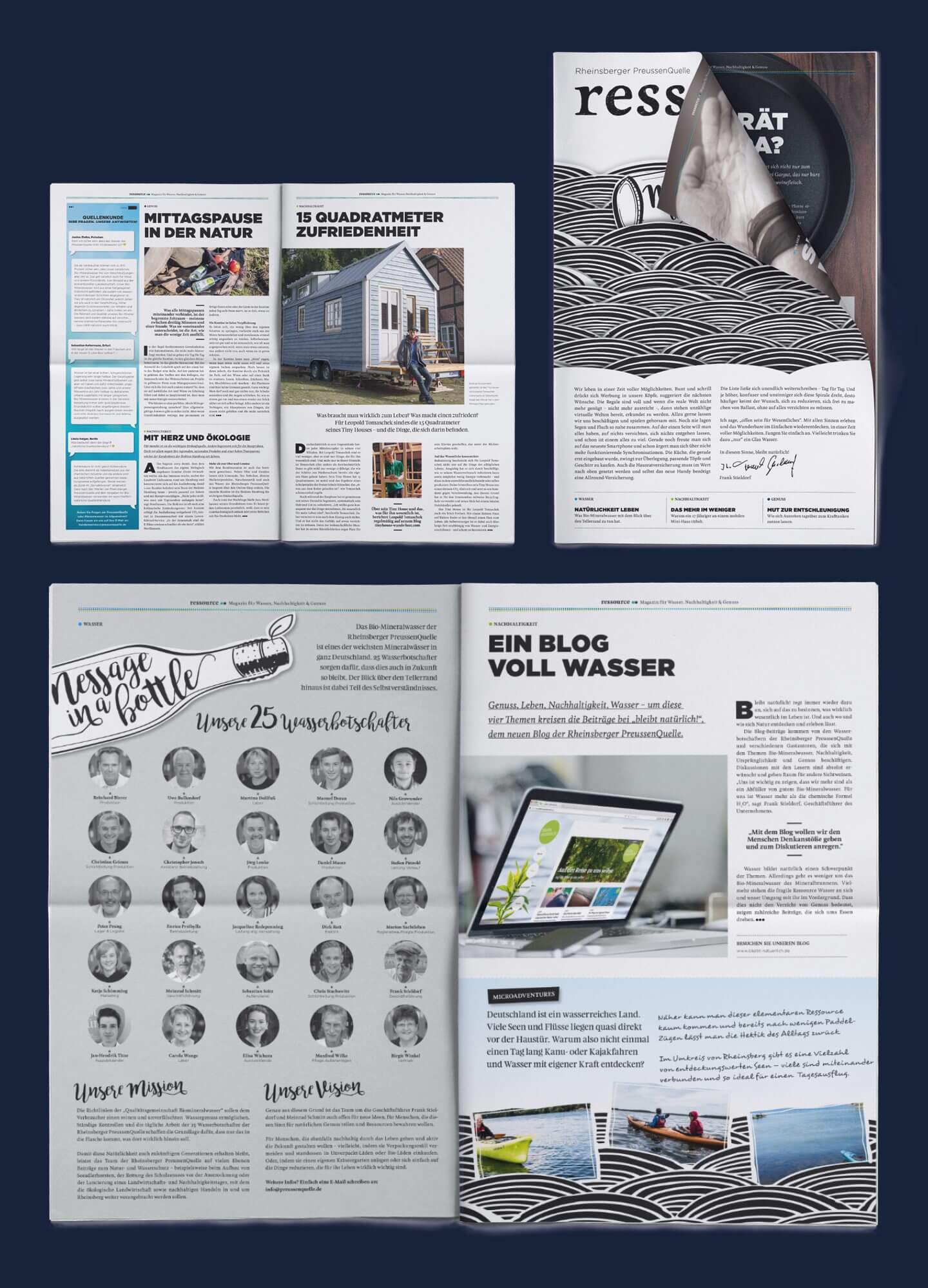
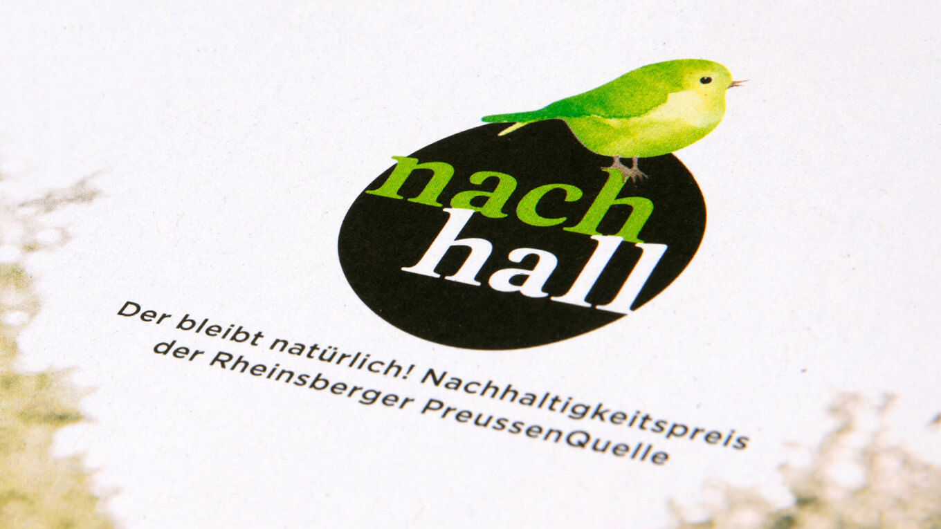
In addition, the website www.preussenquelle.de, the regularly published magazine “ressource” and the blog “stays natural!”where the Rheinsbergers share their thoughts and actions for ecology, sustainability and health with people who want to go through life just as sustainably, as well as social media activities on Facebook and Instagram.
More information:
Our client: Rheinsberger Preussenquelle
All projects for our client Rheinsberger Preussenquelle
More projects from our branding agency


 back
back