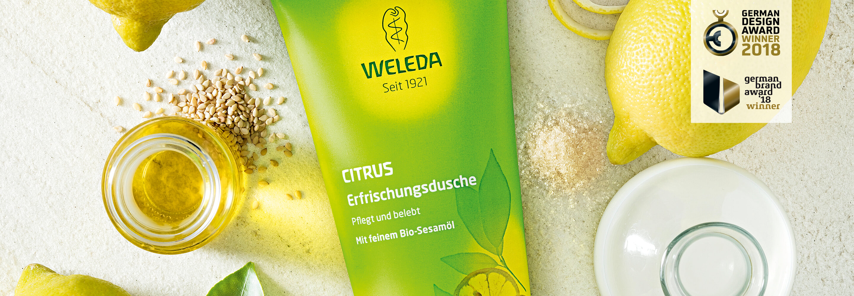
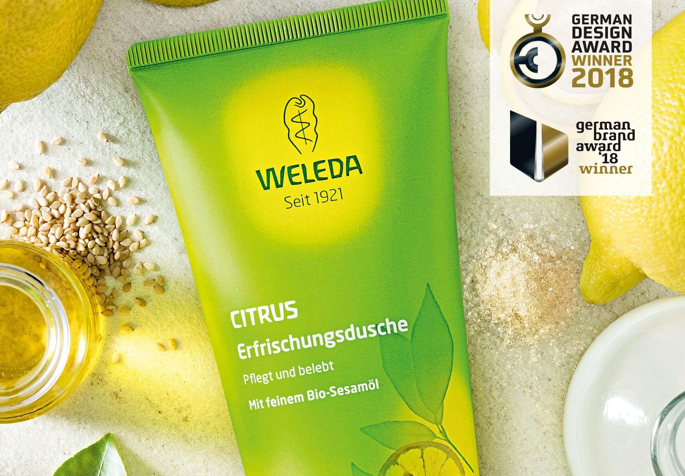
With an extraordinary central idea under the headline “Shower with the best ingredients”, we have further developed the brand image of Weleda care showers and created a new, emotional narrative. The product communication was raised to a new level with targeted key visuals that impressively showcase the high-quality, natural ingredients.
The revised visual language focuses on the purely plant-based care formulas of Weleda care showers and conveys the connection between nature, effectiveness and a sensual shower experience. The colors, shapes and textures of the ingredients – from juicy citrus fruits to fragrant flowers – have been visually highlighted to make the naturalness and caring power of the products even more tangible.
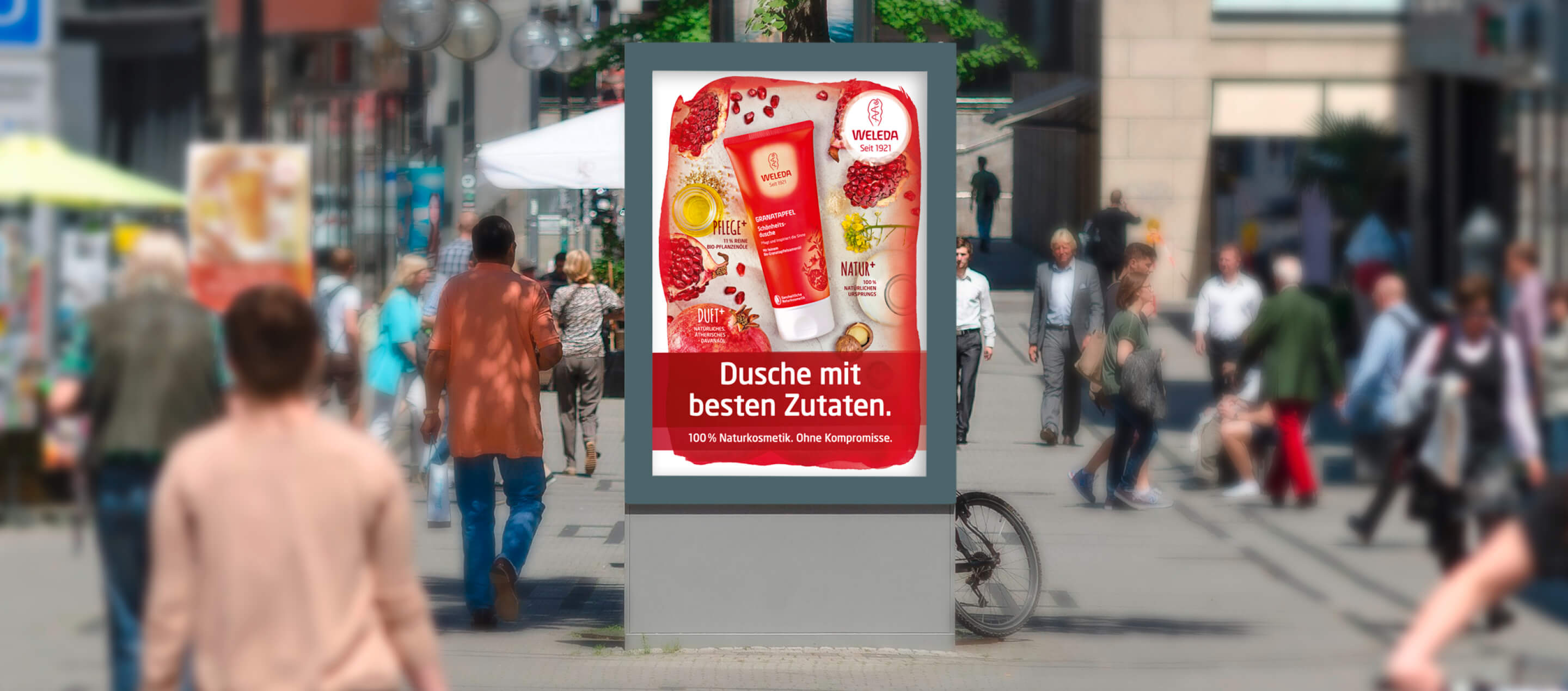
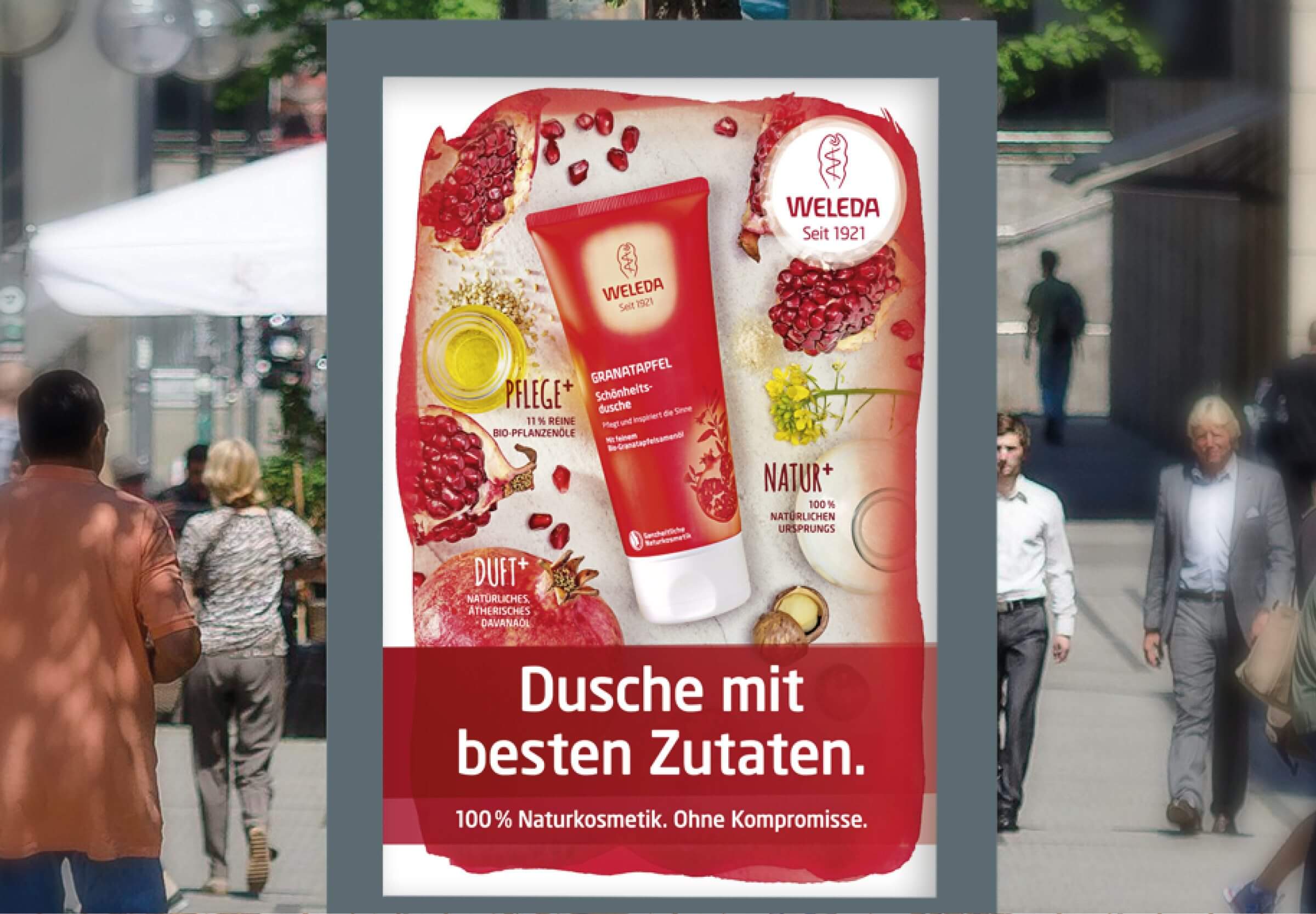
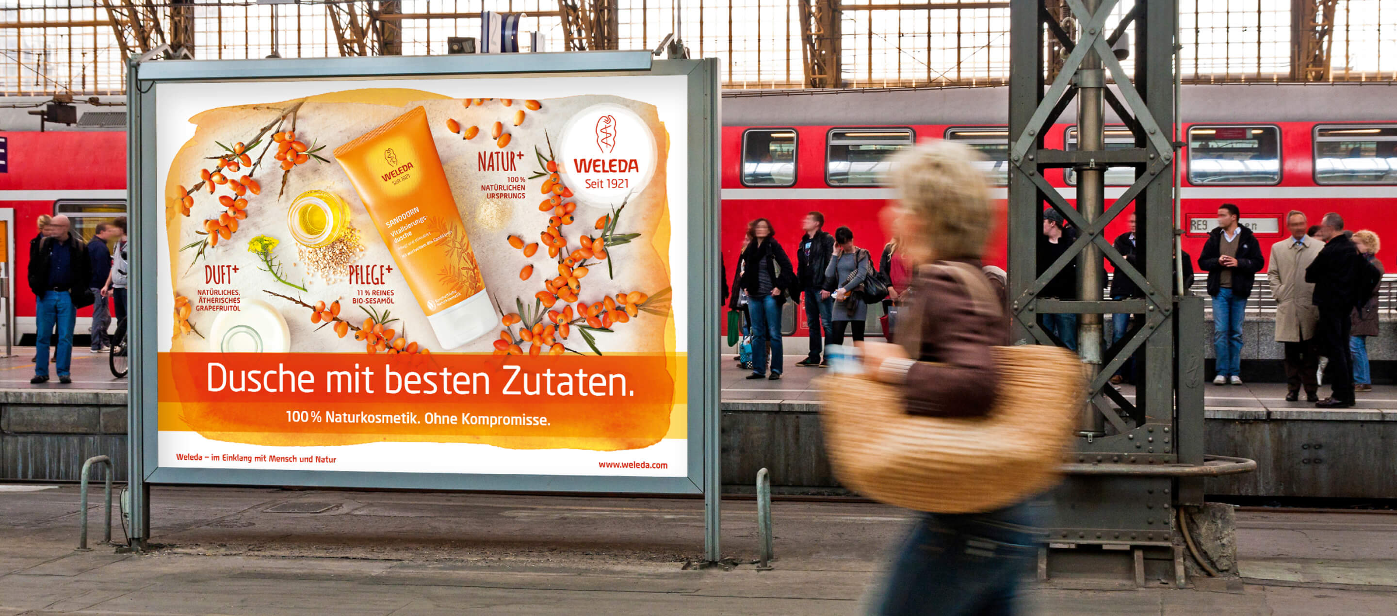
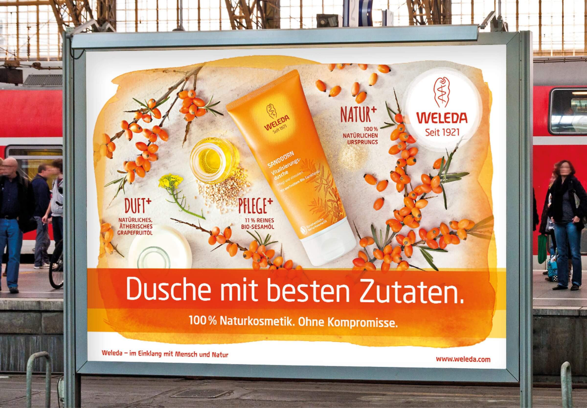
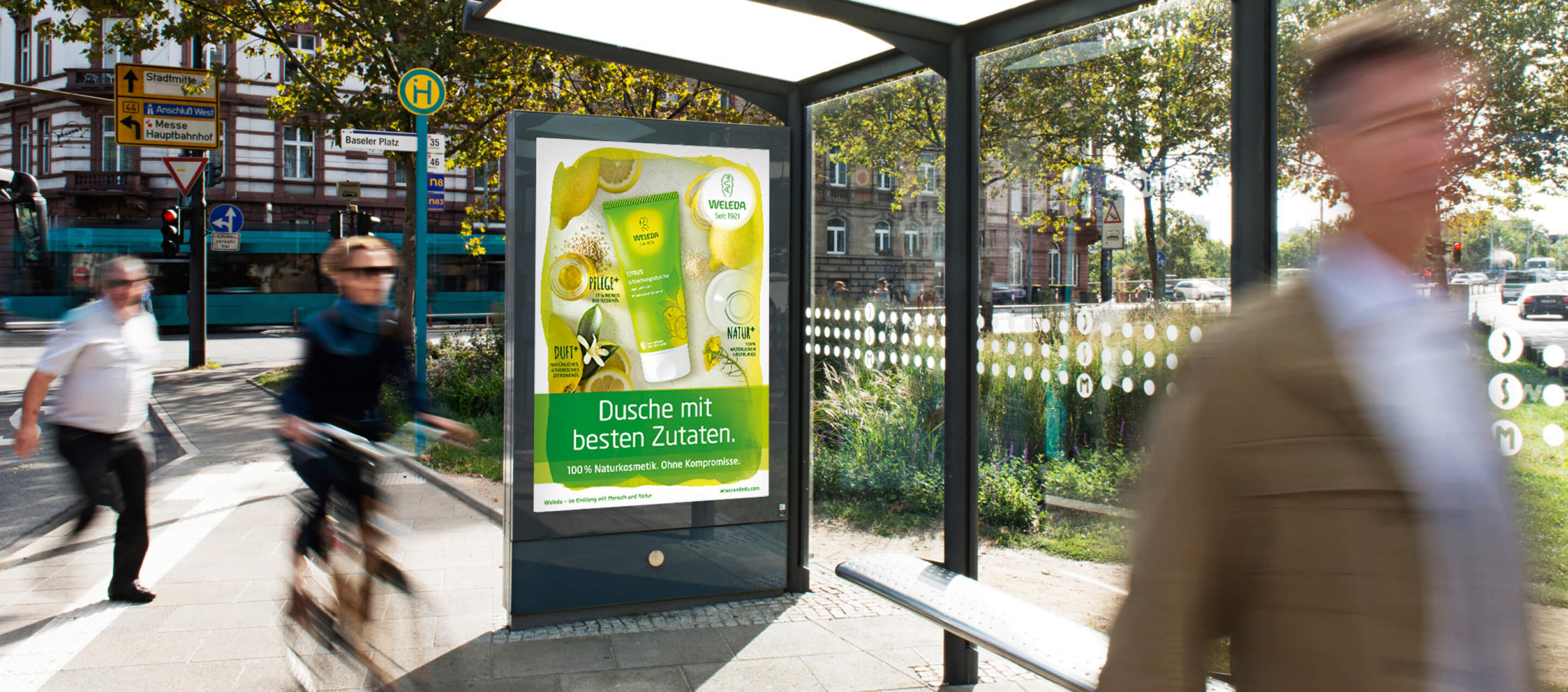
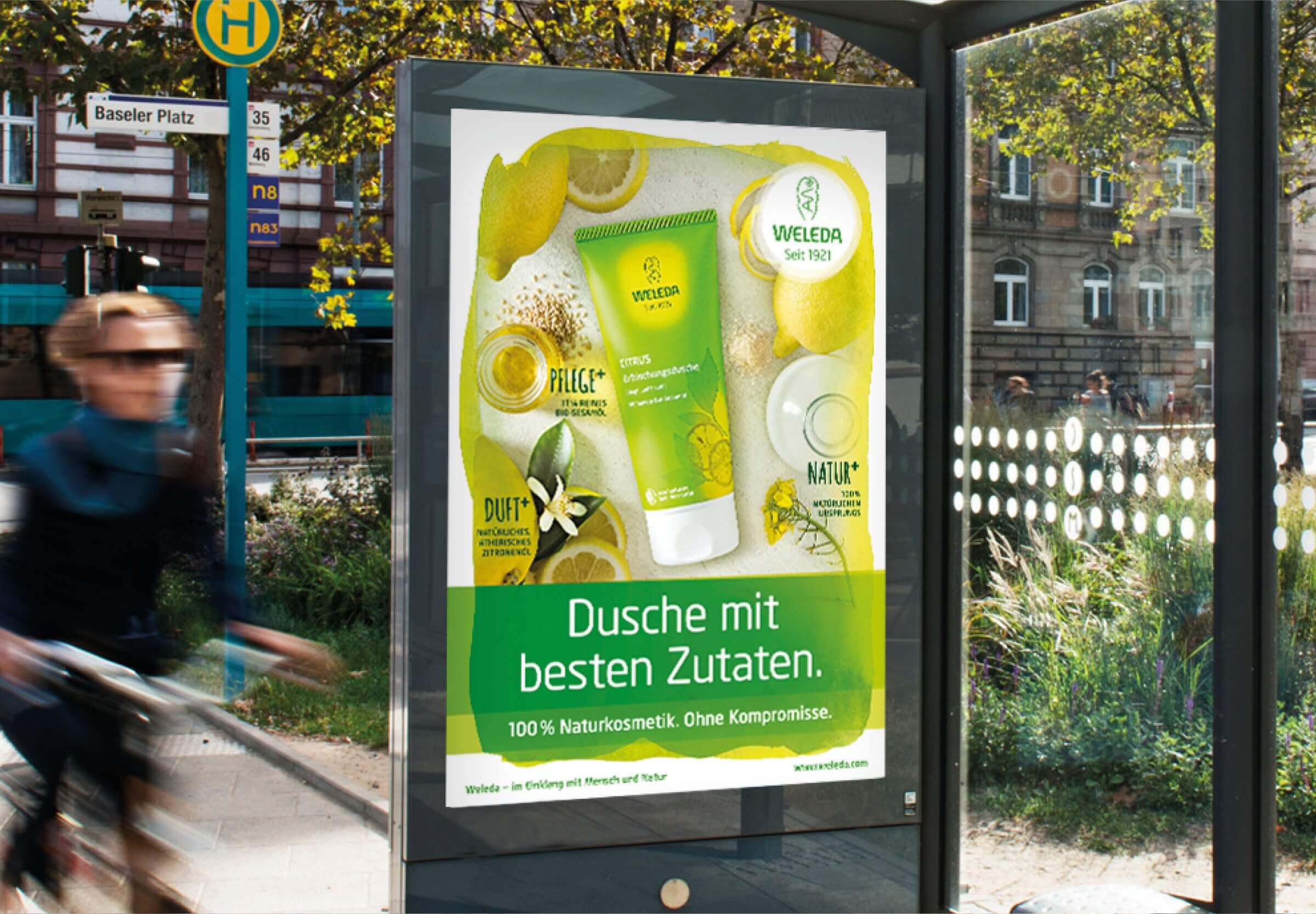
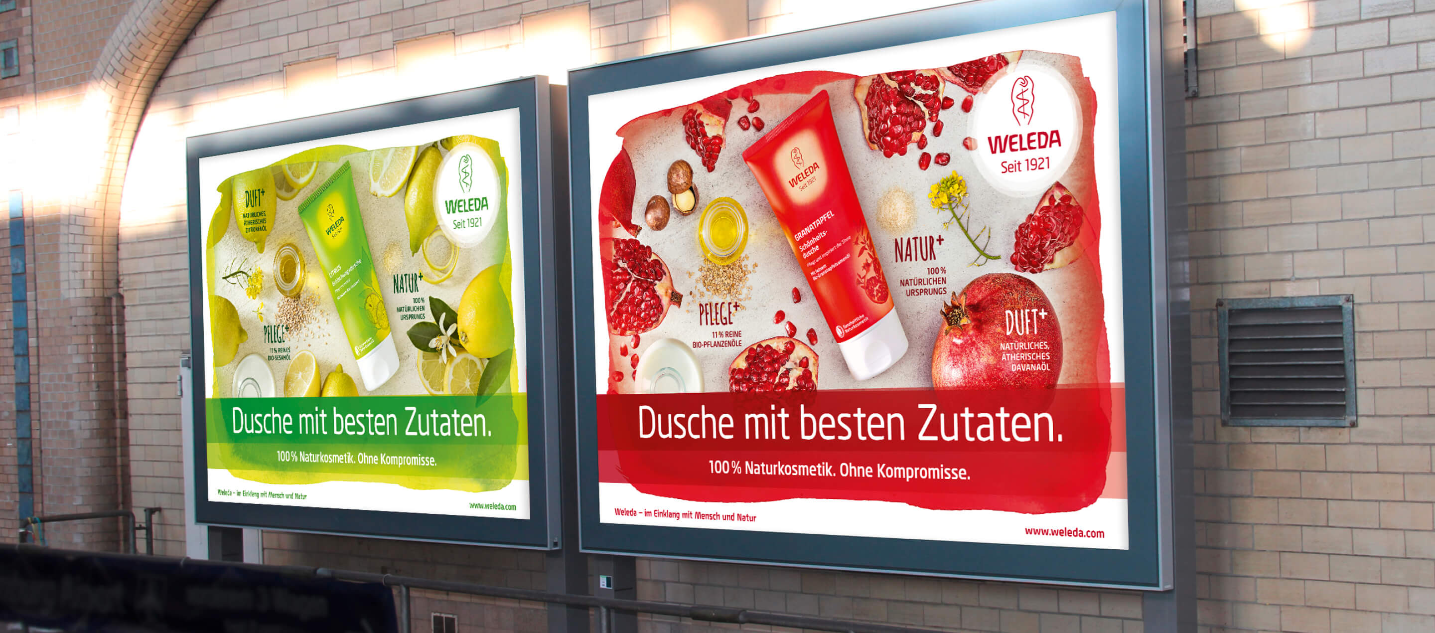
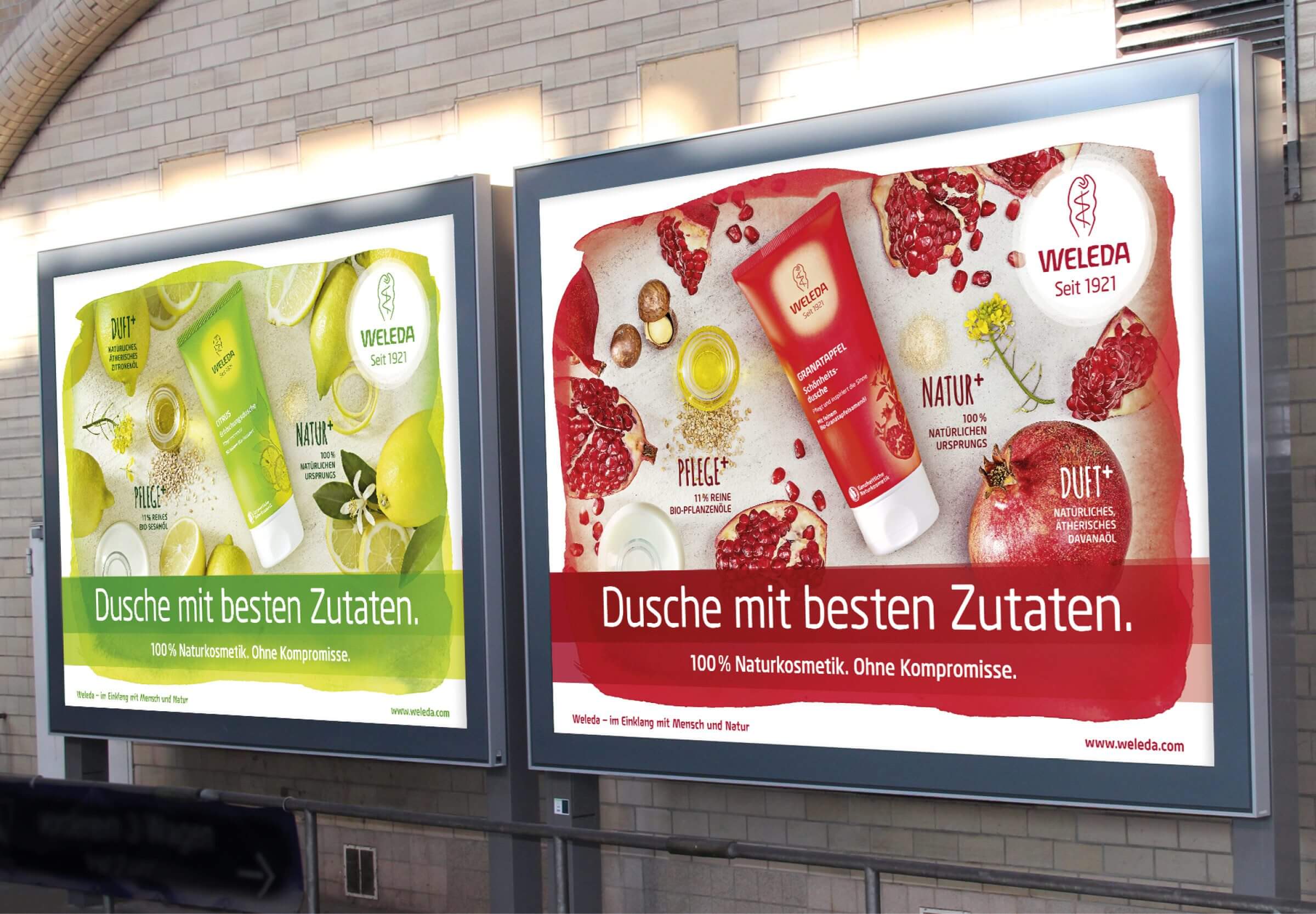
This new staging not only strengthened the existing brand image, but also further sharpened the differentiation in the market. The Weleda care showers now present themselves with a clearer, higher-quality aesthetic that inspires consumers and impressively conveys Weleda’s brand values – naturalness, quality and sustainability. The focus of communication is on the outstanding ingredients that make the difference – simply 100% natural cosmetics. Without compromise.
The campaign attracted a great deal of attention, achieved well above-average KPIs according to market research and was honored with both the German Design Award and the German Brand Award.
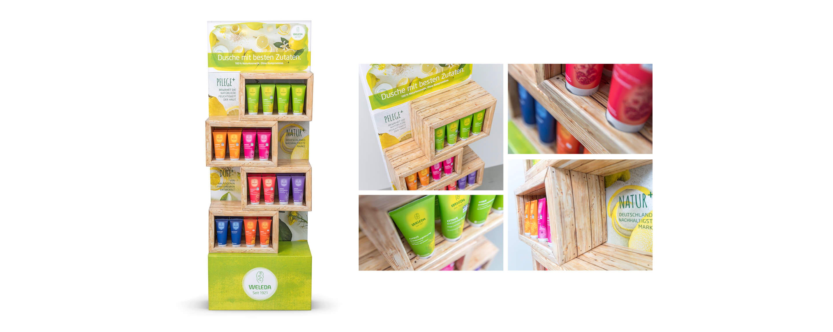
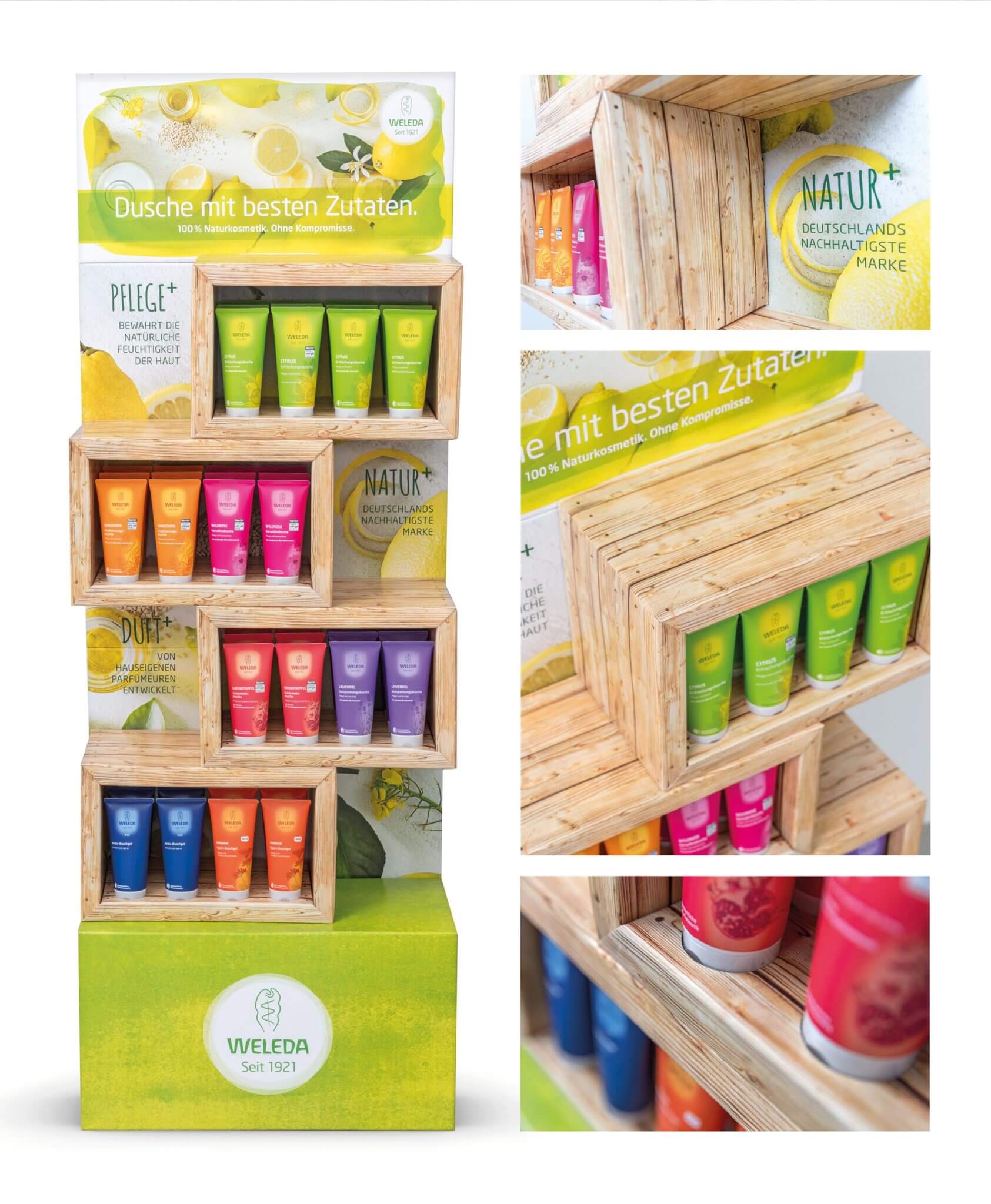
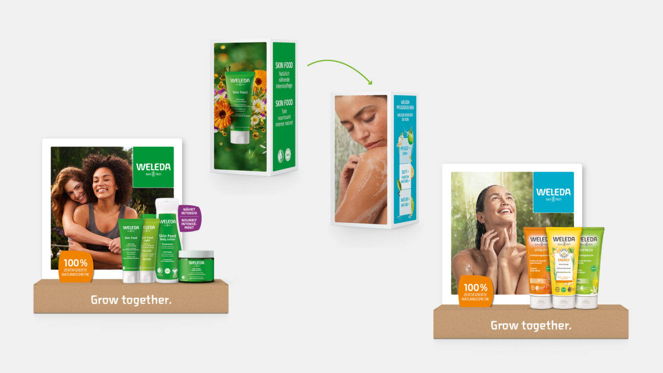
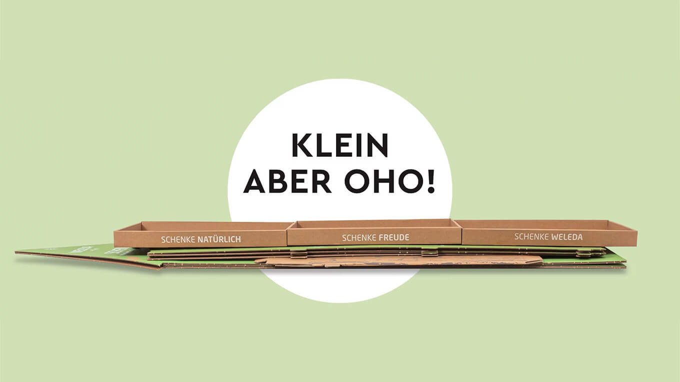
In Germany, Switzerland and Austria, the promotion was accompanied by an OOH campaign, and at the PoS it was staged with an innovative floor display and window dressing. We have been working with Weleda – both for natural cosmetic products and natural remedies – since 1992: in campaign development, trade marketing and packaging.
More information:
Our client: Weleda
All projects for our client MBW


 back
back