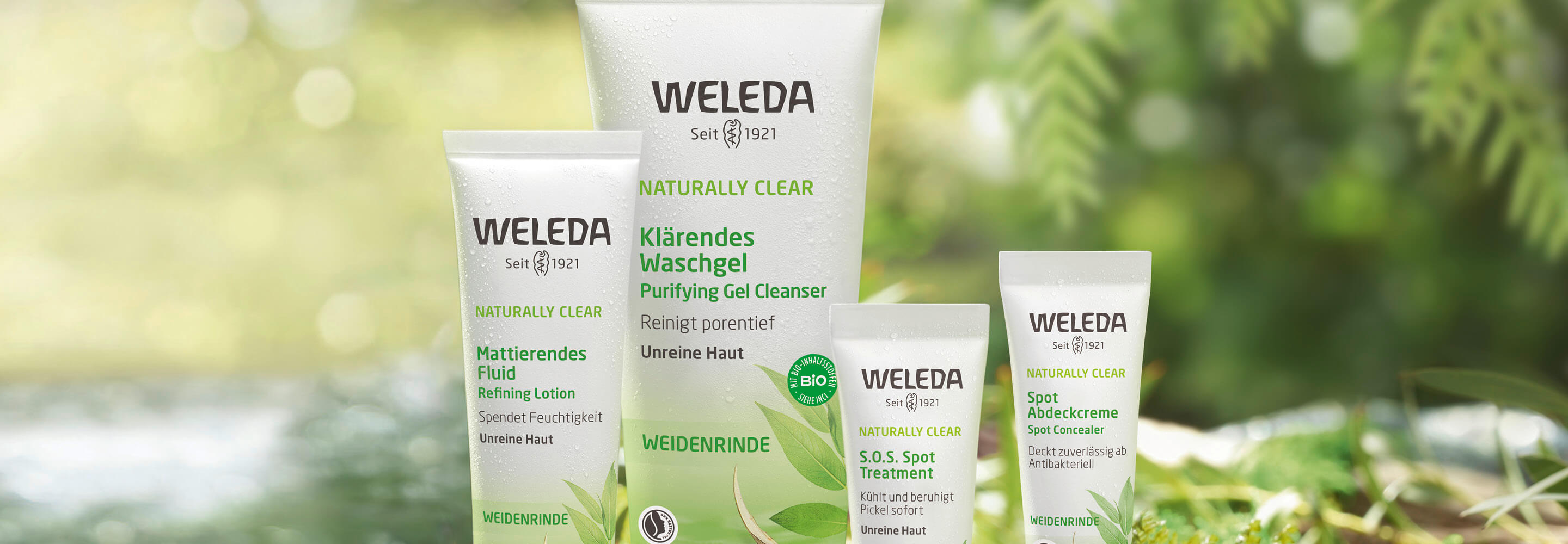
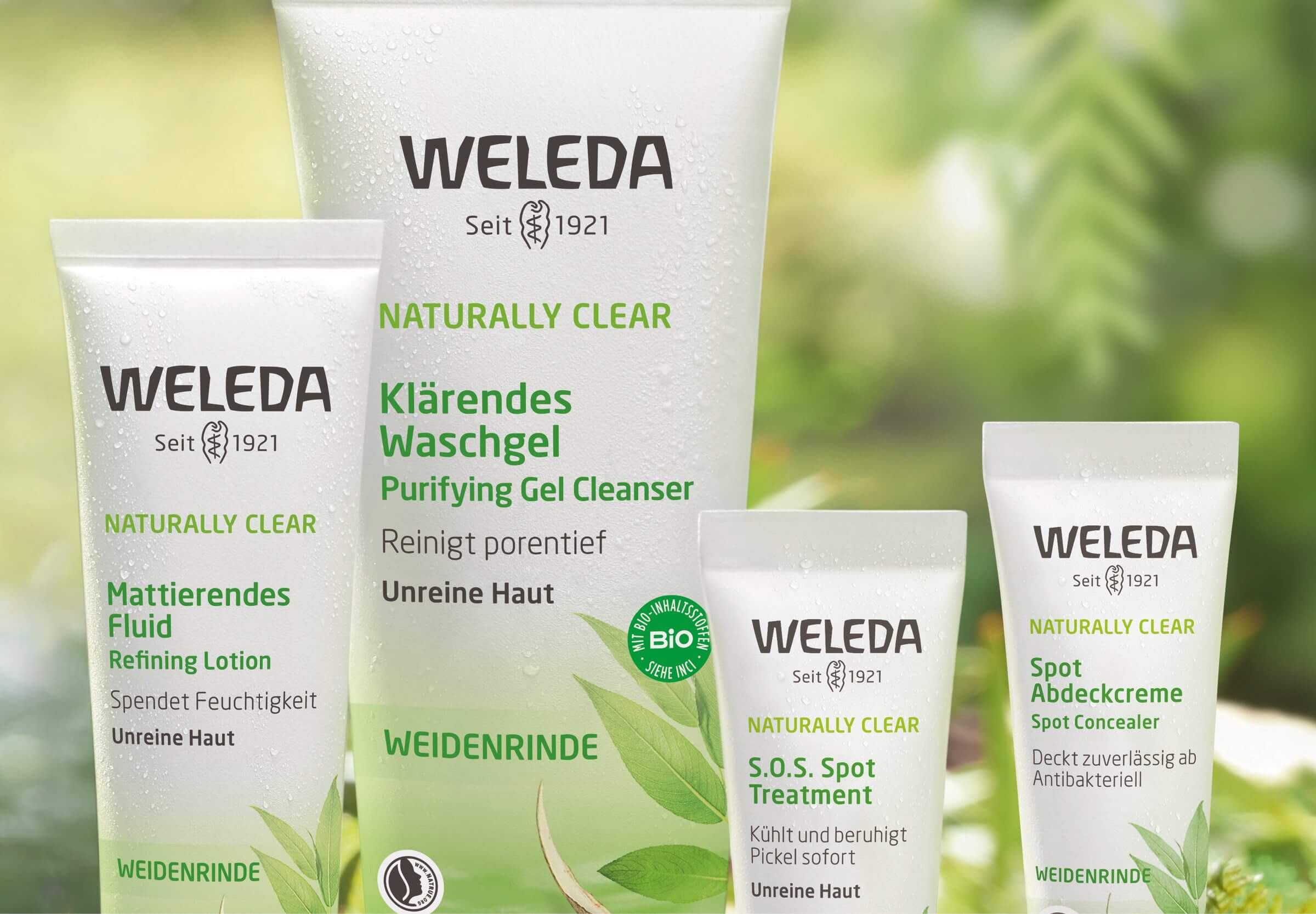
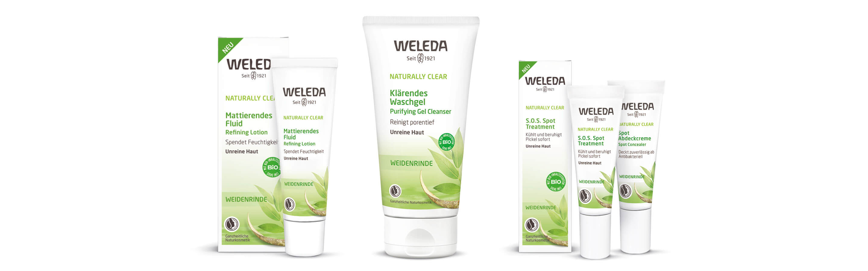
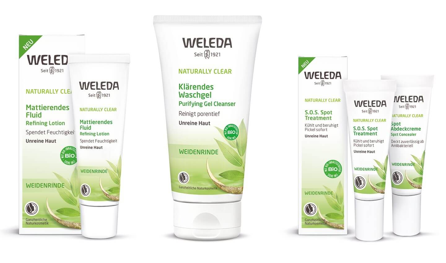
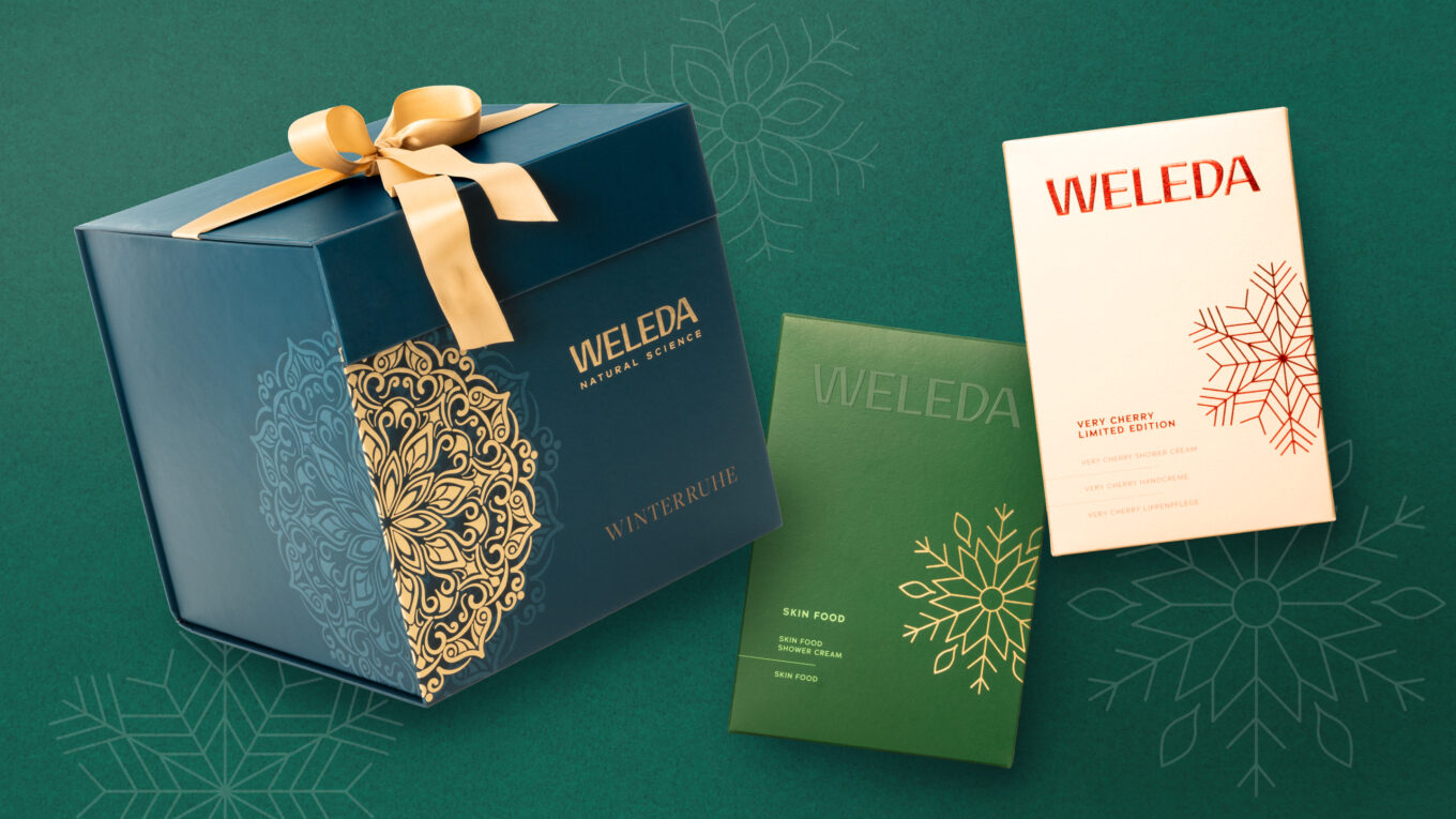
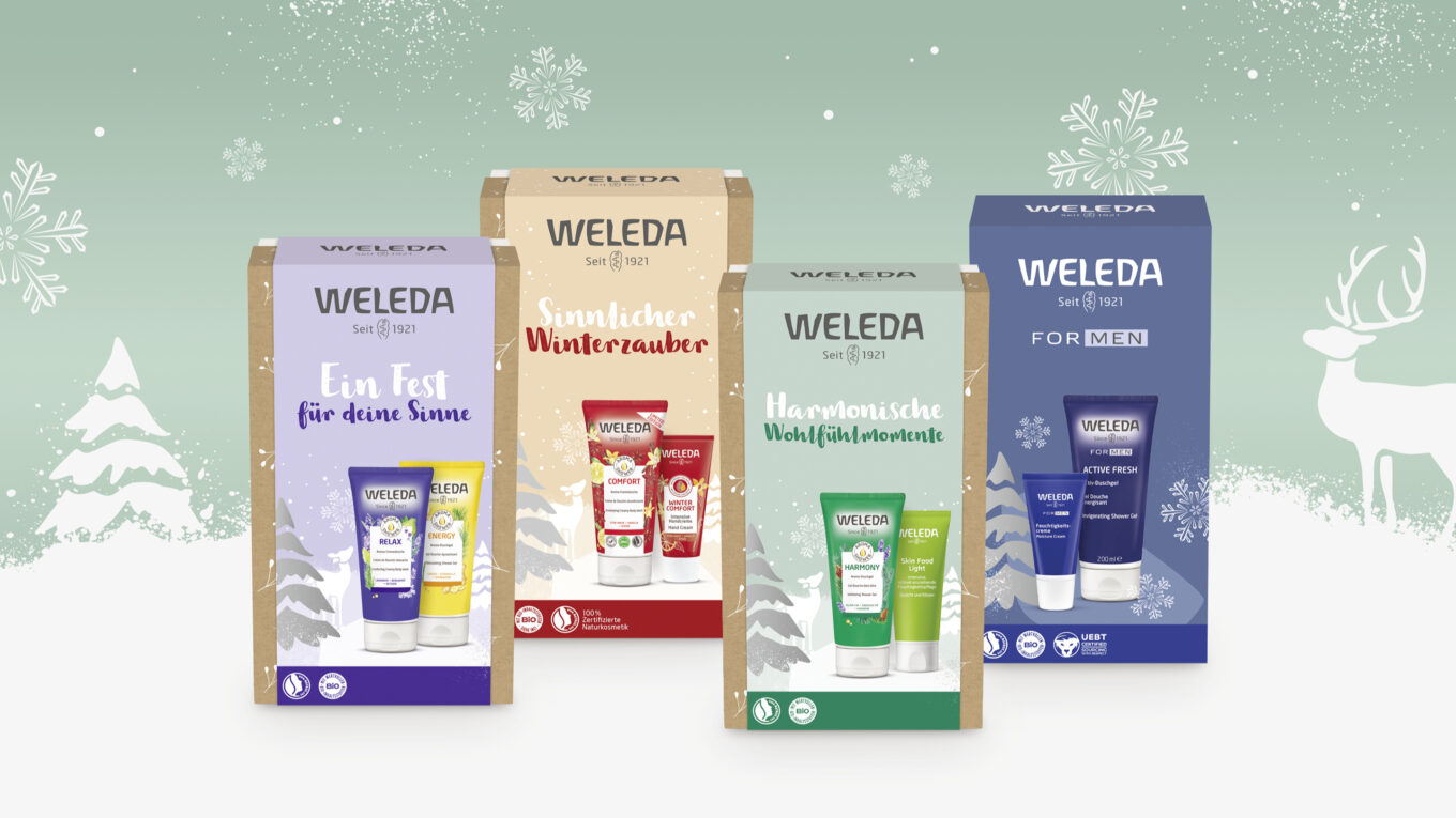
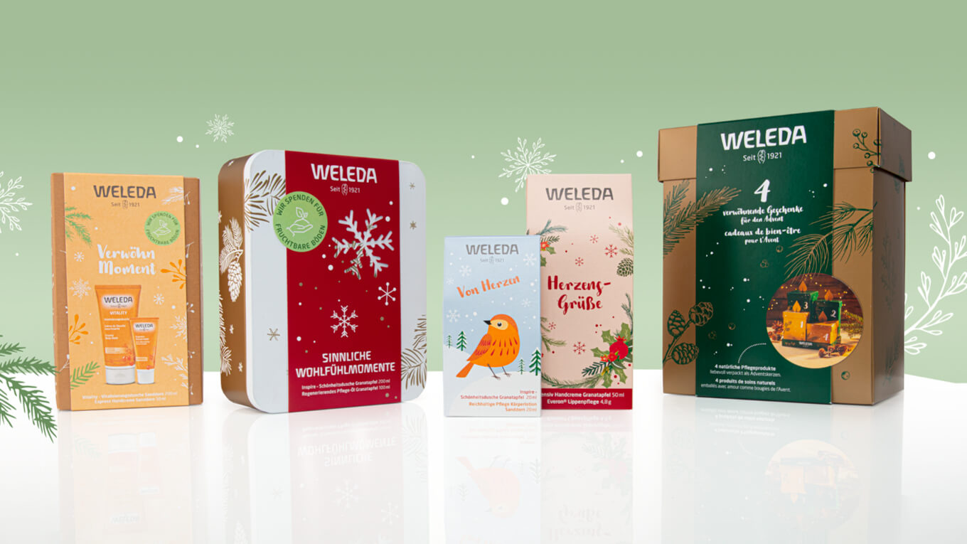
As part of a global project, we developed the comprehensive packaging relaunch for Weleda’s natural cosmetics products in the body and face care segments. With the new Weleda natural cosmetics packaging, a modern, fresh and at the same time authentic design was created that reflects the values and high quality of the brand. The aim was to give the packaging a contemporary look, retain its recognizability and at the same time enable clear differentiation between the individual product lines.
The balance between natural aesthetics and a modern color and design language that conveys the various care needs at a glance was particularly important.
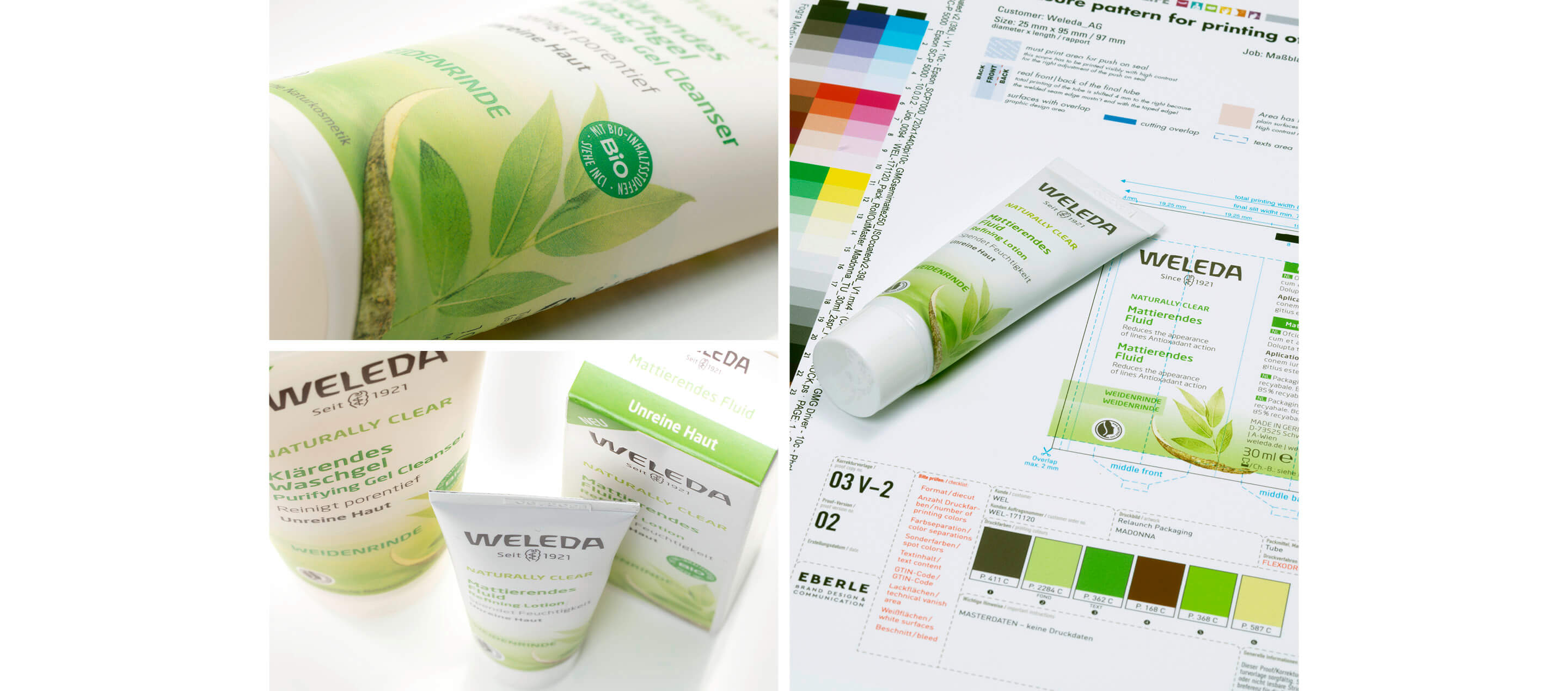
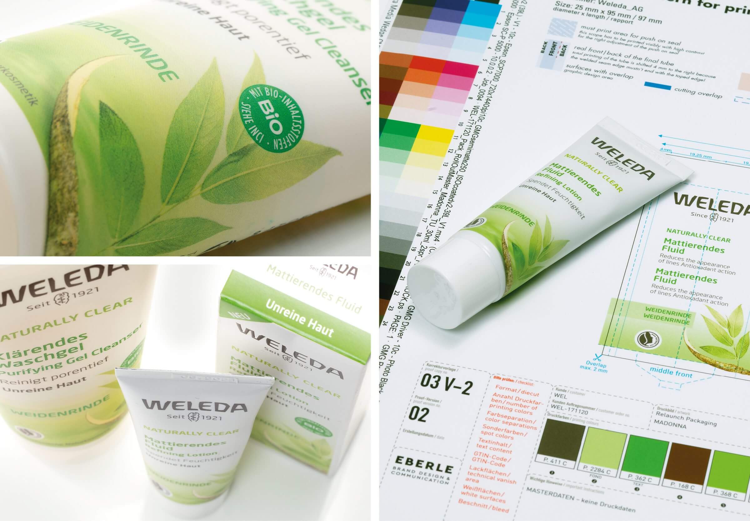
The tool kit has been specially designed to make the transition as efficient and smooth as possible. It not only contains all the design elements, but also a detailed structure that makes it easier for manufacturers to transfer the new layout consistently to different packaging formats.
The tool kit is supplemented by comprehensive guidelines that take into account all the important requirements and specifications of the manufacturers and the printing processes used. These guidelines include technical parameters, color profiles, typography definitions and material specifications to ensure that the new design is implemented precisely and to a high standard on all packaging materials.
The tool kit also facilitates the international implementation of the new packaging design by offering standardized processes that can be easily adapted in different markets and production facilities. This ensures a consistent brand identity across all countries and sales channels.
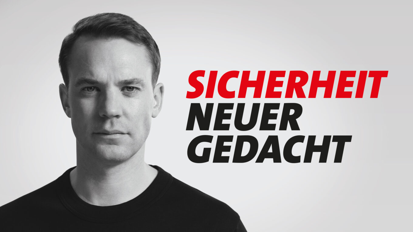
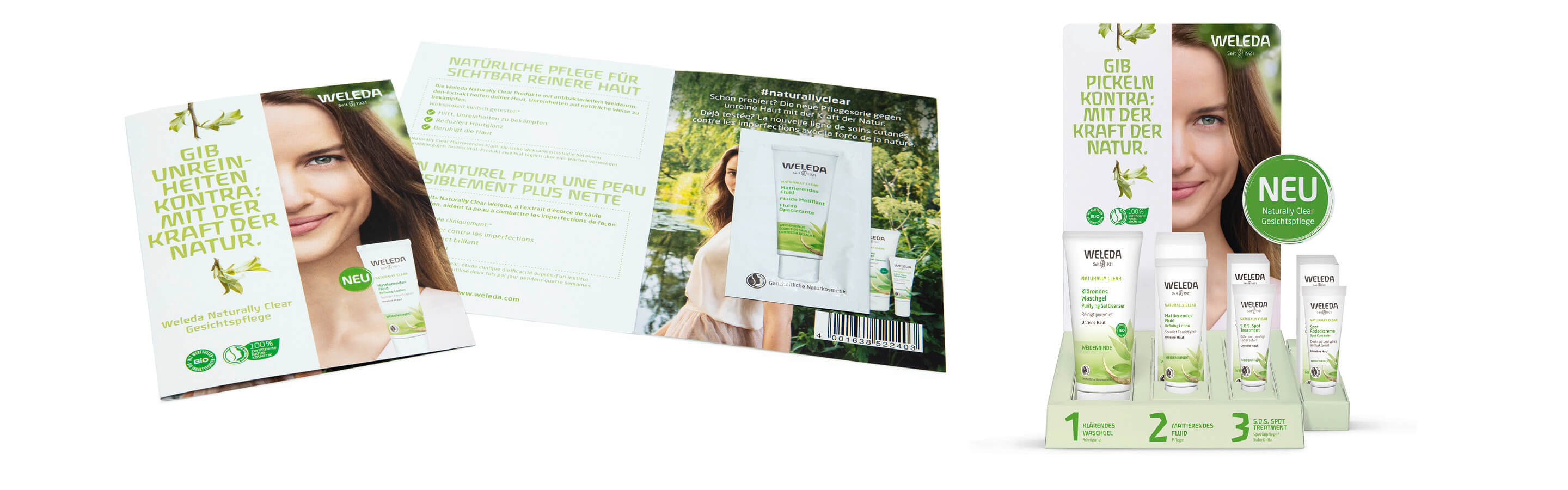
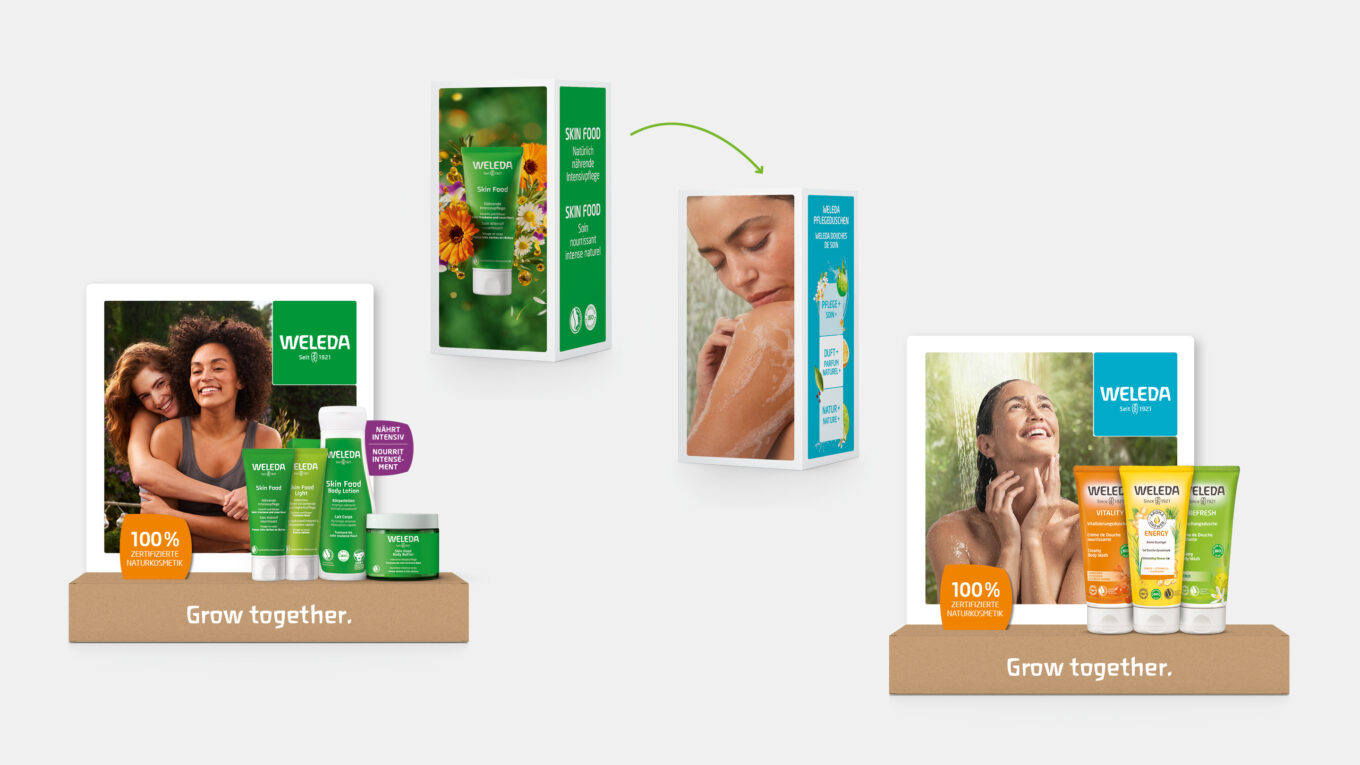
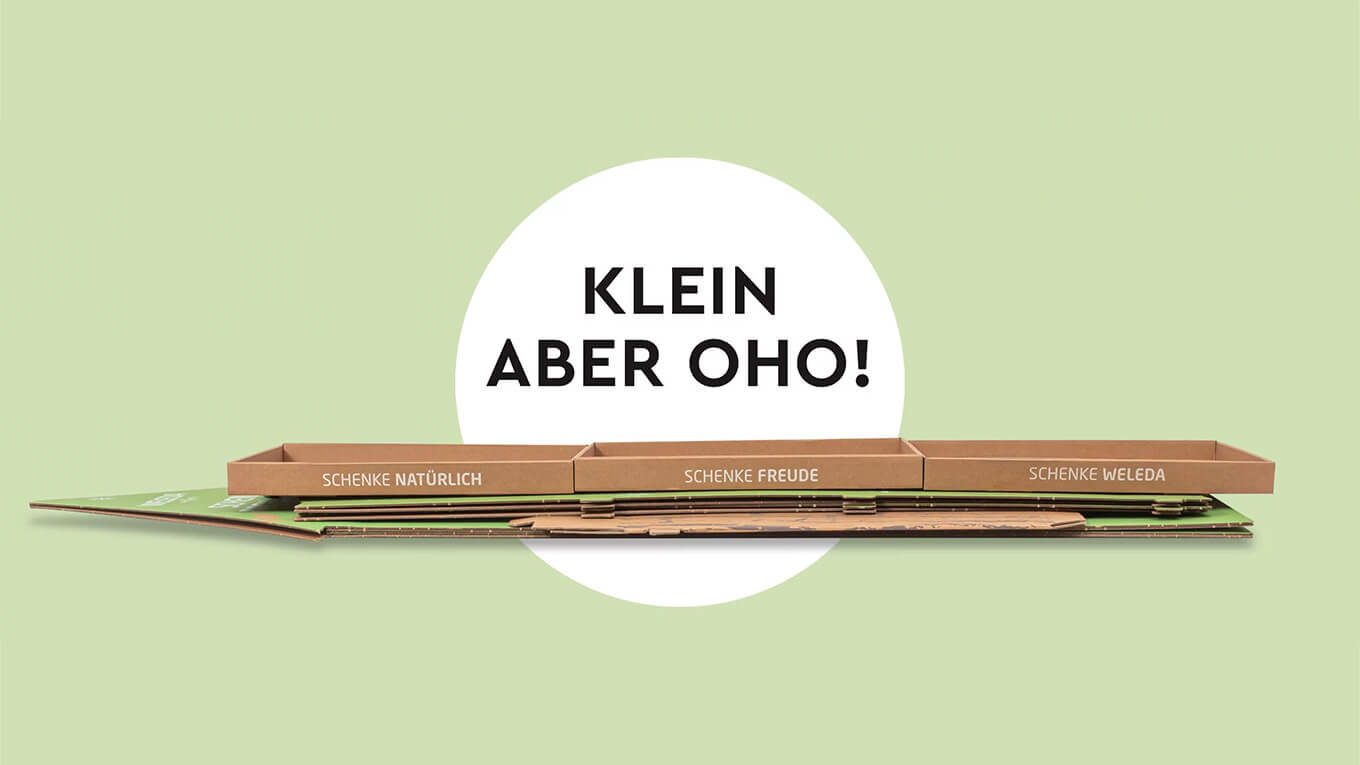
To accompany the launch of the new face care range “NATURALLY CLEAR”, we also developed the PoS appearance for the D-A-CH market.
More information:
Our client: Weleda
All projects for our client Weleda


 back
back