
Hardly any wastage, takeaway effect and payment by the customer – what advertising space could this possibly be? The answer is: the packaging of your products. It is on the shelf where customers are looking for exactly this product. Around 75% of all purchasing decisions are made here. Admittedly, how often customers pick up and look at your “advertising space” depends on the product: a chocolate spread is checked out more often than a muesli bar. However, the likelihood that definitive buyers will be interested in similar products is high and the costs are borne by the customer with the purchase price.
This is why packaging design is such an important discipline, and the sales relevance of the design for a product conversely also speaks for the quality of the packaging as an advertising space. Sometimes there is still space on packaging that is not necessarily needed for its core function, but which remains unused. This does not refer to the free design space that is necessary to allow elements to take effect. It’s about the actual unused space – and you can do a lot with it.
Digital makes it possible
The concept is much easier to implement in our digital age than it was a few years ago. There are now digital printing machines that enable small and temporary print runs, even in packaging. The cost of digital artwork and printing plates has fallen significantly. This makes it possible to make temporary changes to the packaging.
We have put together a few examples that illustrate the optimal use of this remaining space as advertising space that has what it takes to be called the best advertising space in the world:


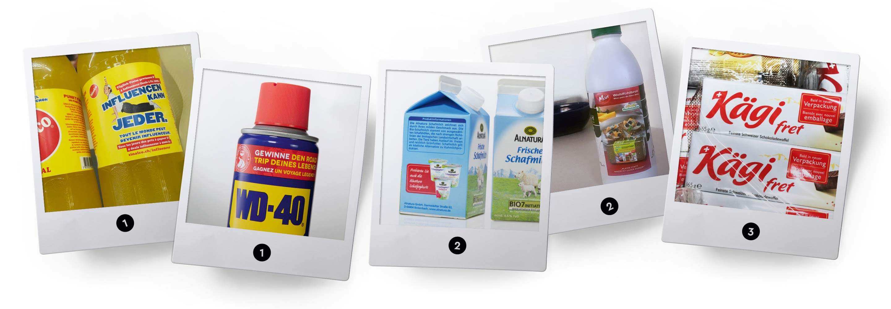
1. promotional campaigns such as the one on the lemonade pictured here are already quite common: Sinalco invites customers to try their hand at being an influencer for the brand and promises inviting prizes in return. The concept is similar for competitions, as the example of the WD 40 brand, the multifunctional product for corrosion protection, shows: “Win the road trip of a lifetime”.
2. cross promotion with in-house products. Example: Alnatura sheep’s milk advertises an Alnatura sheep’s yoghurt. However, cross-brand collaborations are also possible, as the example of Swiss organic milk from the Biedermann dairy (Emmi AG), which advertises an organic bread from Mestemacher, shows.
3 Kägi even announces the imminent relaunch of the packaging on the old packaging. But be careful: make sure that the new packaging also offers real added value. In this case, Kägi justified himself by saying that the new packaging protected the wafers better, but it also contained two wafers less and was hardly more environmentally friendly than the old packaging.
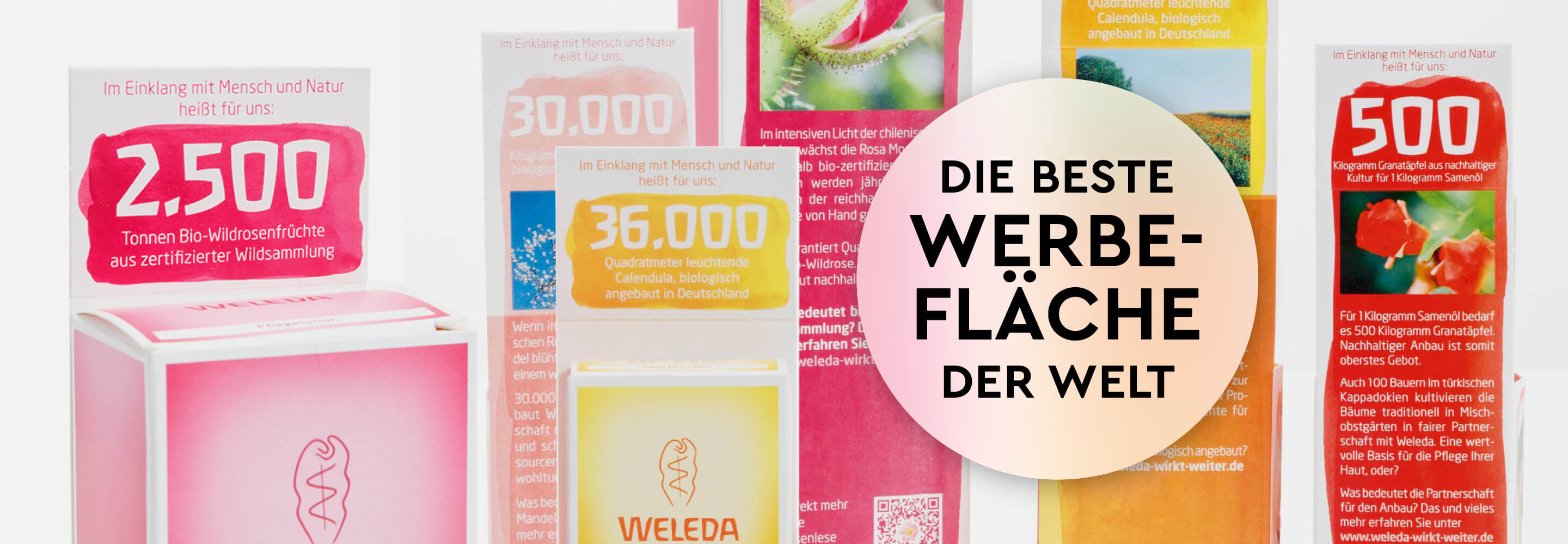
4. also an interesting example: Weleda’s CSR campaign. We used insert tabs and slipcases to communicate the company values as additional added value – strikingly summarized in facts and figures, supplemented by case studies on the product backs, which linked to a microsite with more details via links and QR codes.


5. or we dress a product in a new seasonal look for certain occasions and emotional phases, such as the packaging for the Weleda care products for the Christmas campaign elaborately and artistically designed.
6 Finally, a look outside the box: Toblerone even offers its customers personalized packaging. The name, picture and accompanying text make the triangular XXL chocolate bar the ideal gift for an extra charge. Various sizes between 200 g and 4.5 kg are available. Although this is not an advertising space in the true sense of the word, the campaign is excellent advertising for the Toblerone brand as a whole.


Sources:
Weleda and Alnatura Design from Eberle customer references
Images 1, 2, 3, 6: Design unknown, seen in various supermarkets in Germany and Switzerland 2019/2020