Organic food no longer ends up in the shopping cart quite as often as it used to, as “organic” is often equated with “expensive”. The organic sector is certainly struggling with the reluctance to buy due to inflation. Alnatura is responding to customers’ new price sensitivity with the launch of a new brand: Prima! Alnatura stands for a basic organic range at a low price.
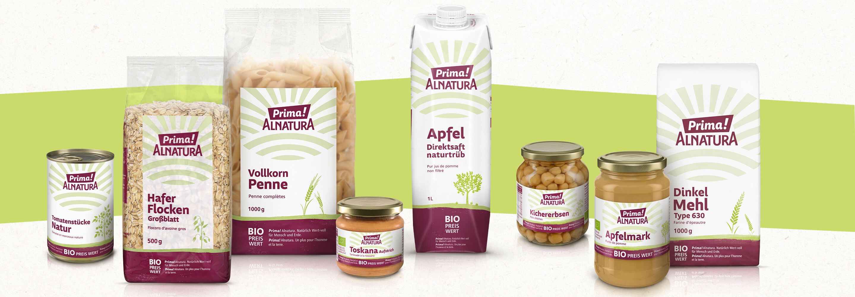
Alnatura has always been associated with top organic quality and low prices. Products for everyday needs such as pasta, oatmeal and flour are marketed under the Prima! Alnatura now offered even cheaper. “Bio Preis Wert” is integrated into the layout as an eye-catching disruptive element. Despite the low prices, the products naturally meet Alnatura’s quality standards – they are “naturally full of value for people and the planet”, a claim that is also an integral part of the packaging design and is deliberately written with a hyphen: Wert-voll.
Overall, the brand identity we developed is convincing with its reduced design and a concise logo with recognition value. The 40 or so products that we designed as part of the launch form a visual unit that is supported above all by the uniform color concept. The entry-level price segment is often rather “simple” in design. What was important in connection with Prima! Alnatura, that the design signals “price entry” on the one hand, but at the same time does justice to the high quality of the contents, after all, these are organic quality products.
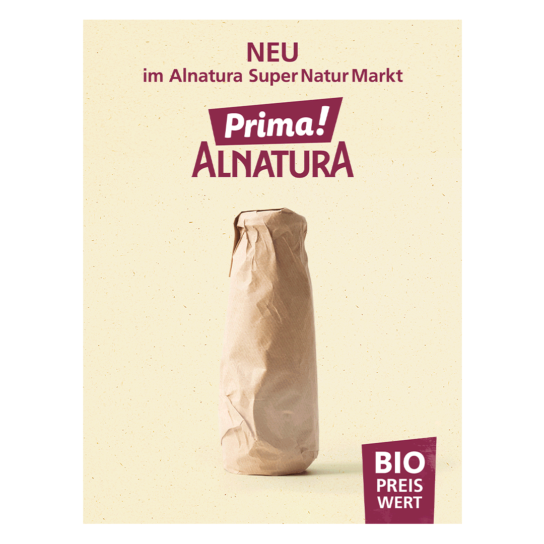
The campaign to launch the brand includes digital and print as well as PoS measures to draw customers’ attention to Prima! Alnatura.


 back
back