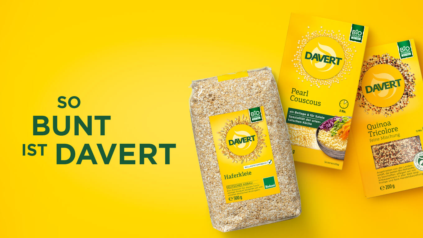
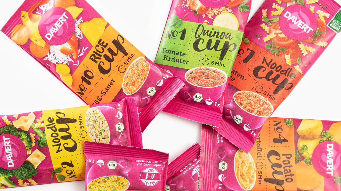
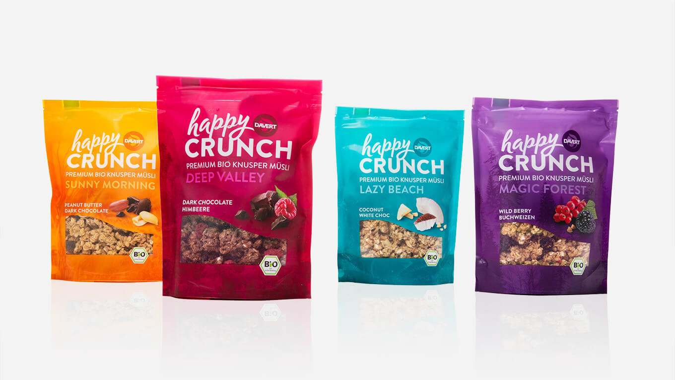
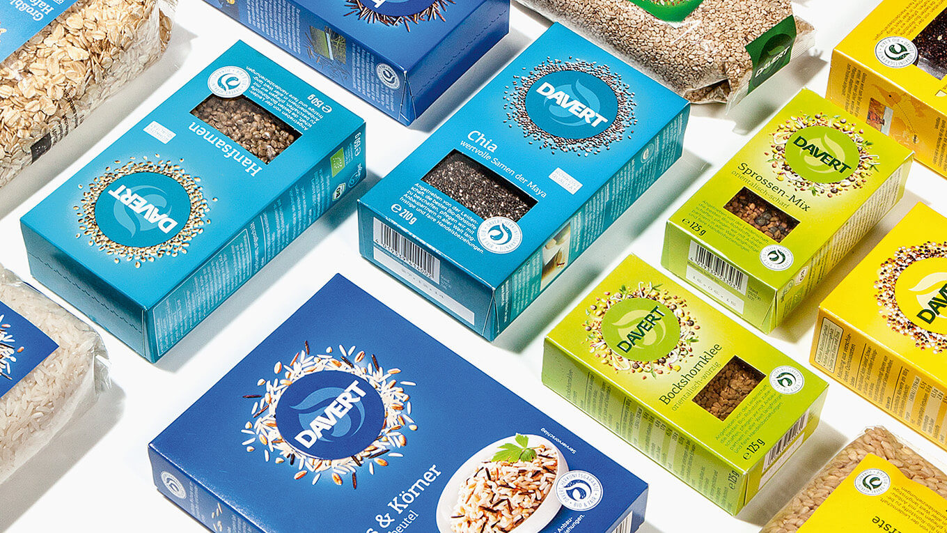
With golden accents in the Davert logo lettering, the variety name and the spoon, we create a high-quality look. In close coordination with the print shop, our prepress department implemented the shiny gold tone on the uncoated packaging perfectly.
More information:
Our customer: Davert
All projects for our customer Davert


