The popular salty snacks from Alnatura have been given a new design. The recent relaunch presents the crispy pretzels in modern packaging that perfectly emphasizes their natural taste and quality. With a combination of muted red and intense blue, the packaging immediately catches the eye and attracts attention on the shelf.
The new packaging uses warm, harmonious colors. The blue background in particular makes the golden-brown pretzels look especially tasty, while the loose arrangement of the cookie emphasizes the snack character of the Alnatura salty snacks. The muted red emphasizes the traditional association with pretzels, while the strong blue adds a modern touch. This combination gives the product a fresh, high-quality look that sets it apart from other products.
The logo is prominent on a beige background in the middle of the packaging. This central focus ensures a strong brand presence, while the special typography makes the salty snacks immediately recognizable. The clear structure of the design provides the customer with orientation and conveys Alnatura’s high quality standards.
A red button with the Demeter seal emphasizes the high organic quality of the product and creates additional consumer confidence. The relaunch not only takes the design to a new level, but also ensures that the proven quality and snack enjoyment are retained.
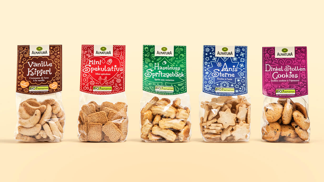
In addition to the salty snacks, Alnatura’s sweet cookies have also been given a new design.
More information:
Our client: Alnatura
All projects for our client Alnatura
