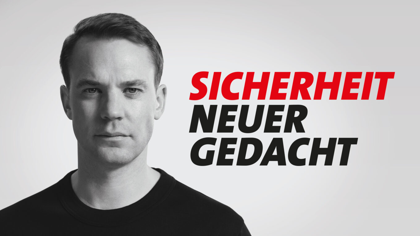
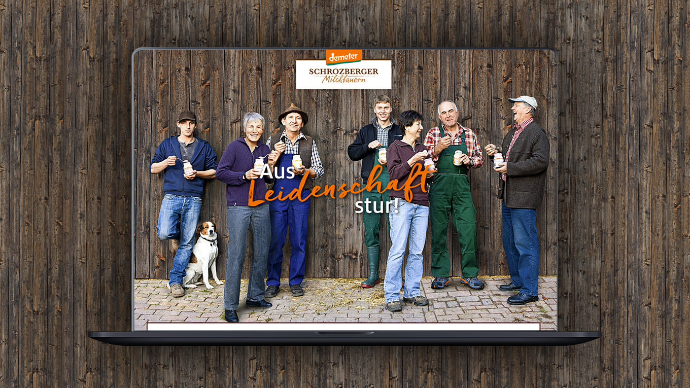
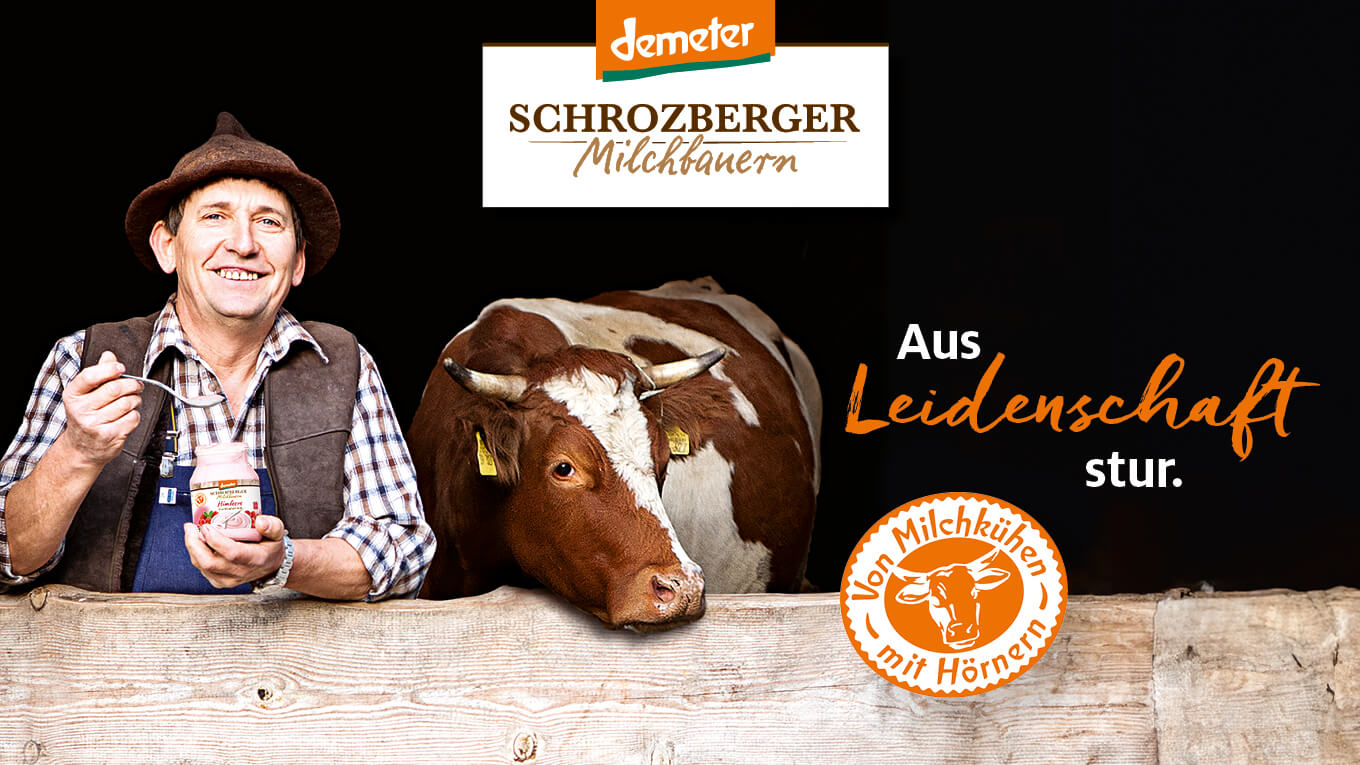
Following a comprehensive strategy process, we not only repositioned the Schrozberg dairy, but also created a clear brand identity that authentically reflects its values and traditions. The focus was on the close connection between the producers and the dairy – a central aspect that was not sufficiently visible in the previous brand identity.
The first and most important step in this repositioning was to change the name to Schrozberger Milchbauern. This brought the cooperative ownership of the farmers into focus and emphasized their decisive contribution to the quality of the products. The new name strengthens consumer confidence by making it clear that the brand is backed by dedicated family farms that are committed to sustainable agriculture and animal welfare.
Parallel to the repositioning, a modern but tradition-conscious image was developed for Schrozberger Milchbauern. This includes a revised visual design, optimized brand communication and a clear message: high-quality organic dairy products from responsible, cooperative production. This strategic reorientation has strengthened the Schrozberger Milchbauern brand and brought its authentic, artisanal character even more to the fore.
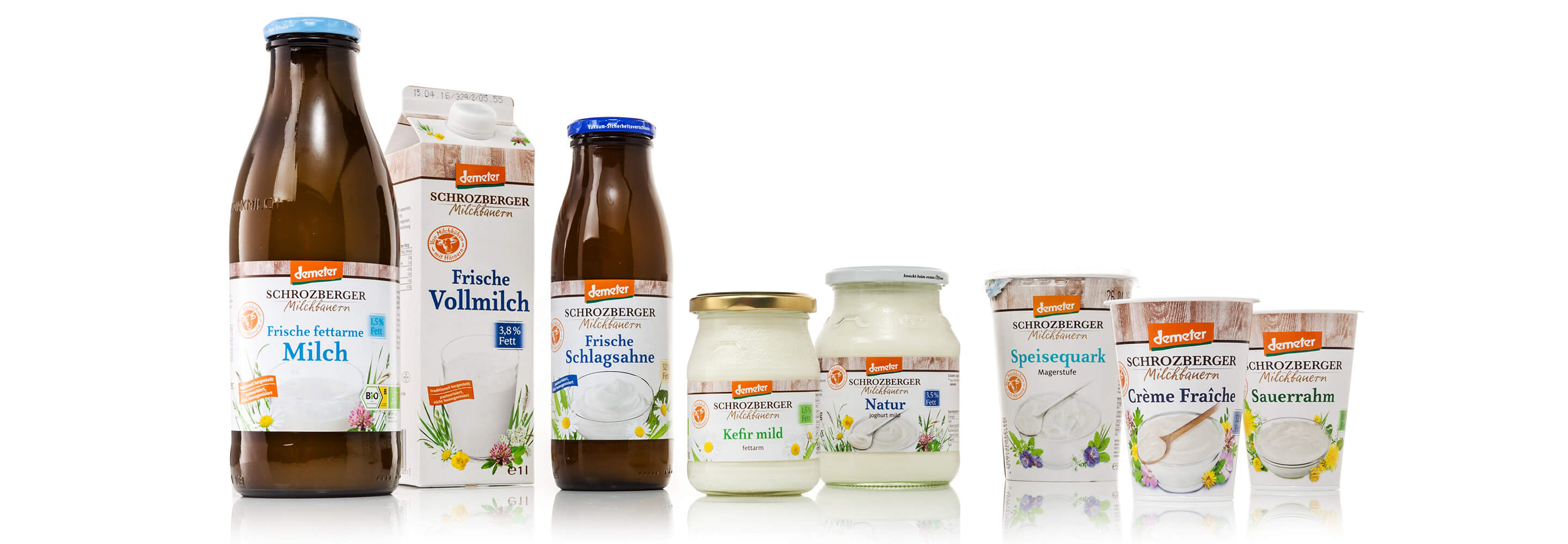
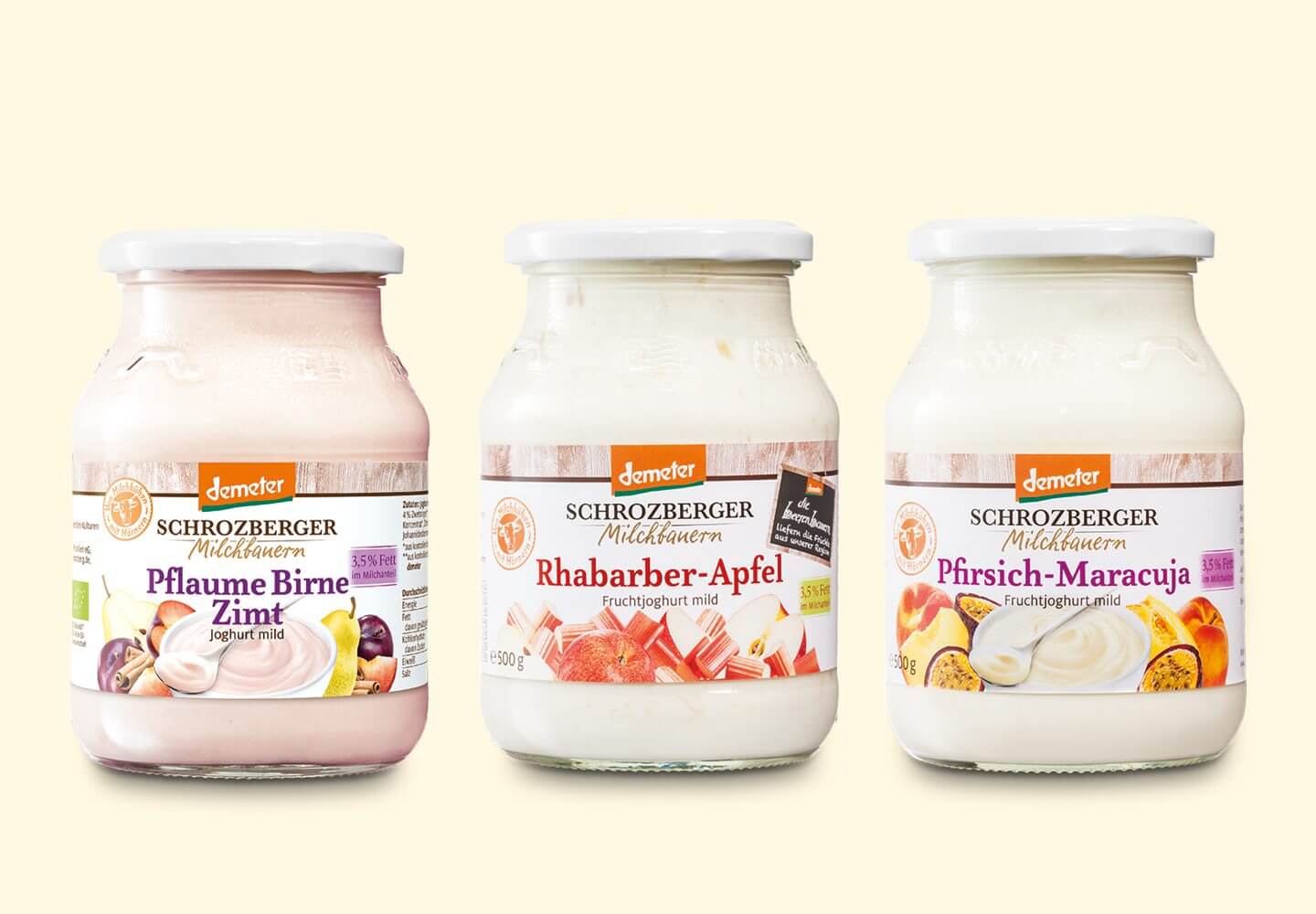
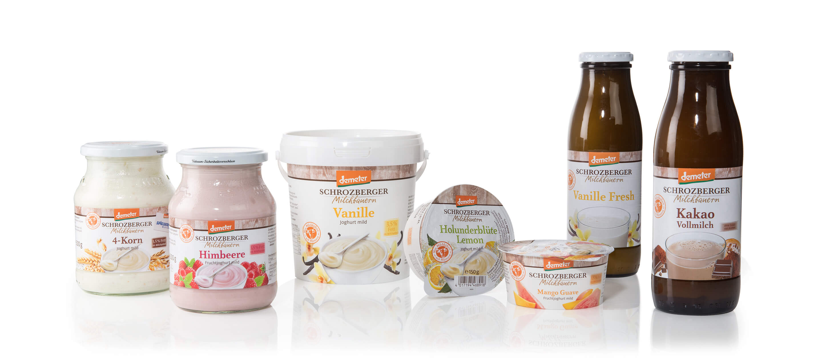
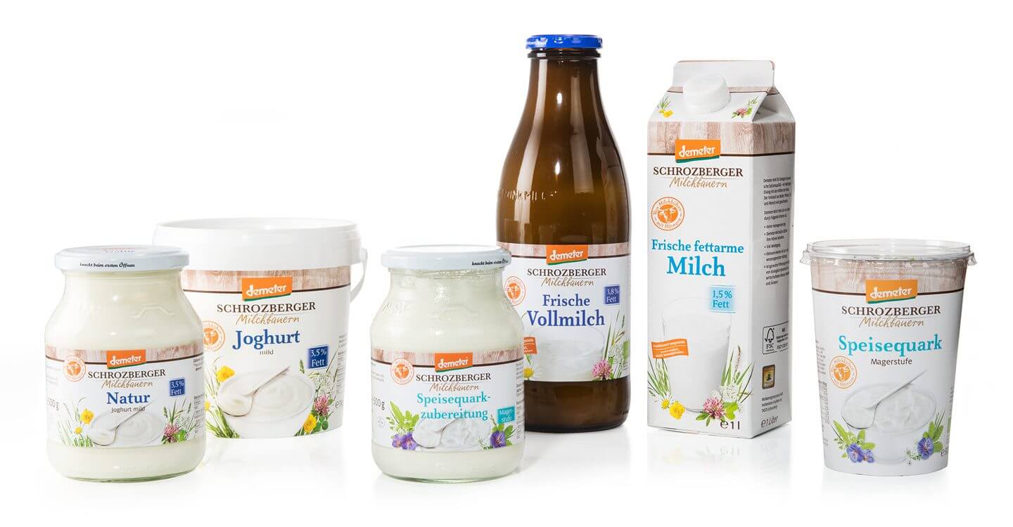
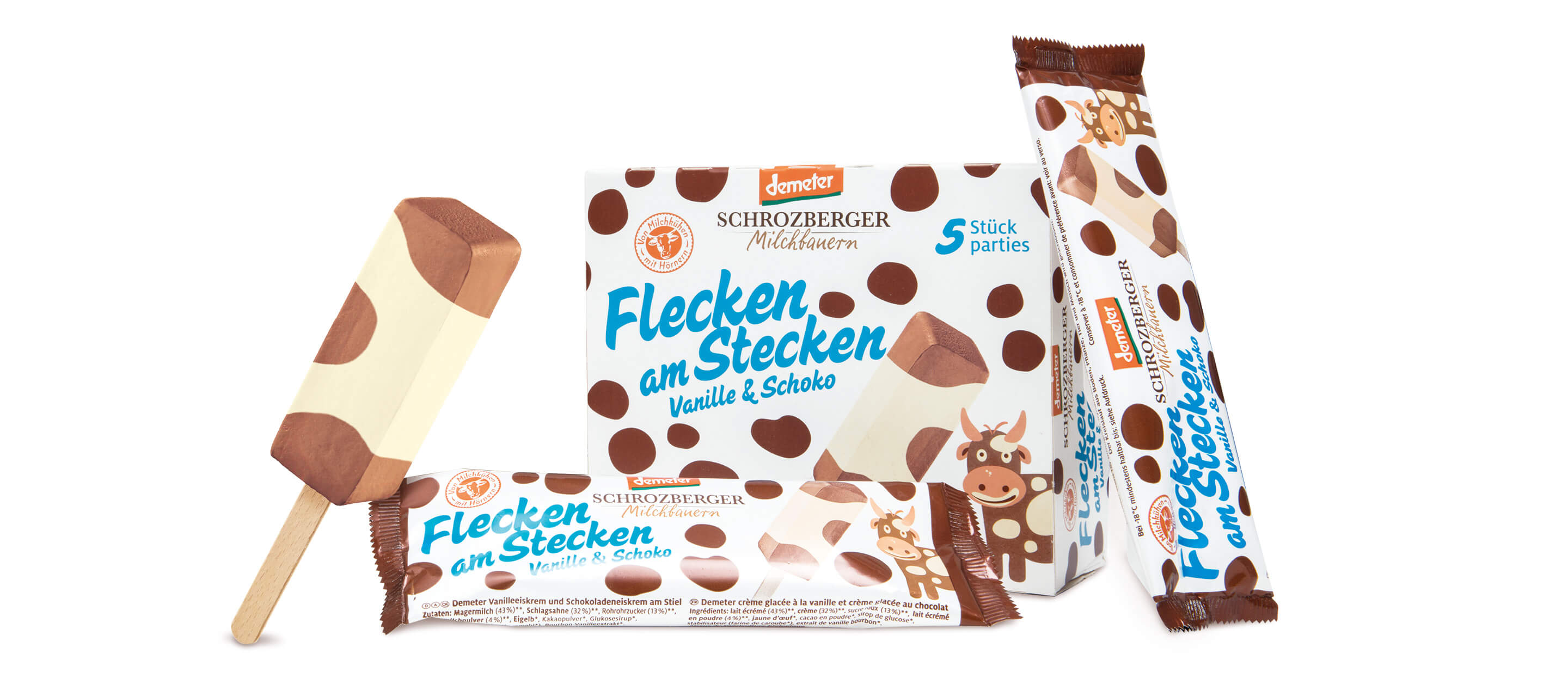
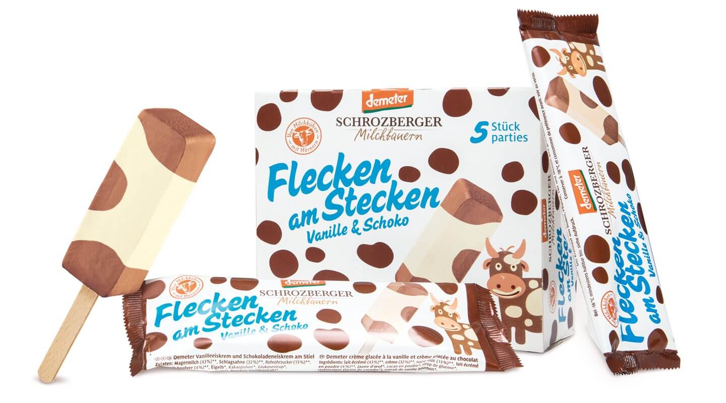
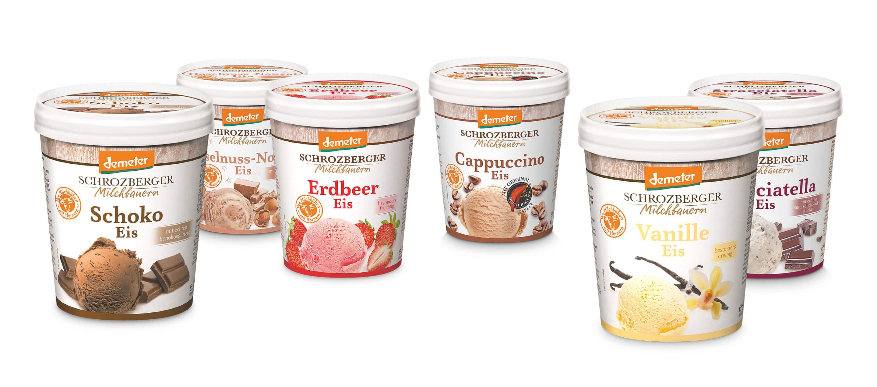
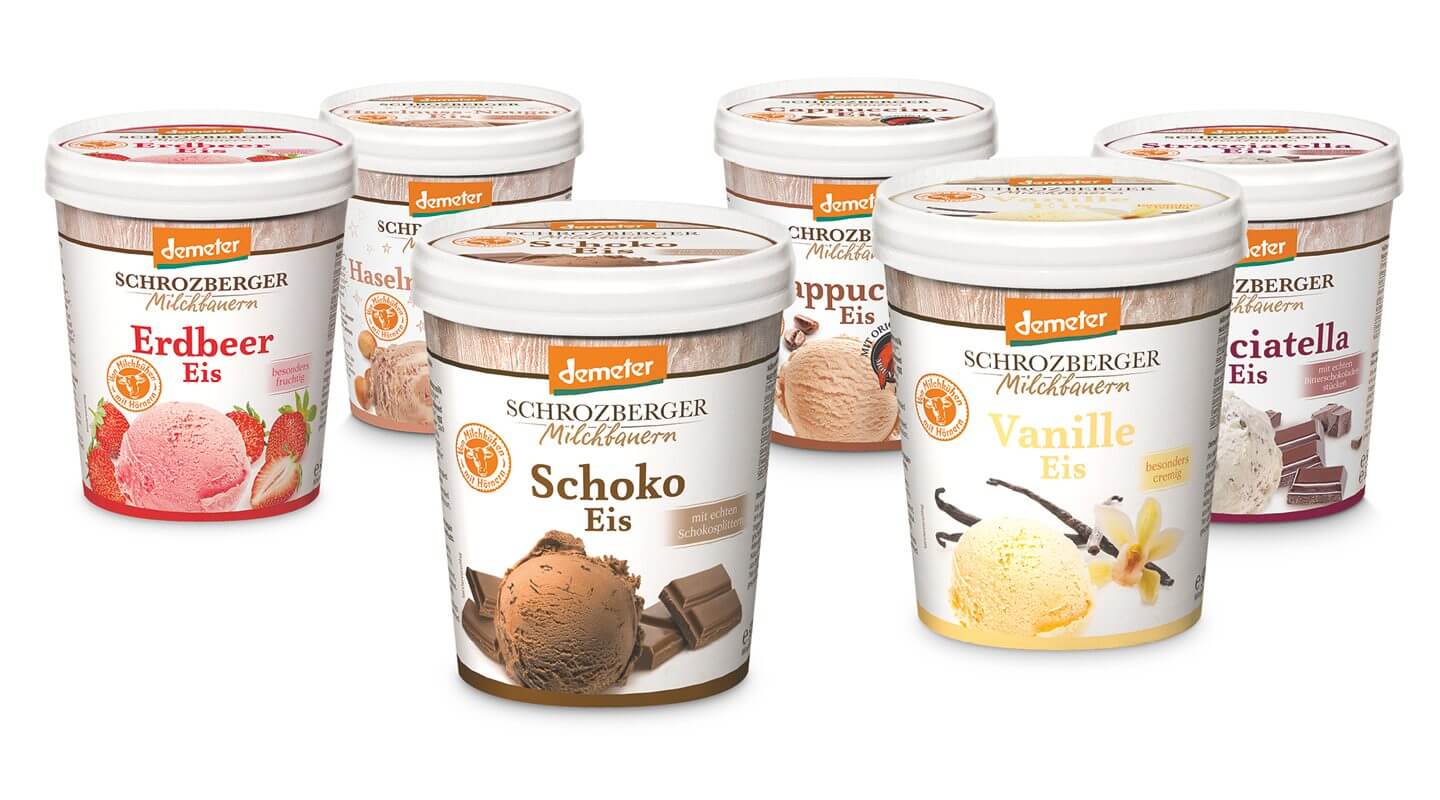
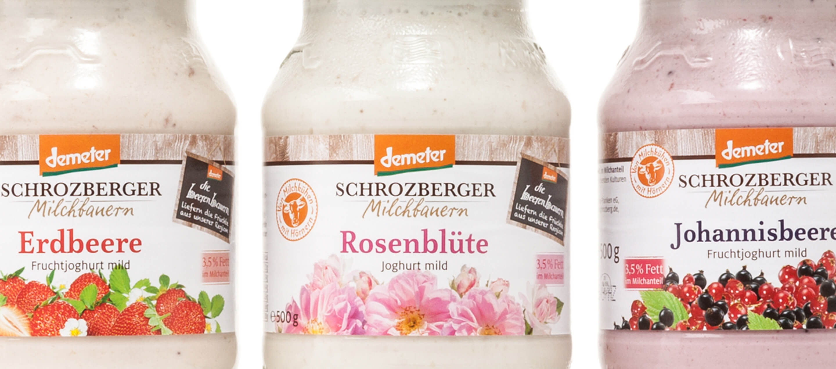
The task of the packaging design was to create a harmonious link between craftsmanship and premium quality that authentically reflects the values and sustainable philosophy of the Schrozberg dairy farmers. The aim was to develop a design that was not only appealing, but also created trust and emphasized the origin and special quality of the products.
One important aspect was to leave enough space for communicating key added values. These make it possible to inform consumers specifically about the special features of the products – be it through certified organic quality, traditional processing or sustainable agriculture. One example of this is the deliberately integrated distractor “… from dairy cows with horns”, which symbolizes the topic of animal welfare in Demeter farming. This emphasizes a key unique selling point of the brand, which underlines the species-appropriate husbandry and respectful treatment of the animals.
In addition to the content communication, the visual appearance was also designed to reflect the natural, unadulterated quality of the products. A high-quality but down-to-earth design, a soft, natural color scheme and authentic typography resulted in a packaging design that conveys the tradition, regionality and sustainability of Schrozberger Milchbauern and clearly positions the brand in the market.
The Schrozberg dairy farmers are now very successful, with double-digit annual sales growth and are among the dairies in Germany that can pay their farmers the best milk money.
Further information:
Our client: Schrozberger Milchbauern
All projects for our client Schrozberger Milchbauern
Further projects of our branding agency and packaging design agency


 back
back