The Egle brand sells a wide range of high-quality Egle foods, which have been specially developed for a health-conscious target group, exclusively by mail order. The focus is on natural ingredients, gentle processing and high nutritional benefits.
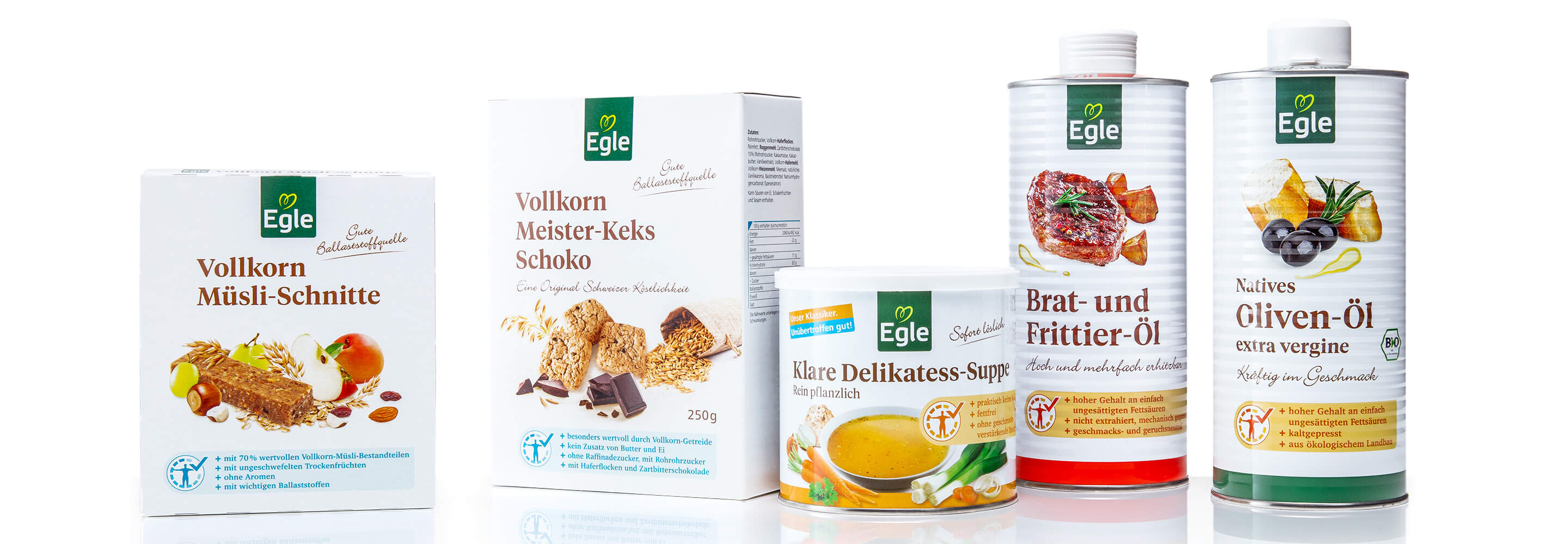
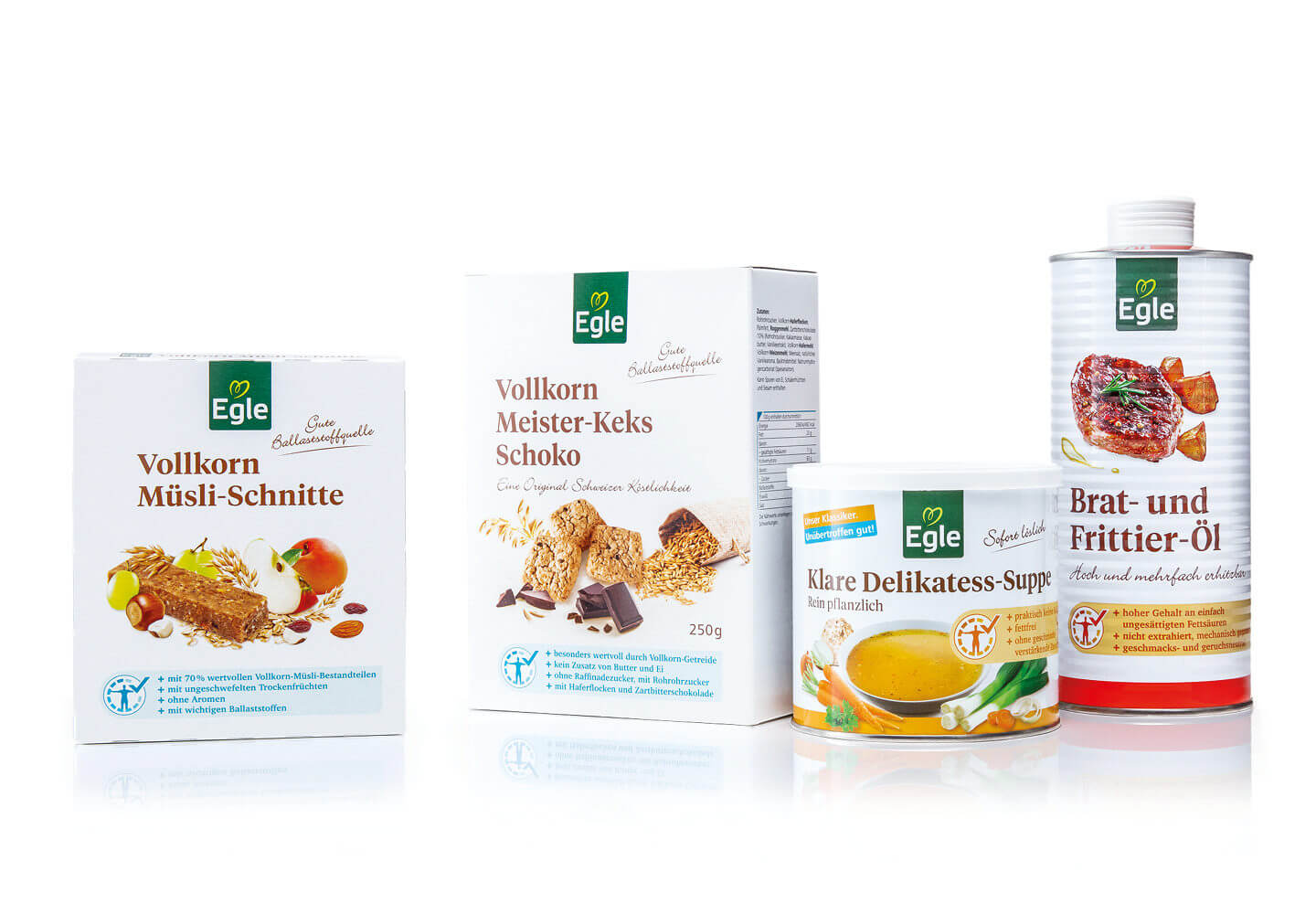
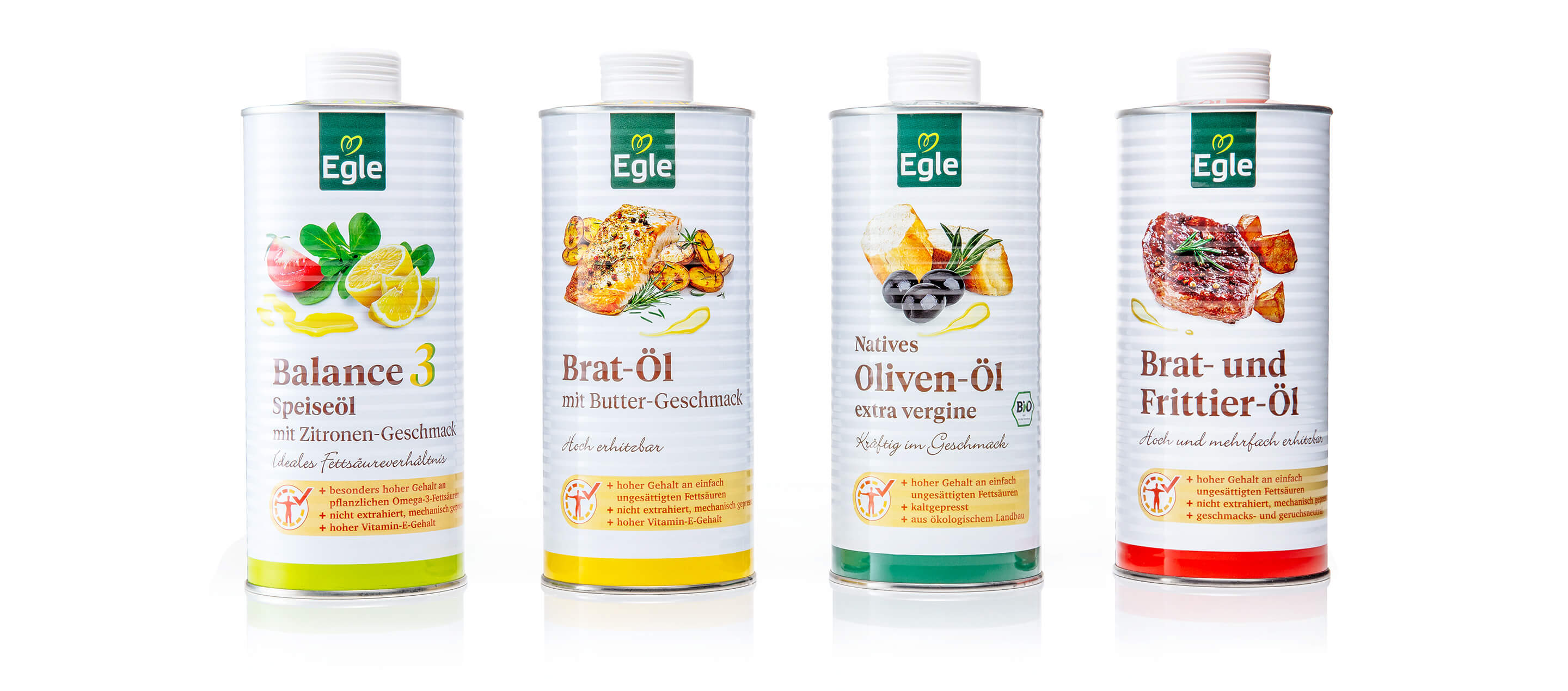
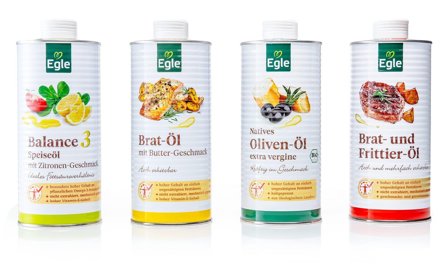
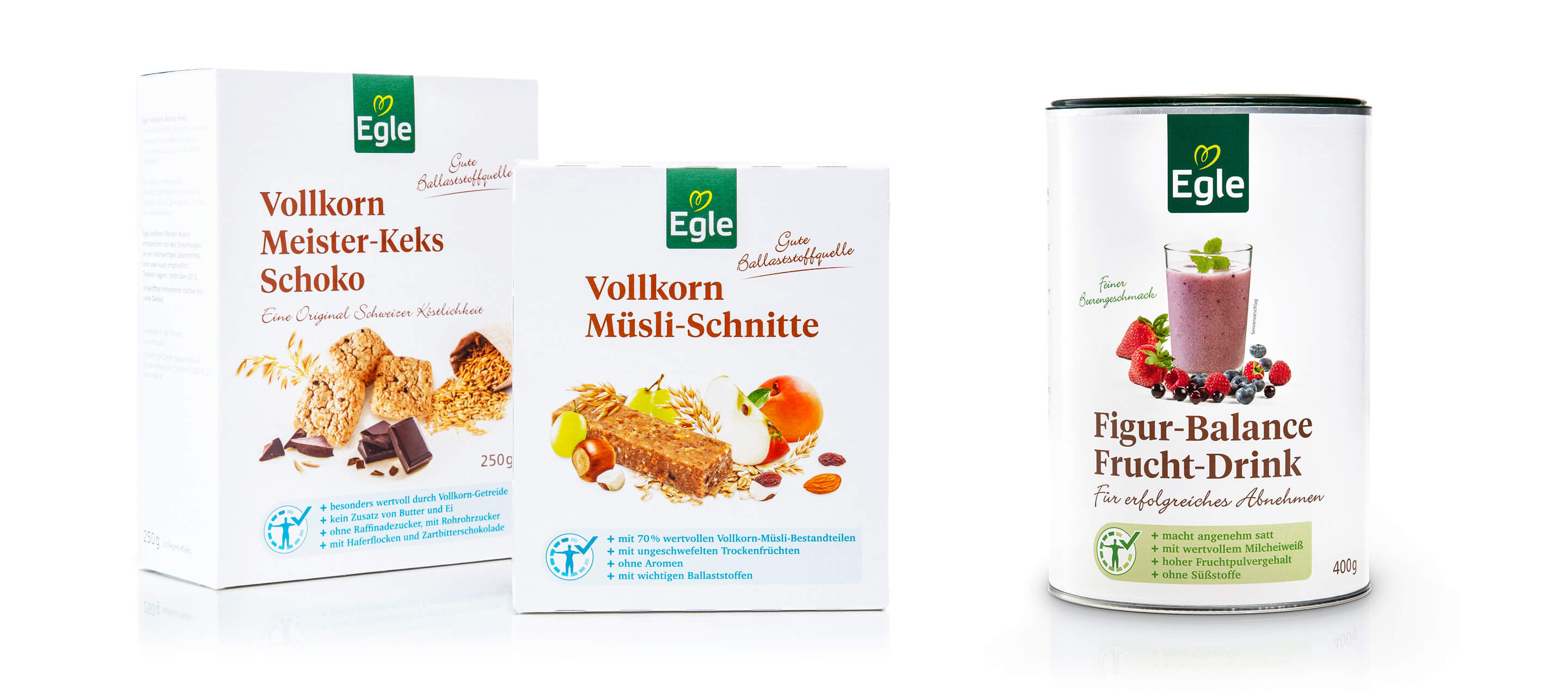
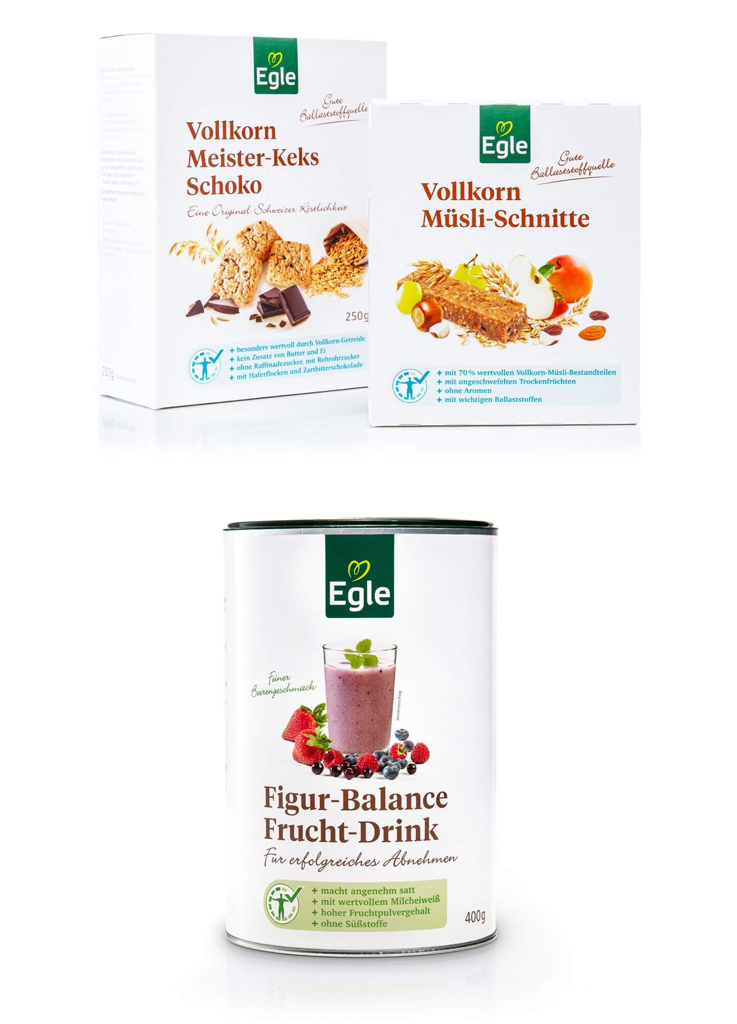
All Egle foods are characterized by special health-promoting properties, be it a reduced salt or sugar content, an optimized fatty acid composition or the absence of artificial additives. To provide consumers with easy orientation, each product in the Egle food concept is identified by a clear color scheme. This facilitates selection and makes it clear at first glance what nutritional added value the respective product offers.
With this well thought-out and consistently implemented strategy, Egle stands out as a specialist in health-conscious nutrition and offers its customers a reliable, transparent and high-quality selection of foods for a conscious lifestyle.
On the basis of a brand workshop, we developed the brand core and brand identity, defined objectives, worked out a clear positioning and carried out a complete packaging relaunch.
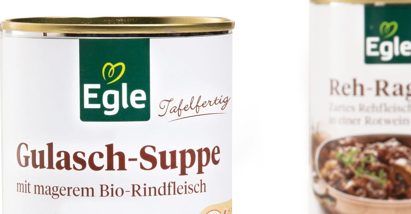
As part of the redesign, the Egle logo was carefully revised to modernize the brand identity while retaining its recognizability. The color coding within the Egle food concept has been more clearly defined so that consumers can identify the nutritional benefits of the products even more quickly. This color concept facilitates orientation within the range and supports intuitive product selection.
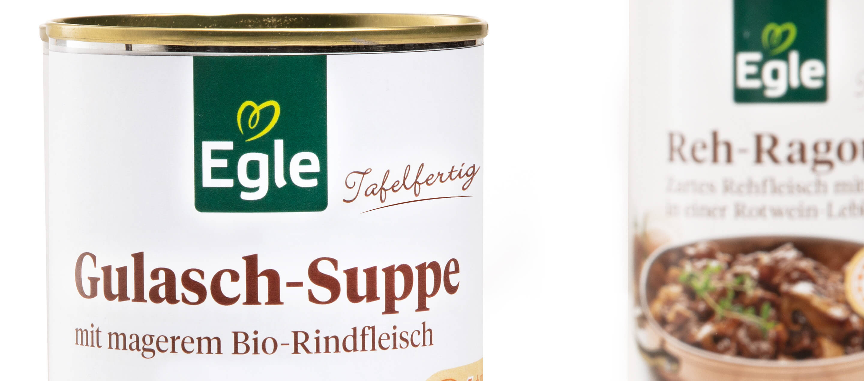
Particular attention was paid to the design of the packaging, which has now been given an even higher quality and more appetizing look. Ingredients and contents are presented in an appealing way using carefully selected imagery and modern typography. Clear, uncluttered design elements ensure that the most important information can be seen at a glance, while the culinary presentation emphasizes the quality and enjoyment value of the products.
This targeted overhaul consistently develops the visual language of the brand and adapts it to current design standards – without losing sight of the traditional brand identity of Egle Lebensmittel. The result is a harmonious overall appearance that appeals to both existing customers and new health-conscious consumers.
A high proportion of white on the packaging underlines both the self-similarity and the premium orientation of the products, which consist largely of ingredients from organic farming or organic animal husbandry.
More information:
Our customer: Egle
All projects for our customer Egle


 back
back