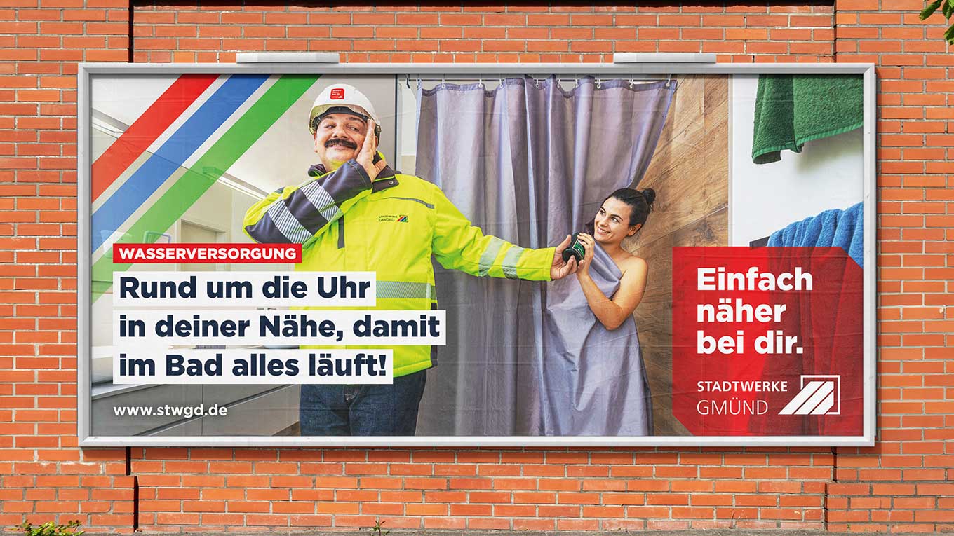
When a well-known chef, entrepreneur, and TV star lends his name to a product, there’s more to it than just marketing. There’s a philosophy behind it—the very philosophy that Johann Lafer discusses in an interview about the Johann Lafer brand.
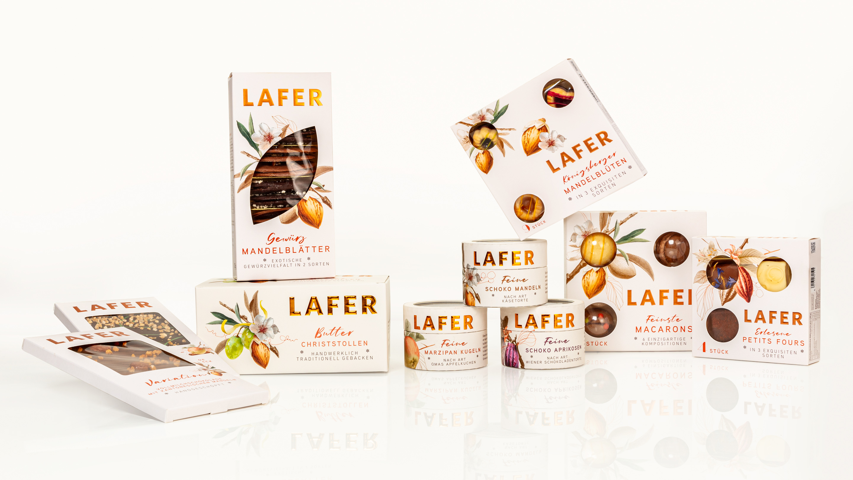
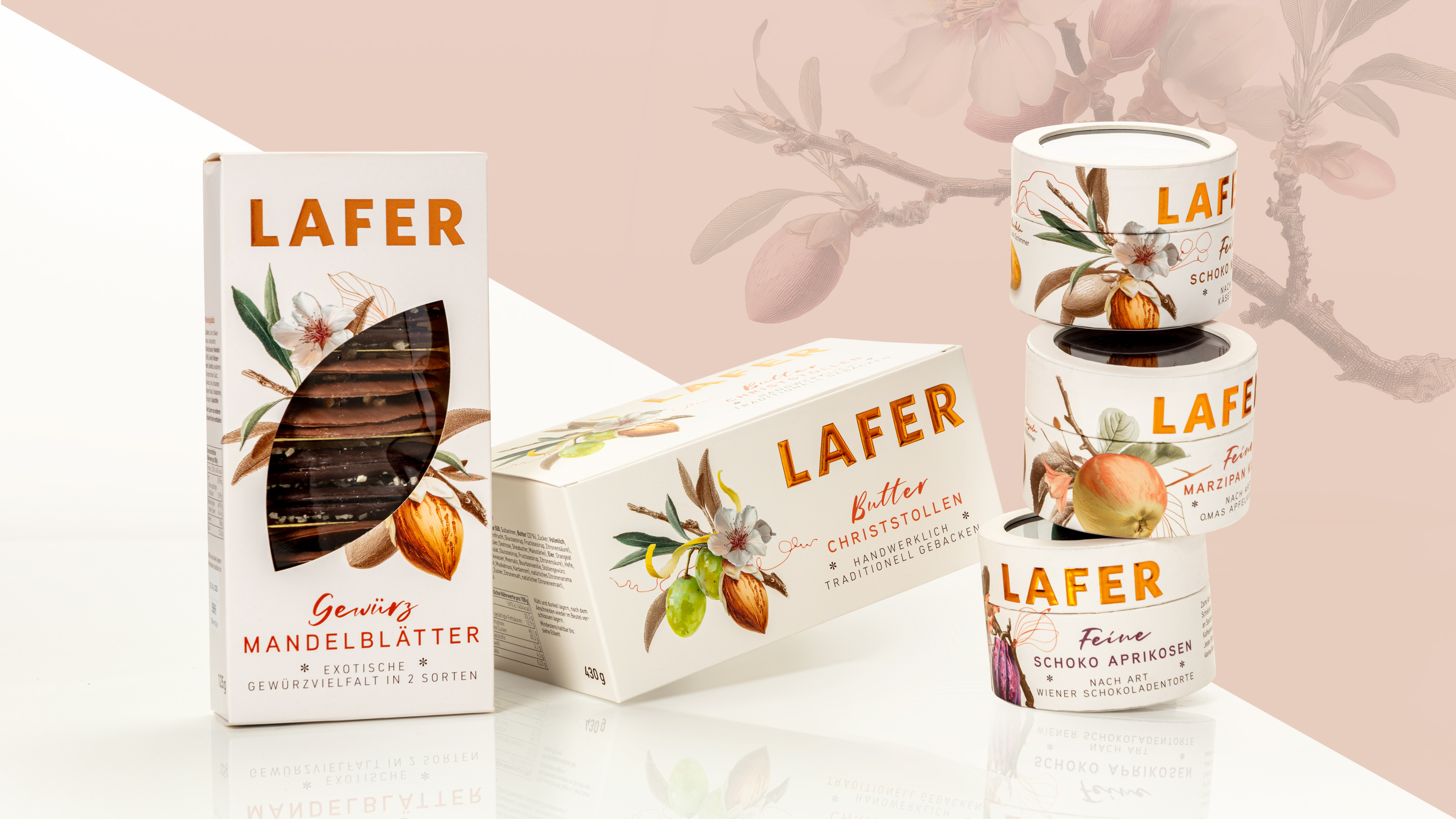
That was exactly our starting point. For Johann Lafer’s confectionery line, we developed a design concept that authentically captures the chef’s world:
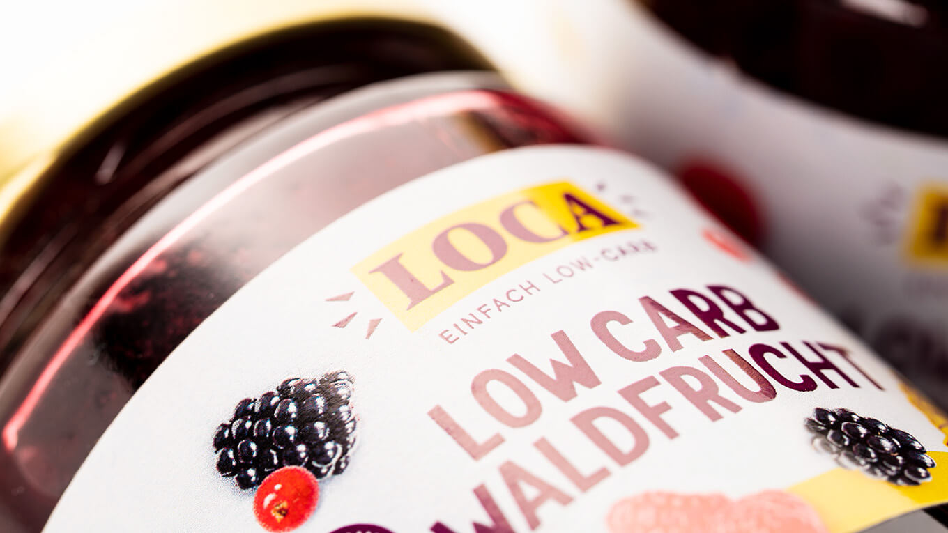
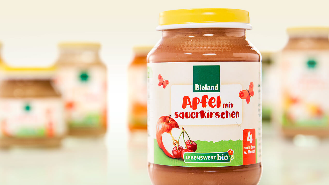
—artisanal precision, a well-thought-out strategy, and a genuine commitment to indulgence. The detailed, high-quality illustrations were created directly from the products’ recipes and ingredient profiles. They bring the diversity of flavors and the depth of craftsmanship to life visually, combining classic design techniques, carefully curated imagery, and AI-supported processes. The creative execution and artisanal finesse of our design team were always crucial to this process.
The packaging itself was deliberately designed to be clear and minimalist. Fine finishes with copper foiling set specific accents. The result is an appearance that makes an immediate impact on the shelf: clearly differentiated, elegant without exaggeration. The system design simply grows with you – new varieties can be seamlessly integrated. A brand that delivers what the name promises. And a design that shows exactly that.


 back
back