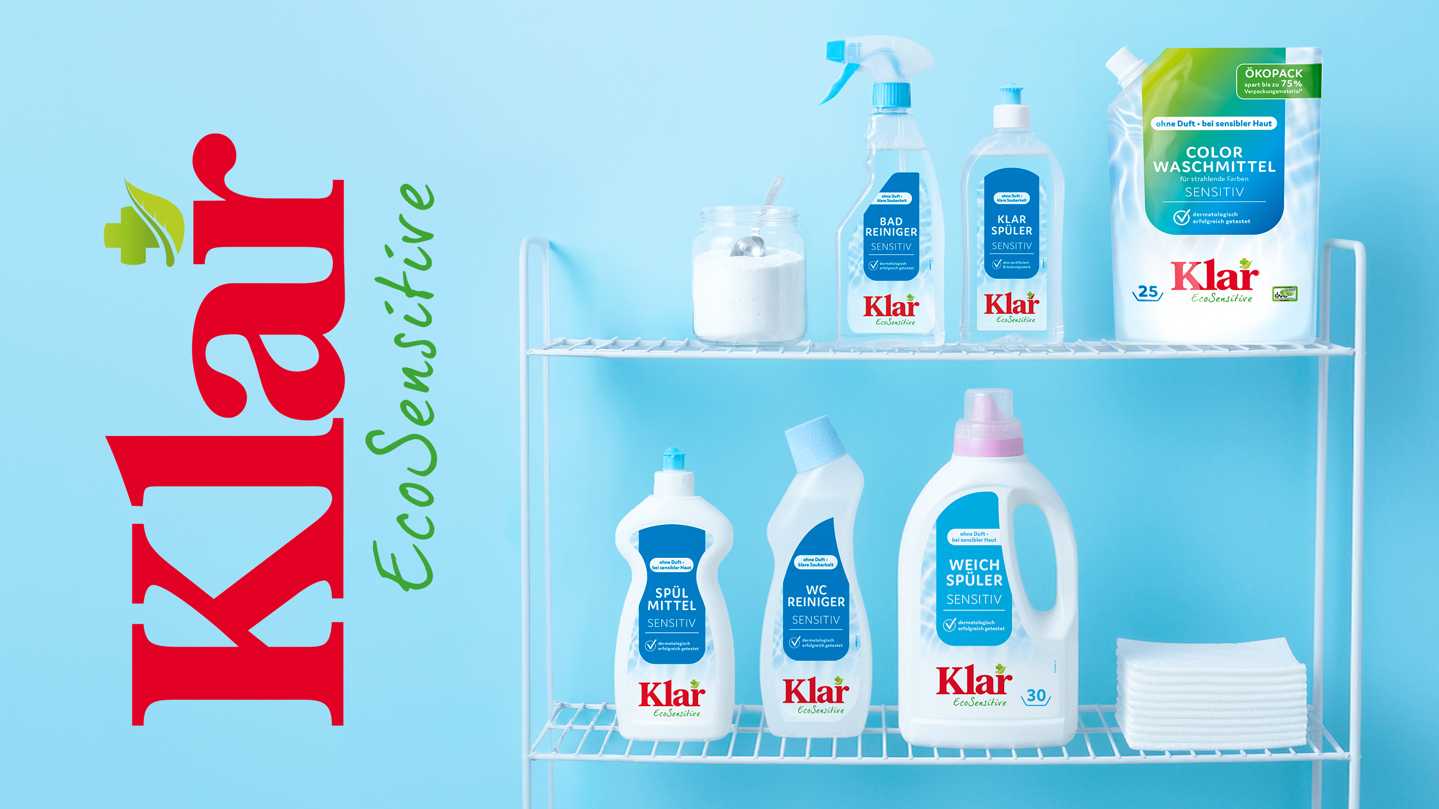
For KLAR EcoSensitive’s laundry and cleaning products, we developed a new packaging design that more clearly highlights the brand’s unique strength: formulas consistently tailored to the needs of people with allergies and those with sensitive skin. The focus was on how to make this product benefit more immediately apparent on the shelf. After all, KLAR EcoSensitive stands for more than just cleaning—the brand stands for reliability, skin-friendliness, and a conscious focus on what is truly necessary.
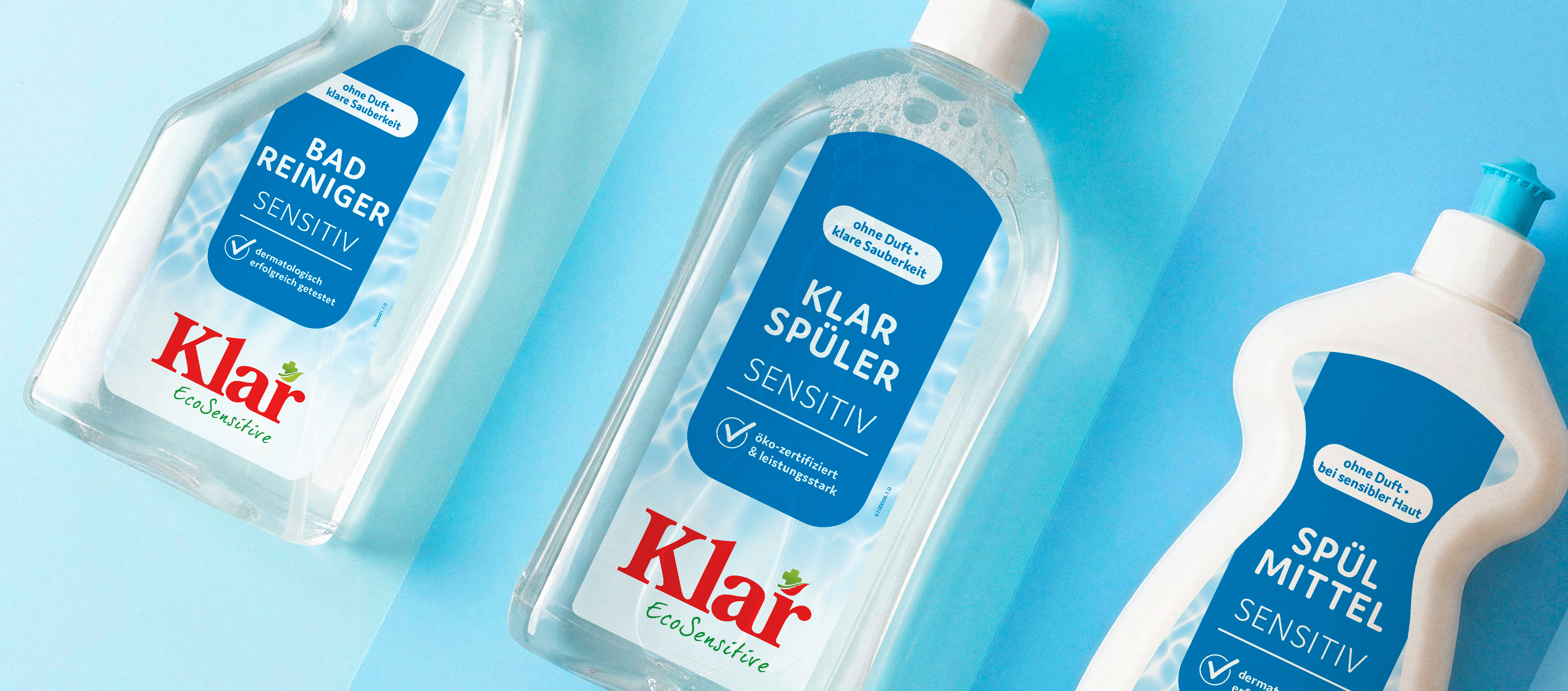
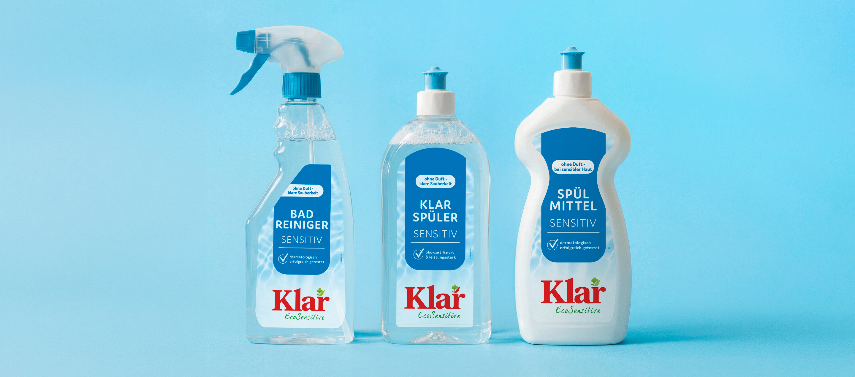
The new design language emerged from this core concept. Calm, clear, consistent—but not clinical. Minimalist design, clean typography, and reorganized product information: What defines the brand is now immediately apparent.
Three defined shades of blue provide guidance within the product range. The repositioned logo in the lower third ensures consistency on the shelf—regardless of package size.
The result strengthens existing products, seamlessly integrates new ones, and positions KLAR EcoSensitive as a trusted solution in the laundry, cleaning, and household products category—clear, honest, and distinctive.


 back
back