EBEP_181101_Relaunch_Web_Stadtwerke-Konstanz_01-2 EBEP_181101_Relaunch_Web_Stadtwerke-Konstanz_01-2

New brand identity for Stadtwerke Konstanz

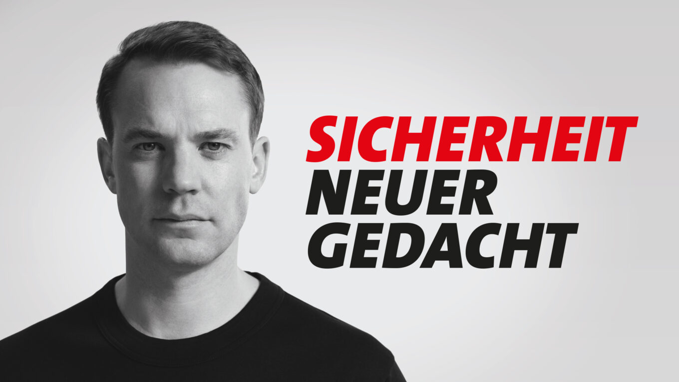
Stadtwerke Konstanz is a versatile group of companies belonging to the city of Constance and covers essential supply and infrastructure services for the region with its energy and water, telecommunications and mobility divisions. As a central player for sustainable energy supply, digital networking and modern mobility solutions, the company makes a significant contribution to the quality of life in Constance. In order to visually emphasize this important role and create a future-oriented, uniform brand image, we redesigned the entire brand identity from the ground up.

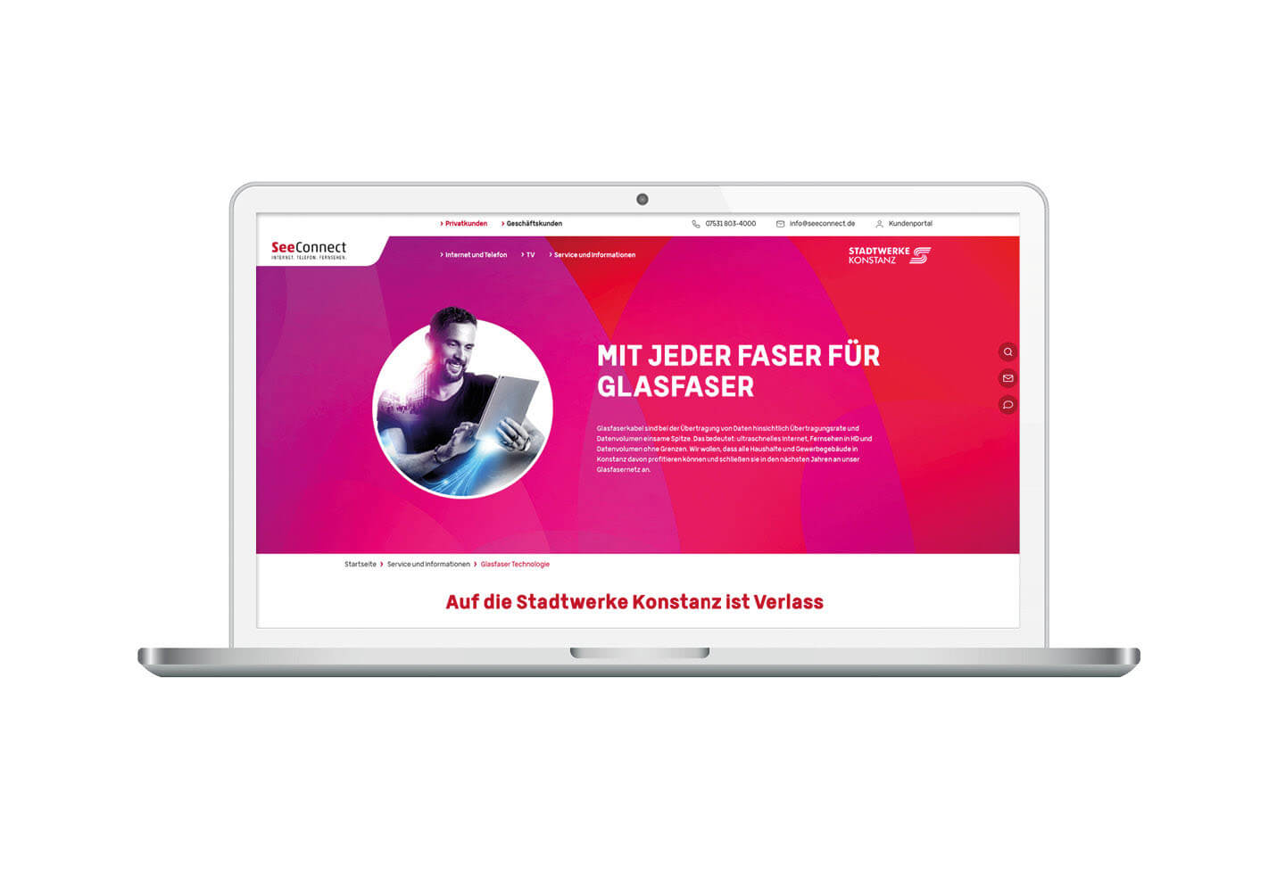
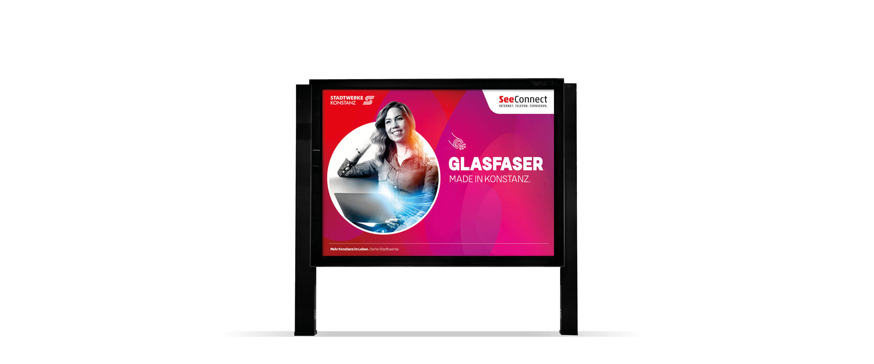
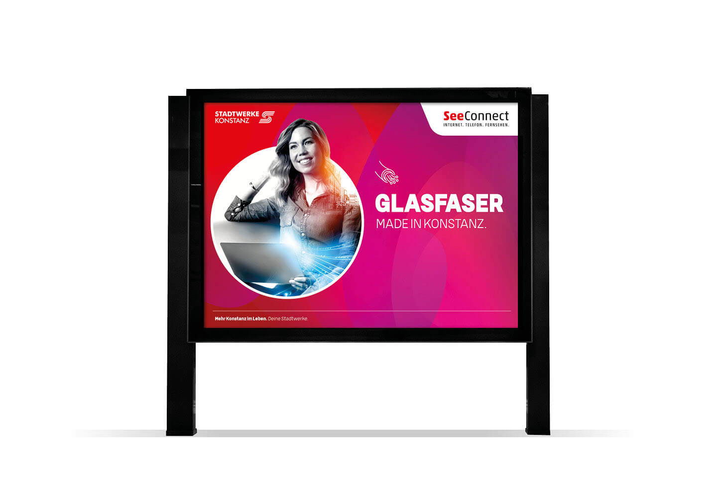
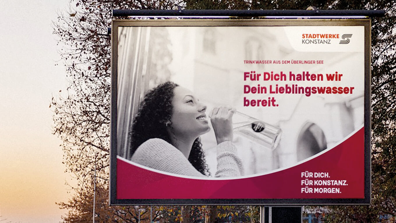
The biggest challenge was to develop a flexible design concept that would give the various business units an individual visual identity, but still make them clearly recognizable as part of the overarching Stadtwerke Konstanz umbrella brand. This required a well thought-out balance between independence and togetherness – each business unit was to be clearly differentiated, but at the same time recognizable in the context of the overall brand.

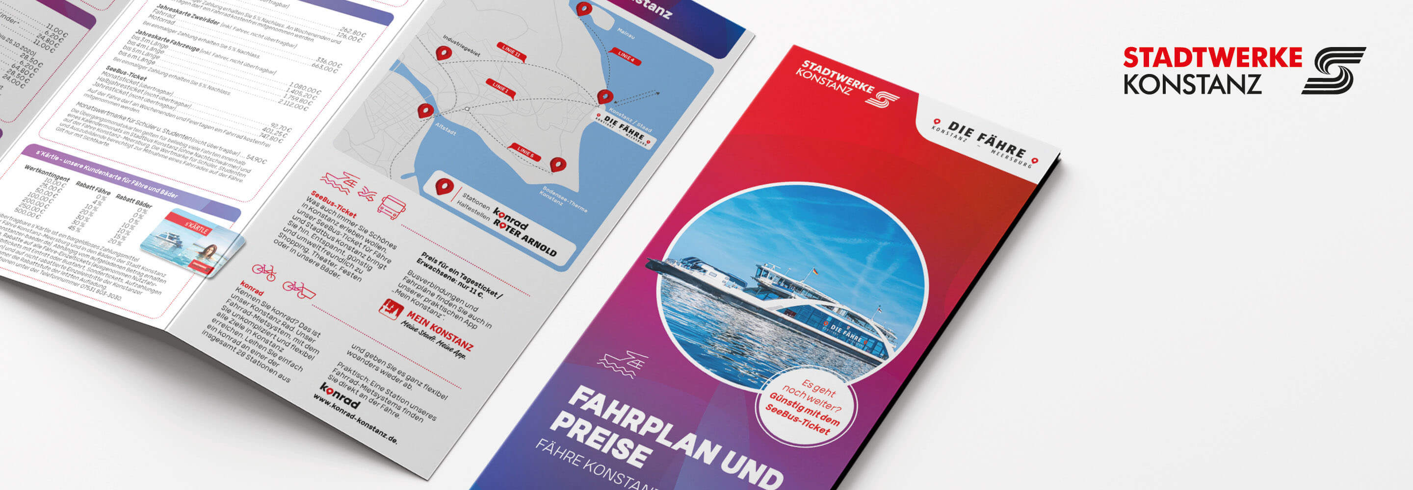
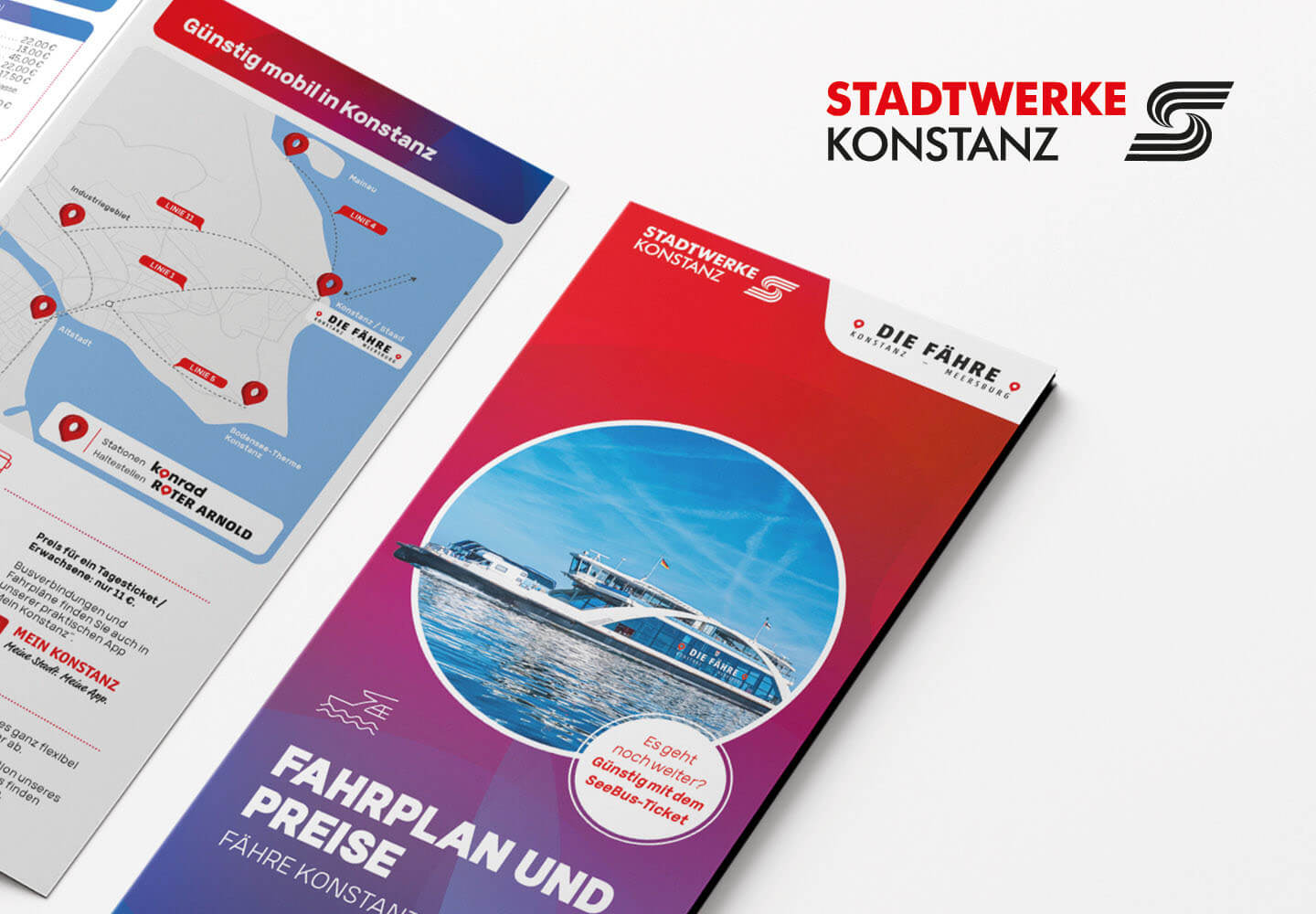
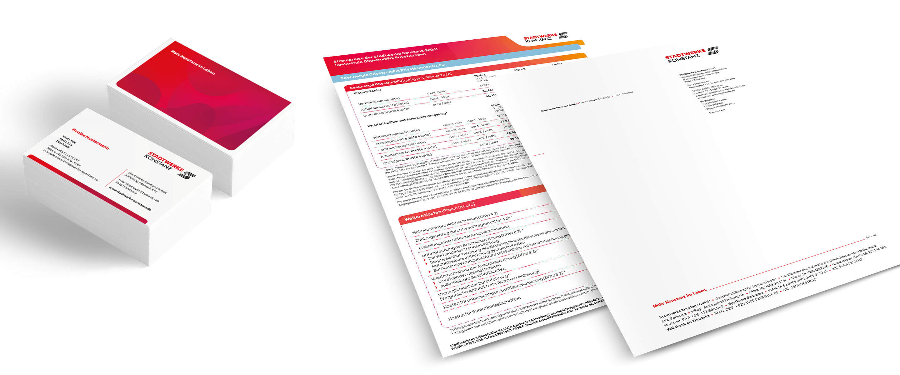
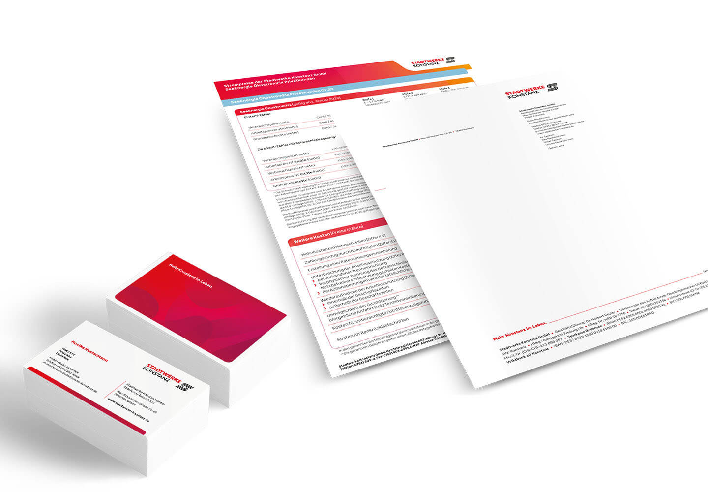
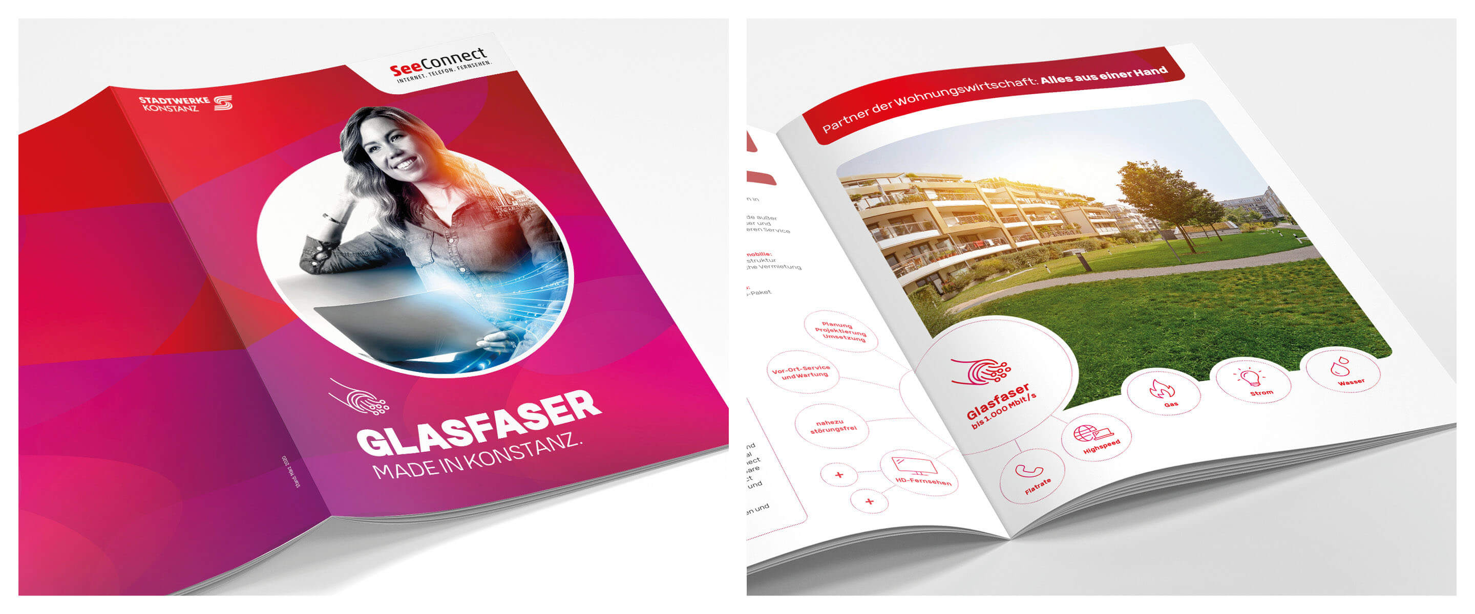
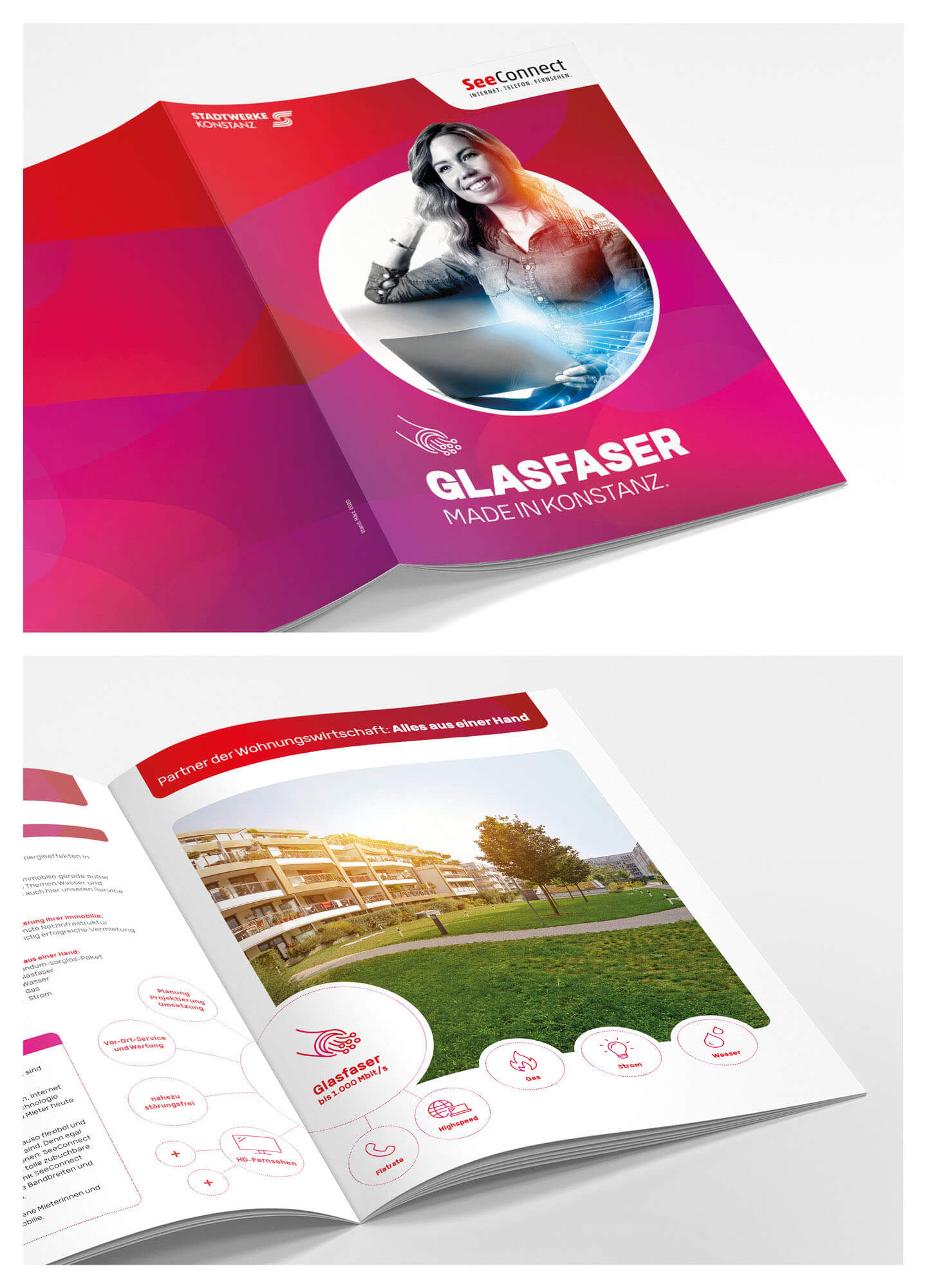
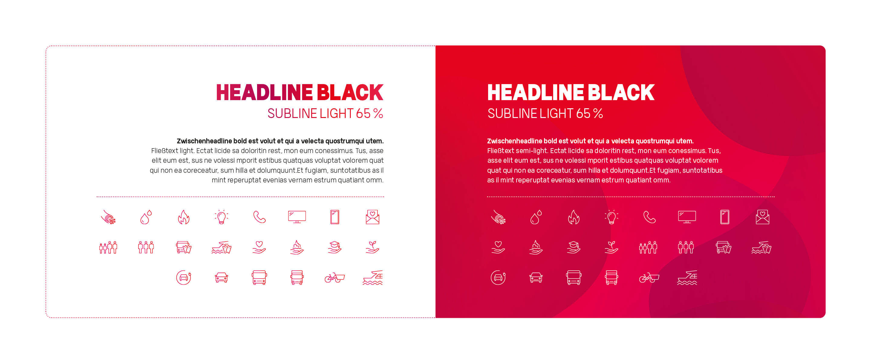
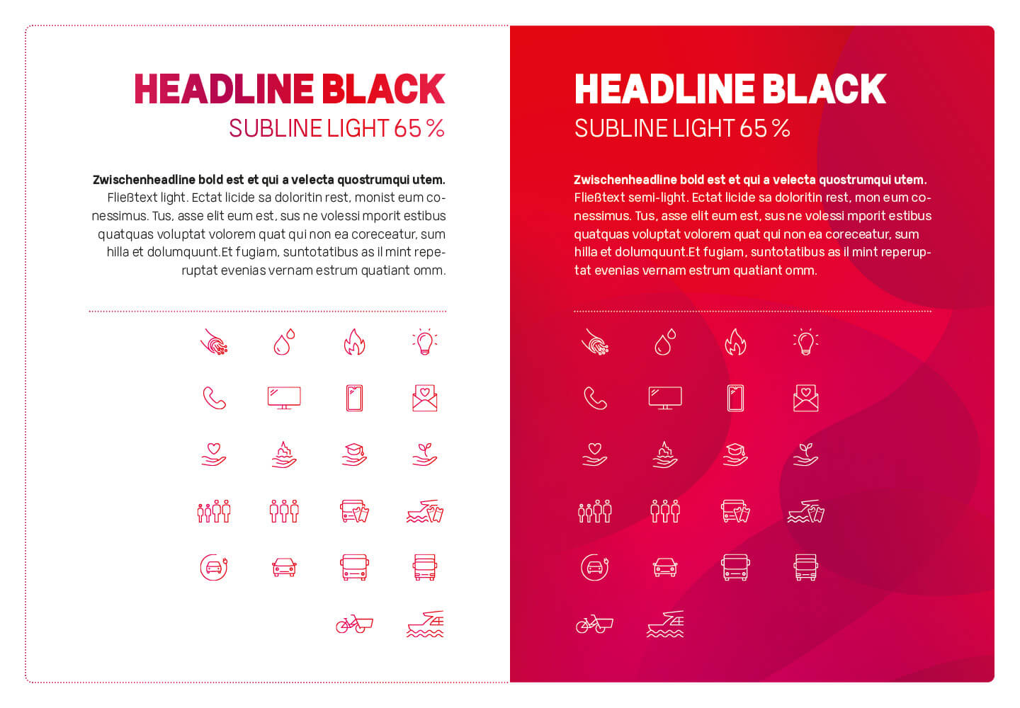
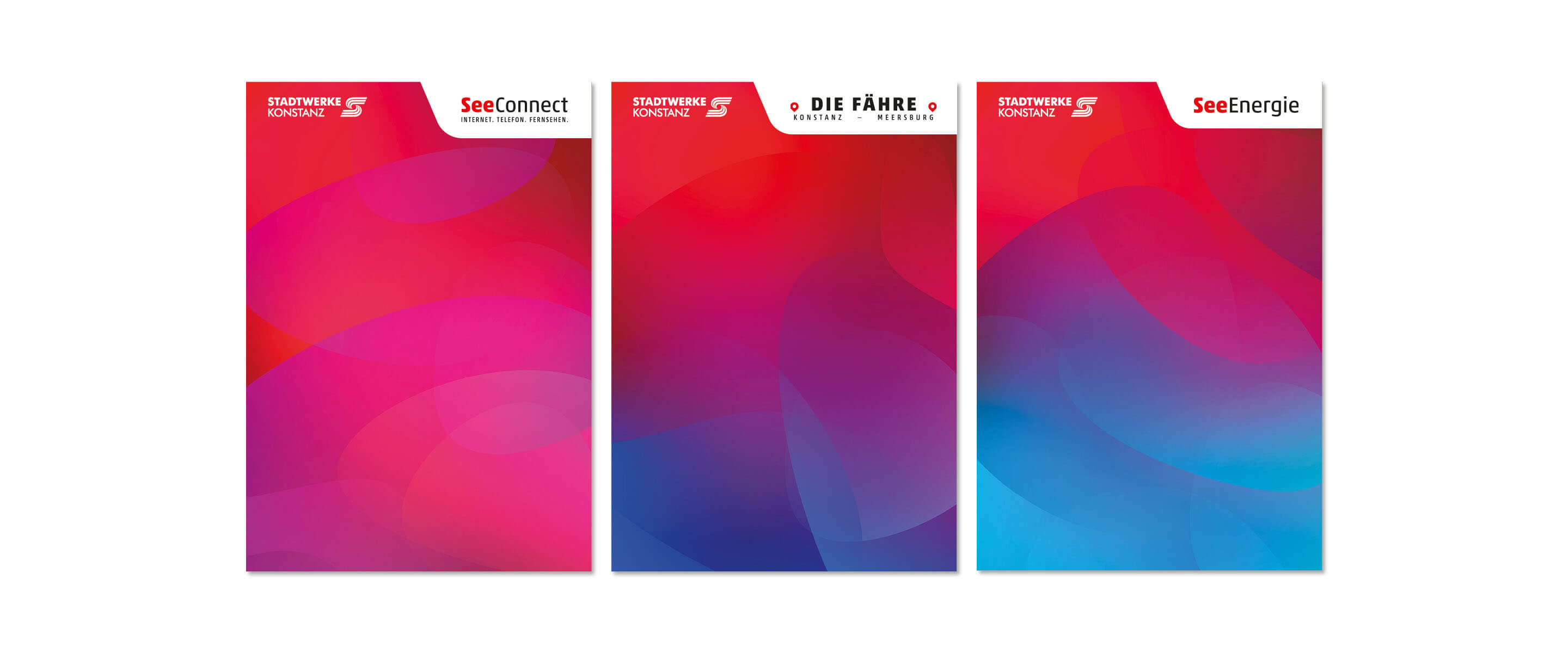
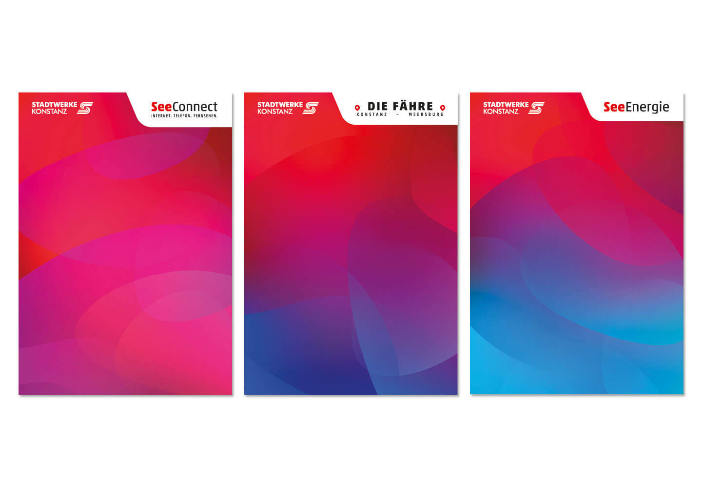
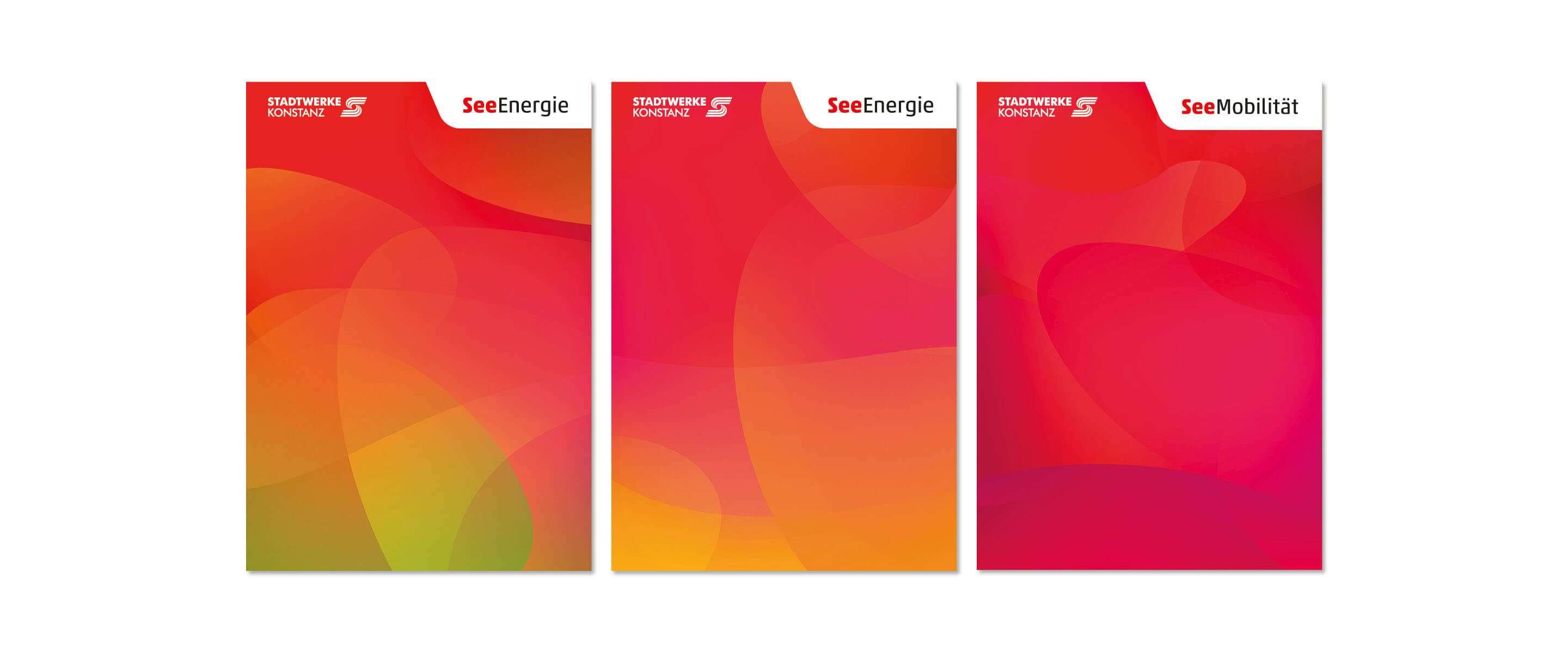
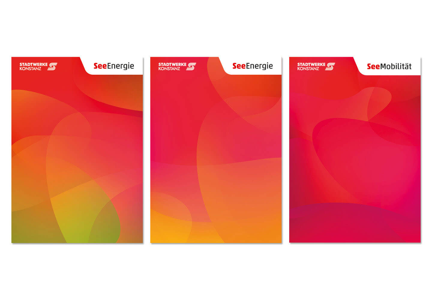
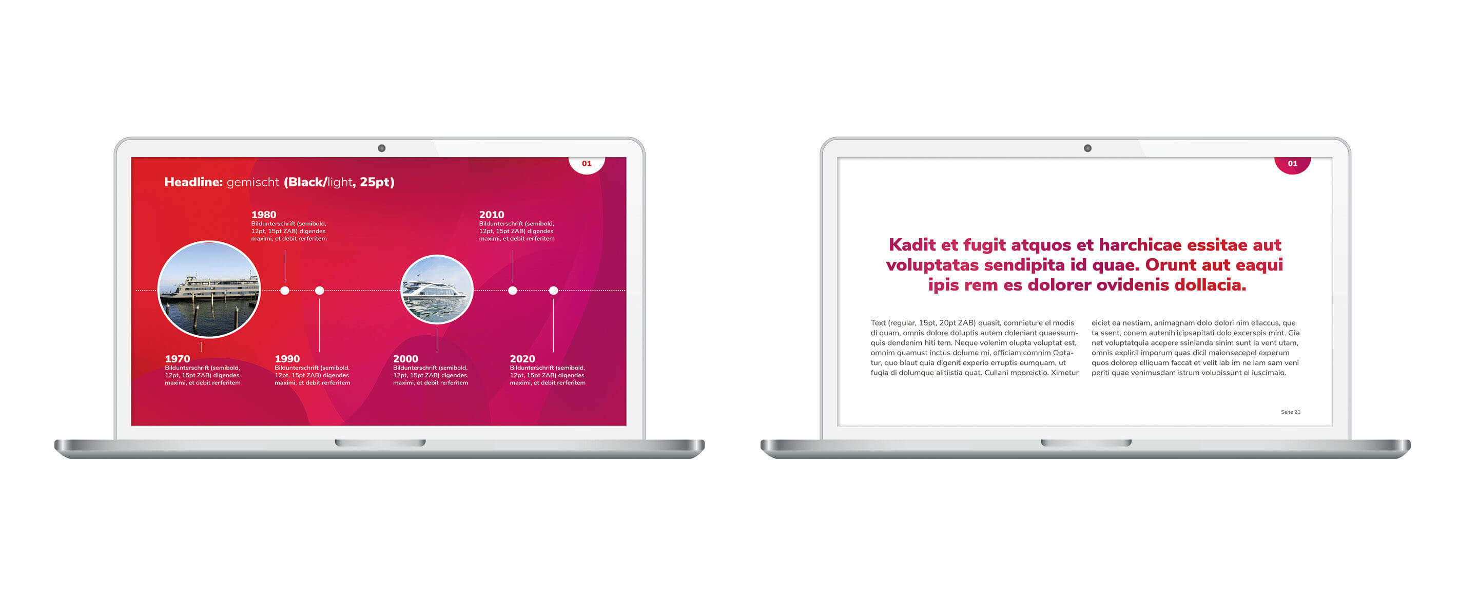
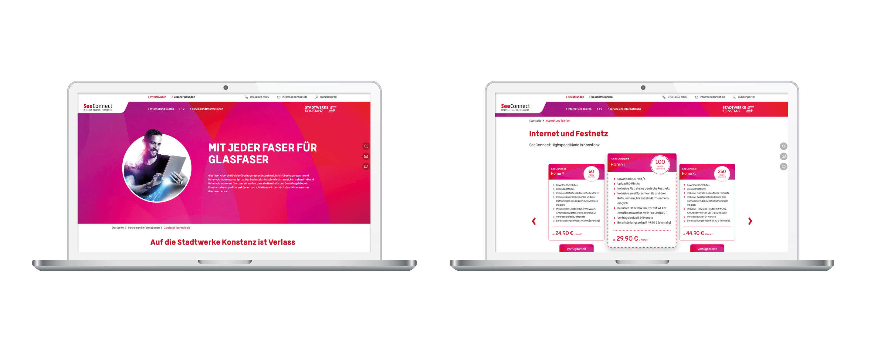
To meet this requirement, we developed a modular design system that creates strong recognizability through a consistent color scheme, typography and design language. Each business unit was given its own characteristic color palette, which facilitates intuitive assignment and reflects the main focus of the content – for example, a fresh, dynamic color scheme for the mobility area or calming, sustainable tones for energy and water. At the same time, common design elements, logo adaptations and a stringent visual language ensure that all areas fit harmoniously into the overarching Stadtwerke Konstanz universe.

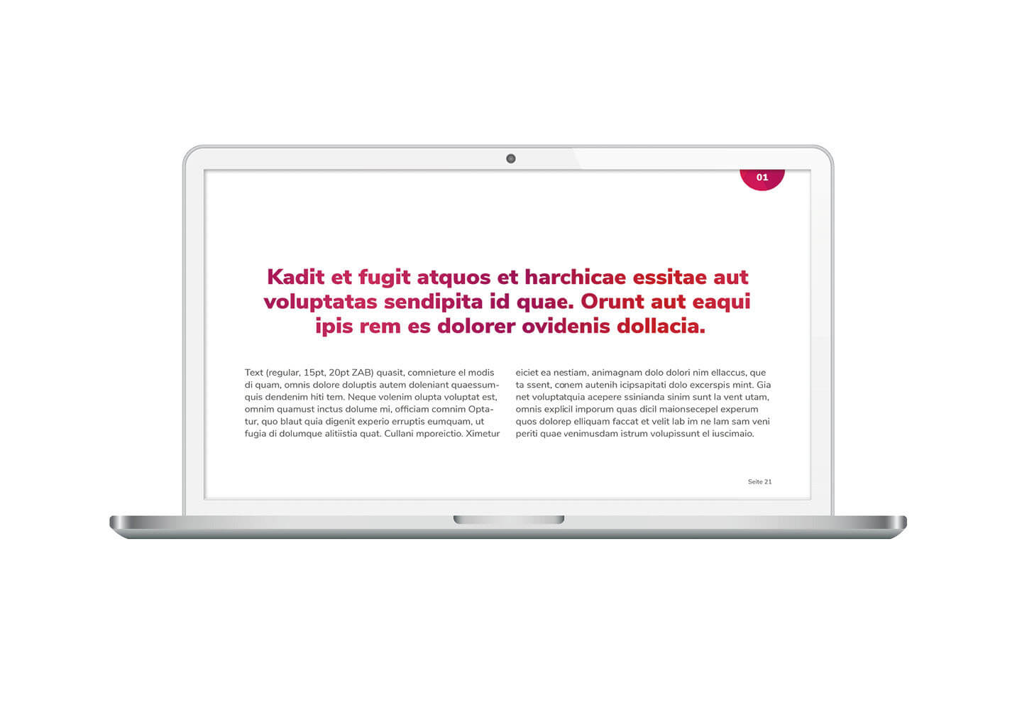
In addition to the visual design, the brand communication was also modernized in order to convey the values and services of Stadtwerke in an even clearer and more appealing way. Clear, comprehensible messages, a stronger customer focus and an optimized information architecture were specifically integrated into the design.

With this new brand identity, Stadtwerke Konstanz presents itself as a modern, future-oriented and approachable group of companies that stands for innovation, sustainability and reliability with a clear visual concept. The design not only creates a strong visual identity, but also improves orientation for customers and strengthens the perception of Stadtwerke Konstanz as a central brand for a sustainable and networked future.

EBEP_181101_Relaunch_Web_Stadtwerke-Konstanz_01-23 EBEP_181101_Relaunch_Web_Stadtwerke-Konstanz_01-23

The result is a powerful, modern brand identity that immediately attracts attention with its intense color scheme, dynamic design language and clear visual structure and creates a strong identity for Stadtwerke Konstanz. The design not only conveys competence and innovation, but also arouses sympathy and trust by consistently conveying the company’s values – sustainability, reliability and future orientation.

A central design element is the individually developed color system, which gives each business unit its own visual identity without losing its affiliation to the Stadtwerke Konstanz umbrella brand. The characteristic Stadtwerke red serves as a unifying element, which is included as a basic tone in every color spectrum. This balance between differentiation and recognizability ensures that the individual business areas stand out clearly from one another, but at the same time are perceived as part of a uniform brand system.

The color system is complemented by typography with a strong character that radiates modernity and stability. The font design is based on a clear, reader-friendly structure that ensures a consistent and professional appearance in all applications – from print and digital media to signage.

Another key element of the new corporate design is the extensive set of icons that were specially developed for Stadtwerke Konstanz. These icons help to visually simplify complex information, facilitate orientation and ensure a high level of user-friendliness in communication – be it on the website, in brochures or on advertising materials.

The result is a memorable, flexible and functional brand system that is convincing in both the analog and digital worlds. The new brand identity of Stadtwerke Konstanz combines aesthetics with clarity, creates a strong visual identity and ensures that the company is perceived as modern, accessible and future-oriented.

EBEP_181101_Relaunch_Web_Stadtwerke-Konstanz_01-26 EBEP_181101_Relaunch_Web_Stadtwerke-Konstanz_01-26

We implemented the new look in the business stationery, for example business cards, tariff documents, letterheads and a PowerPoint template. For end consumer communication, we developed out-of-home posters, brochures and designed the website for the telecommunications division. We also designed new lettering for the ferries with matching color accents.


Further work
Stadtwerke Konstanz - Image campaign
Constance public utilities
blank
Stadtwerke Konstanz - Image campaign
Constance public utilities
Davert - Convenience Range
Davert
Davert Convenience Range
Davert - Convenience Range
Davert
Wingo - Packaging for cleaning agents
Wingo
Wingo Putzmittel Verpackungen
Wingo - Packaging for cleaning agents
Wingo
Südwestdeutsche Salzwerke AG - Relaunch of the AQUASALE brand
Südwestdeutsche Salzwerke AG
Relaunch Aquasale
Südwestdeutsche Salzwerke AG - Relaunch of the AQUASALE brand
Südwestdeutsche Salzwerke AG
LET Group
LET Group
LET Gruppe
LET Group
LET Group
Riedenburger - Complete relaunch for organic beer
Riedenburger
Riedenburger Brauerei Bio
Riedenburger - Complete relaunch for organic beer
Riedenburger
DuMont - Campaign Escapades Travel Guide
DuMont
DuMont Eskapaden Reiseführer
DuMont - Campaign Escapades Travel Guide
DuMont
Eber