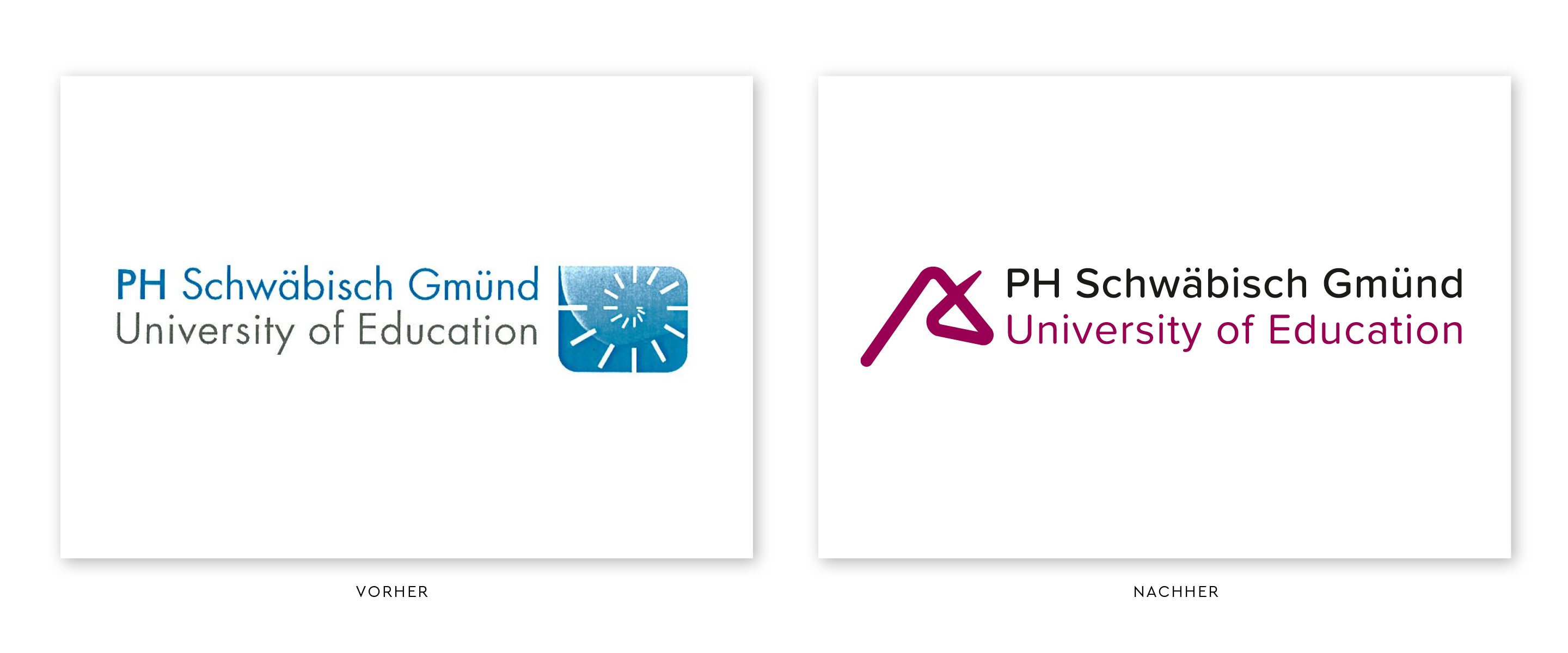
200 years of history is a proud foundation – but in the competition for the best minds among students and teachers, it’s looking ahead that counts. The University of Teacher Education took its anniversary as an opportunity to modernize its image with us.
The previous blue logo, shaped like a nautilus shell, had lost its appeal in today’s modern higher education landscape. A new corporate design was intended to counteract this inconsistent brand image, as the individual departments’ logos diluted brand recognition and created an external image that did not align with the university’s international reputation.
A new, forward-looking logo and a corporate design were required that would make the university visible as a modern educational and research institution and at the same time assert itself confidently in competition with other teacher training colleges and renowned universities.
With our new logo, we are consciously breaking away from our previous appearance and uniting origin, aspiration and future in one symbol: The greatly reduced, newly interpreted unicorn head in the logo picks up on the unicorn from Schwäbisch Gmünd’s coat of arms and at the same time embodies intellectual agility and innovative strength. The red ties in with the city color and is complemented by clear, modern typography.
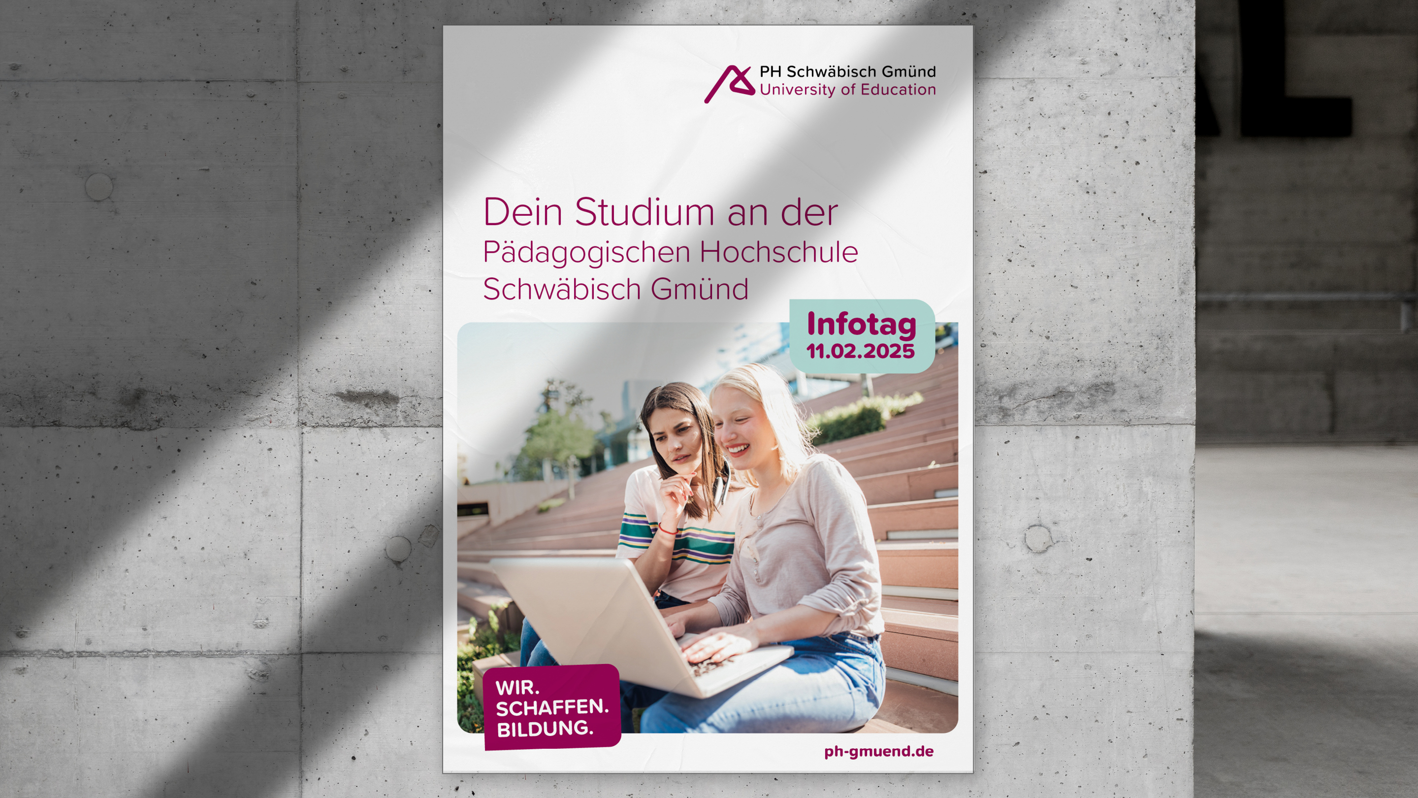
Claims such as “Wir.Schaffen.Bildung” and “Wir. Create. Knowledge.” are consistently integrated into the communication. The new corporate design already characterizes the entire appearance of the university and is impressively displayed on all communication and advertising materials.
Further information:
Our client: PH Schwäbisch Gmünd
All projects for our client PH Schwäbisch Gmünd
Further projects of our branding agency











 back
back