EBEP_181101_Relaunch_Web_Projekt_2880_1000_01 EBEP_181101_Relaunch_Web_Projekt_2880_1000_01

Relaunch and strategic realignment of the Tress brothers

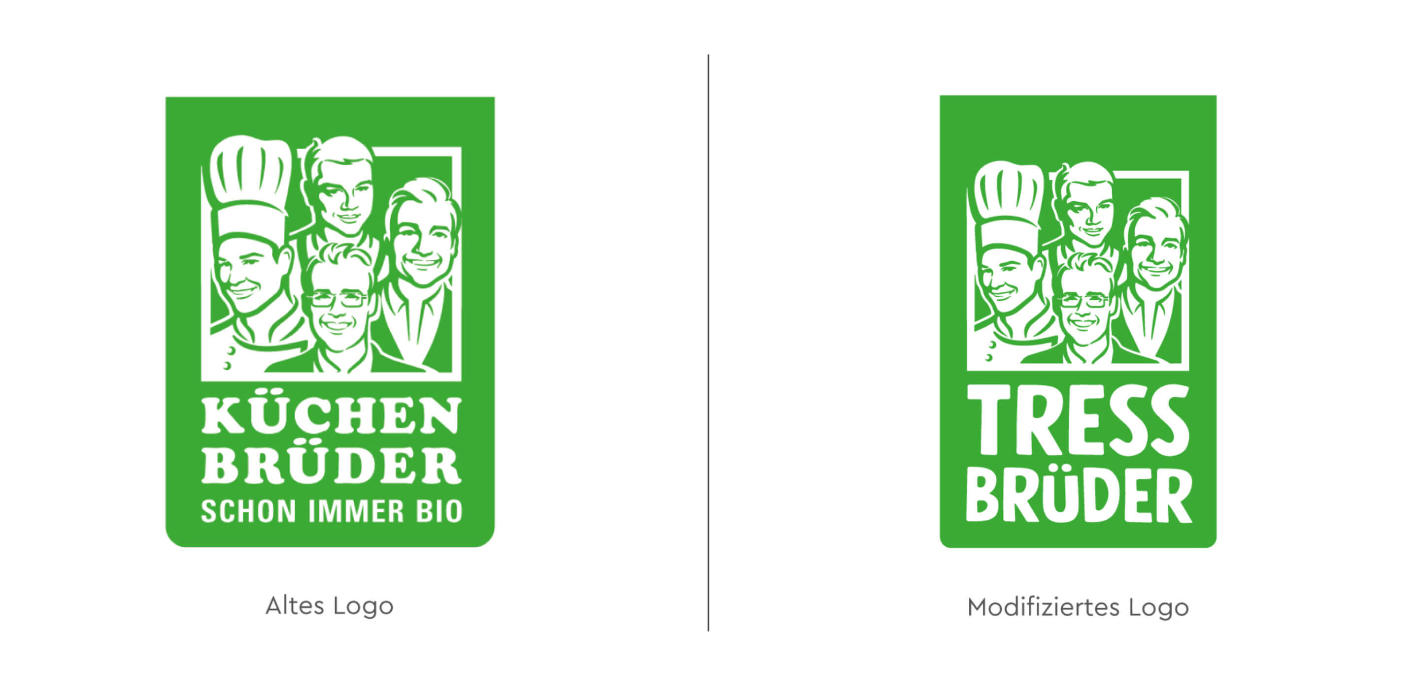
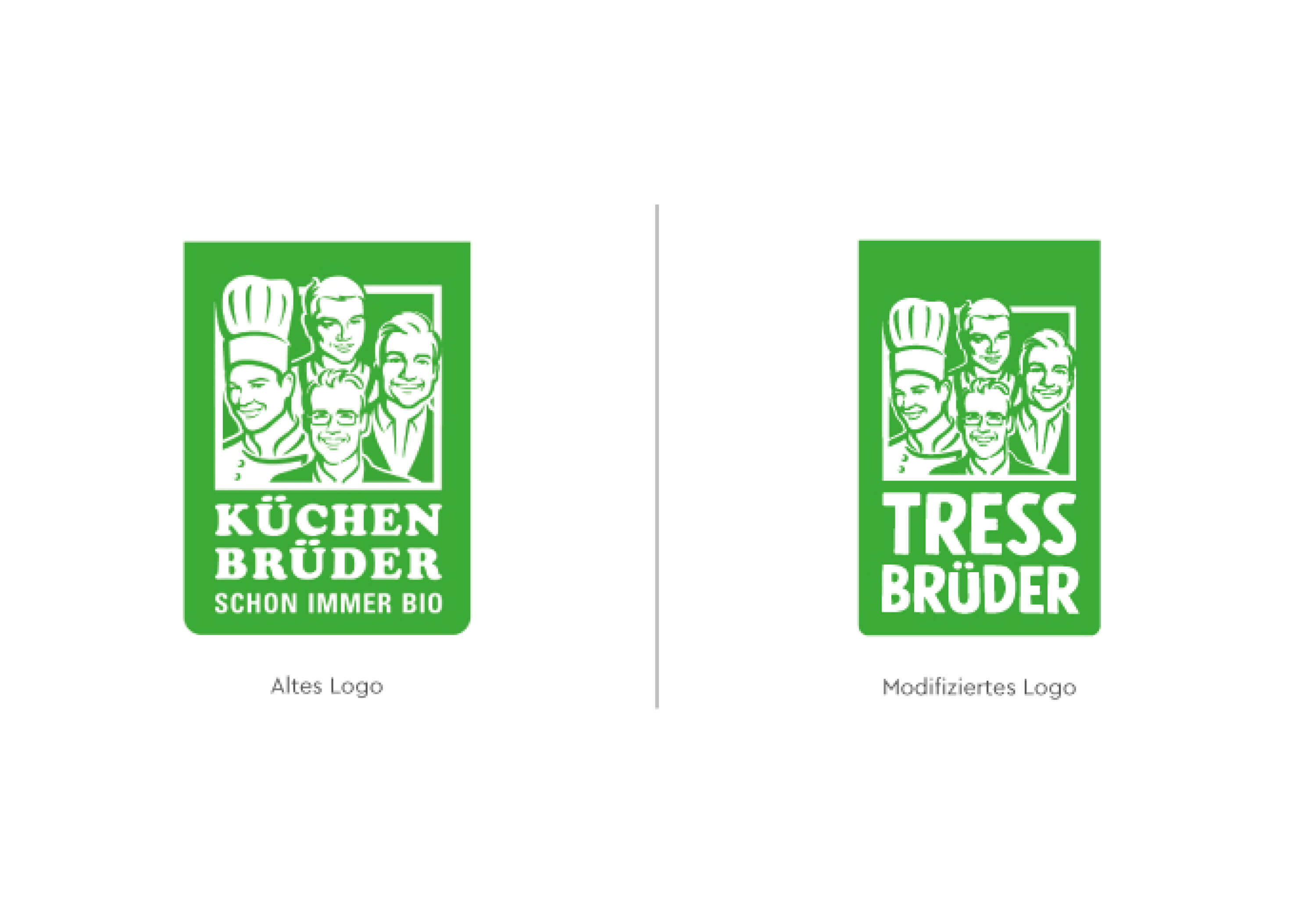
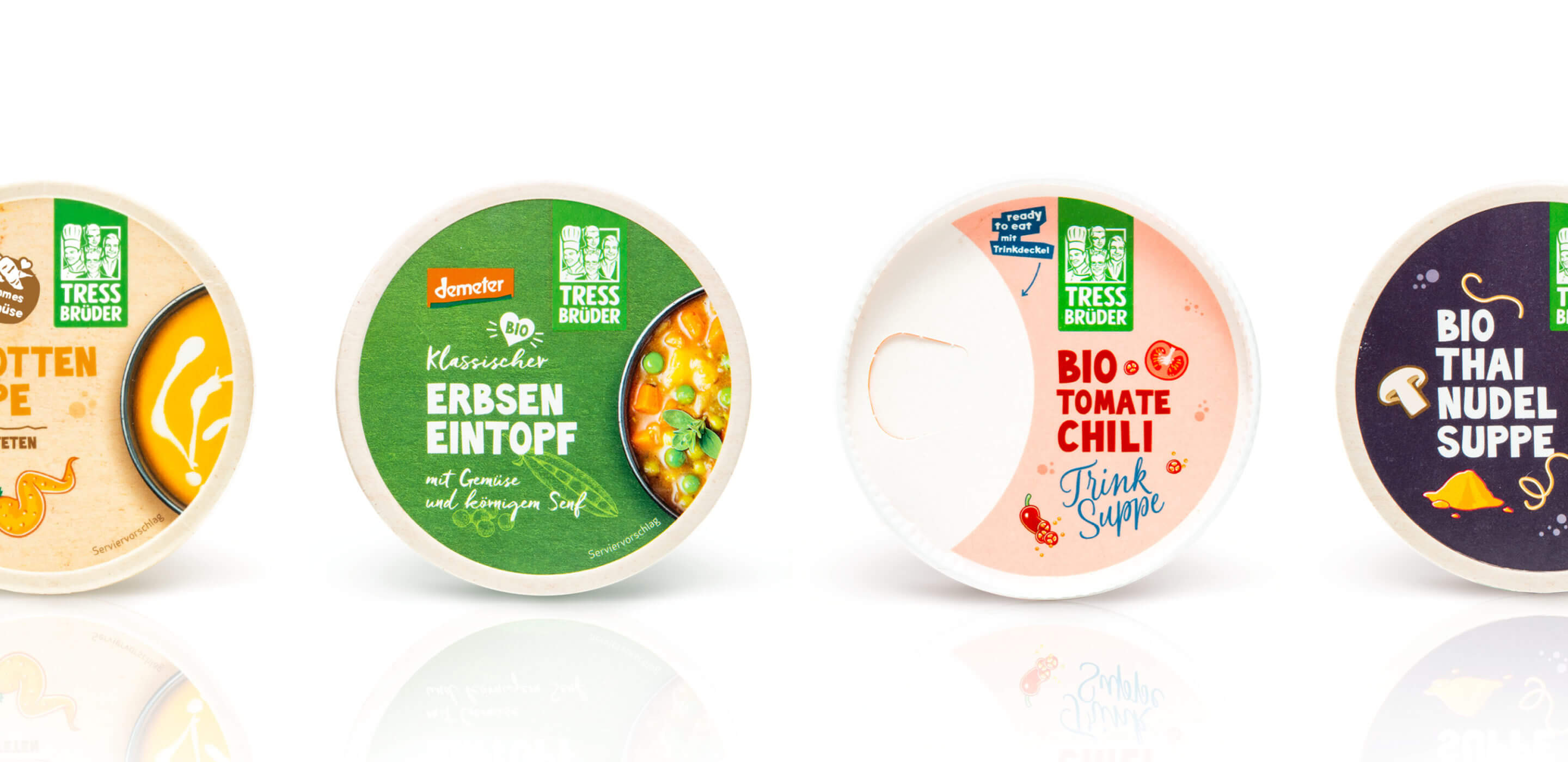
The TressBrüder relaunch marks a significant step in the strategic development of the successful secondary brand of the Tress brothers’ organic food company based in Hayingen. Given the great success of the previous brand, “Küchenbrüder,” the decision was made to position it more strongly alongside the primary brand, Rose. As part of our strategic support, the brand identity was redesigned: the name and logo of “Küchenbrüder” evolved into “TressBrüder,” laying the foundation for the subsequent packaging design.

The logo was deliberately designed in such a way that it remains self-similar for high recognition in the trade, but is now charged with the name Tress. This emphasizes the close connection to the family business and at the same time strengthens the brand identity. In addition, the name Tress is already known in the industry through organic chef Simon Tress, which provides additional appeal for the repositioning. The Tress Brothers relaunch thus stands for a clear brand strategy that skillfully combines tradition and innovation.
EBEP_181101_TRESS_Case_MOBIL_12 EBEP_181101_TRESS_Case_MOBIL_12

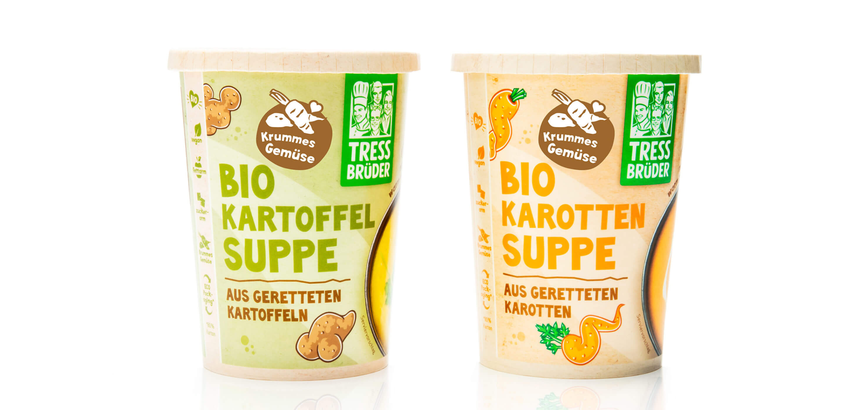
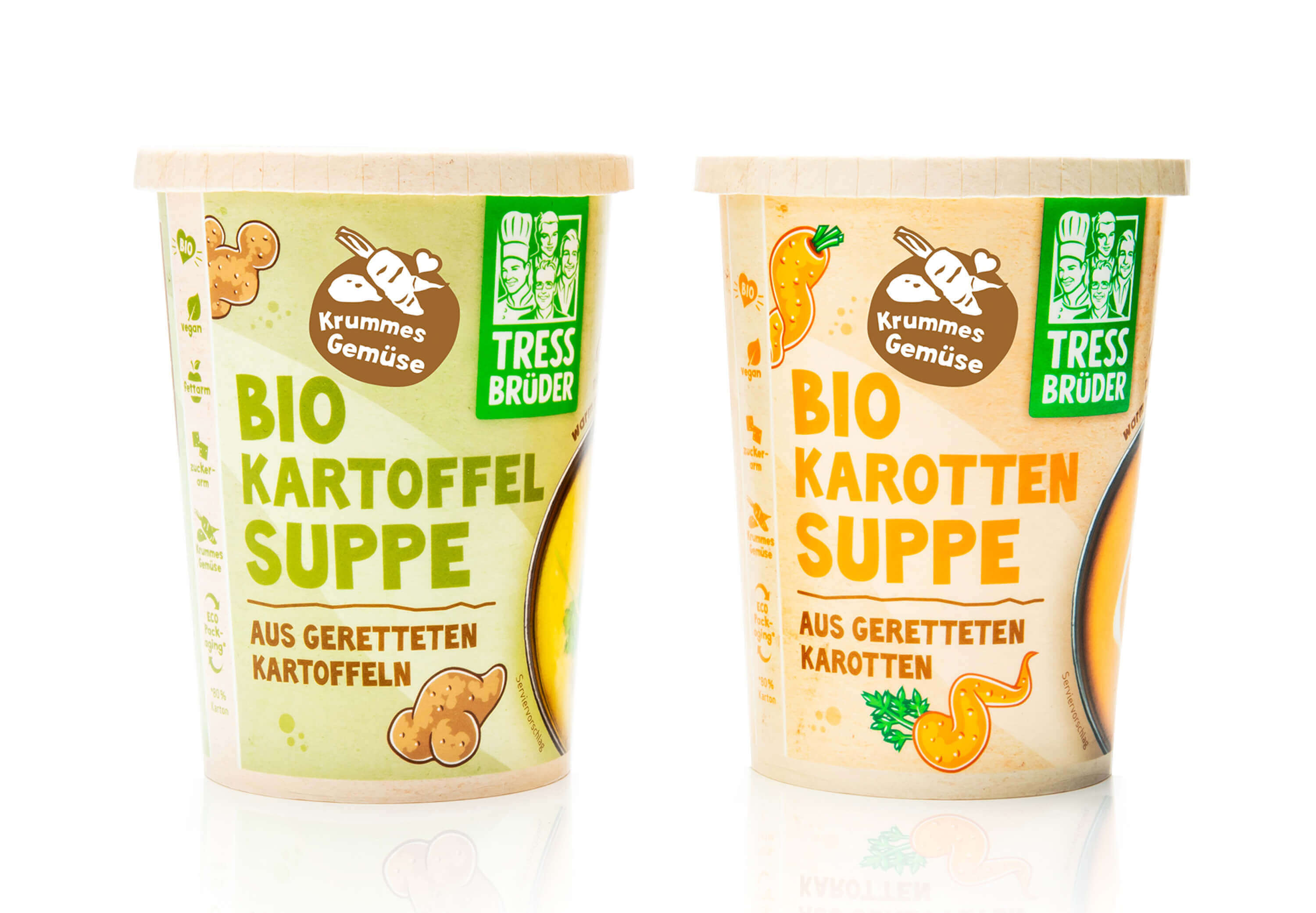
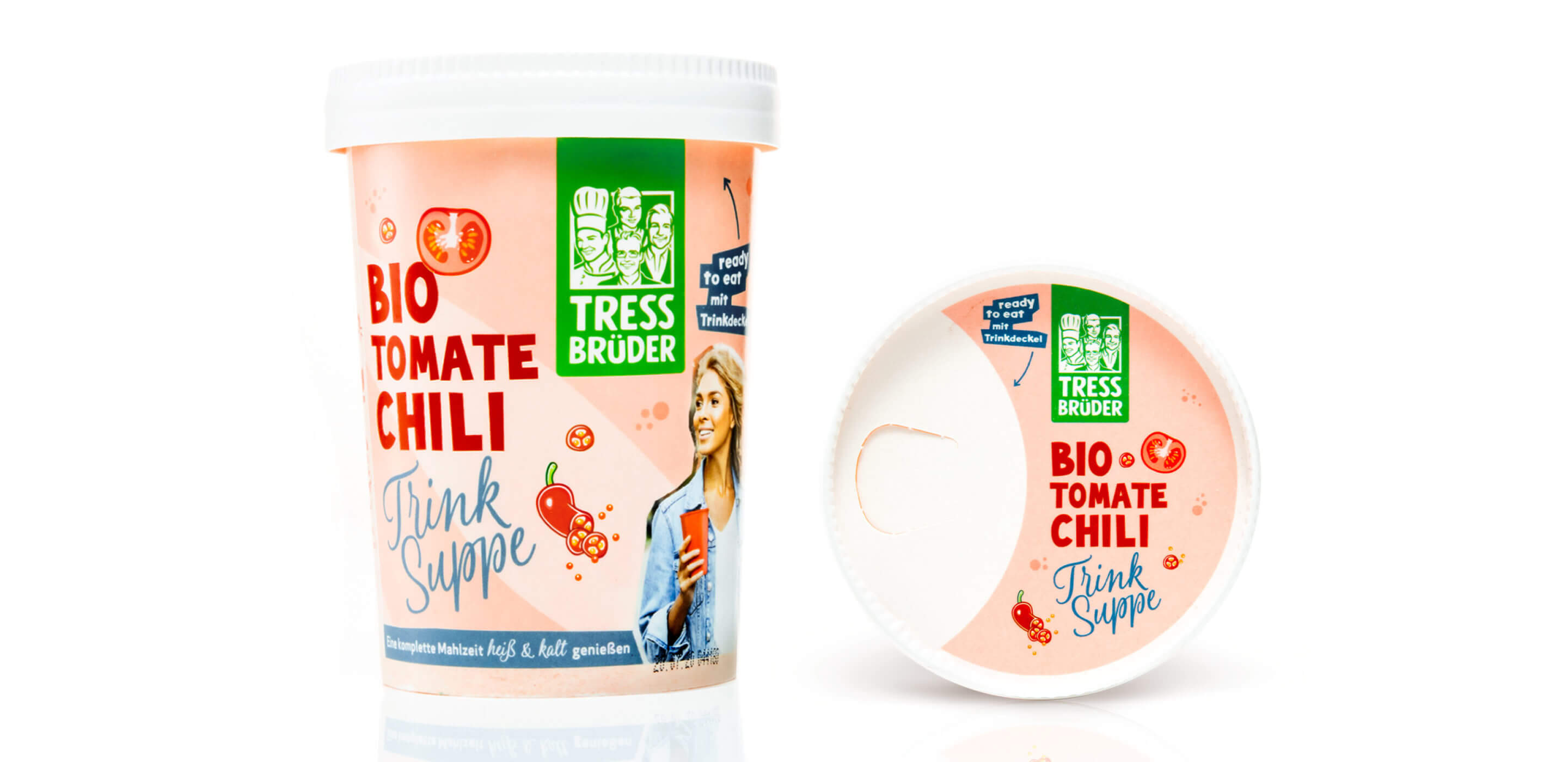
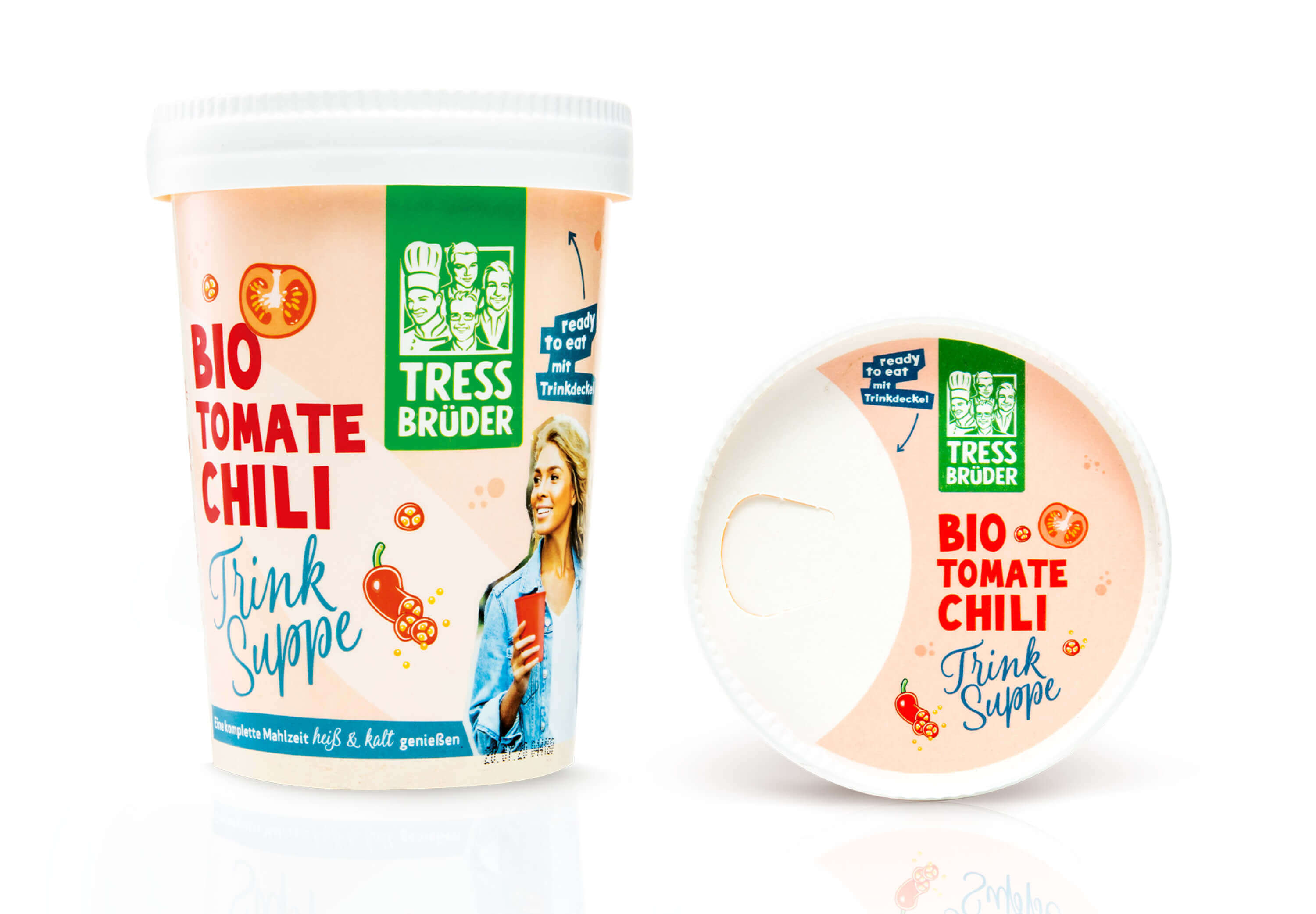
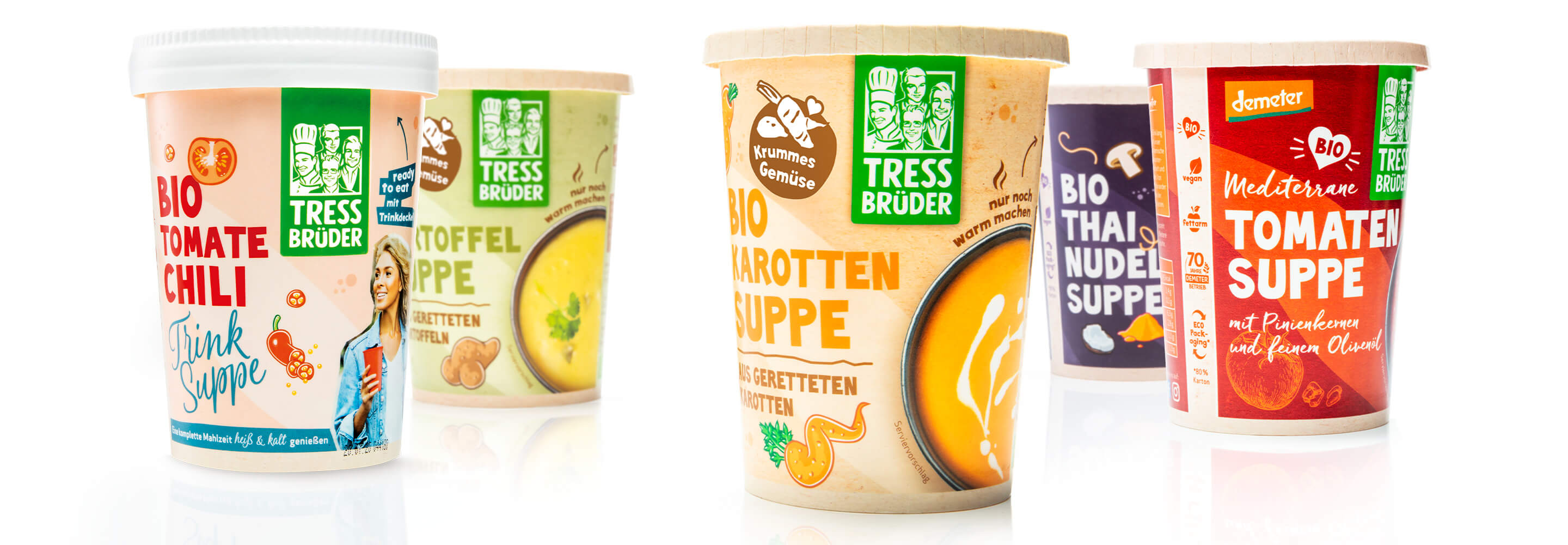
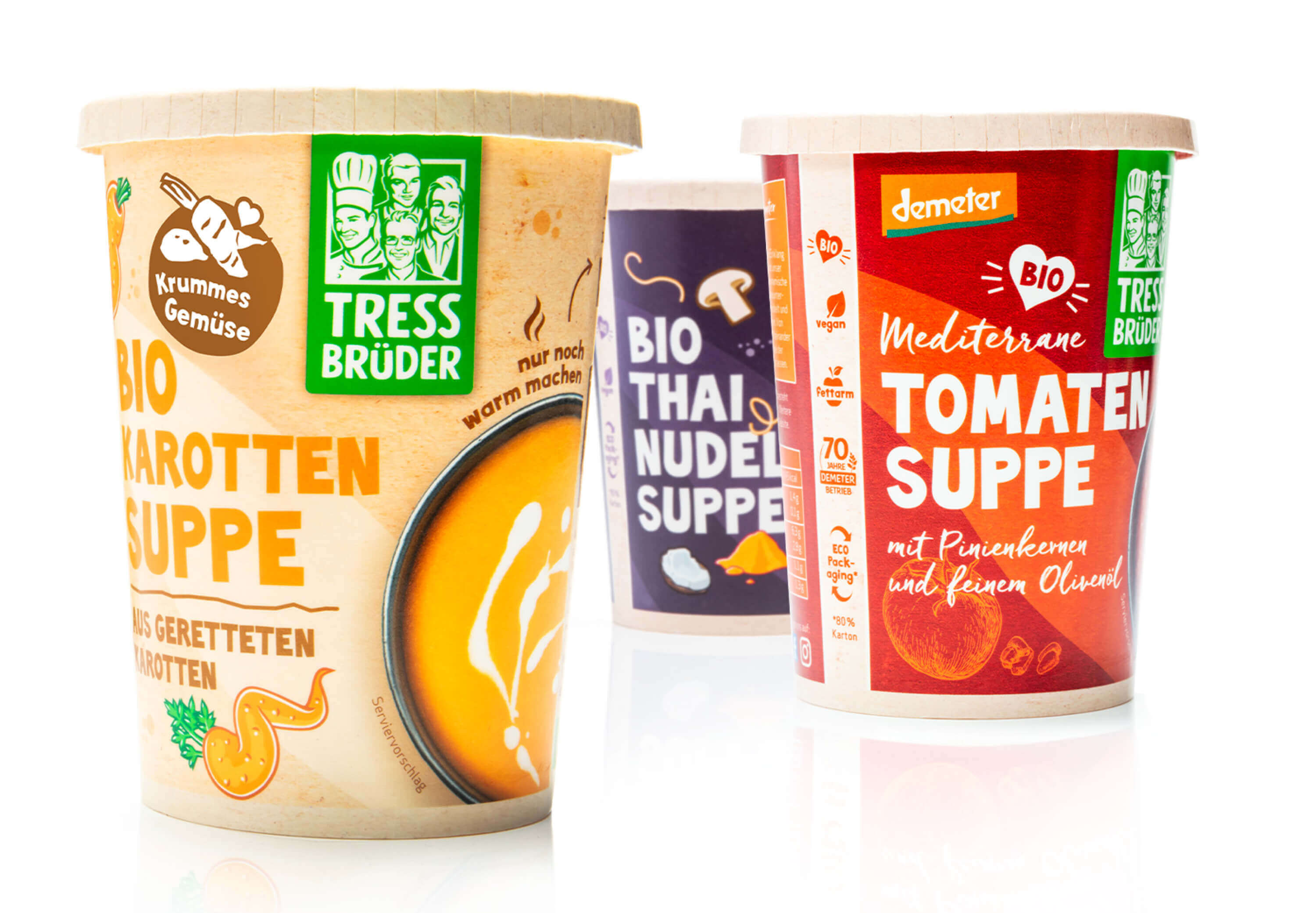
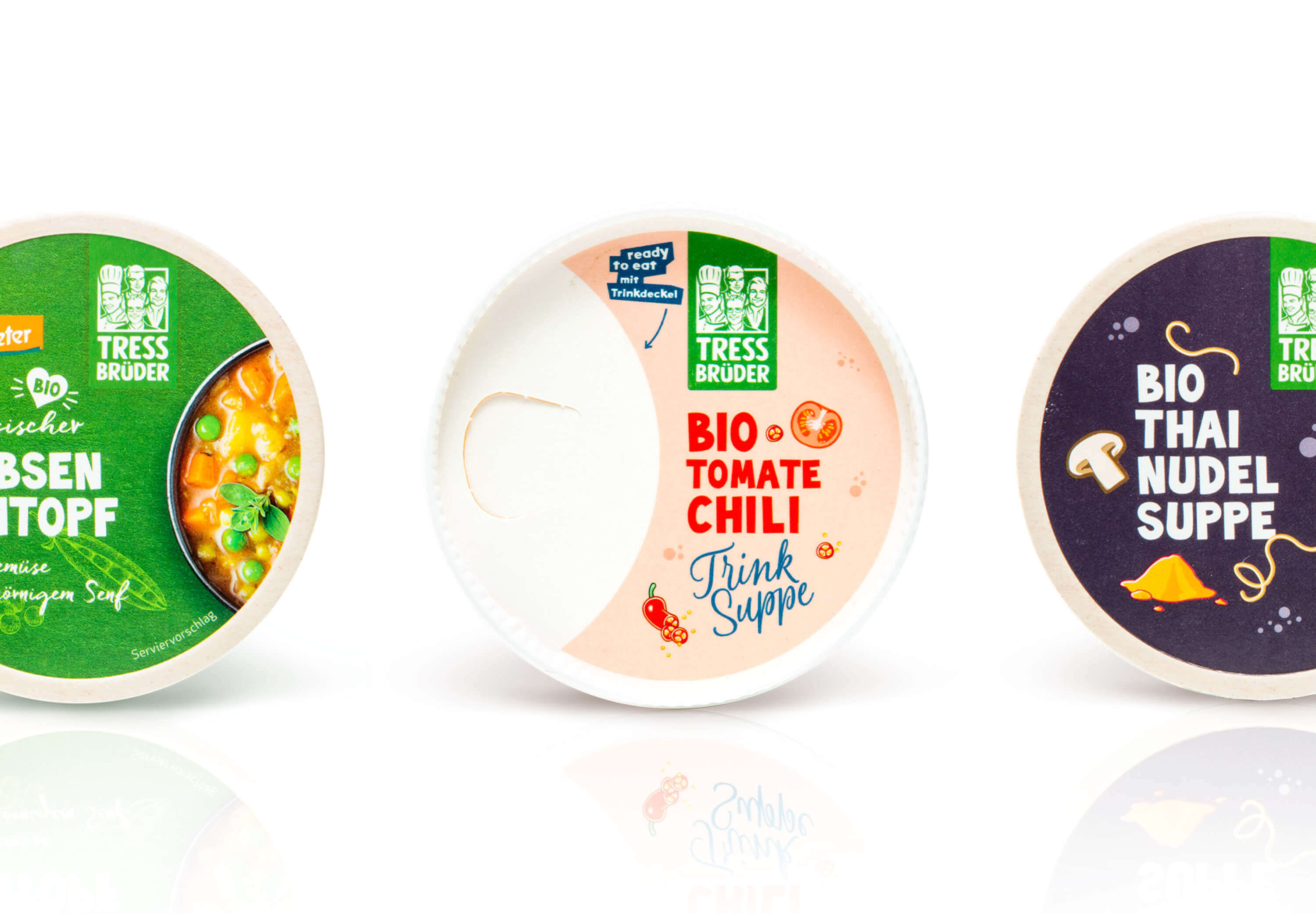
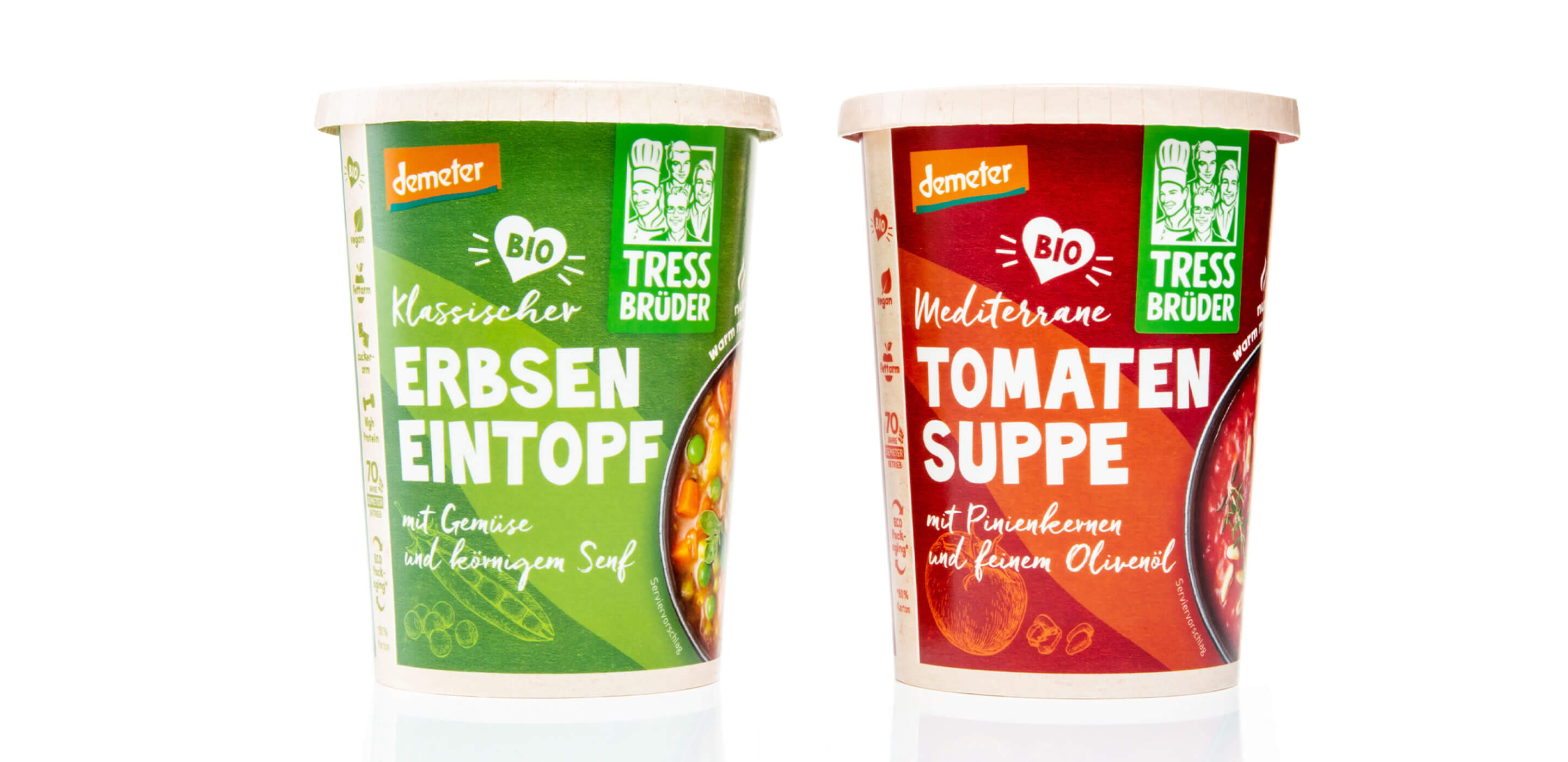
This was followed by a comprehensive packaging relaunch, which further strengthened the sustainable brand image of the Tress brothers. As part of this redesign, particular emphasis was placed on more environmentally friendly materials and an authentic, handcrafted look. Since then, the Tress brothers have been using more sustainable packaging materials: the cups for the organic ready-made products are now made from 80% renewable raw materials, thus reducing the brand’s ecological footprint.

In addition to the choice of material, the design also played a central role. Paper with a good grip and a handmade look reflect the sustainability aspect in terms of design and convey the handcrafted quality of the products at first glance. The reduced, natural color scheme and the deliberate typography also underline the brand’s values: tradition, regionality and ecological responsibility.

This packaging relaunch not only optimized the visual and functional aspects of the packaging, but also sent a strong signal for greater environmental awareness in the food industry. The new packaging provides an improved feel, greater differentiation on the shelf and also supports the Tress brothers’ sustainable brand promise.

EBEP_181101_TRESS_Case_MOBIL_10 EBEP_181101_TRESS_Case_MOBIL_10

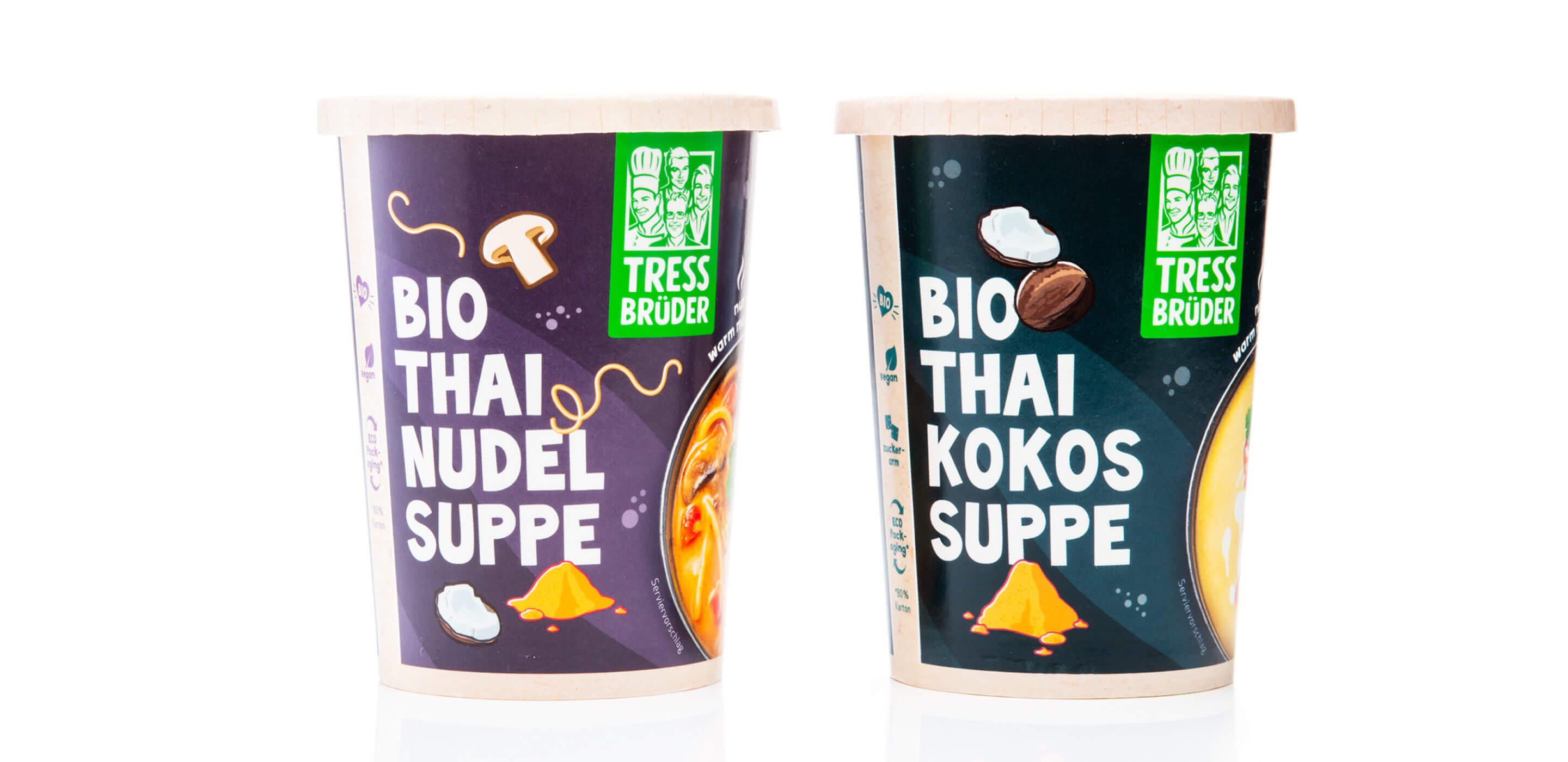
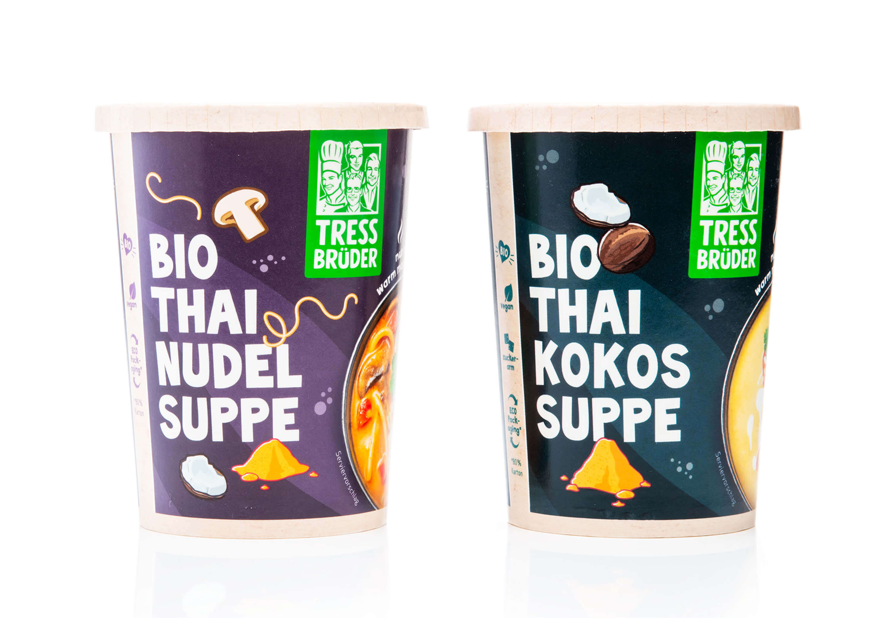
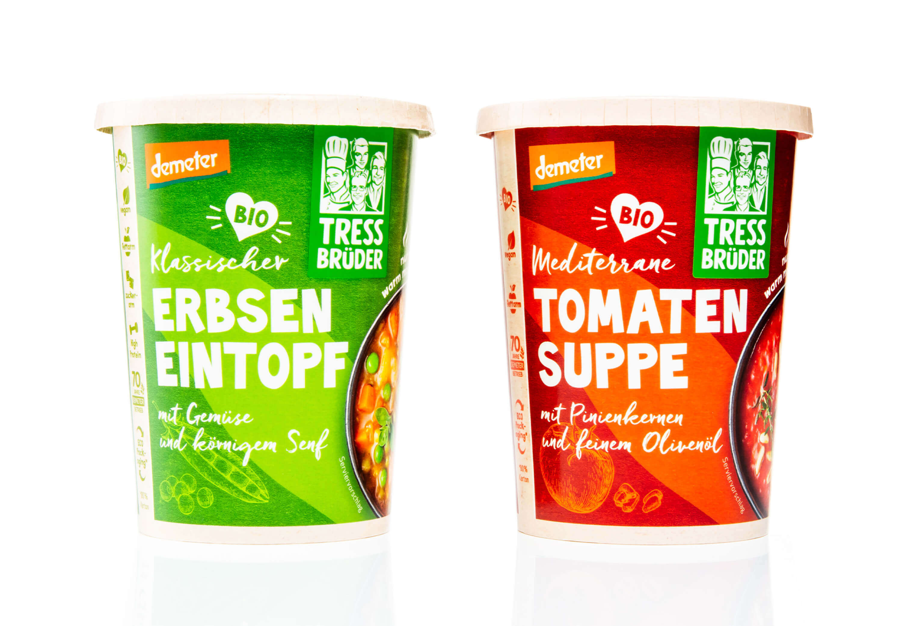
The added value of the dishes is communicated on the packaging by means of a concise, illustrated vertical strip on the front. This graphic accent deliberately stands out from the rest of the design and provides a clear, structured presentation of the most important product features. This provides consumers with all the relevant information at a glance – from the high-quality organic ingredients and sustainable packaging to the special taste characteristics of the respective dishes.

Another central design element are the high-quality photo motifs, which were staged in our studio with great attention to detail. These authentic images show the 20 or so different dishes in all their delicious variety – from traditional potato soup and spicy tomato and chili soup to exotically inspired dishes such as street food Thai. Each motif was specifically chosen to perfectly reflect the freshness, quality and craftsmanship of the TressBrüder products.

The combination of well thought-out illustration, informative design and appealing food photography creates packaging that is not only functional and aesthetically pleasing, but also effectively conveys the Tress brothers’ brand values – regionality, sustainability and first-class organic quality. The new design makes it easy for consumers to find their way around the shelves and at the same time emphasizes the special character of each individual dish.

More information:
Our client: TressBrüder
All projects for our client TressBrüder
More projects from our branding agency





Further work
Weleda - Medicines spring campaign
Weleda
Arzneimittel Weleda Frühjahr
Weleda - Medicines spring campaign
Alnatura - Payback mailings
Alnatura
Payback Mailings
Alnatura - Payback mailings
Kaiser - Corporate Design
Emperor
Kaiser Backformen
Kaiser - Corporate Design
DuMont - Campaign Escapades Travel Guide
DuMont
DuMont Eskapaden Reiseführer
DuMont - Campaign Escapades Travel Guide
Weleda - Neurodoron campaign
Weleda
Weleda Neurodoron Kamapgne
Weleda - Neurodoron campaign
Holle - Packaging
Holle
Holle baby food Packaging
Holle - Packaging
Eber